Certain chart types tend to grow to a wide layout, while others will quickly evolve to a tall layout.
Bar charts with vertical bars will tend to be wider than high, unless they show only a couple of values. Horizontal bar charts grow in the vertical direction, and have a tendency to be higher than wide.
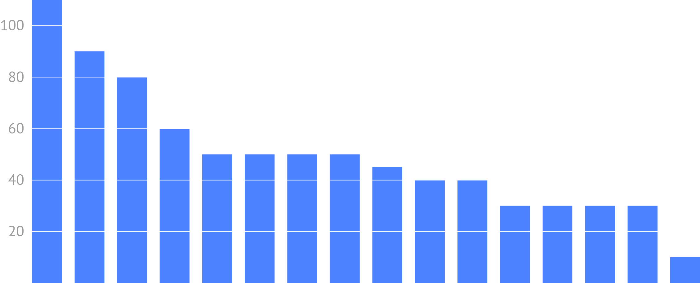
Source: Maarten Lambrechts, CC BY 4.0
Another example of an inherent aspect ratio is the high layout of slope charts. Slope charts are line charts that show values for only 2 moments in time, so they require only a limited horizontal space. They do need enough vertical space to show the evolution between the 2 moments in time, especially when they contain a lot of time series.
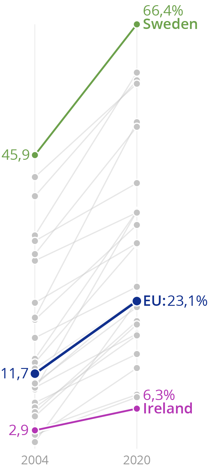
Source: Maarten Lambrechts, CC BY 4.0
And of course, a pie chart is a circle and will occupy a more or less square space in a grid based design (see the page about the grid.
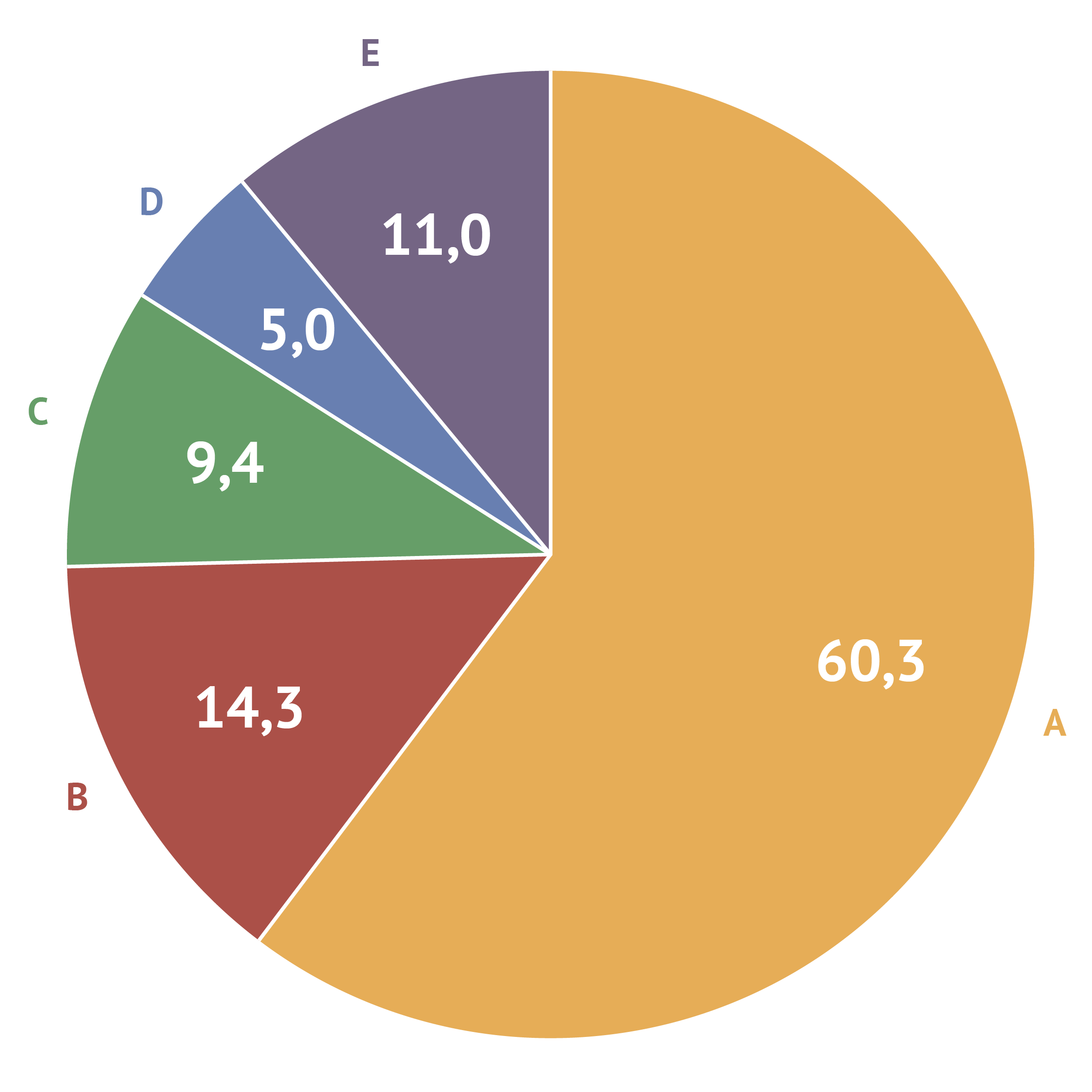
Source: Maarten Lambrechts, CC BY 4.0
So if you know the dimensions and the aspect ratio of the space assigned to a visualisation in a publication, this can help you in choosing a chart type that fits the aspect ratio of the available space.
Of course the reverse is more ideal: choose a chart type that fits best the data and the message you want to convey, and reserve a space in your design that has an aspect ratio that fits the chosen visualisation.