Many time series values carry some kind of measurement error: a deviation between the measured value and the actual value. For example, a thermometer might not be calibrated well, or differences in wind and humidity can lead to higher or lower measurements between observations. These measurement errors, together with natural variability in the data, can lead to noise hiding the underlying trend in the time series.
The chart below shows the yearly global temperature anomaly compared to the 1951-1980 reference period.
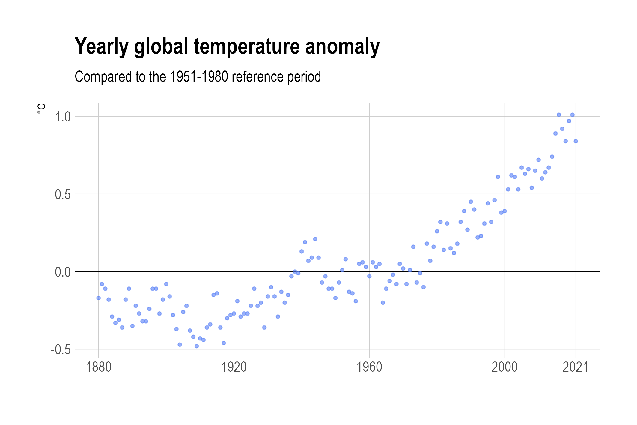
Source: Maarten Lambrechts, CC BY SA 4.0
There is a clear trend in the data, but also some noise that is hiding the underlying trend. This is also apparent when the dots are connected to crate a line chart.
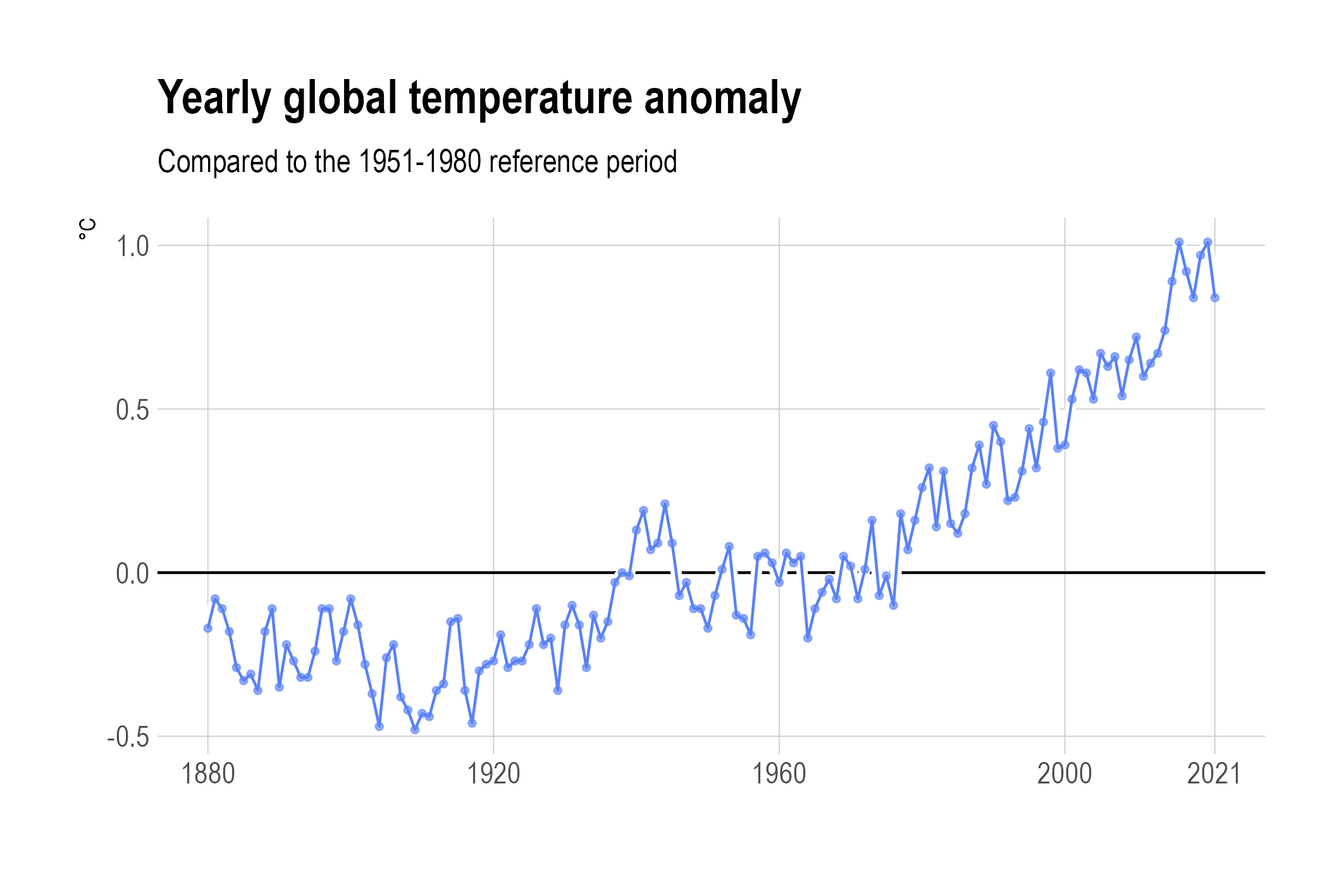
Source: Maarten Lambrechts, CC BY SA 4.0
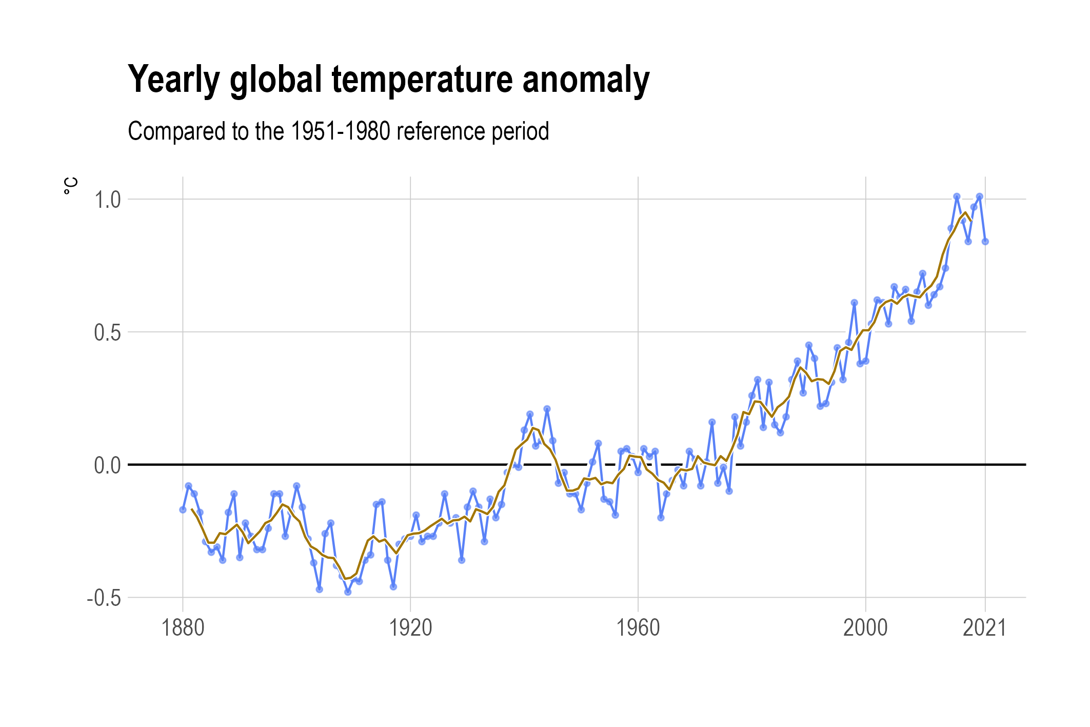
Assuming the relationship between the measured value and time is a linear one (which is clearly not the case here), a linear regression line can be calculated and displayed. But in many cases, this relationship is not a linear one, and a linear regression is not very helpful in revealing the underlying trend.

A linear regression line for global temperature anomalies. Source: Maarten Lambrechts, CC BY SA 4.0
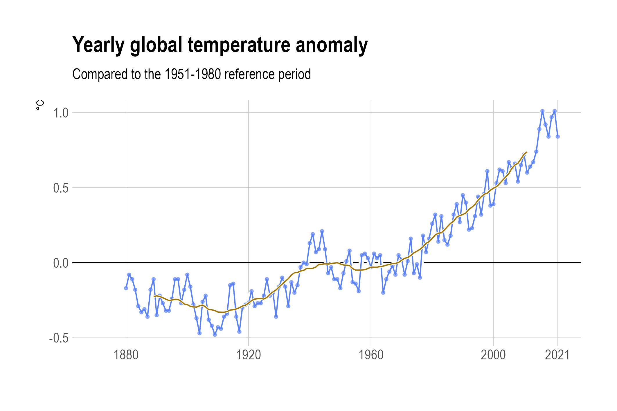
In order to reveal the underlying trends, a technique called smoothing can be used. The simplest technique is a moving average (also called rolling average, or running average). To calculate the moving average, an equal number of values before and after each value in the time series is selected (this is called the window), and the average for all values in the window is calculated.
A moving average with a window of 5 years wide (from 2 years before to 2 years after each year). Source: Maarten Lambrechts, CC BY SA 4.0
The size of the window in a moving average determines how smooth the curve is: larger windows yield smoother curves.
A 20 year moving average. Can you explain why the curve with the moving averages does not start and end at the start and end of the time series? Source: Maarten Lambrechts, CC BY SA 4.0
Local regression (also known as LOESS or LOWESS) uses windows on time series values to fit regression lines on the windows locally, giving more weight to the data points closer to the window center in both the x and y direction. This is applied in the chart below.

A LOESS curve. Source: Maarten Lambrechts, CC BY SA 4.0