Just like scales have default configuration in all three implementations of the Grammar of Graphics, plots have default theming settings. The theming of a plot consists of the used colours, the spacing between elements and the used fonts.
Colours used in scales are specified in the scales themselves. But the colours of non-data elements in a plot can be set in the theming. In the plot below, a background colour is applied to an Observable Plot visualisation. The plot is also using a customised font family, font size and font colour.
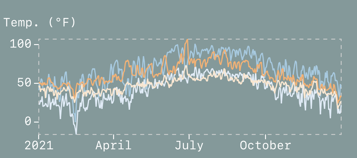
Source: observablehq.com/@observablehq/plot-cheatsheets-layouts
Apart from colours and fonts, the spacing between elements on a plot is an important part of its theming. Below is a schematic representation of the available spacing options in an Observable Plot visualisation.
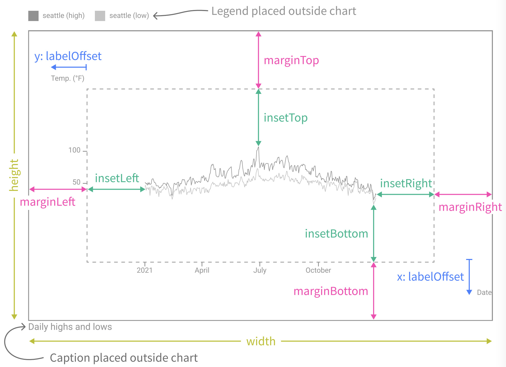
Source: observablehq.com/@observablehq/plot-cheatsheets-layouts
Below is a similar schema, illustrating all chart elements that can be themed with the theming system in ggplot2.
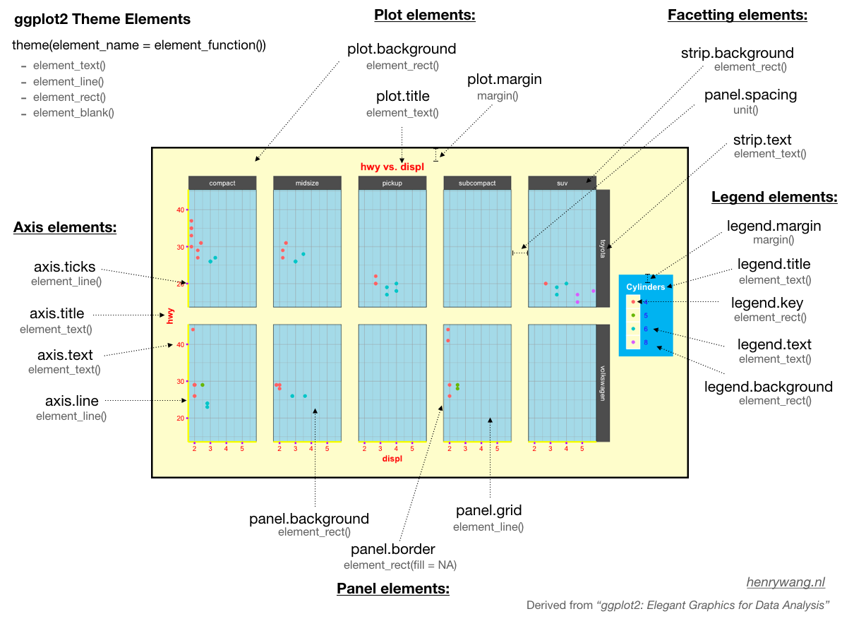
Source: Henry Wang
More about the theming in each of the 3 implementations of the Grammar of Graphics can be found in their respective introduction pages: