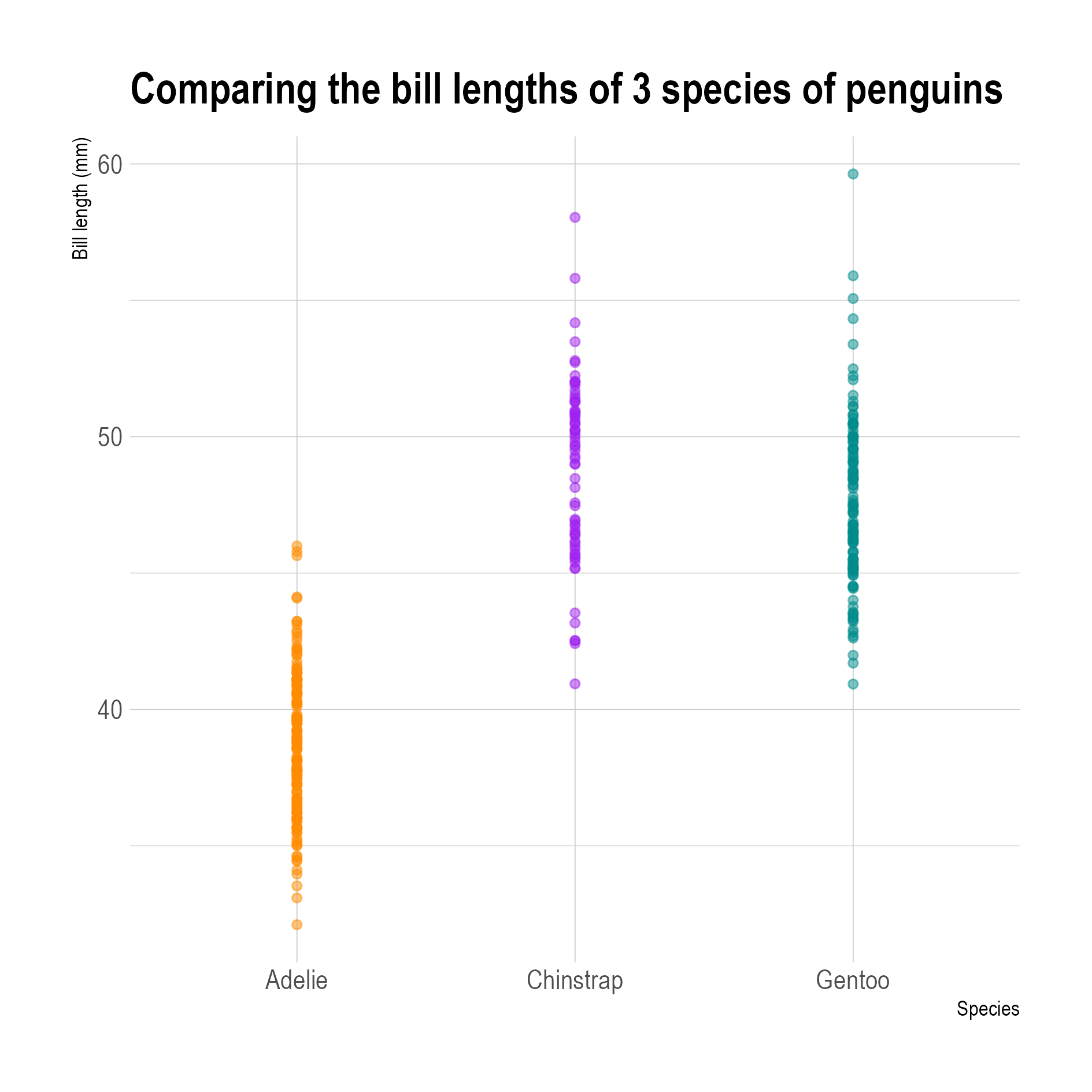
The easiest way of showing a distribution is to use a numerical axis and plot the values in the data using dots, to create a univariate scatter plot.
Source: adapted from Allison Horst
In the example above the bill length of 342 penguins from 3 species are plotted using circles. The range for the bill lengths for the 3 species is immediately clear: Adelie penguins have shorter bills, and the variability is the highest for the bills of the Gentoo penguins.
And because the circles have some transparency, the shape of the distribution emerges: clusters in the data, where many points overlap, are darker, while parts of the distribution with few data points are lighter.
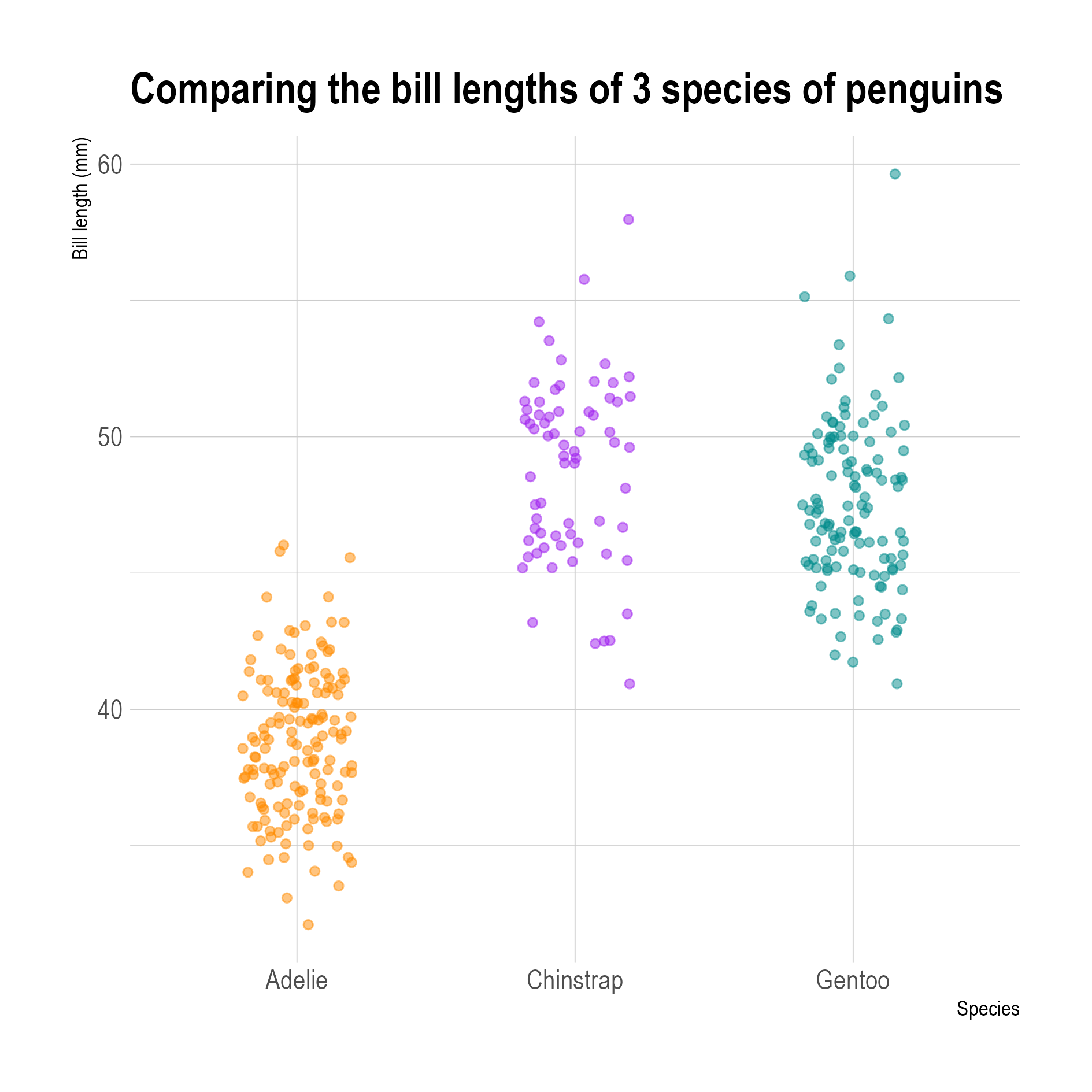
When the number of data points to show is too high to get a good view on the distribution by using transparency, the dots can be randomly shifted a little bit to reduce the overlap between the circles. This technique is called jittering.
Jittered data points. Note that the points are only jittered in the x direction, so each dot is still at its correct vertical position. Source: adapted from Allison Horst
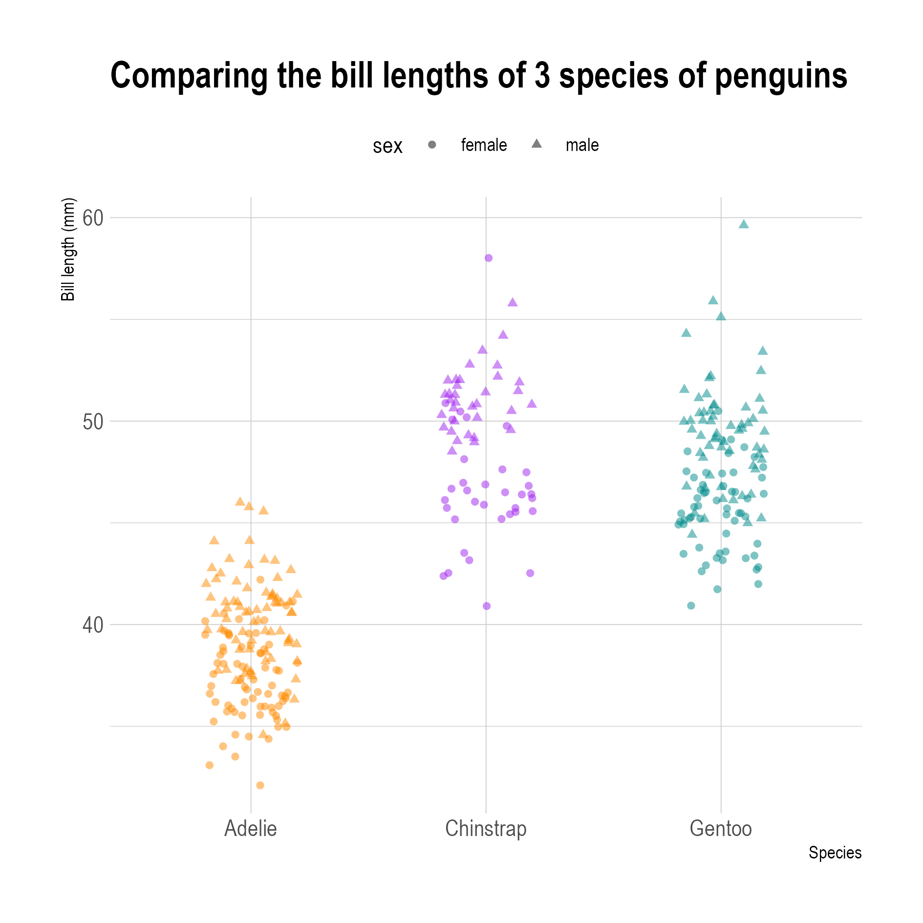
From this plot, you can see that there is some bimodality in the bill lengths of the Chinstrap penguins: there seem to be 2 clusters in the data. Using different symbols for male and female penguins shows that the bimodality is due to the penguins’ sex. The difference in bill lengths between males and females is much more prononounced for Chinstrap penguins than for the two other species.
Source: adapted from Allison Horst
When points are jittered, they should not be jittered in the direction of the numerical axis, and only be shifted in the direction perpendicular to that.
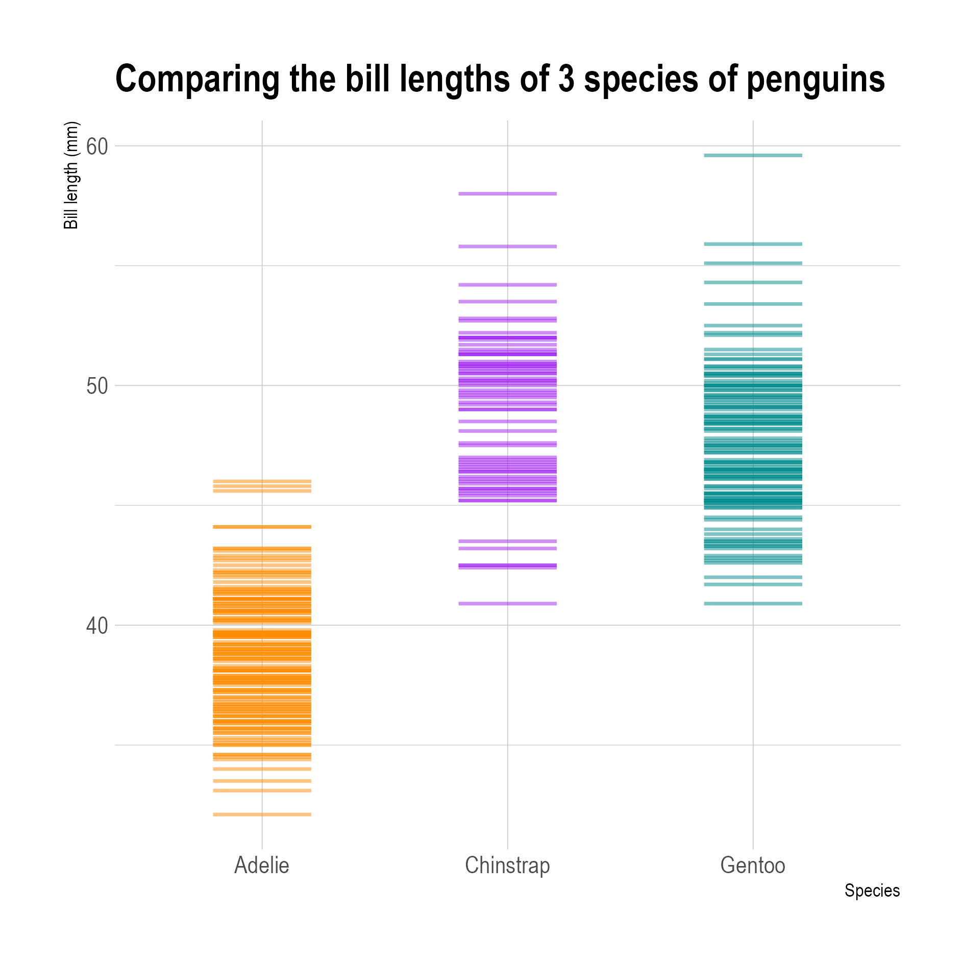
An alternative to dot plots are strip plots. These use lines instead of dots to show the data values, which also reduces overlap.
Source: adapted from Allison Horst
Strip plots are sometimes also called barcode plots, for obvious reasons.
Strip plots can be added in the margins of visualisations like scatter plots. In that case they are referred to as rug plots.
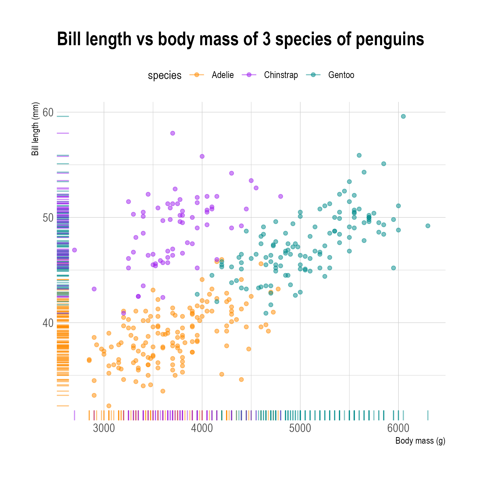
Source: Maarten Lambrechts, CC BY SA 4.0