What if instead of plotting many dimensions on a scatter plot, like in a bubble chart, you would simply like to plot lots and lots of points? You will quickly run into the problem of overplotting: the dots or other symbols on the scatter plot will start to overlap, and chart becomes a big blob of ink that completely hides the patterns in the data.
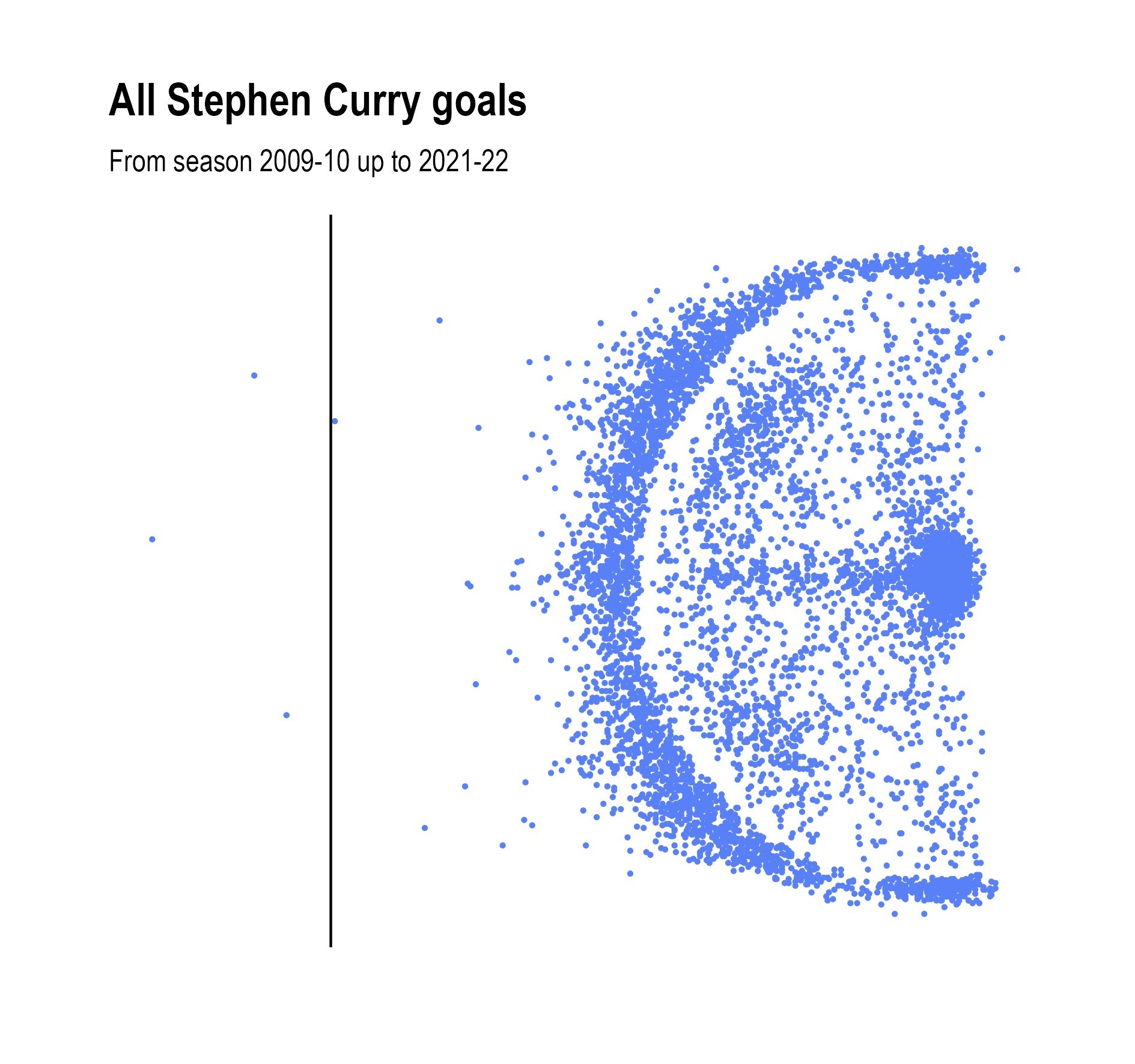
Below is a scatter plot of all the 6.873 goals scored by Golden State Warriors basketball star Stephen Curry. Although the 3 point line is clearly visible (Curry is famous for his high accuracy from behind this line), you can see that the sheer amount of points hides the patterns, because a lot of points are just plotted on top of each other. Could you, for example, see if Curry scores more from under the basket than from behind the 3 point line? Or if he scores more 3 pointers from the left side of the field than from the right?

Source: Maarten Lambrechts, CC BY SA 4.0
Making the dots smaller can help, but this has limitations too.
Source: Maarten Lambrechts, CC BY SA 4.0
Giving the dots some transparency can help to bring back the patterns in the data: clusters in the data, with a high density of points, become darker and parts of the chart where only a small number of dots are located, become lighter.
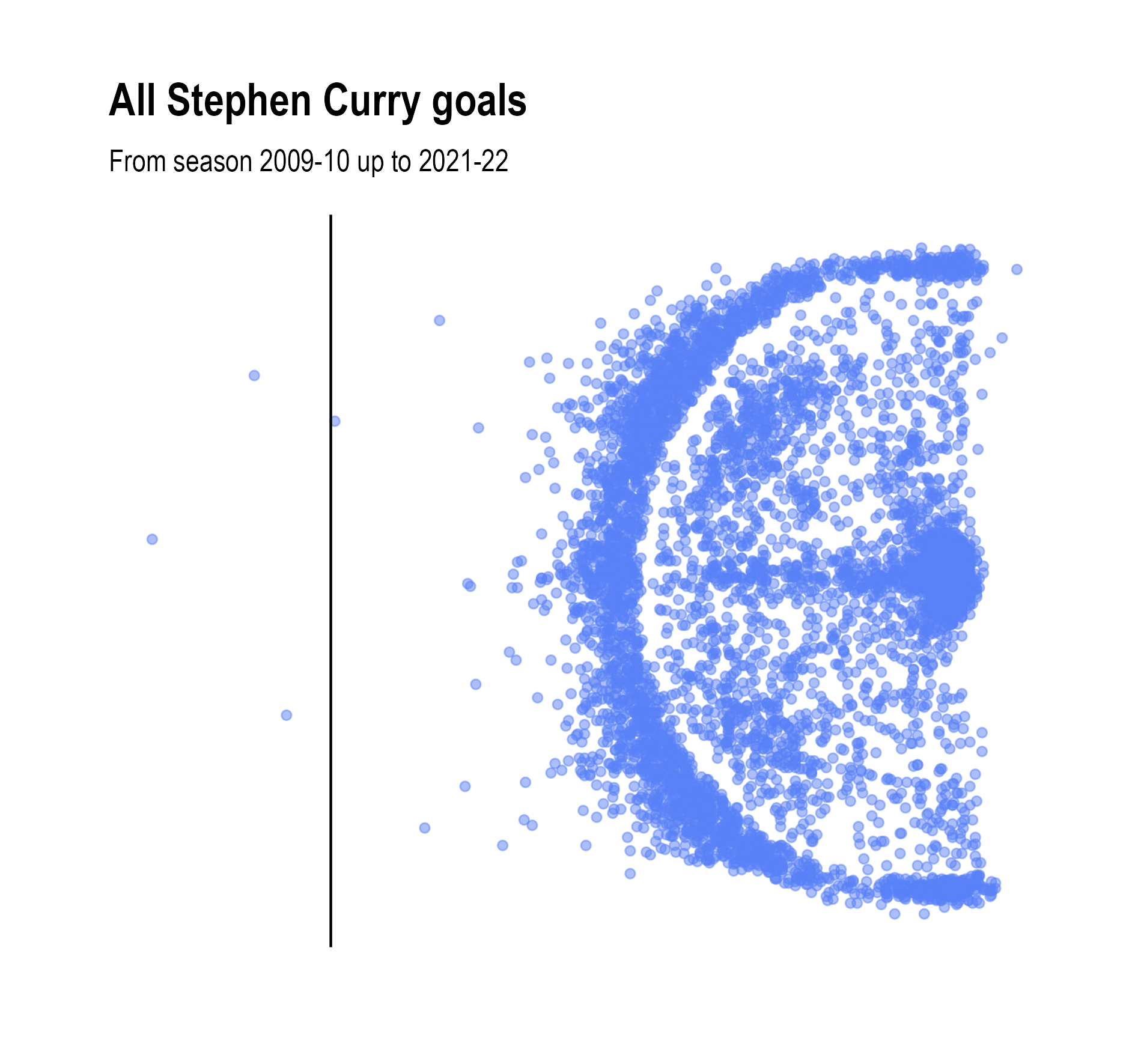
Source: Maarten Lambrechts, CC BY SA 4.0
To even better reveal patterns, the data in a data dense scatter plot can be visually summarised by binning the data, or by drawing contours around areas with the same density of points.
To make a binned scatter plot, the plane of the scatter plot is divided into regular polygons (squares, or hexagons, which work better), the points in each polygon are counted, and the polygon is coloured and/or sized according to the counted number of points it contains.
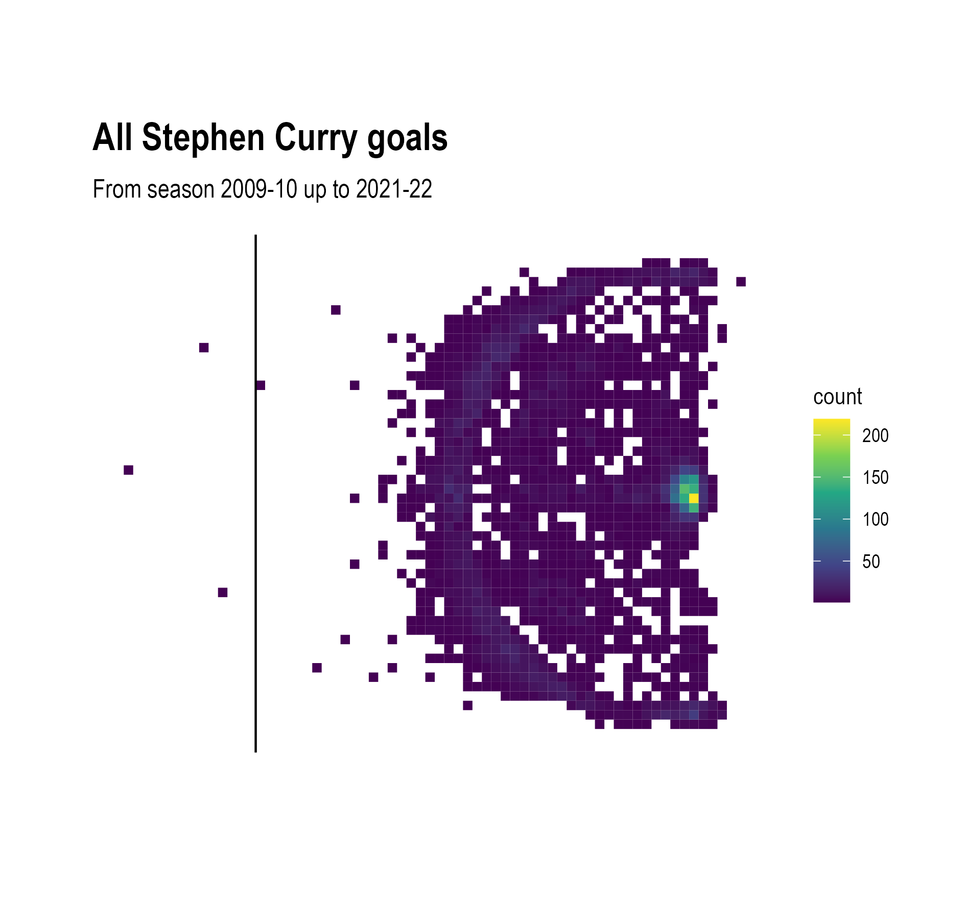
Source: Maarten Lambrechts, CC BY SA 4.0
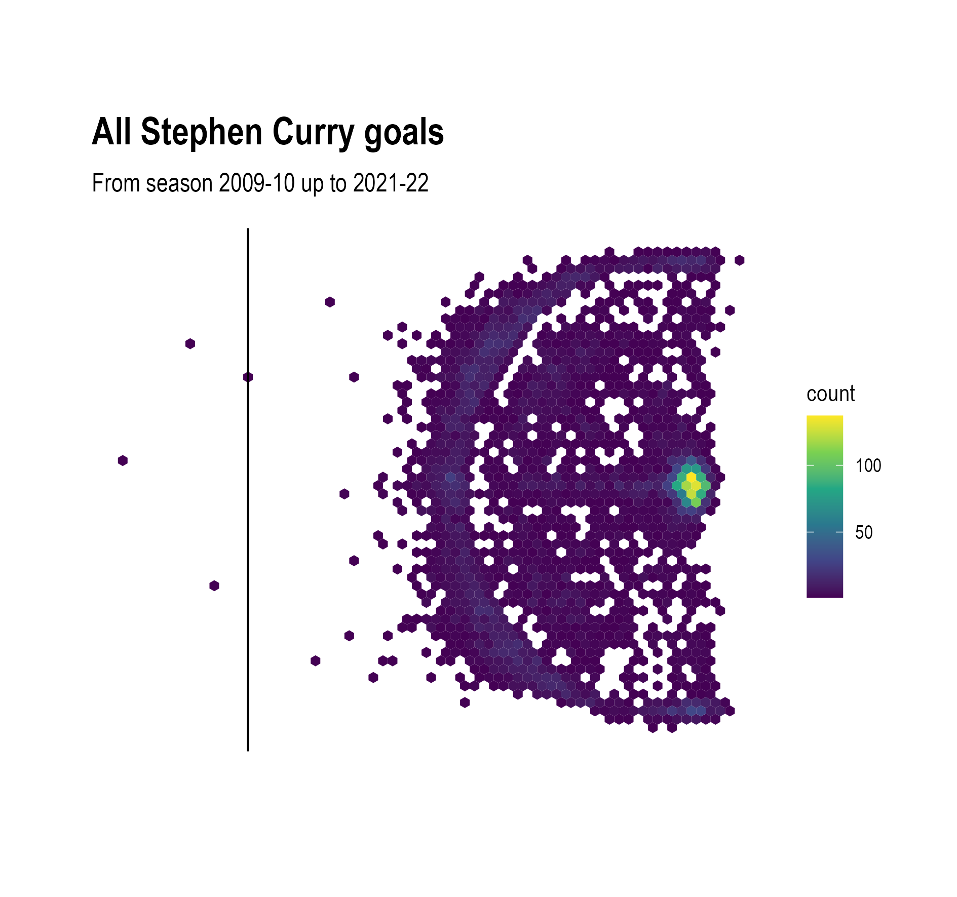
Source: Maarten Lambrechts, CC BY SA 4.0
From the binned scatter plots, we can now see that Curry scores more from under the basket than from behind the 3 point line. But the the high values of the bins under the basket make it hard to compare the number of successful shots from the right versus the left.
An obvious technique to solve the overplotting problem is to filter the data to show only the data that answers your question. Below only the shots made from further away from the basket are taken into account. It is now clear that Curry has a preference for shots taken from the deep right corner of the court.

Source: Maarten Lambrechts, CC BY SA 4.0
To turn a scatter plot into a contour plot, the density of points at each location is estimated, and areas with similar densities are connected, like the isoheight lines on a topographic map. The contour plot below shows the density of the areas from where Curry scored in his career, taking into account all his goals except the ones from directly under the basket.
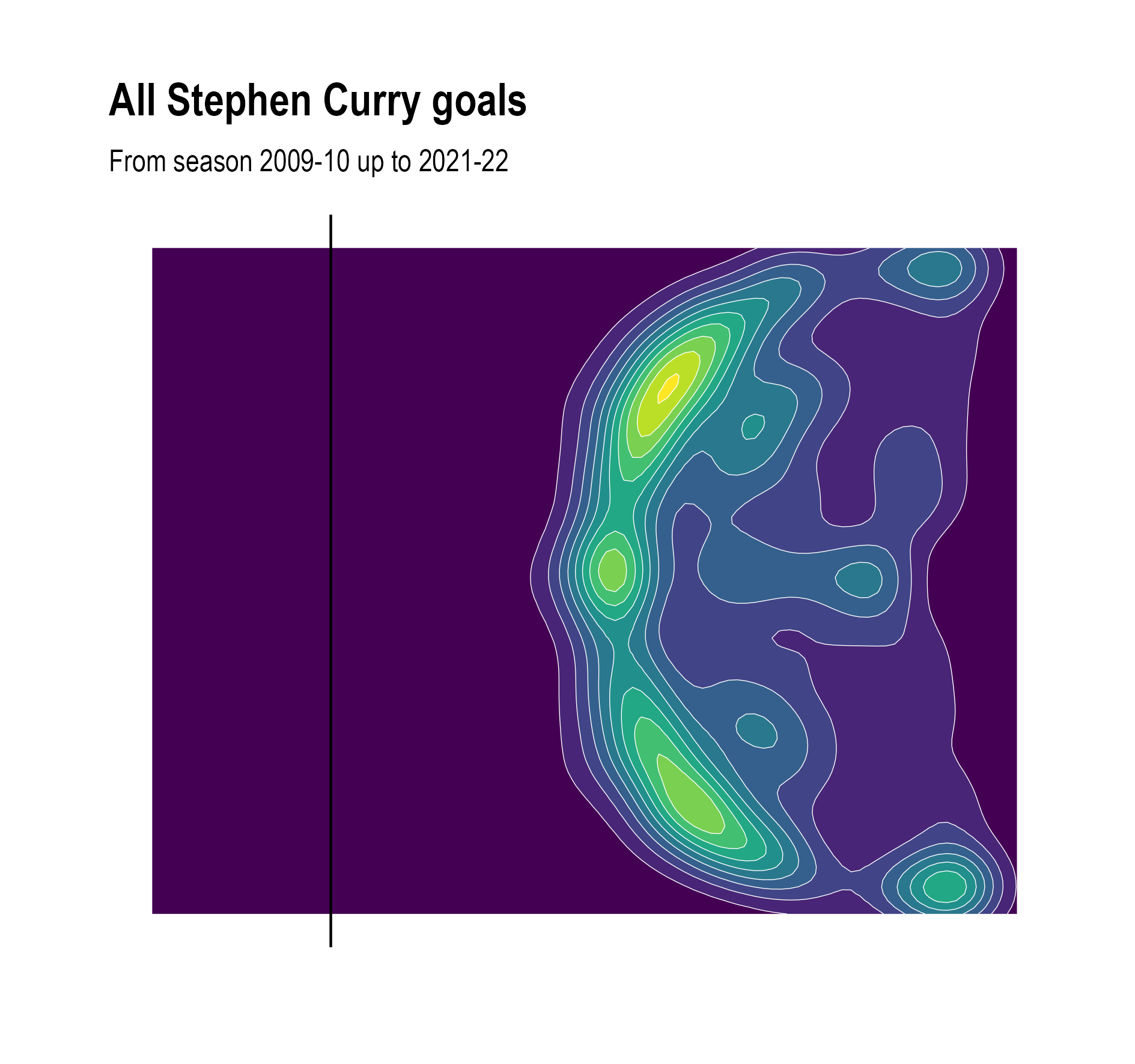
Source: Maarten Lambrechts, CC BY SA 4.0
From the contour lines, we can see that Curry indeed prefers the deep right corner of the field over the left one, but more to the center of the field, he scores more points to the left than to the right.
Just like the a different number of buckets in a histogram can result in a more or less revealing chart, the size of the bins in a binned scatter plot and the interval between the contours in a contour plot determine what patterns are revealed on the charts.

Binned scatter plot using bigger hexagons. Source: Maarten Lambrechts, CC BY SA 4.0
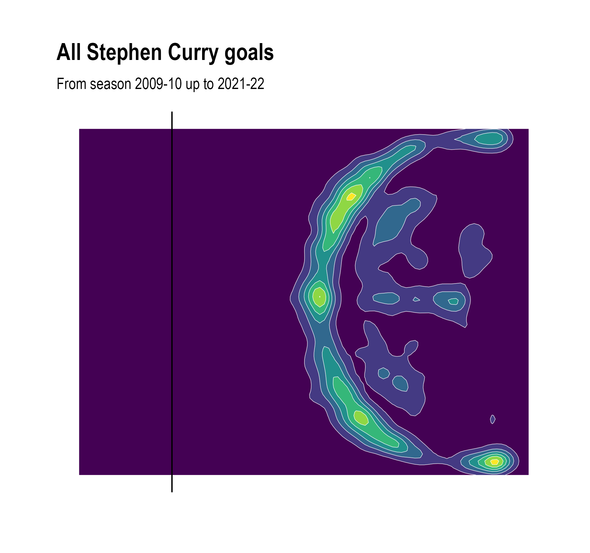
Contour plot with wider and less contours. Source: Maarten Lambrechts, CC BY SA 4.0