The number of time series you can plot on a line chart is limited: too many series will create a spaghetti chart. Below 2 chart types are described that sacrifice the exact reading of data values for plotting many time series in a single visualisation.
In heatmaps, the colour of data marks are used to encode the numerical values in time series. And because the marks can be made compact, many time series can be plotted next to each other.
A famous example of a heatmap is the chart below, showing the impact of vaccines on the incidence of measles in the US. The chart shows the incidence of measles as the number of cases per 100.000 people in 26 states.
Source: Battling Infectious Diseases in the 20th Century: The Impact of Vaccines, graphics.wsj.com
Notice that the visualisation contains many time series, but at the cost of reading exact values. In traditional line charts, values can be read from the vertical axis. Here, values should be read from the colour legend, but this is much harder than reading the values of the y axis of a normal line chart.
The famous Warming Stripes visualisation of the rising global temperature, designed by climate scientist Ed Hawkins, is also a heatmap. It uses lines (stripes) instead of squares, and it doesn’t even bother to provide a colour legend: reading values is not important, everyone knows what the message of the chart is.
Source: showyourstripes.info
The stripes scale very well, even up to the point that you can put warming stripes for every country in the world into a single (literal) heatmap.
Source: Ed Hawkins, CC BY SA 4.0
Binned scatter plots are sometimes also called heatmaps, and matrix plots can also look very similar. The difference lies in the type of data plotted on the axes:- a binned scatter plot has 2 numerical axes, to plot 2 numerical dimensions in the data
- a heatmap has one numerical or time axis and one categorical axes
- matrix plots have 2 categorical axes
In reality, the difference between these chart types is more blurry, because data types can be converted (for example, in a binned scatter plot numerical values are grouped into buckets, which act more like categories than like numerical values).
Horizon charts are a hybrid chart type, somewhere in between classical line charts and heatmaps. Getting familiar reading them can take a little bit of time, but they are very compact and data dense, while still offer accurate reading of data values.
To make a horizon chart, you start from a normal line chart and you
- divide the vertical space into bands
- give the bands with the highest values (and the lowest values, in case there are negative values in the data) a more intense colour
- flip the negative values up in case they are present in the data
- stack the bands on top of each other.
The following animation shows each of these steps:
Source: vizualism.nl
The horizon chart below proves that horizon charts are a data dense chart type: it packs over 73 time series each with daily numbers spanning a period of 2 years: that is more than 53.000 data points, and for each you can still read the values from the chart!
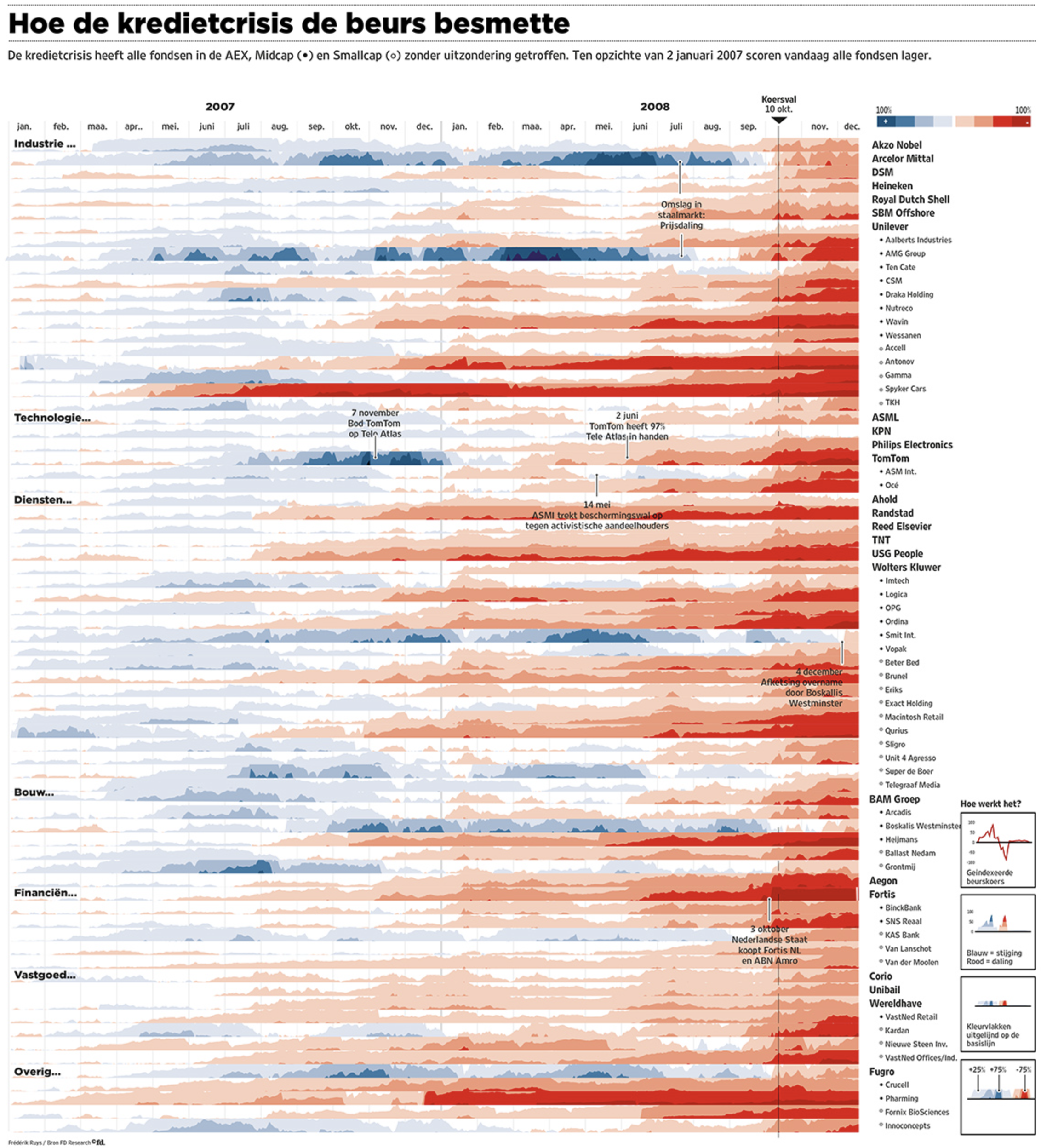
This horizon chart shows the prices of 73 stocks on the Amsterdam stock exchange and how these were affected by the financial crisis in 2008. Stocks are grouped by sector (see the labels on the left) and named on the right of the chart. The main point of the chart is that all stocks were affected, and had a lower price at the end of 2008 than they had in the beginning of 2007. Source: Frédérik Ruys for Financieele Dagblad