Looking at the visualisation below, we can also note that some elements in the chart are giving more weight by being enclosed.
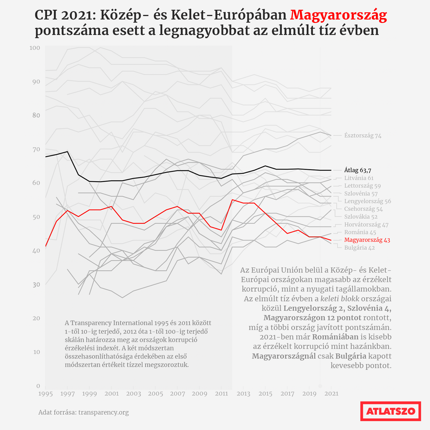
Source: atlatszo.hu
Firstly, the name of the medium (”Atlatszo”) in the bottom right corner is enclosed in thick red border, giving it even more visual weight. And second, the left time interval on the chart is implicitly enclosed by the rectangle containing it having a darker background. From the visual hierarchy, it seems that the left time interval is more important than the right one.
So enclosure is another mechanism to move elements up in the visual hierarchy of a visualisation: enclosed elements seem more important than other elements lacking the enclosure.
Therefore, borders and boxes should be applied consciously, and not be put onto elements that shouldn’t be highlighted.
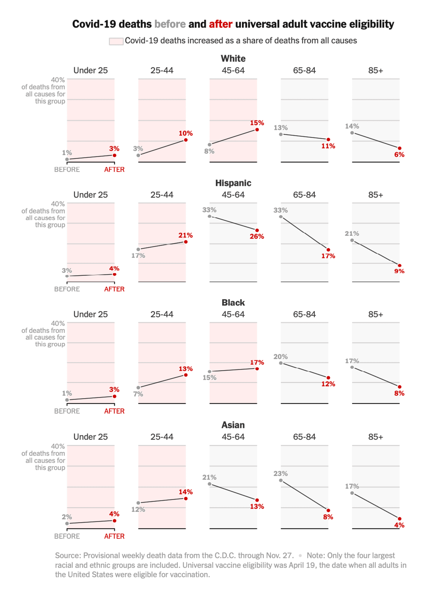
Source: Why Covid Death Rates Are Rising for Some Groups, nytimes.com