To create visual hierarchy, there is more than just positioning elements in the xy space. Although paper and screen publications are by nature two dimensional displays, techniques exist to simulate depth and a third dimension in the z direction.
Layering
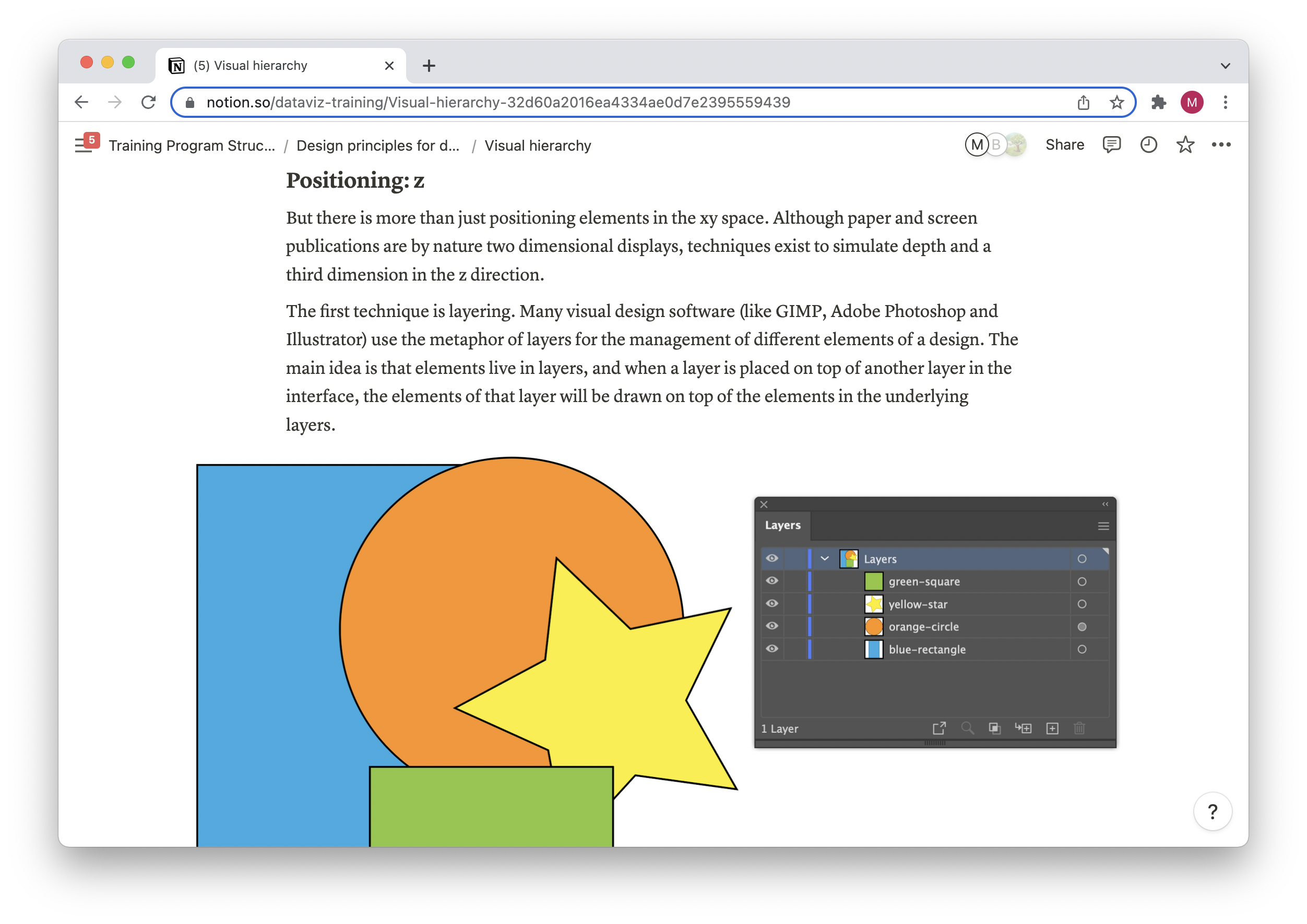
The first technique is layering. Many visual design software (like GIMP, Adobe Photoshop and Illustrator) use the metaphor of layers for the management of different elements of a design. The main idea is that elements live in layers, and when a layer is placed on top of another layer in the interface, the elements of that layer will be drawn on top of the elements in the underlying layers.
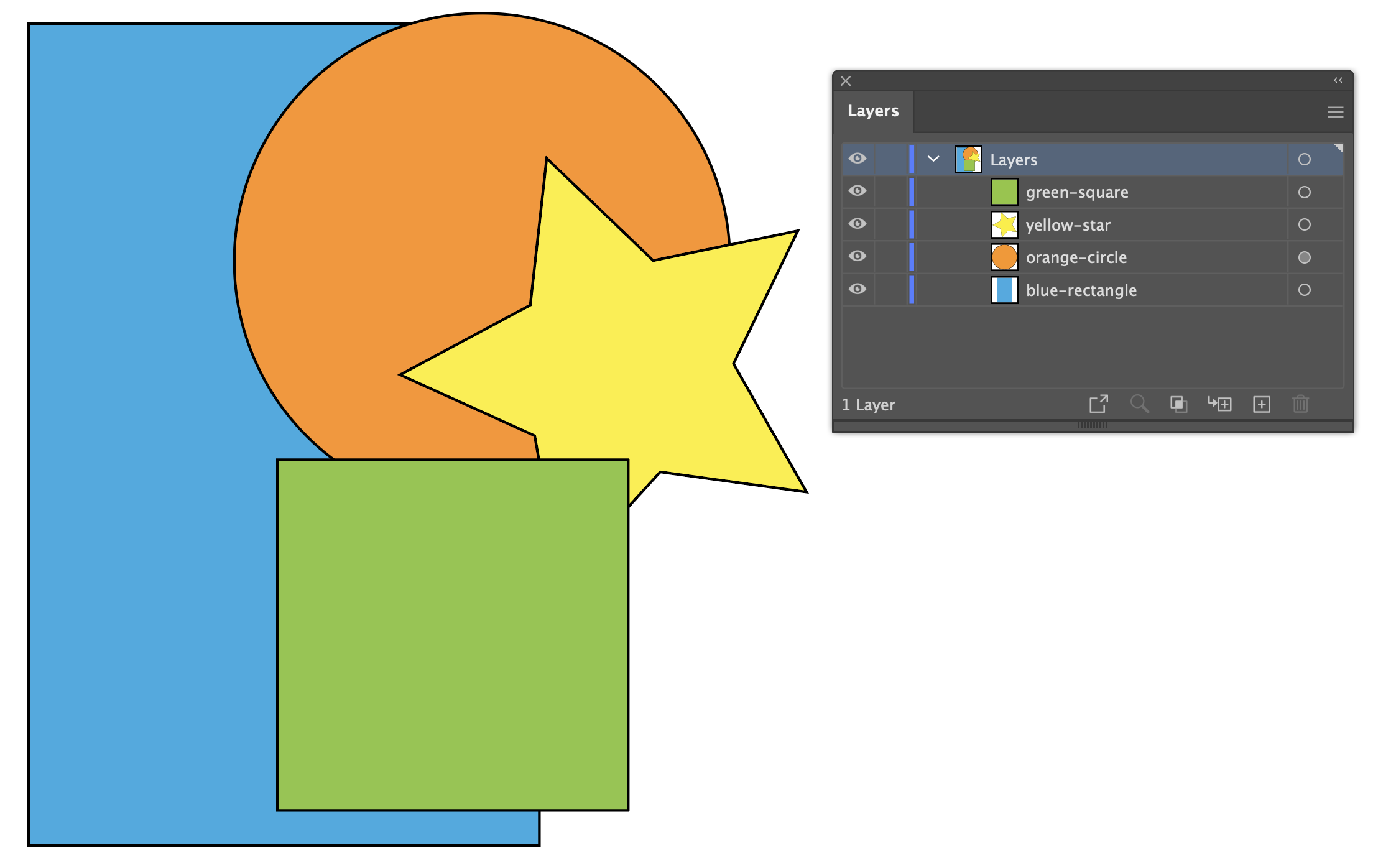
Layers in an Adobe Illustrator document. Source: Maarten Lambrechts, CC BY 4.0
The layers metaphor is also used in geographical information systems, software used to produce maps. Maps have base map layers (like satellite imagery), thematic layers (like roads and administrative boundaries) and text (like labels for city and street names). These layers should be nicely stacked, so that more important layers are covering the underlying less important layers.
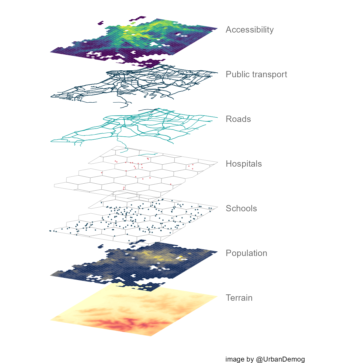
Illustration of the the layers of a map. Source: Raphael H. M. Periera
Not all data visualisation tools give you control over how the elements of the chart anatomy and data points are stacked on top of each other. Below are some basic rules.
All text should live on top of all other layers. You don’t want text to be covered by other elements, and become illegible.
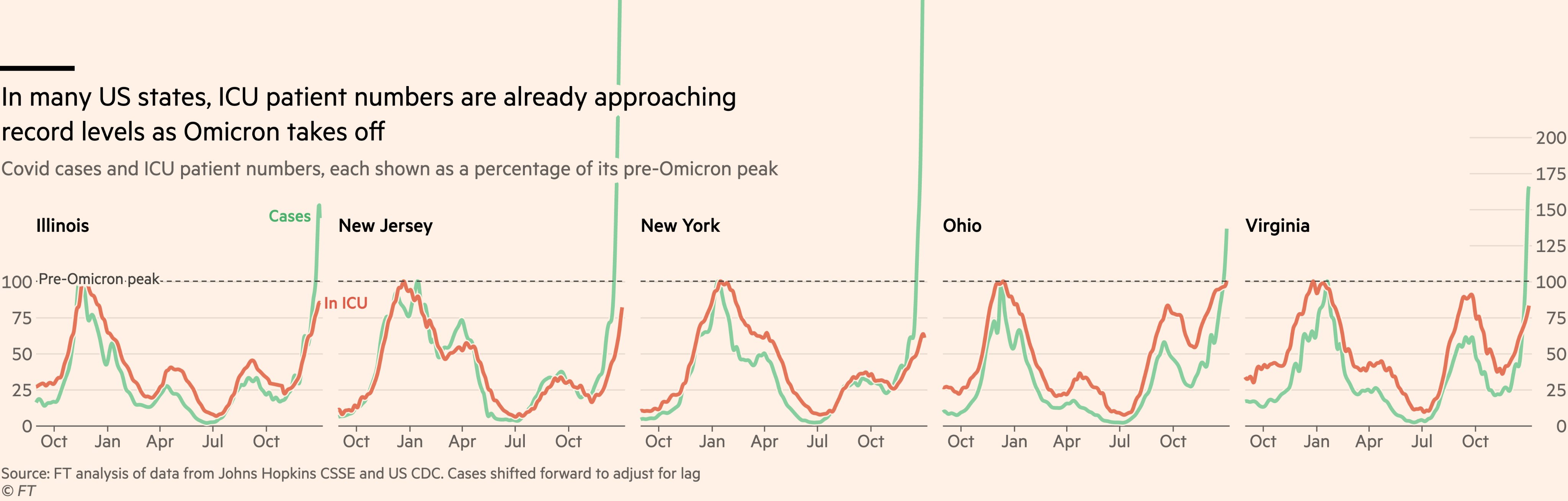
Notice how the text of the title and subtitle are positioned on top of the lines breaking out or their frames in this Financial Times chart. Source: twitter.com/jburnmurdoch/status/1478340575053197313
Data marks (points, circles, bars, lines, …) should live on top of supporting elements, like grid lines. In some cases, grid lines can be drawn over marks like bars, to create “invisible” gridlines.
Source: The Guardian
If data marks can overlap each other, make sure that smaller elements are drawn on top of bigger ones (in most cases this can be done by sorting the data before visualising it). Otherwise there is a risk of smaller marks being totally covered by bigger ones and becoming totally hidden.

When bigger marks are drawn on top of smaller ones, smaller marks can become hidden. Source: Maarten Lambrechts, CC BY 4.0

Drawing smaller marks on top of the bigger ones ensures all marks are visible. Source: Maarten Lambrechts, CC BY 4.0
When chart elements overlap, giving covering elements a little bit of transparency can make underlying elements not disappear but shine through.
Shadows
Another technique to create the illusion of depth is to use shadows. Even very subtle shadows give the impression of depth and separate elements in a design from each other.
Adding shadow to the browser window you are reading this article in, gives the impression that the window is floating above the rest of the page. If you take a close look at the application windows of your computer, you’ll notice that the windows on top cast shadows on the windows in the back.
Shadows with different settings can create a visual hierarchy on themselves, with elements “floating” higher and lower over each other.

How a visual hierarchy is created with shadows in Google’s Material Design system. Left: no shadows, all elements in the same space, middle: shadows applied to the blue and pink element, but they have the same shadow, so they have the same “elevation”. Right: by applying different shadows, the pink element appears to have a higher elevation, indicating that it is more important. Source: material.io
The use of shadows in data visualisation is rather limited, and mostly used in user interface elements, like scrolly boxes or map legends:
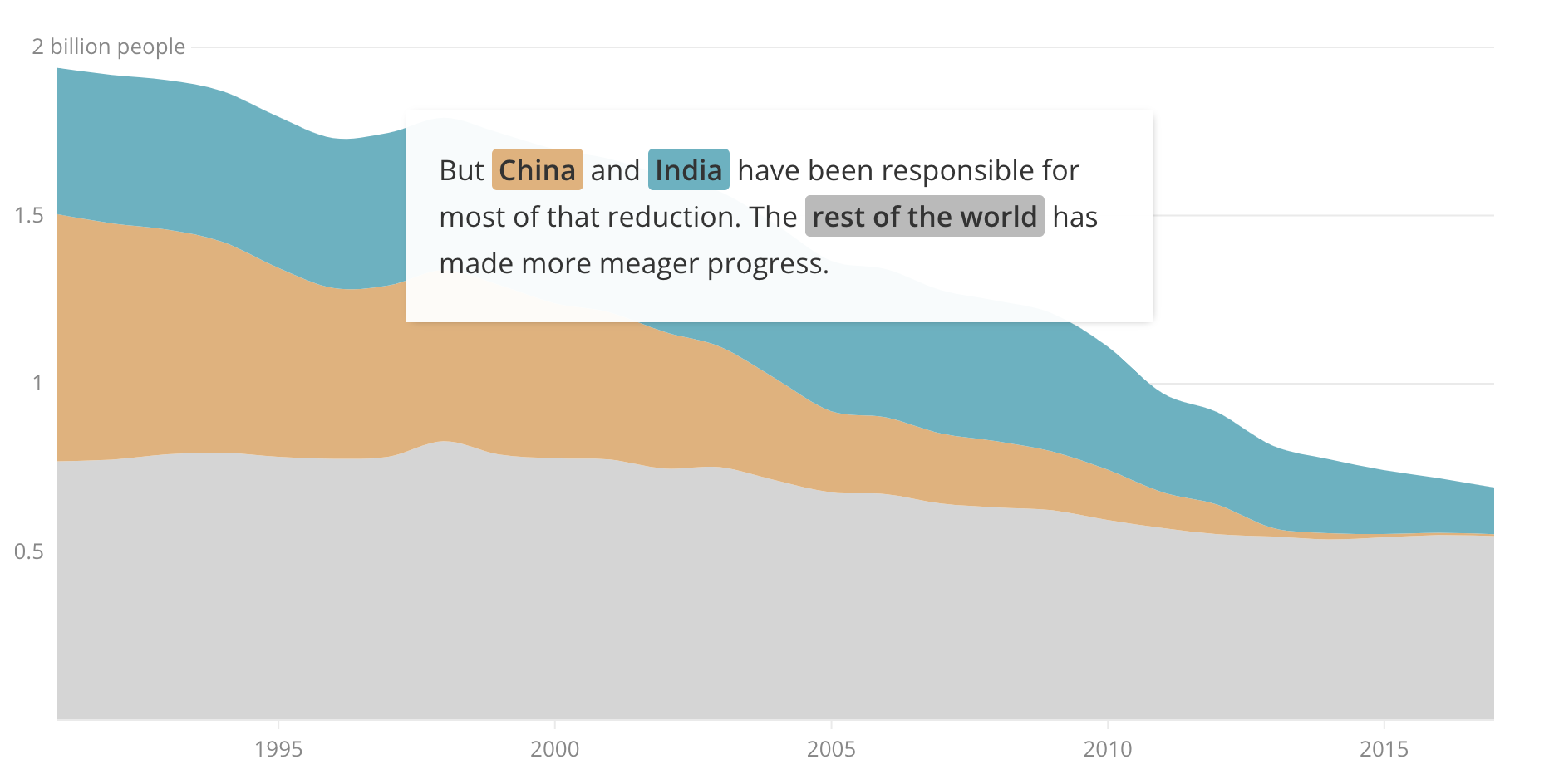
The layering of the text, on top of the graphic, is reinforced by a subtle shadow. Source: The near future of global poverty, Sustainable Development Goals Atlas 2020, The Worldbank
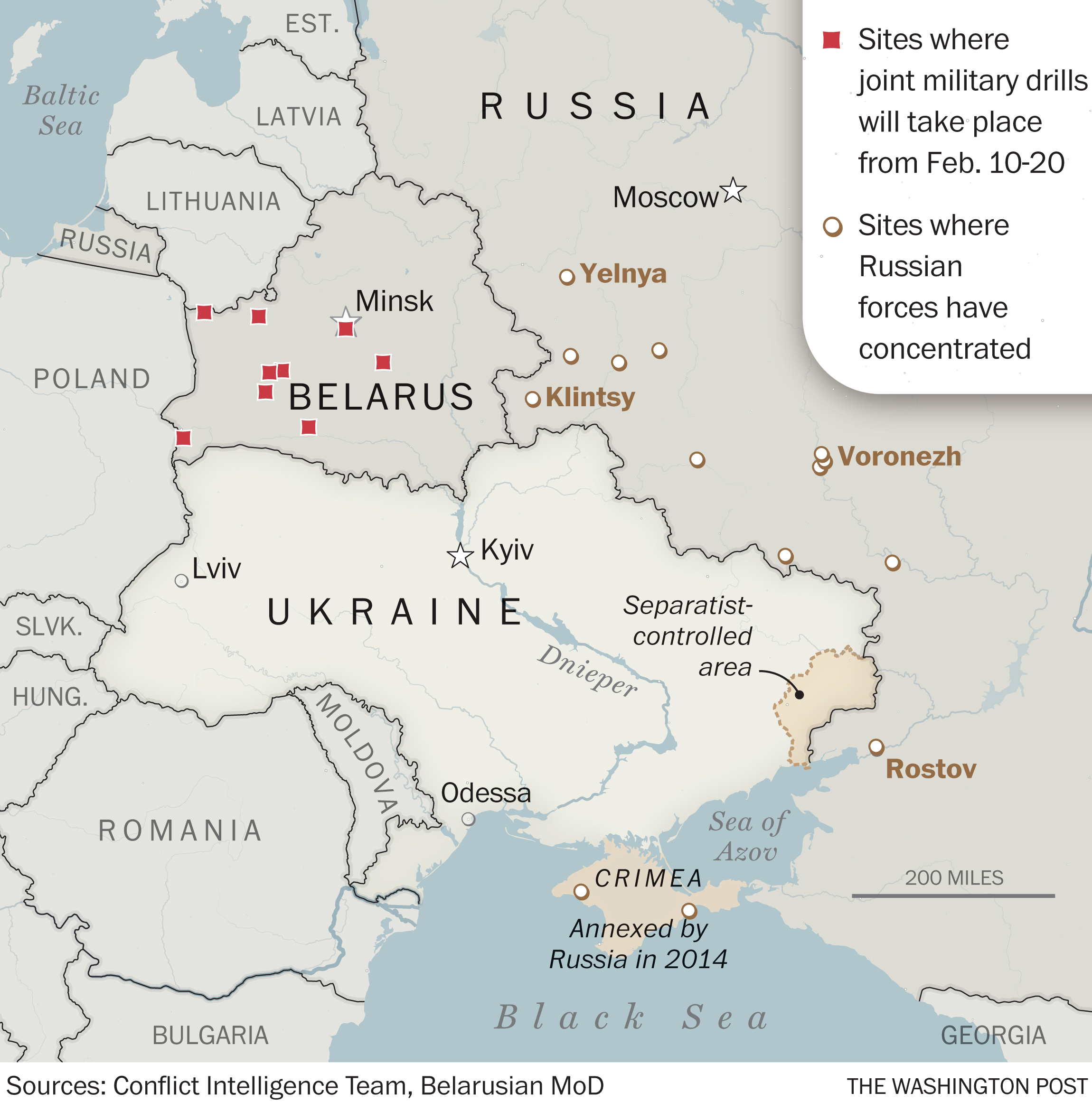
The map legend in the top right corner of this map uses a heavy shadow, and appears to be quite elevated in comparison to the map. Notice that the white circle symbols also have a little shadow. Source: Russia’s military is again on the move, adding pressure on Ukraine as invasion fears grow, Washington Post
Halos
A related technique to using shadows is very common in situations where text is displayed on dark backgrounds: adding halo to text. Again, this is a technique very common in mapmaking, because maps often have to display text labels on backgrounds with varying colours.
Check for example the labels on this map, by Le Monde: the city names placed on top of the land area clearly have a light glow, or halo, to make them legible on all backgrounds. Sidenote: the symbols of the colour legend also have a little shadow.
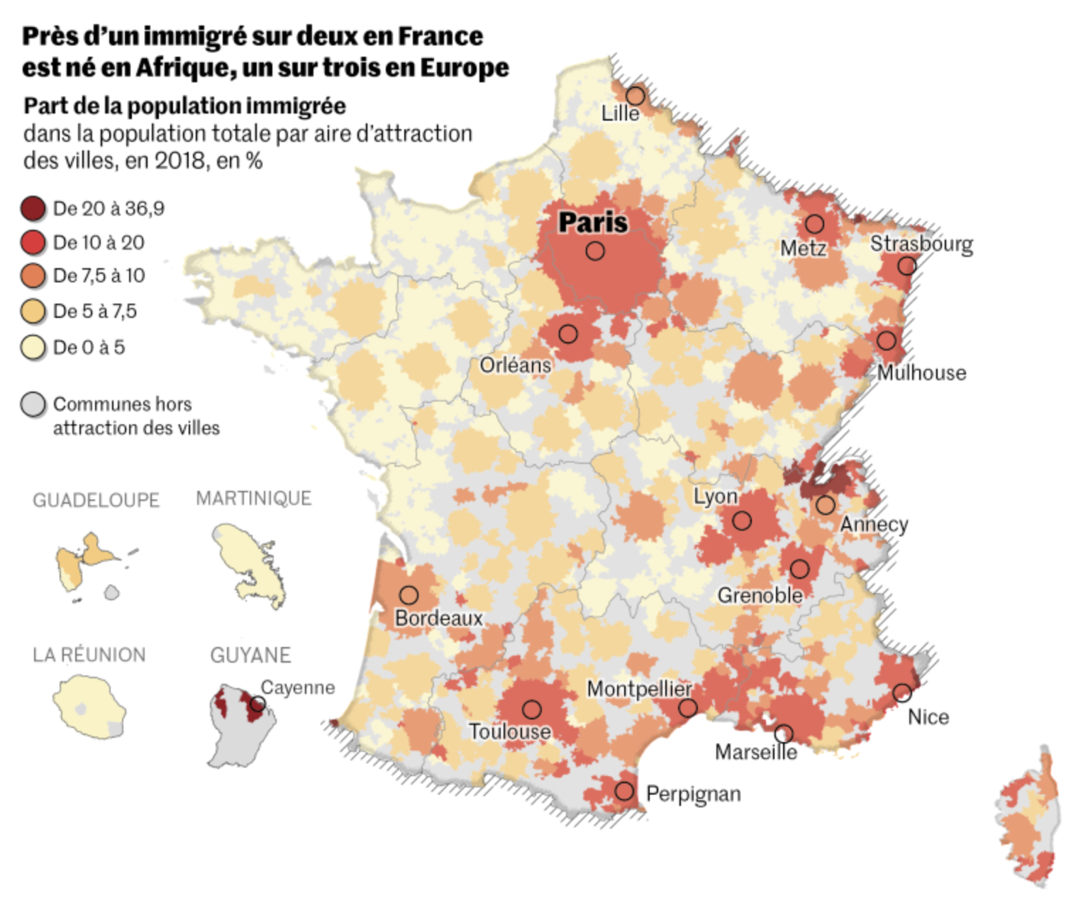
Source: lemonde.fr
Visualisations rich in labels and annotations can also make use of this technique. The halo can be subtle…

Source: Biden, who pledged to diversify the Supreme Court, has already made progress on lower courts, Washington Post
…or very strong. In that case, they are called outlines instead of halos:

US based data journalism medium FiveThirtyEight has a very striking data visualisation style, which includes heavy text outlines. This makes annotations stand out and legible on all backgrounds. Source: Unvaccinated America, In 5 Charts, fivethirtyeight.com
In the chart below, shadow and outlines are used together, to create a chart with clear layers in the z dimension.
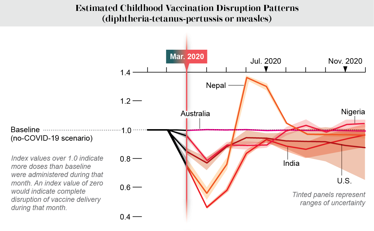
Source: Jen Christiansen, COVID’s Uneven Toll Captured in Data, Scientific American
Outlining can also be used in line charts to bring the main lines more to the foreground, even if they are already layered on top of the other lines in the chart.

White outlines applied to lines in a line chart by The Economist. Because of the outlines, the lines are clearly “sorted” in the z direction, with the red line for Canada as the one on top, closest to the reader. Source: Do vaccine mandates actually work?, The Economist
The opposite of creating elevation with shadows, is blending layers into other layers. This can be achieved by giving the (text) layer on top some transparency, so it blends in or fuses into the underlying layers. This technique can be used to label area charts or streamgraphs, for example.
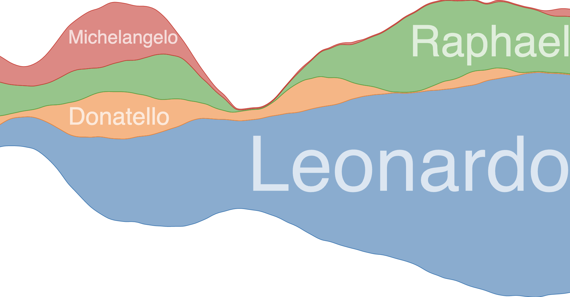
Source: github.com/curran/d3-area-label