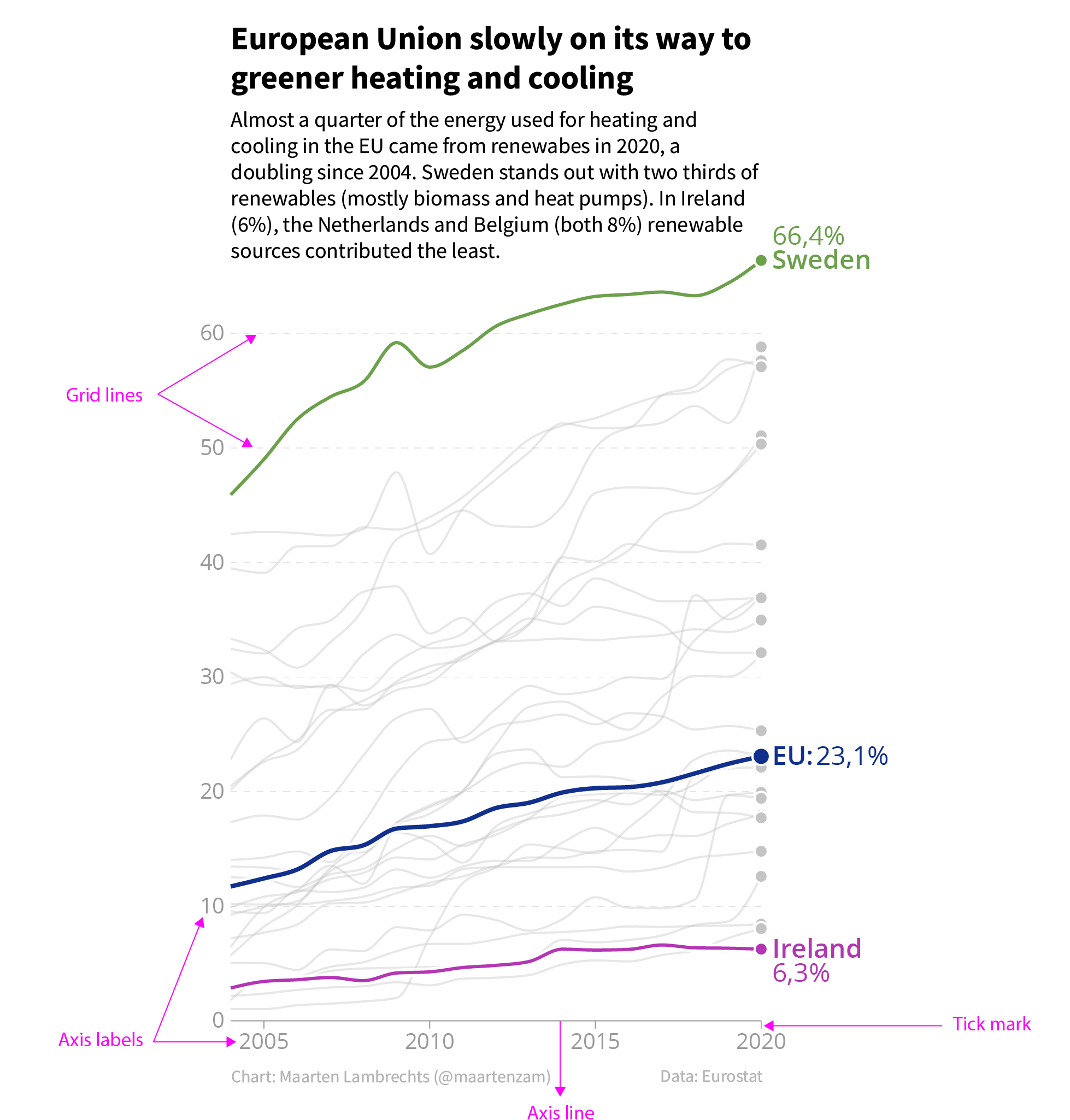
To give the reader some guides to interpret the data and read data values in a chart, you can provide axes, grids and legends.
Axes
Axes let readers assess the position and/or size of data marks. If a chart uses cartesian coordinates, the x axis is the horizontal axis and the y axis is the vertical axis.
The building blocks of an axis are the ticks, with their associated tick marks and axis labels, and an optional axis line. Next to the tick marks and labels, grid lines can also be attached to the axis ticks.
Source: Maarten Lambrechts, CC BY 4.0
Notice that the y axis of this chart does not have an axis line. Many data visualisation tools draw axis lines by default. But in many cases, these axis lines do not serve any real purpose, and they can be left out without any problem. This is especially true for bar charts, from which axis lines can be removed without any consequences.
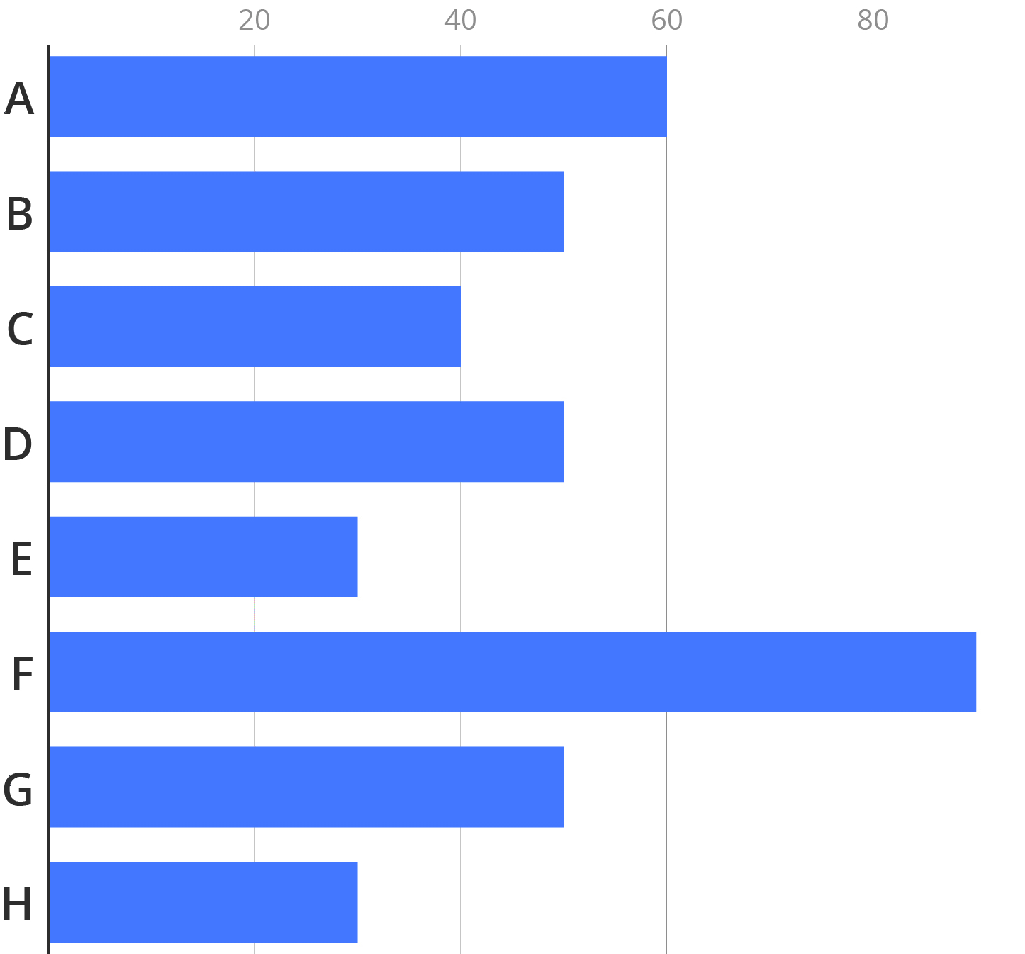
A comparison of a bar chart with and without axis line. Source: Maarten Lambrechts, CC BY 4.0
Axis labels, however, are indispensable to interpret the data on a visualisation. Without axis labels, a visualisation is meaningless.

Source: Maarten Lambrechts, CC BY 4.0
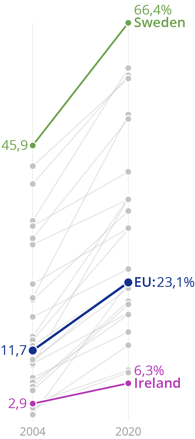
The only exception to this are visualisations where enough data points are labelled so that axis labels are not needed.

Source: Maarten Lambrechts, CC BY 4.0
Another example of a chart type that doesn’t require axis labels, is a slope chart.
Source: Maarten Lambrechts, CC BY 4.0
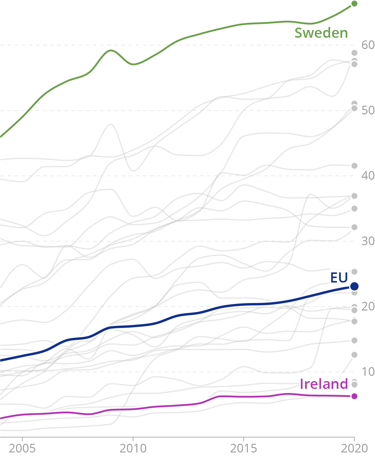
Many visualisation tools put the y axis on the left of charts. This creates space for labels on the right side of the chart. But on line charts showing time series data, the most interesting values on the chart are usually the most recent data. So when no labelling is applied, it makes sense to move the y axis to the right of the chart.
Source: Maarten Lambrechts, CC BY 4.0
In the same way, some chart types, like heatmaps, benefit from moving the x axis to the top, instead of having it at the bottom, where many visualisation tools put them by default.
As a rule of thumb, numerical and date axes should at least have 2 labels and up to 8 at most. More than 8 labels will create busy axes. The number of labels should depend on
- the available space: small charts should have less axis labels than charts with big dimensions
- the length of the labels: too many long labels will cause labels to overlap. See the number formatting and date formatting pages for techniques to shorten long time and numerical labels
- the resolution you want the reader to distinguish values at: if for example on a line chart with yearly values it is really important to see which value corresponds to which year, you could decide to label every year and draw a grid line for each of the years
Grid
In order to improve the legibility of the data values, you can choose to attach a grid line to each of the axis labels. But remember that grid lines, and all other elements of axes, are there to support the reading of the data. So they shouldn’t compete for attention with the graphical elements representing the data.
It is good practice to give all supporting elements on a chart a grey colour. The grid lines especially need to be muted, as they run across the whole visualisation and often overlap with the data elements. A (light) grey colour, some opacity, a small stroke width and dashing the grid lines are all techniques to mute the chart grid.
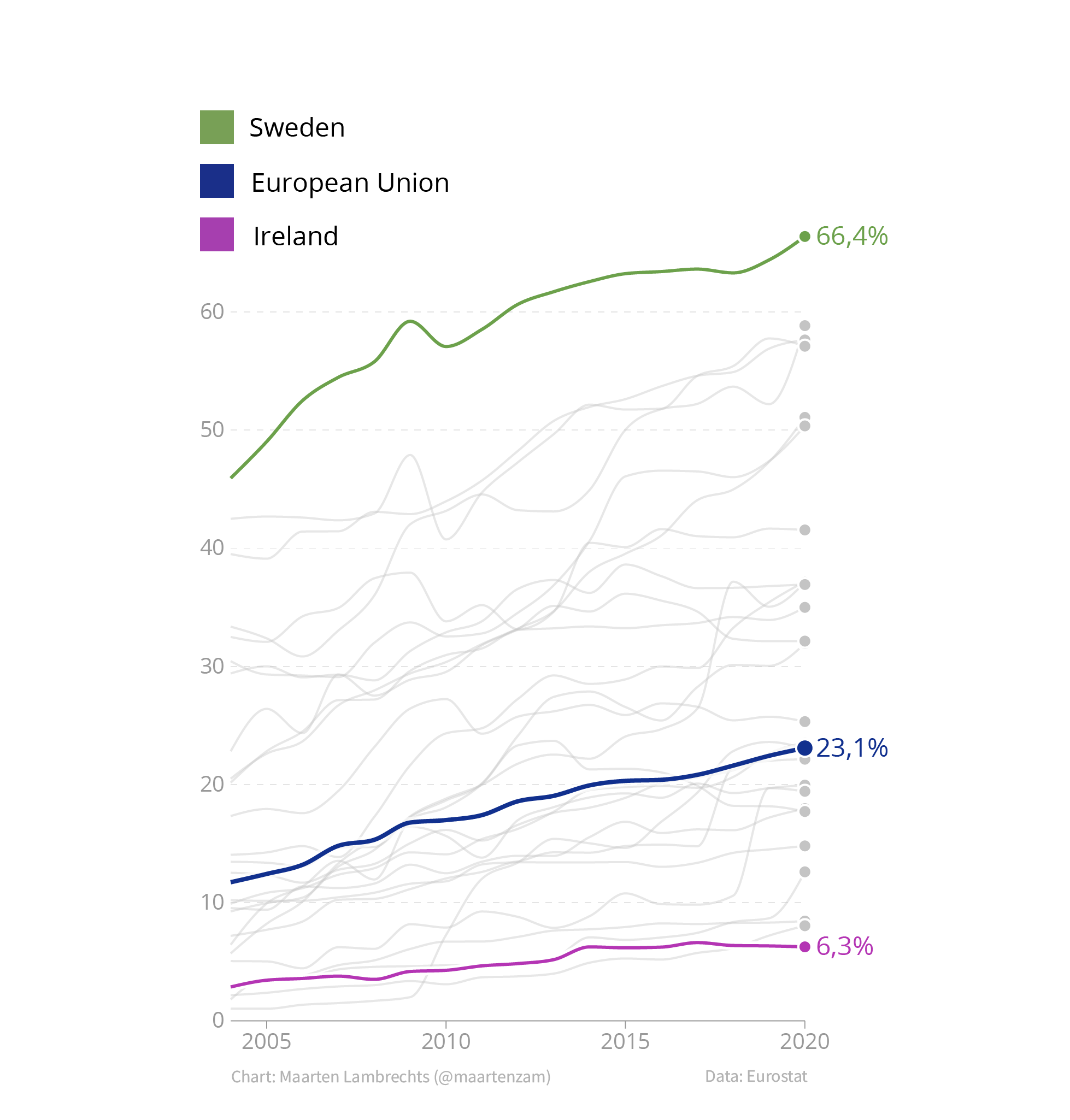
Legends
Another suboptimal behaviour in chart tools defaults, is the creation of separate legends to identify colours on a chart.
Source: Maarten Lambrechts, CC BY 4.0
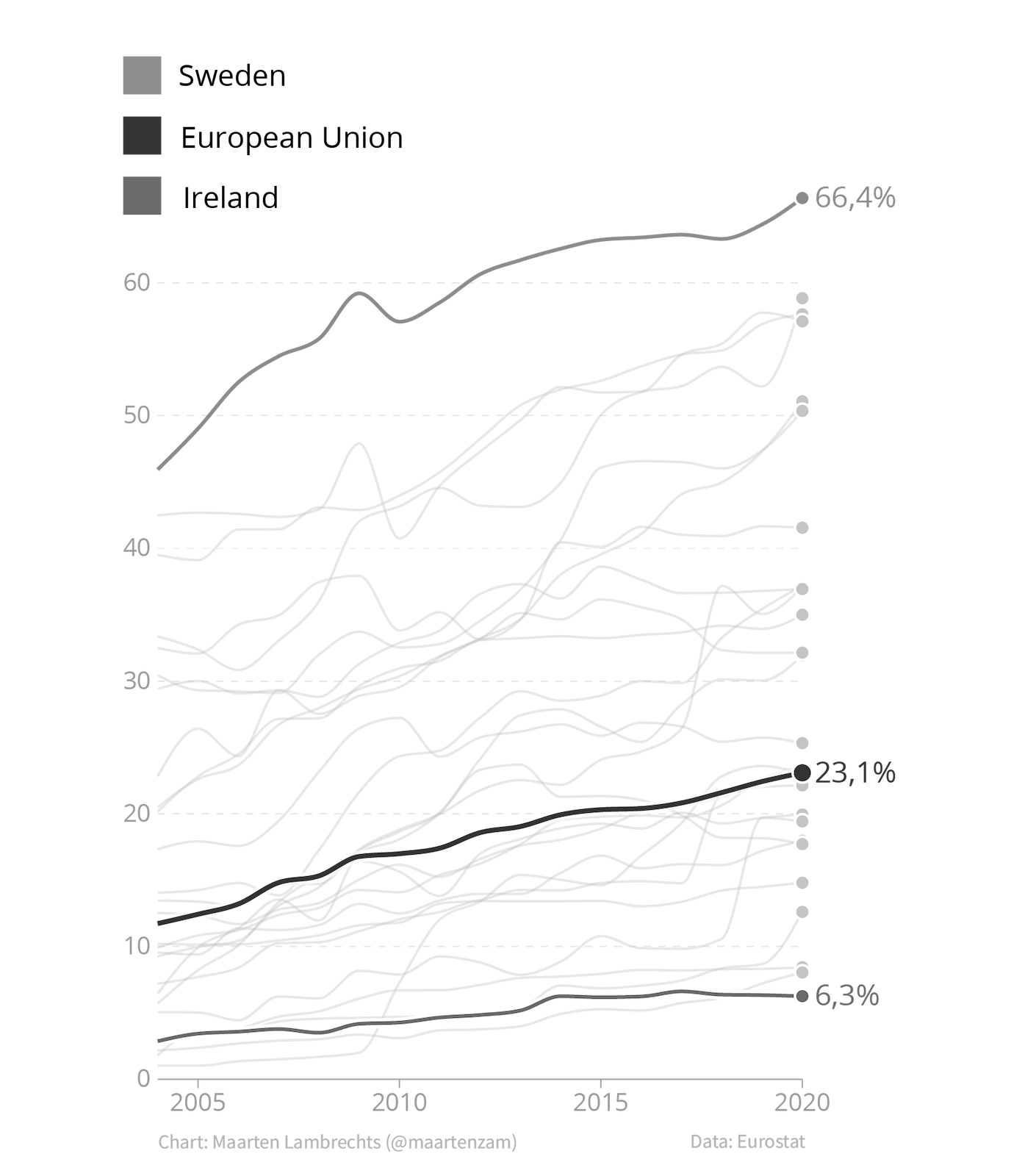
Separate legends create unnecessary cognitive load for the chart reader: they require readers to look back and forth between the chart and the legend to identify the elements with different colours on the chart. On top of that, many colour legend will loose their functionality for colour blind people, or when printed on black and white.
Source: Maarten Lambrechts, CC BY 4.0
A solution to this problem is a technique called direct labelling: integrating the names of elements and categories in the chart and positioning their labels next to the elements. This removes the drawbacks separate legends suffer from.
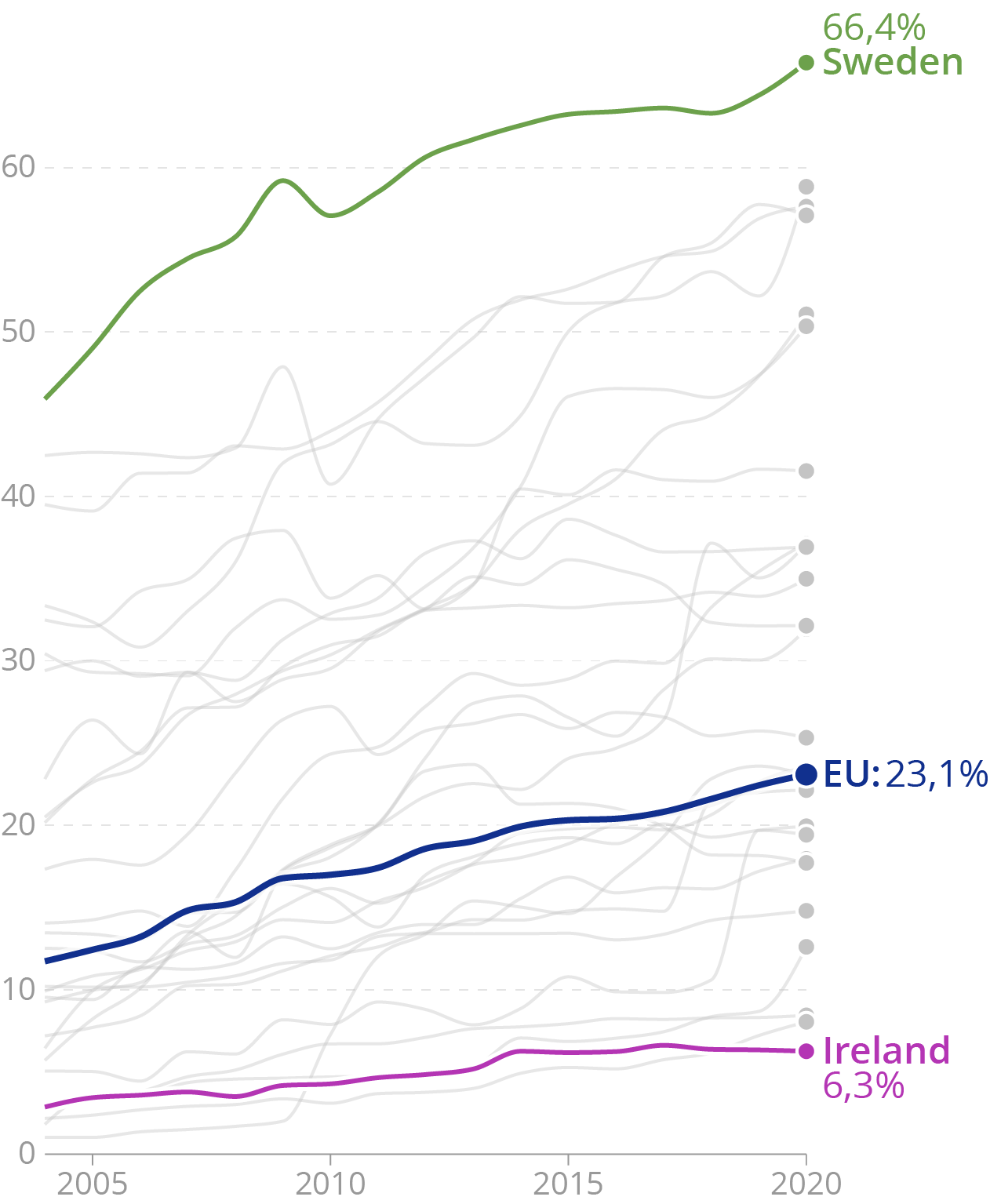
Source: Maarten Lambrechts, CC BY 4.0
Direct labelling has its limits though: when many elements are close together on a chart, it is tricky to direct label each of them without creating overlapping text. And most visualisation tools don’t have an option to apply direct labelling. So in that case direct labelling means manually adding the labels.
Another technique that can work really well and that integrates a visualisation and the surrounding text, is to reuse the colours on the chart in the surrounding text.
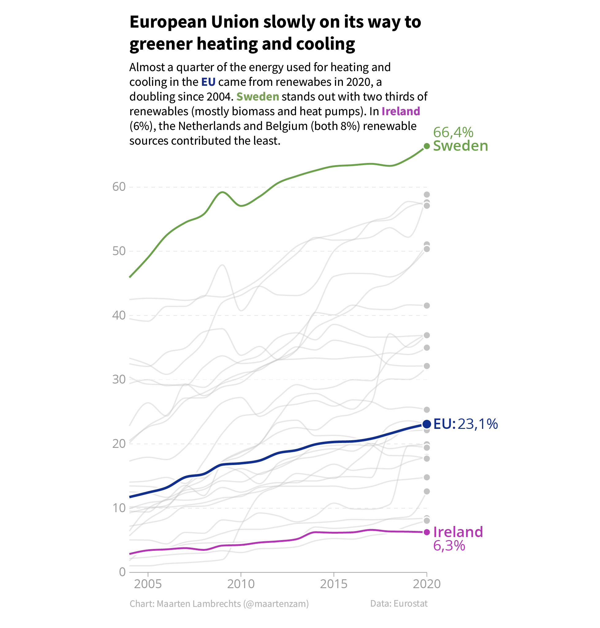
Source: Maarten Lambrechts, CC BY 4.0