The chart canvas is the basis on which charts are built on top of: the chart background. Usually the chart background is white, which makes it easy to guarantee that all elements of a chart have enough contrast with the background to be read easily, even the smaller elements and elements in muted colours like grey.
If you use a non-white background, make sure to check the contrast between the background and the lighter elements on your chart (see Colour contrast).
When embedding a visualisation in a publication, it doesn’t need a frame around it: this creates a “boxy” design. Charts without a border blend in better.
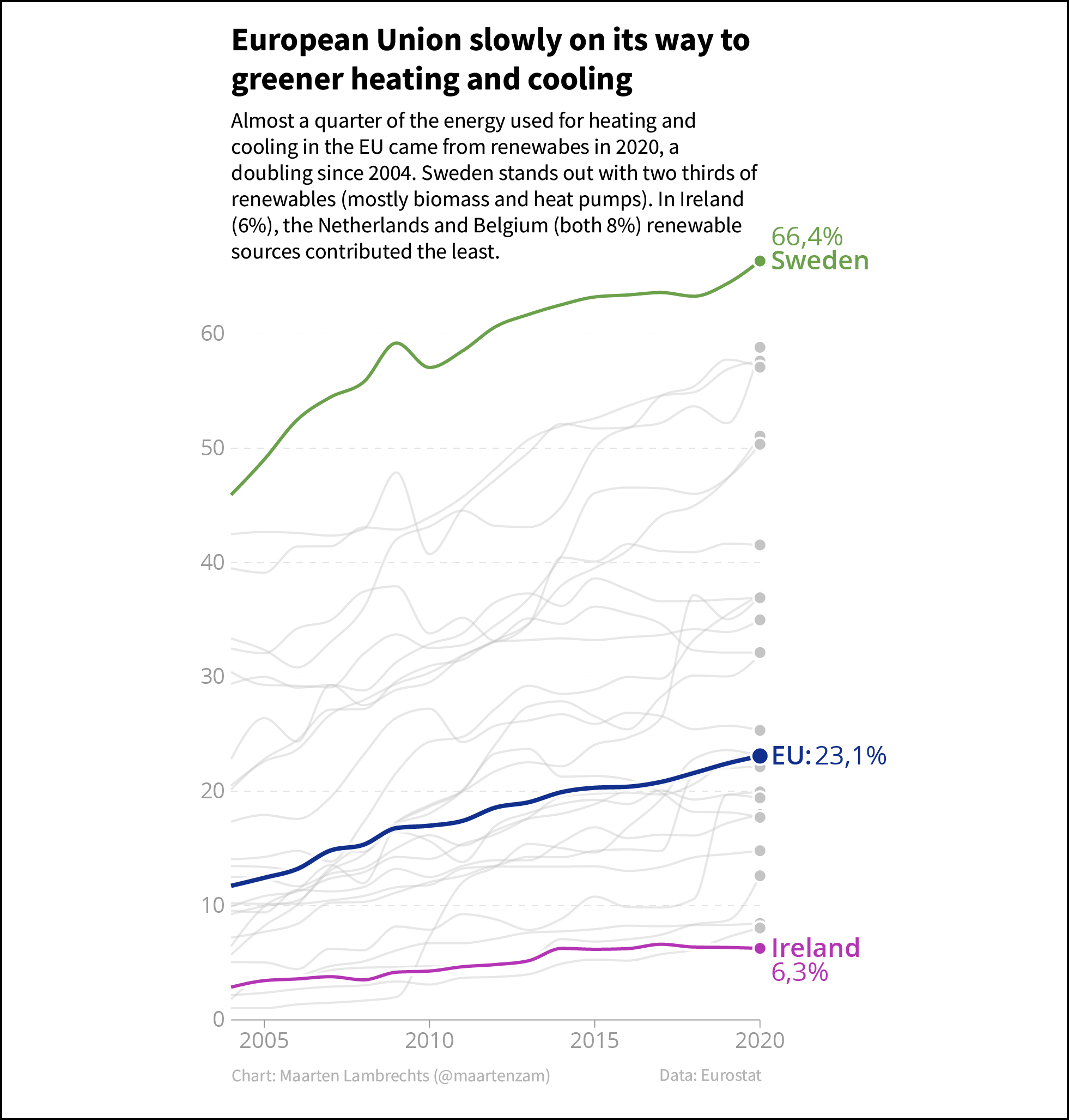
Source: Maarten Lambrechts, CC BY 4.0
The main part of the chart background is the plotting area. The plotting area is the plane enclosed between the x and y axes and is the area on which the data is plotted. Sometimes the plotting area is given a background colour. In that case, again, enough contrast must be ensured between the plotting area colour and the data plotted on it.
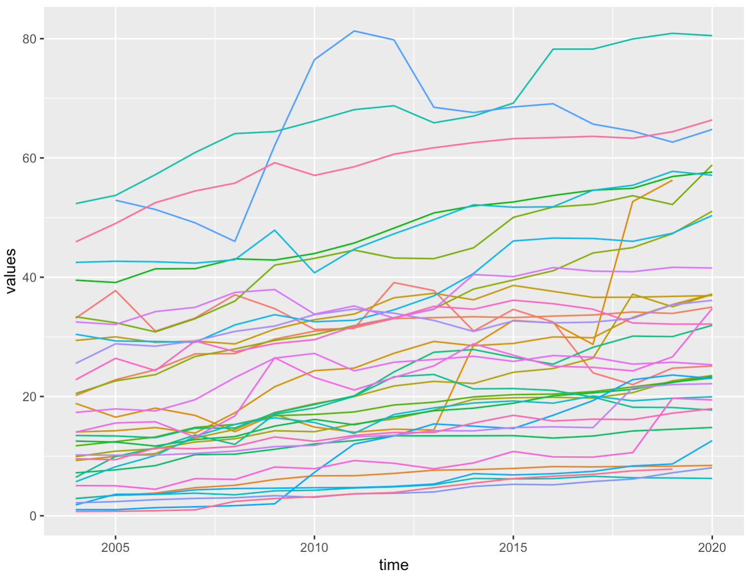
The default theme of the ggplot2 package in R applies a grey colour to the plotting area. Source: Maarten Lambrechts, CC BY 4.0