When picking colours for data visualisation, or for any design in general, you need to be aware that colours come with connotations, and that these connotations are not universal, but culturally dependent.
Marketeers and logo designers are very aware of the emotions that colours evoke. The below image shows 7 colours, their supposed emotional connotations, and a range of brand logos using the colours.
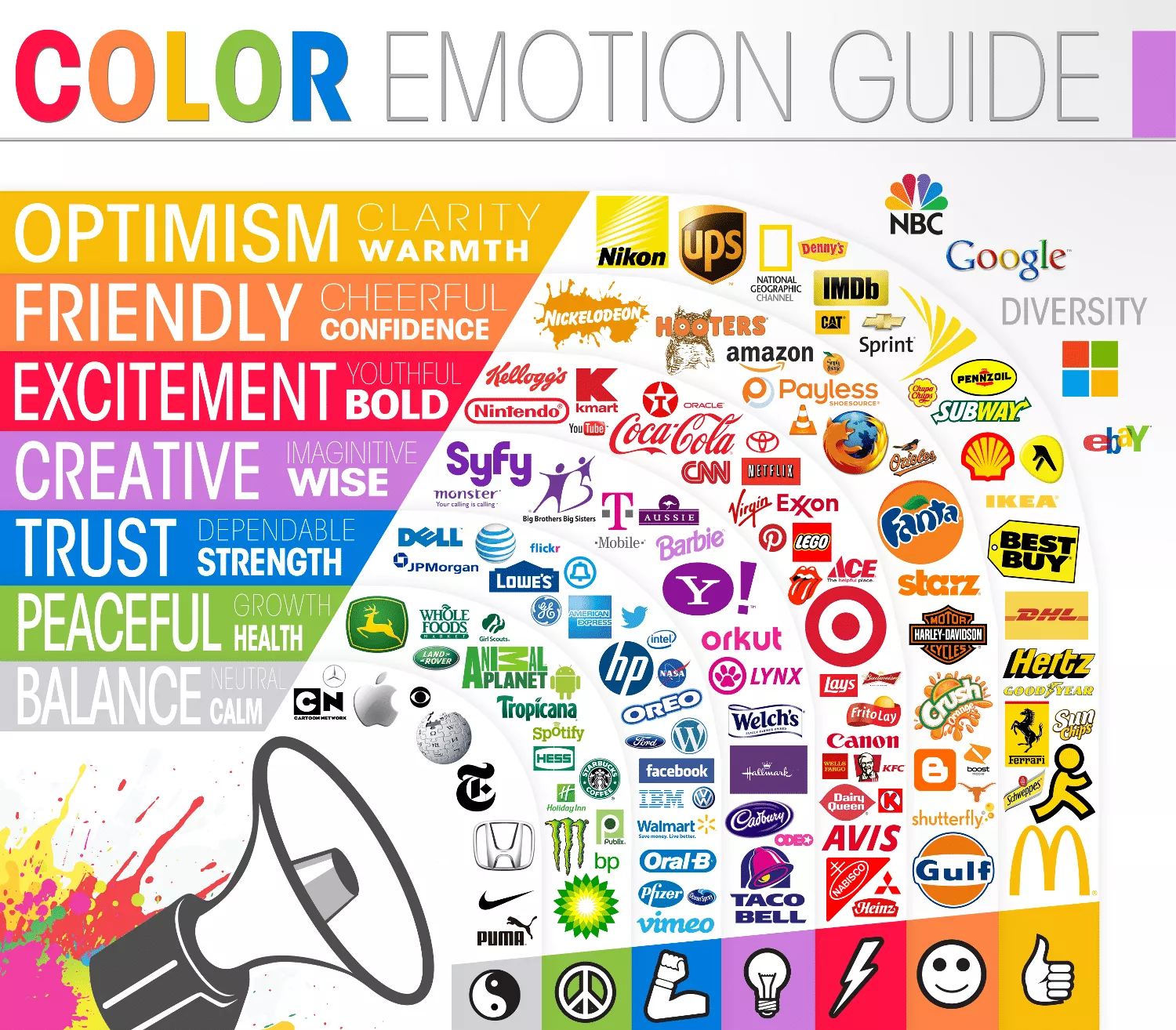
Source: thelogocompany.net
Yellow is the colour of the sun, so it evokes feelings of optimism, clarity and warmth. Red is the colour of blood and love, so it is exciting and urgent. Blue is the colour of the ocean, so it is associated with strength, trust and tranquility.
Wether all these associations are true and what exact effect they have on people, is still matter of scientific research. But that there are feelings associated with colours is clear, going against these associations is not advisable.
What is also clear is that these associations are not universal. The best known example are the “traffic light” colours green and red. In the West, green means good, while red means bad and danger. So on dashboards tracking stocks, stocks going up are marked in green and stocks losing value are marked in red. But in China this connotation is reversed: there, red is the colour of wealth and prosperity, while green is the colour of illness. The same connotations exist in Japan and Korea.

A chart showing the Shanghai Composite Index, with low and negative numbers in green, and high and positive values in red. Source: Shanghai Stock Exchange
So while green = good and red = bad might be a connotation your target audience is very familiar with, this might be problematic for a more international audience.
Colours of political parties are sensitive colours too in many countries. Red for Republicans and blue for Democrats in the United States are very strong associations, and many Americans will read political messages in data visualisations applying red and blue, even though the data might not be linked to politics and political parties.
Also to avoid are cliche colour connotations, of which the blue - pink for male - female is the most notorious example. This connotations is very widespread and understood by a lot of people. But many women actually dislike pink, or don’t want to be associated with it. And the blue - pink divide also reinforces gender stereotypes. So why use such a loaded colour combination when there are so many other nice colours and colour harmonies to choose from?