Apart from ensuring contrast between background and foreground colours, another important concept in pairing colours is figure-ground. In visual perception, figure-ground allows us to recognise objects by distinguishing between the “figure” in the foreground and its background. For black text on a white background this is easy: the text is undeniable in the foreground while the white paper is the canvas in the background.
But in some graphics, the figure-ground is metastable, which means that it can be seen in multiple ways: some people might see the background as the figure and vice versa. The most famous example of this is the vase/faces image: depending on what you focus on in the image, you either see 2 black faces or a white vase.

Source: Bryan Derksen, CC BY-SA 3.0
The elements in the image have more than enough contrast, but they are competing visually to get in front of one and other. In data visualisation, a similar effect can occur, especially in visualisations with non-white backgrounds and with crammed designs.
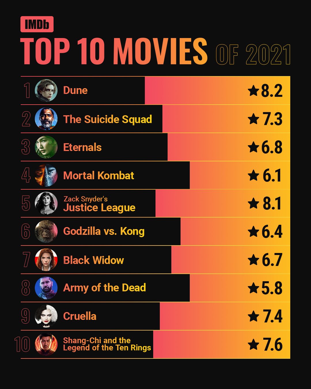
Source: https://twitter.com/IMDb/status/1468600009285320707
Depending on what you focus on (the orange-rose bars on the right or the black bars on the left), you see 2 different bar charts. So always make sure that foreground and background are not ambiguous in your designs.