A popular way of representing numbers with colours is the rainbow colour scale. But there are many problems associated with this colour palette.
Take this map, showing the annual precipitation in the state of Texas.
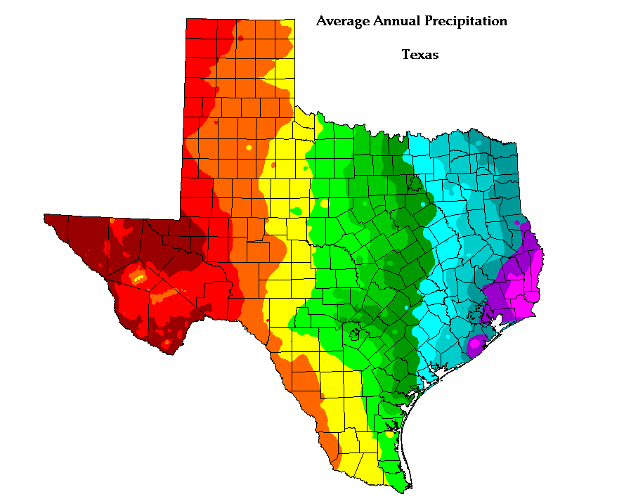
Map by Jenny Weisburg, source: Reddit
As we discussed, without a legend, it is impossible to decode the numbers from the colours on this map. But there is more: you can’t even identify the relatively drier and wetter areas in Texas, because there is no natural order in the colours. Is purple wetter than yellow?
Here is the map, this time with the legend:
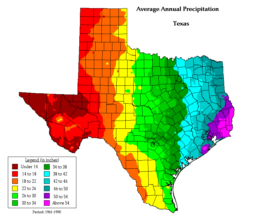
Map by Jenny Weisburg, source: Reddit
With the legend, the reader now has access to the values, and it is possible now to identify the wetter and drier areas in Texas.
But watch what happens when the map is printed in black and white:
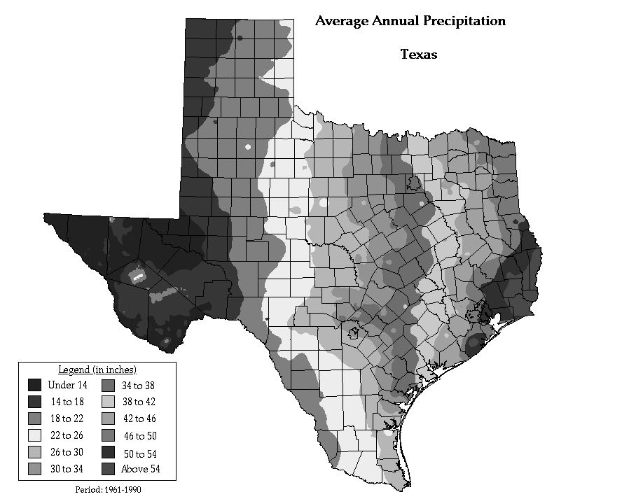
Map by Jenny Weisburg, source: Reddit
The map no longer makes sense, and even with the legend present, it is impossible to interpret it correctly.
Alternative colour palettes exist that don’t suffer from these issues. Consider this precipitation map:
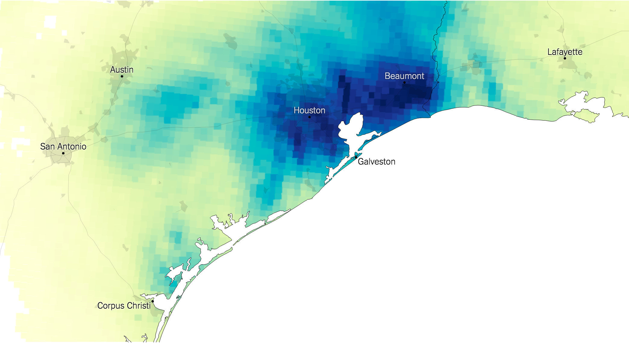
Source: Maps: Tracking Harvey’s Destructive Path Through Texas and Louisiana, New York Times
The map does not need a legend to identify the wet and dry areas: darker values are associated with higher values, and the blue colours have an association with water.
A legend just helps to get access to the actual numbers:
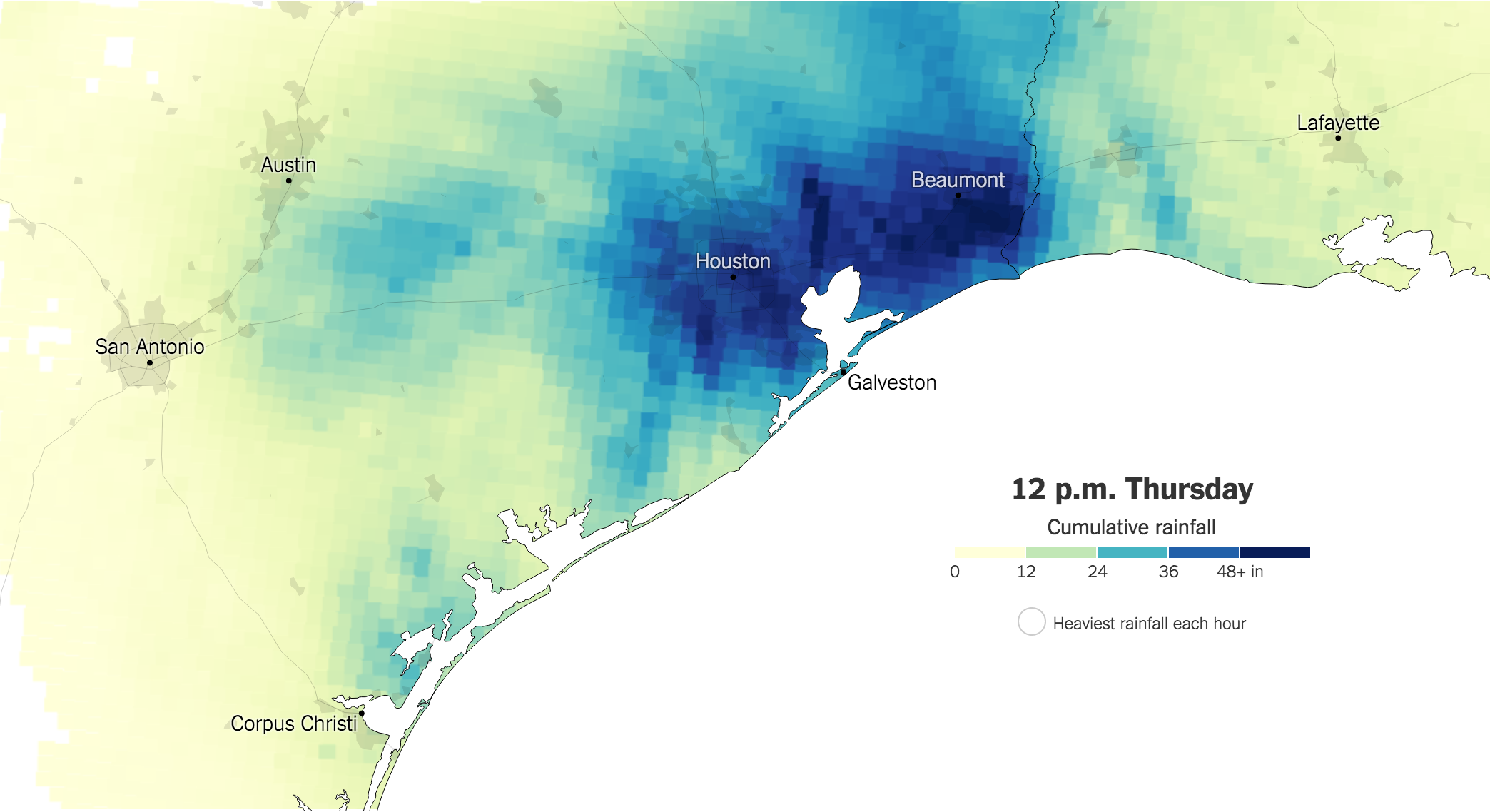
Source: Maps: Tracking Harvey’s Destructive Path Through Texas and Louisiana, New York Times
The map even survives black and white printing very well:
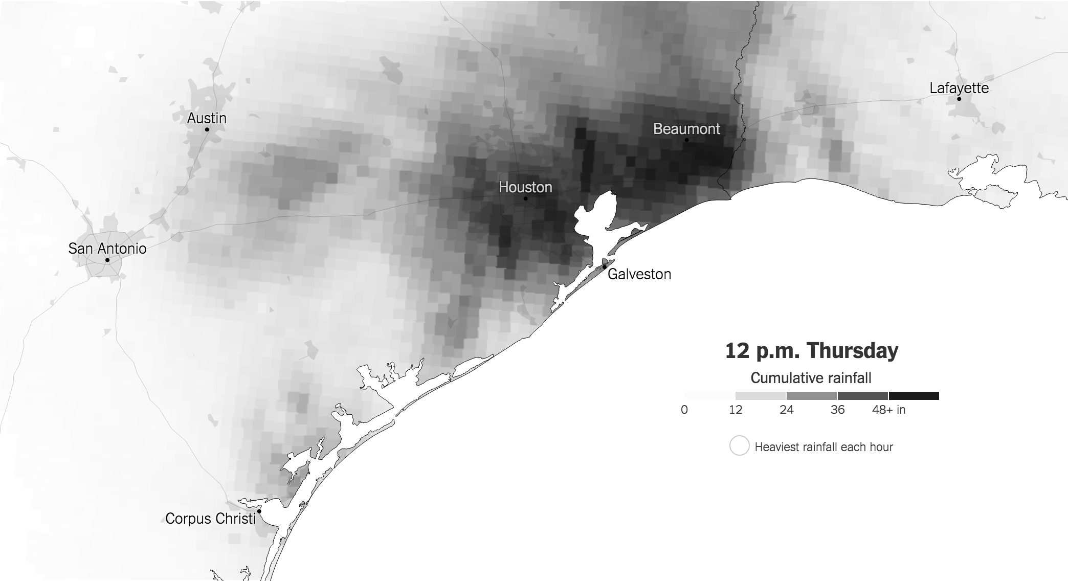
Source: Maps: Tracking Harvey’s Destructive Path Through Texas and Louisiana, New York Times