Home icon
Data Visualisation Guide

Combining with other media: photoviz

3 minutes read

Combining with other media

A window into Delhi’s deadly pollution, by Reuters, uses photographs to tell the story of the horrible air quality in Delhi.

Screenshot of the opening of the article titled Delhi's deadly pollution, showing a composition of views on the city with increasing amount of smog from left to right

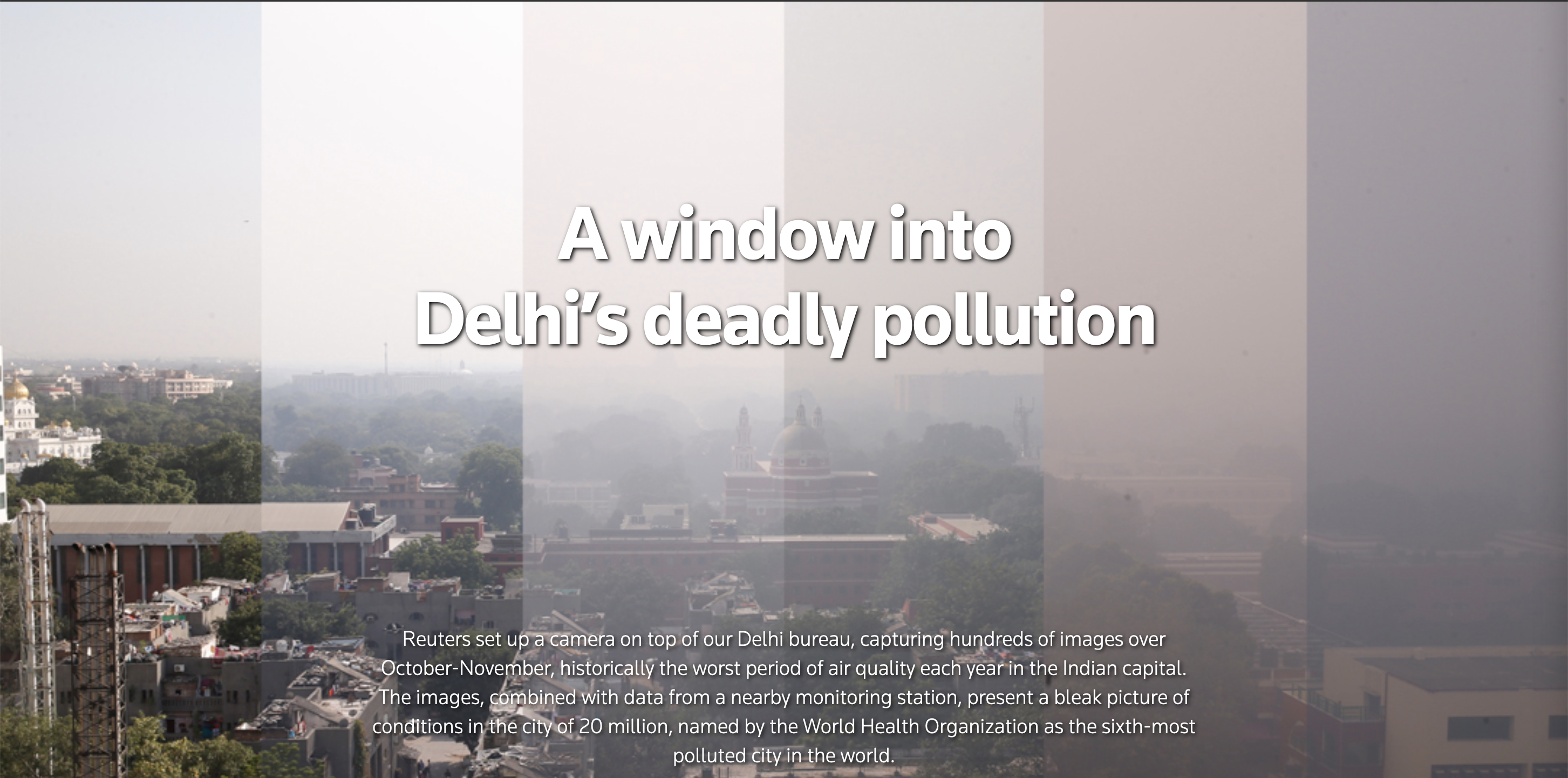
Source: A window into Delhi’s deadly pollution, graphics.reuters.com

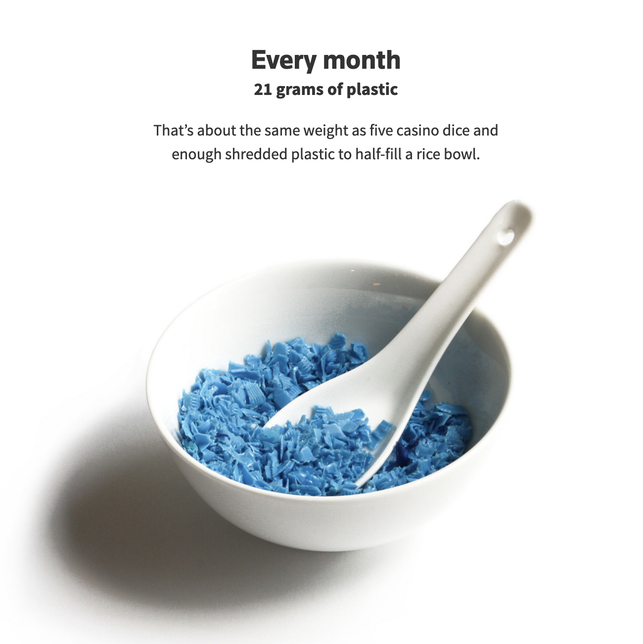
In A plateful of plastic, Reuters also used photography to show the amount of microplastics we eat:

A photo of a spoon full of plastic, the amount we consume of it every week

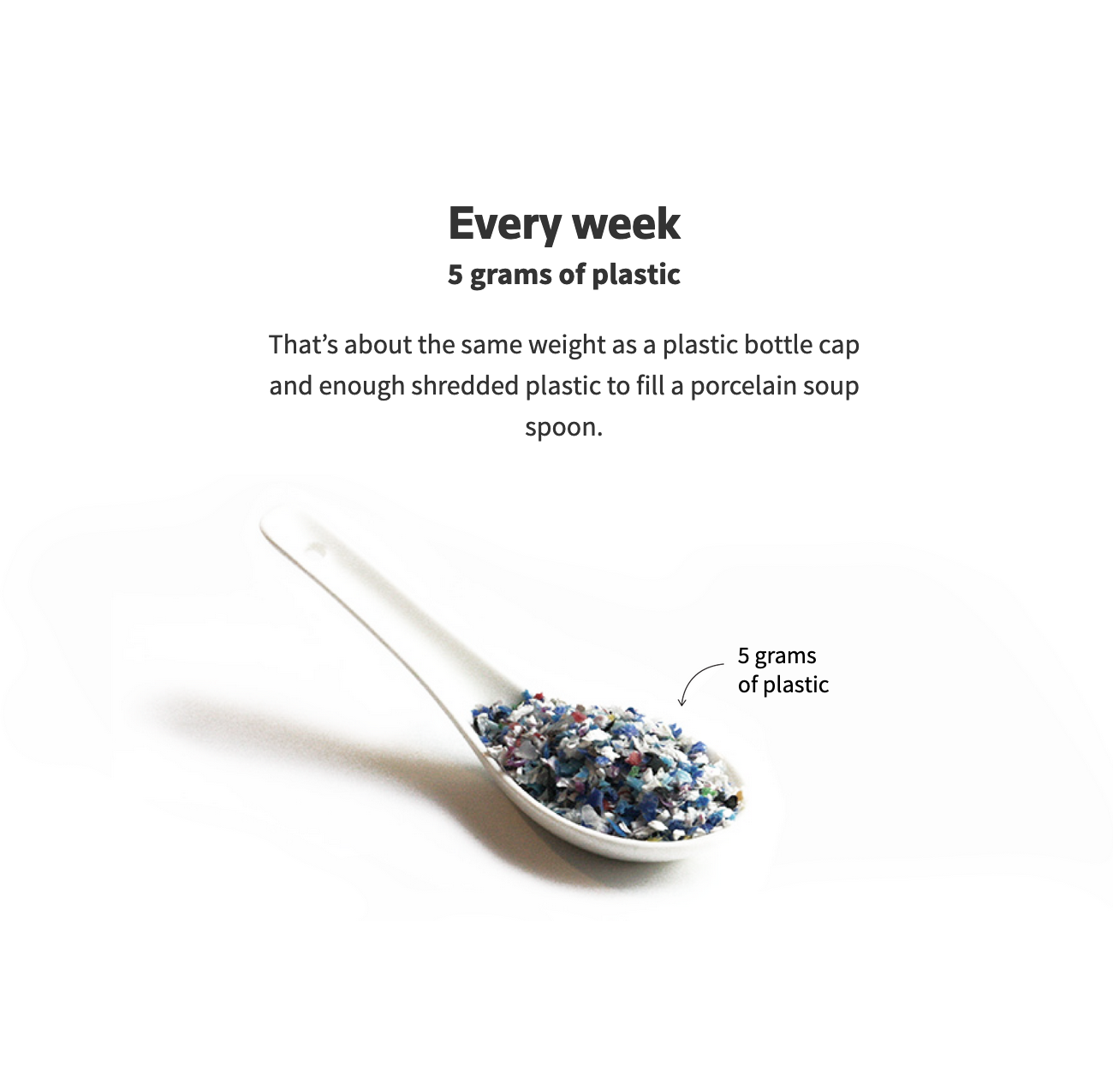
Source: A plateful of plastic, graphics.reuters.com

A photo of a bowl full of plastic, the amount we consume of it every month

From Use Only as Directed, by ProPublica:

A photo of jars of pills showing the amount of pills of acetominophen you can buy in the USA compared to England, Germany and Mexico

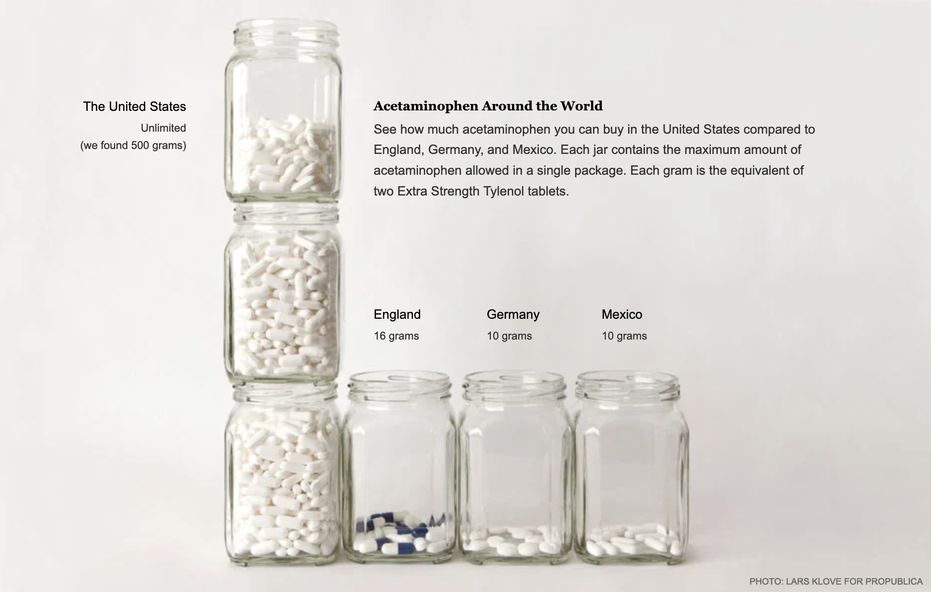
Source: Use Only as Directed, propublica.org

Artist Dillon Marsh uses computer graphics to place metal spheres in abandoned mines to show the extracted amount of material.

A rendering of a copper sphere behind a lake in a closed mine

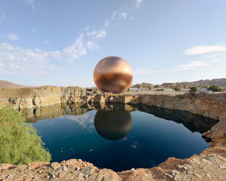
Source: Dillon Marsh

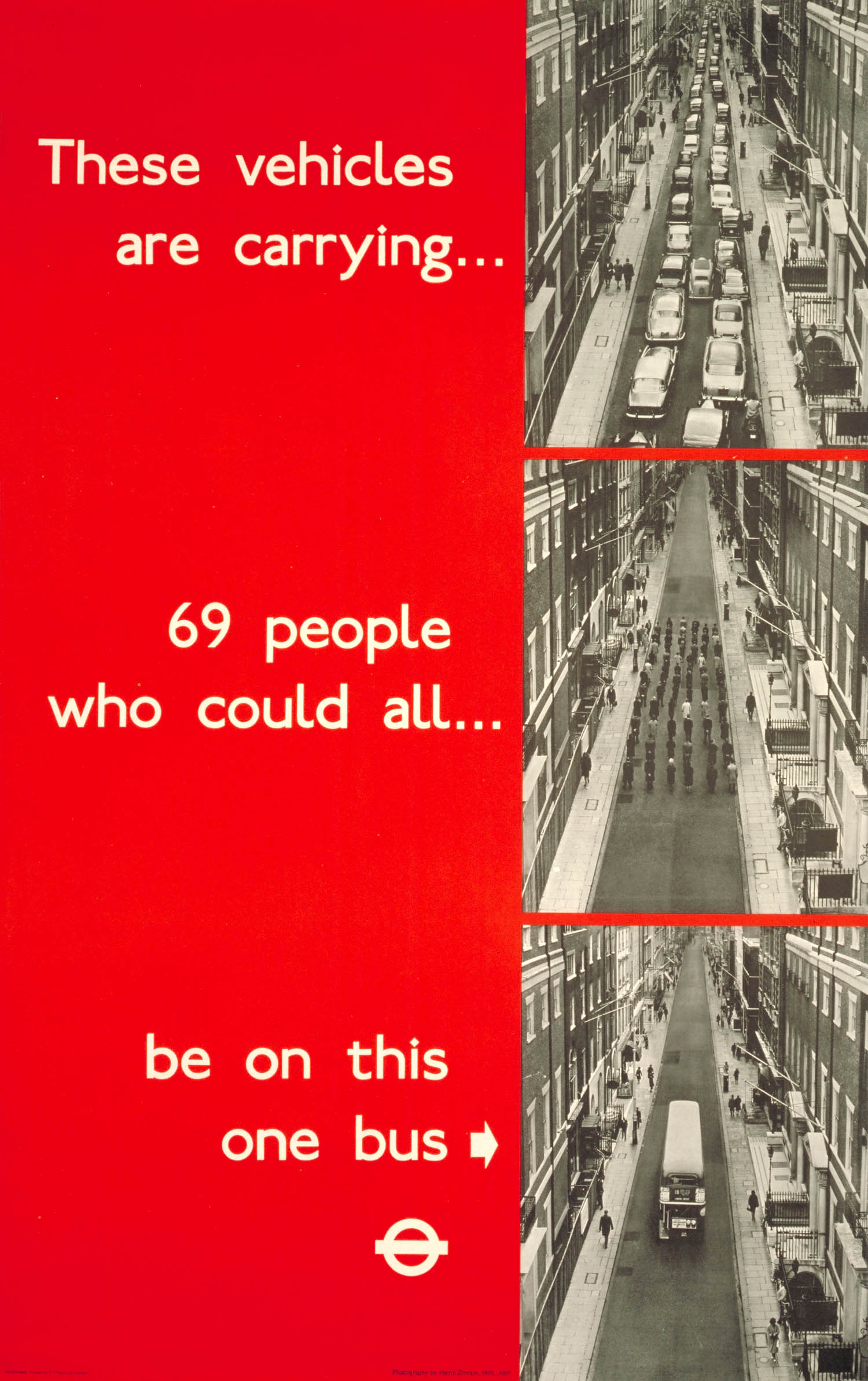
And finally a classic example from a 1965 campaign by London Transport showing the difference in space needed for cars and a bus.

3 photos showing 69 people in cars, on foot and in one bus. The text next to the photos says 'These vehicles are carrying... 69 people who could all... be on this one bus

Source: Heinz Zinram at the London Transport Museum

Related pages

Combining with other media: sound

Combining with other media: video

Combining with other media: layout

Combining with other media: drawings and illustrations

Combining with other media: data comics

Annotated chart narrative visualisation

Combining with other media