Data physicalisation is the process of turning data into physical objects. It can make numbers much more tangible and engaging: being in the same space and being able to touch a data representation is a more visceral and accessible experience than seeing a visualisation printed on paper or rendered on screen. And sometimes you can even add your own data points to a data physicalisation, changing its shape in the process.
Below or some examples of data physicalisations, taken from the List of Physical Visualizations. This list is curated by researchers Pierre Dragicevic and Yvonne Jansen, who also collect all relevant information on the Data Physicalisation Wiki.
Artist Mathieu Lehanneur created 100 objects, each showing the age distribution of a country, for his State of the World, Sculptures.
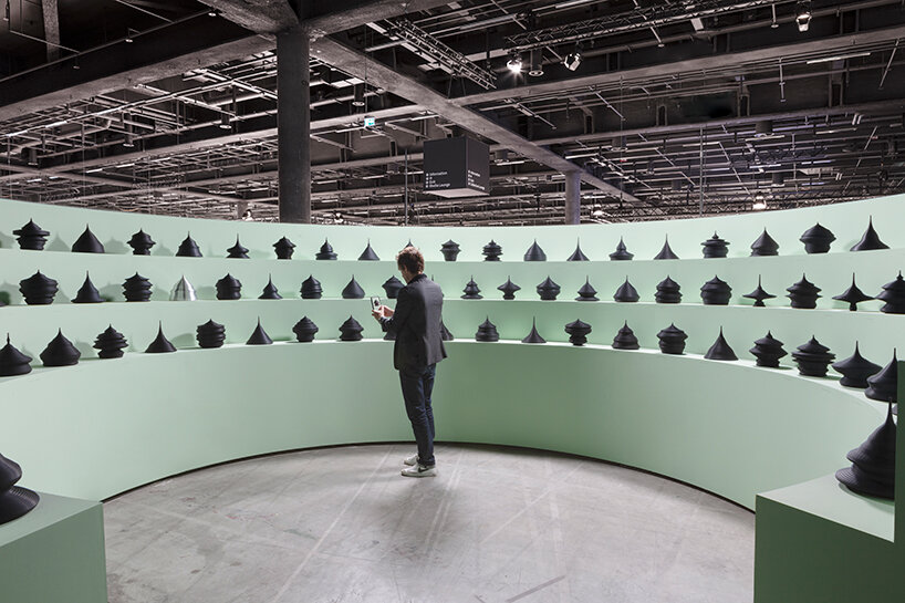
Source: mathieulehanneur.fr

Source: mathieulehanneur.fr
Perpetual Plastic is a data artwork installed on a beach in Bali, showing the amount of plastic discarded, recycled, incinerated and still in use world wide. It was composed out of marine debris collected from nearby.
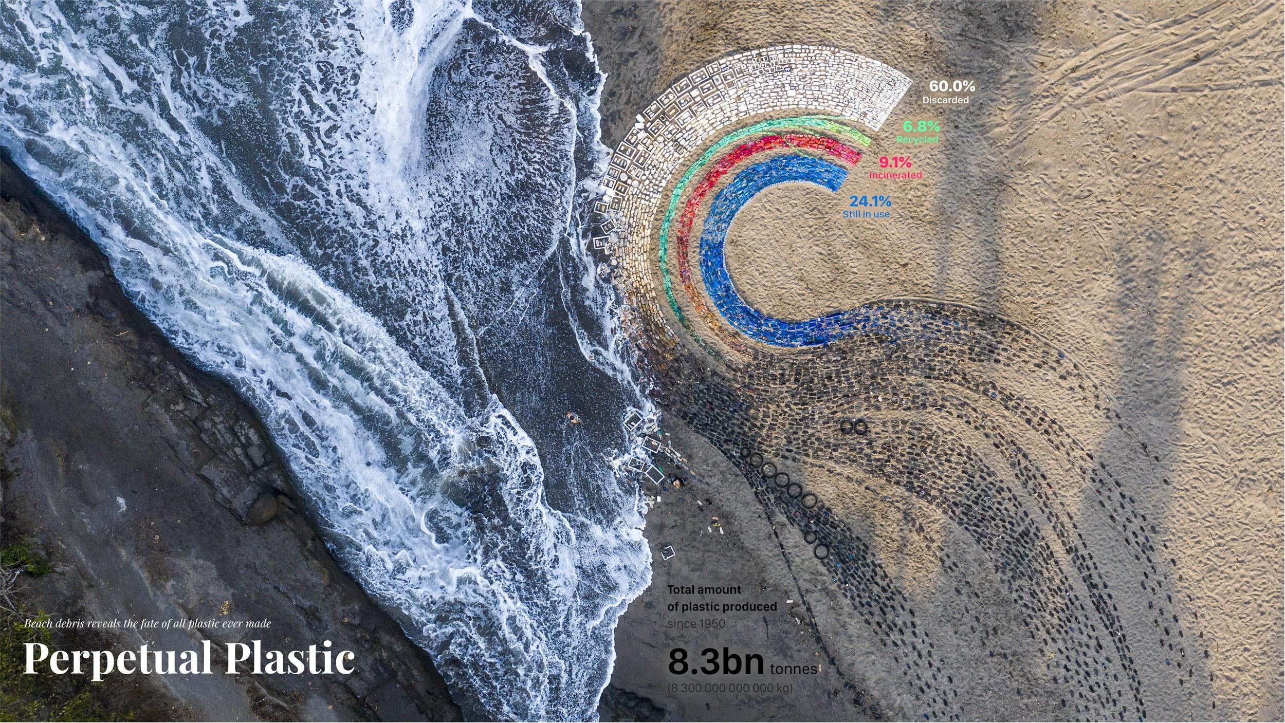
Source: perpetual-plastic.net
Data physicalisation today is almost always supported by computer technology. But data physicalisation was already being used in the pre-digital era. For example, the Detroit Edison Company used this physicalisation to anticipate power demands. It shows electricity consumption for the whole year of 1935, with each slice representing a day, divided into 30 minute intervals.
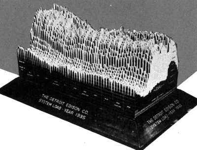
Source: Graphic Presentation, Willard Cope Brinton
Of All the People in All the World is a travelling art and theatre piece in which piles of rice grains are used to communicate all sorts of human statistics. It shows that physicalisation can be used to make large, abstract numbers more tangible and easier to compare.
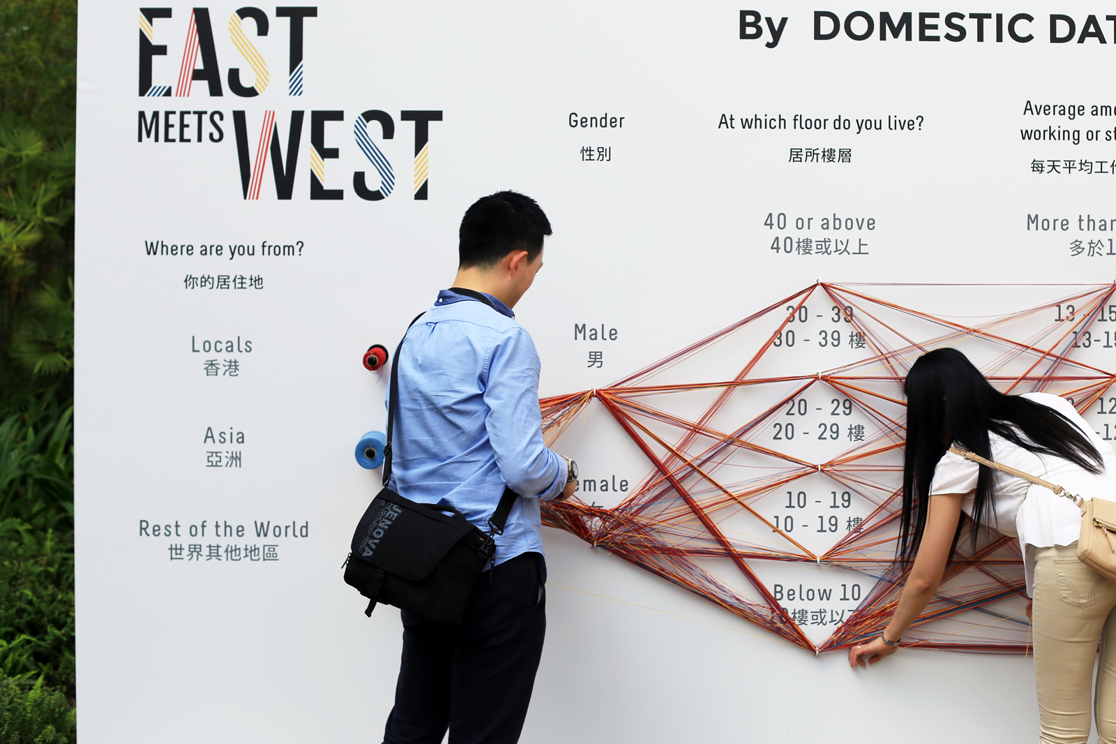
Data Strings is a participatory data physicalisation of people’s opinions, developed by Spanish agency Domestic Data Streamers. People in the audience are invited to answer different questions by knitting information on the different options, generating a visualisation of collective thoughts and facts that enables them to compare their answers with the bigger picture.
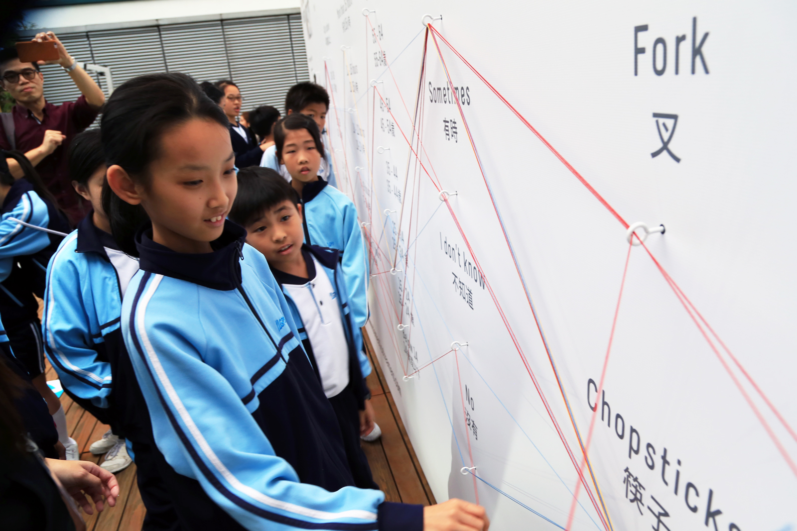
Source: domesticstreamers.com
Source: domesticstreamers.com
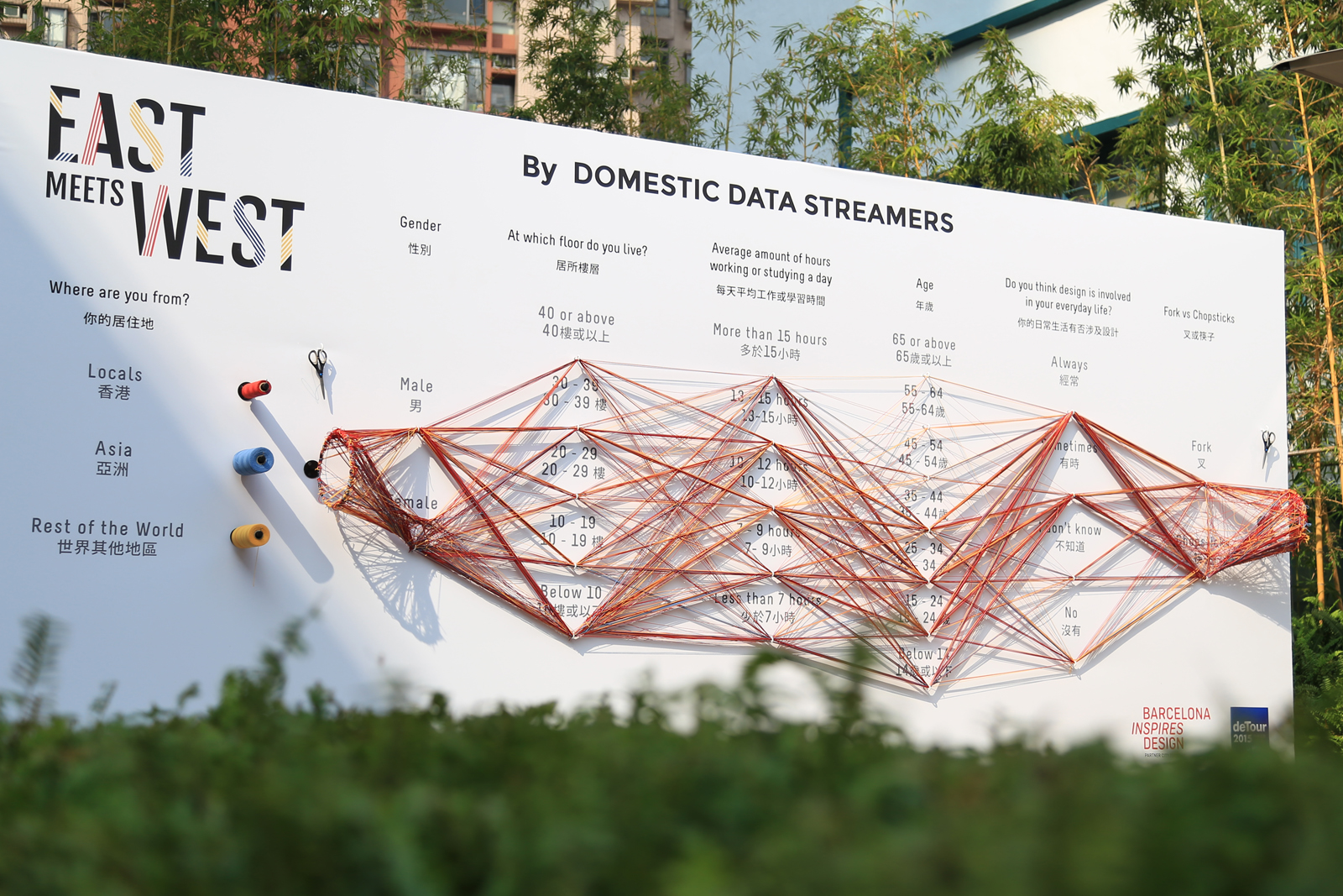
Source: domesticstreamers.com
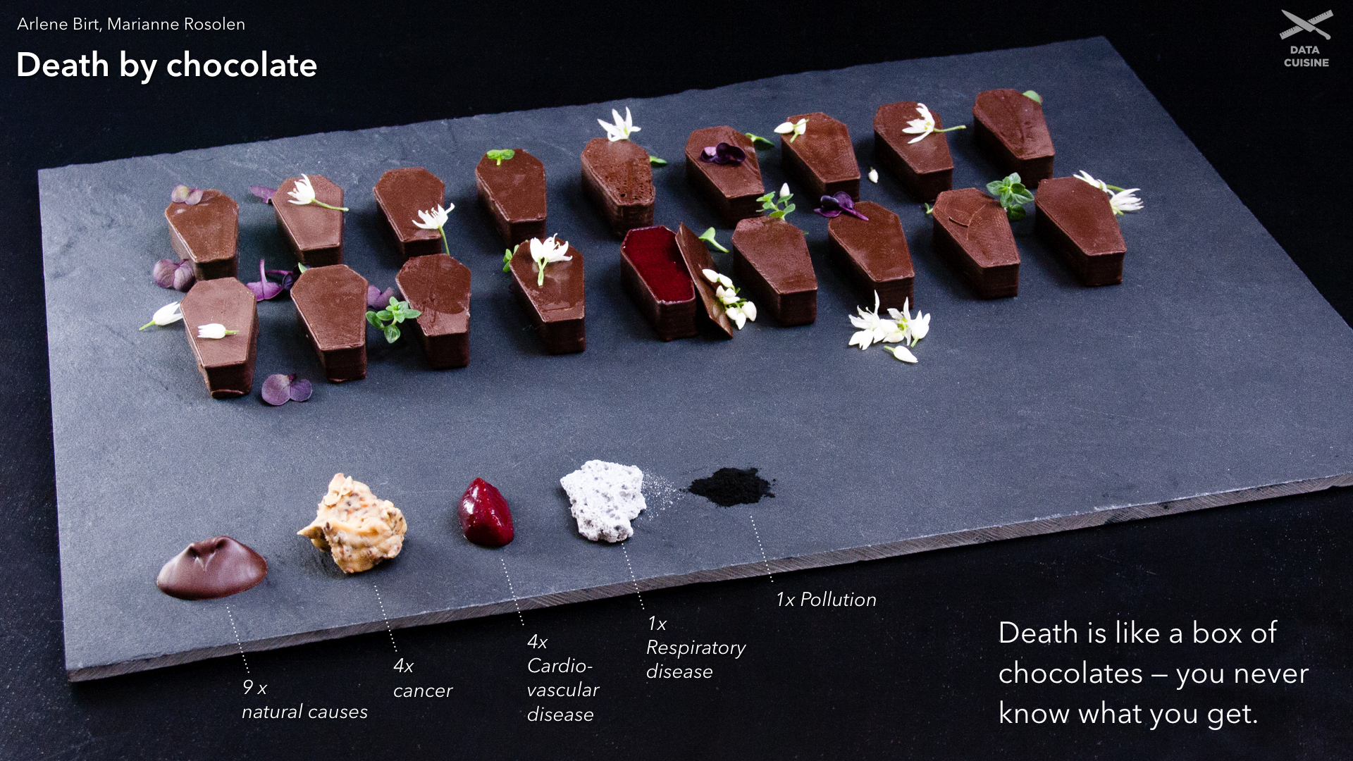
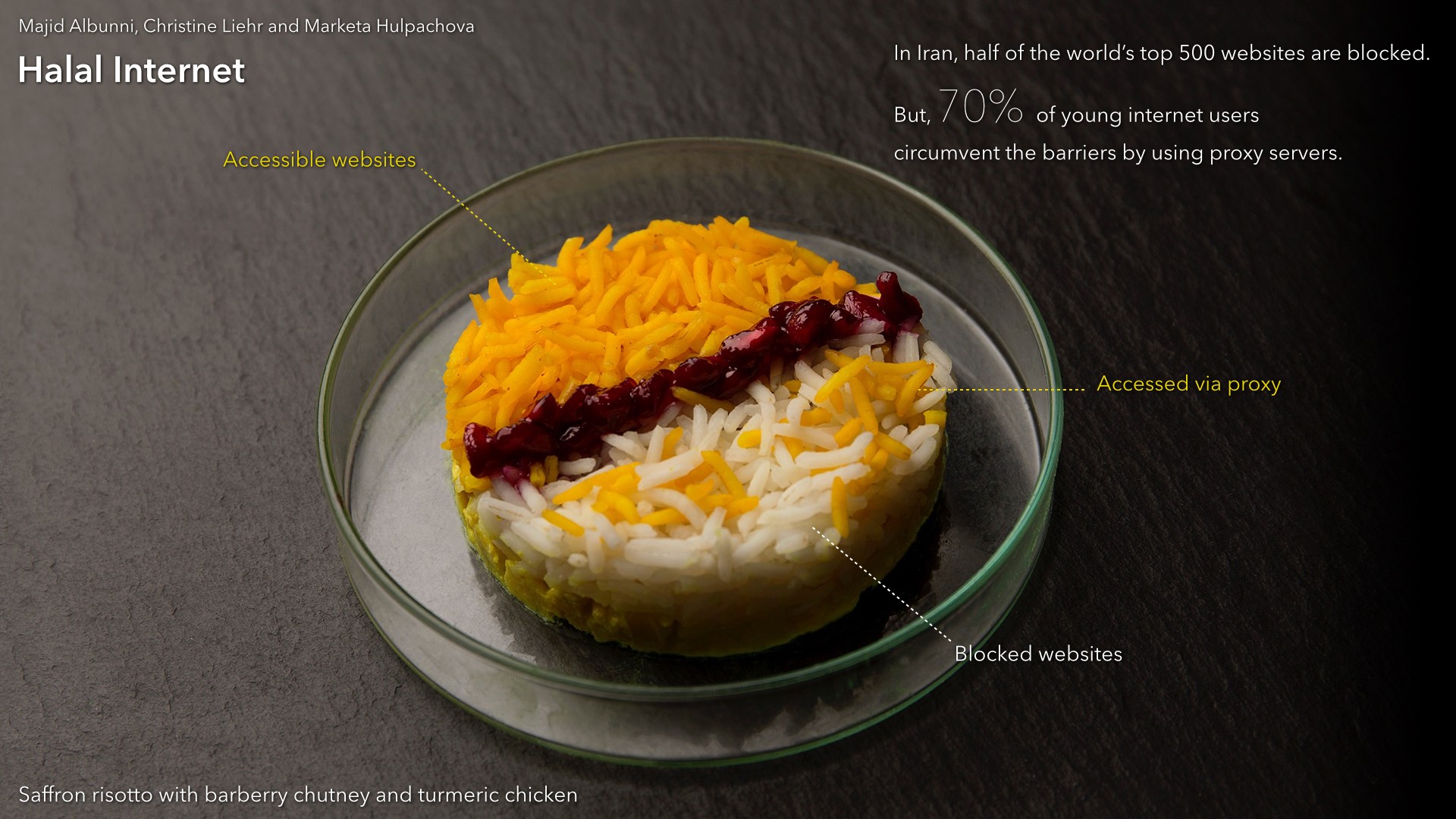
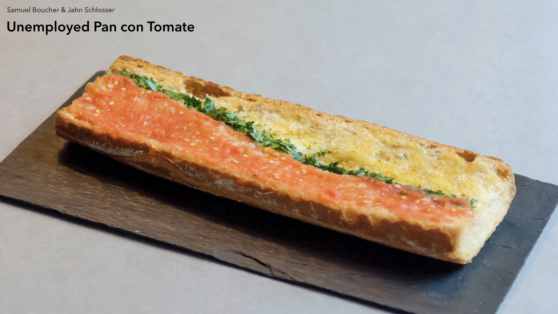
The Data Cuisine project goes even further than mere physicalisation: it aims to represent data in food dishes. It is run as a series of workshops in which participants can collaboratively experiment.
Source: data-cuisine.net
Source: data-cuisine.net
Source: data-cuisine.net