Just like data can be mapped to visual properties of graphical elements (like position, size and colour), data can also mapped to properties of (non-speech) audio, like pitch and loudness. In a sense, any kind of sound alarm is a form of data sonification: a metric is measured, and when it reaches a certain threshold (for example the number of smoke particles in the air reaches a smoke alarm’s threshold), a sound starts ringing.
But sonification can also be used to explore and communicate the data in a visualisations without visual aids. Just like a visualisation, a data sonification can give an overview of a data set and identify patterns and outliers. Highcharts has a sonification module to play a sonification of a visualisation’s data. You can play the sonification of the chart below by clicking the “Play” button under the chart embedded below (Highchart’s sonification module is still experimental, and doesn’t work in all browsers. If you have issues playing the sonification, try a different browser, or upgrade your current one).
Source: highcharts.com
There are a lot of variables that can be used to map data and numbers to sounds: sounds can be easily overlayed over each other (easier than layers in a visualisation, which create overlap and clutter), you can pick many different “instruments” to generate the sounds with, each with their own aural “mood”, the speed of the sonification can be modified and even changed midways, … And because the field of data sonification is so young, people and researchers are still experimenting and testing what works and what does not work in sonification.
The good examples of data sonification or still quite scarce, but one excellent example was created by the Financial Times in 2019. The sonification uses data from what is called the yield curve, which shows the yield of government bonds in function of their maturity (the time period after which the bond “matures” and is paid out to the bondholder).
The graphic below explains how the data is mapped to musical notes. The range between the minimum and maximum values in the data is binned into 24 buckets, which are assigned to 24 notes evenly spaced out over 4 octaves.
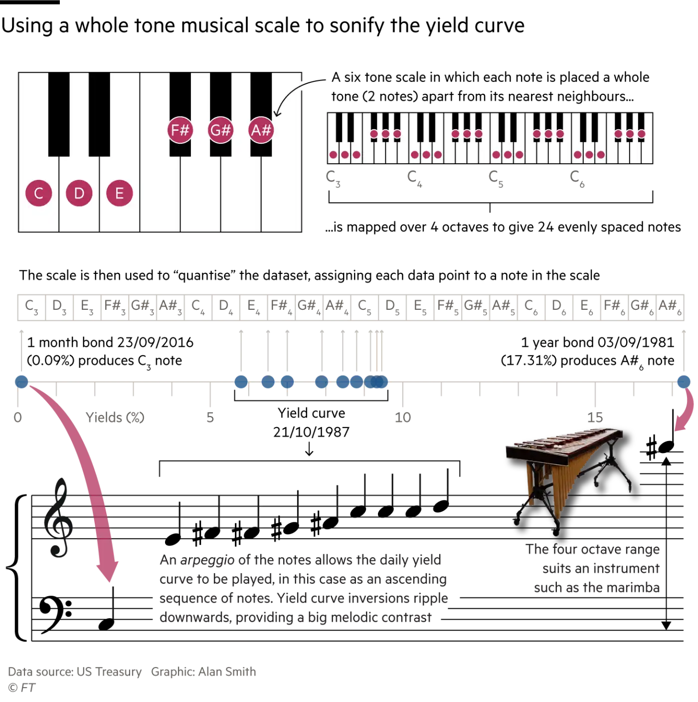
Source: What does a chart sound like?, ft.com
Watch the video below, in which the creator of the sonification, Alan Smith, explains how he created the sonification.
Mister Smith also explains why he created the sonification. The first reason is that sighted people will also hear what they see when they play the animation with sound on. This reinforces the data and the message, which makes them more memorable. But of course the real power of sonification for people with visual impairments. The sonification makes a big data set accessible for non-sighted people in a nice and fun way. You could even argue that sonification works better for this data set than (static) data visualisation: it would be quite a challenge to create a visualisation that shows and reveals the patterns in the data as well as the sonification does.
Although there is no sound in space, NASA has also been experimenting with the sonification of the data coming from the Hubble space telescope. Elements of the images, like brightness and position, are assigned pitches and volumes to create sounds that allow the audience to “listen to” galaxies, black holes, nebulas and supernovas.
Here are some resource in case you want to know more about data sonification, or create one yourself:
- The Data Sonification Archive is a curated collection of data sonifications. It is maintained by researchers of the Center for Design of the Northeastern University in Boston, USA. The researchers use the collection to study the field of data sonification, and they encourage submissions of new sonifications to add to the collection.
- Loud Numbers is a data sonification podcast created by Duncan Geere and Miriam Quick. Duncan and Miriam go a step further than just data sonification: they make real music from sounds created from data. In each podcast episode they explain how they made one of their “data songs”
- TwoTone is a free online tool to create data sonifications. It provides example data sets, but you can also upload your own data. You can layer audio tracks on top of another, select different instruments and set the tempo of your sonification. At the end of the sonification creation process, you can download your sonification as an mp3 file.