After data is loaded and parsed correctly, one or more transformations can be performed on the data before it is mapped to aesthetics. Transformations have multiple purposes: they can be required for some visualisations, they can create summary statistics that can be added to a visualisation, or they can be used to compute additional, derived dimensions for each record in the data.
Many of the data transformations discussed below can also be performed outside of the tool used to visualise the data. But all Grammar of Graphics-based tools have transformations built in, and using the built in transformations is often much more convenient than preparing the transformed data outside of the tool and then importing the transformed data into it.
Required transformations
Many visualisations require some intermediate calculations on their source data before a visualisation can be constructed. Here are some examples of those:
- Histograms require a numerical dimension to be divided into bins, and the number of values in each bin to be counted. Many other visualisations that summarise the distribution of a dimension require the counting of the number of observations in each bin.
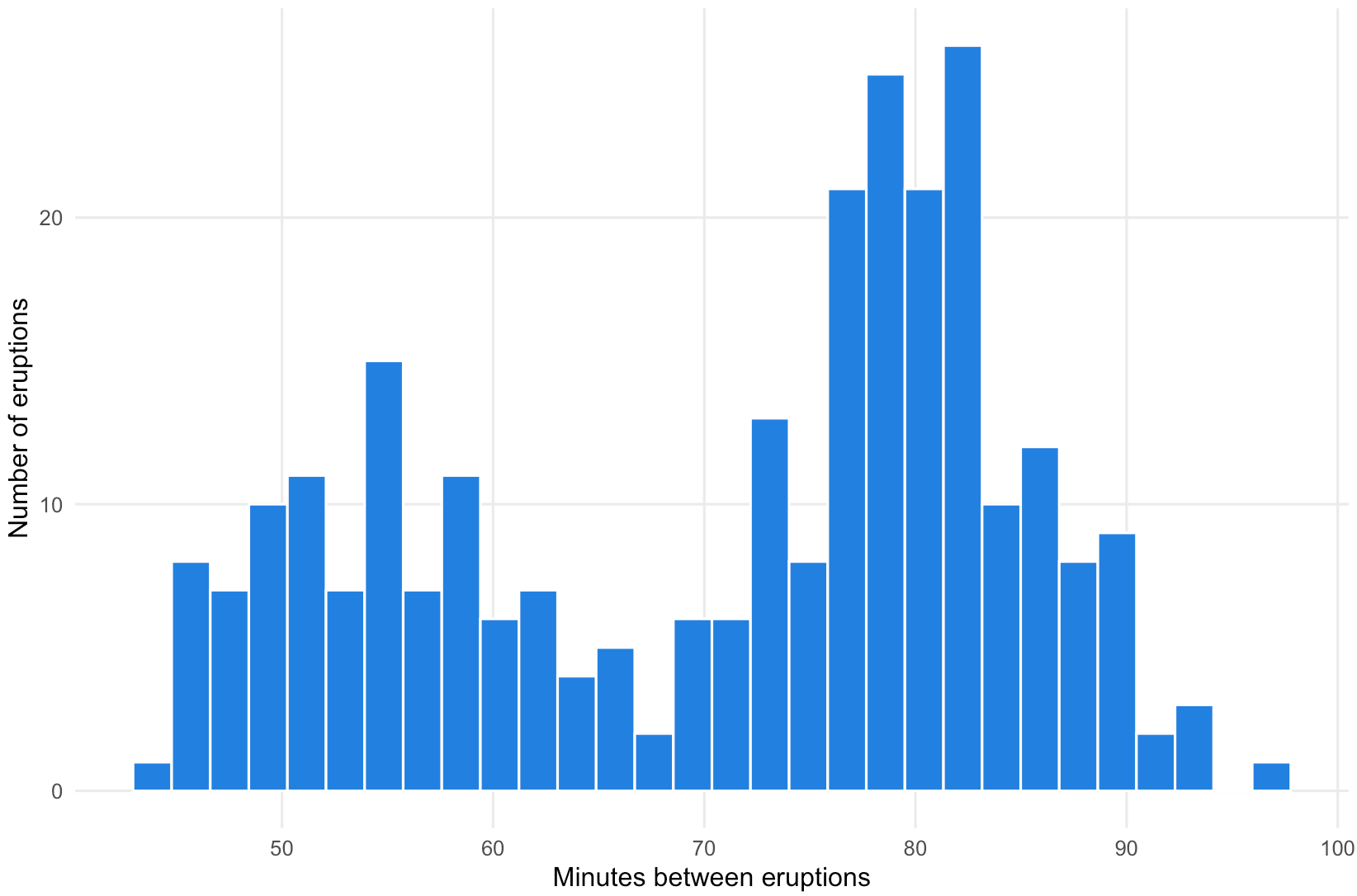
A histogram showing the time between eruptions of the Old Faithful geyser in Yosemite National Park. The height of the bars represent the number of observatins in each bin. Source: Maarten Lambrechts, CC-BY-SA 4.0
- Box plots show the quintiles in the dimension of the records in a data set. So these quintiles need to be computed from the data before the plot can be constructed.
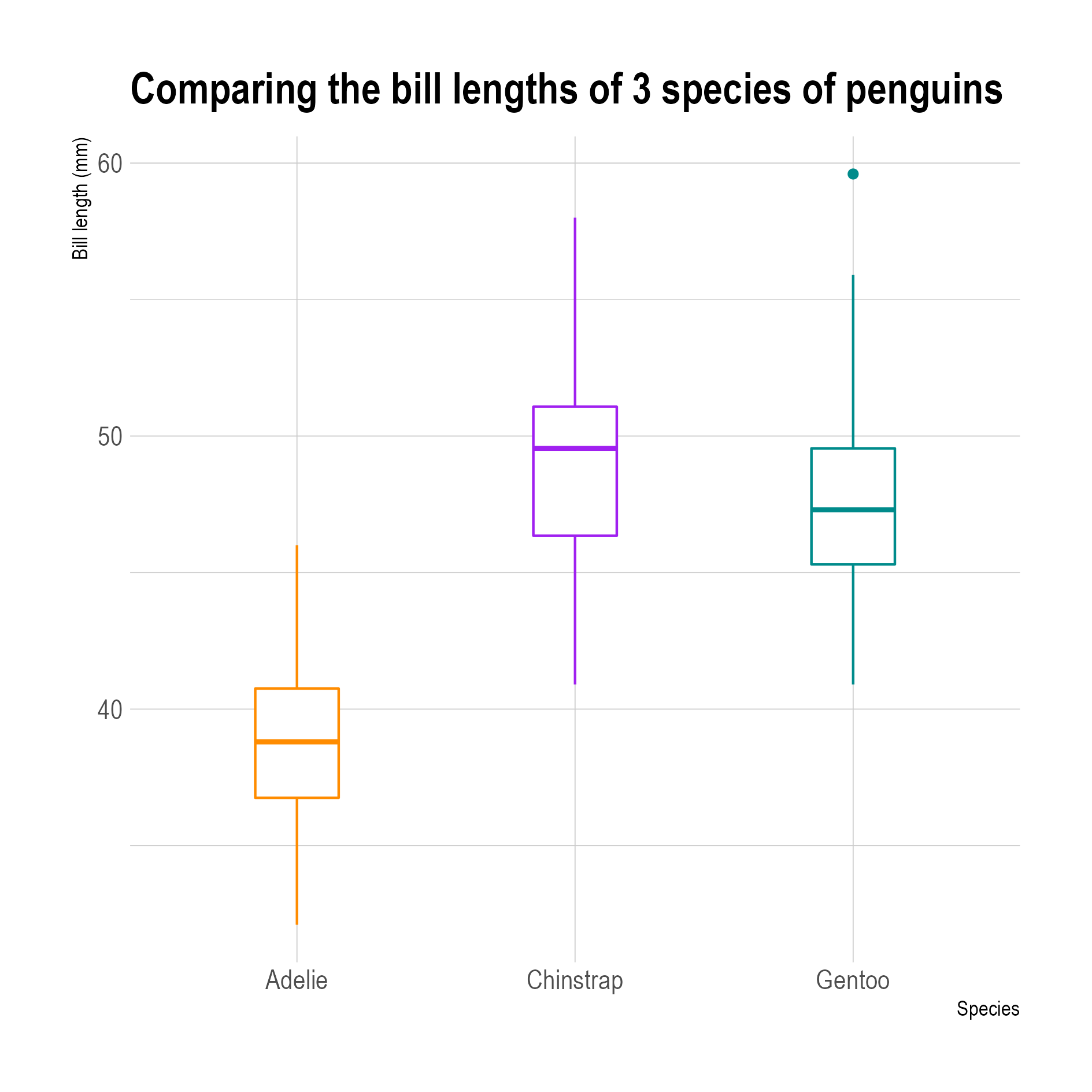
3 box plots comparing the distribution of bill lengths of 3 penguin species. Source: adapted from Allison Horst
- In stacked charts, like stacked area charts and stacked bar charts, the shape and position of each stacked element is determined by the underlying stacked elements. So before the plot can be constructed the shape and position of each of the stacked elements needs to be computed.
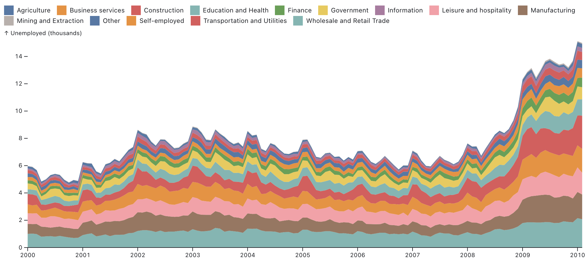
A stacked area chart showing unemployment numbers in different sectors stacked on top of each other to show total number of unemployed people over all sectors. Source: observablehq.com/@observablehq/plot-area
- Density plots show distributions as curves. The shape of the curve can be calculated with a density transformation, of which the result is then plotted with a line or area geometry.
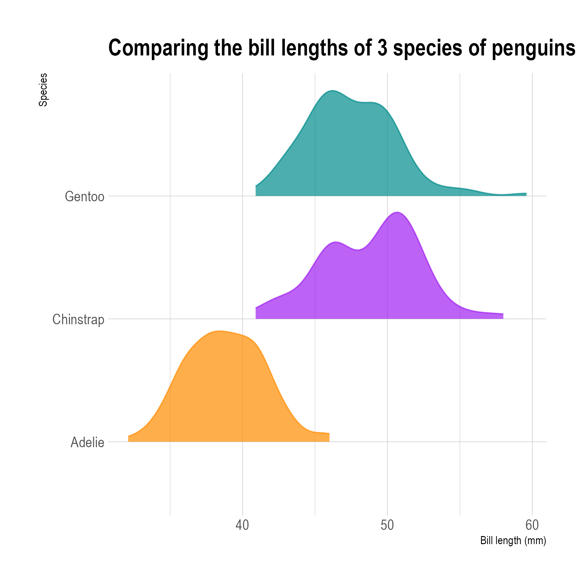
Density plots of the bill lengths of 3 species of penguins. Source: Maarten Lambrechts, CC-BY-SA 4.0
Aggregation transformations
All implementations of the Grammar of Graphics discussed in this training have a layered approach. This means that layers using different geometries can be stacked on top of each other in a visualisation. On top of using different geometries, these layers can also use different data.
For example, the following plot shows (relative) gdp per capita numbers for the regions of the European Union as dots, while a second layer is overlaid showing the country averages as outlined squares. This can be achieved by a data transformation that aggregates the regional values into an average value for each country.
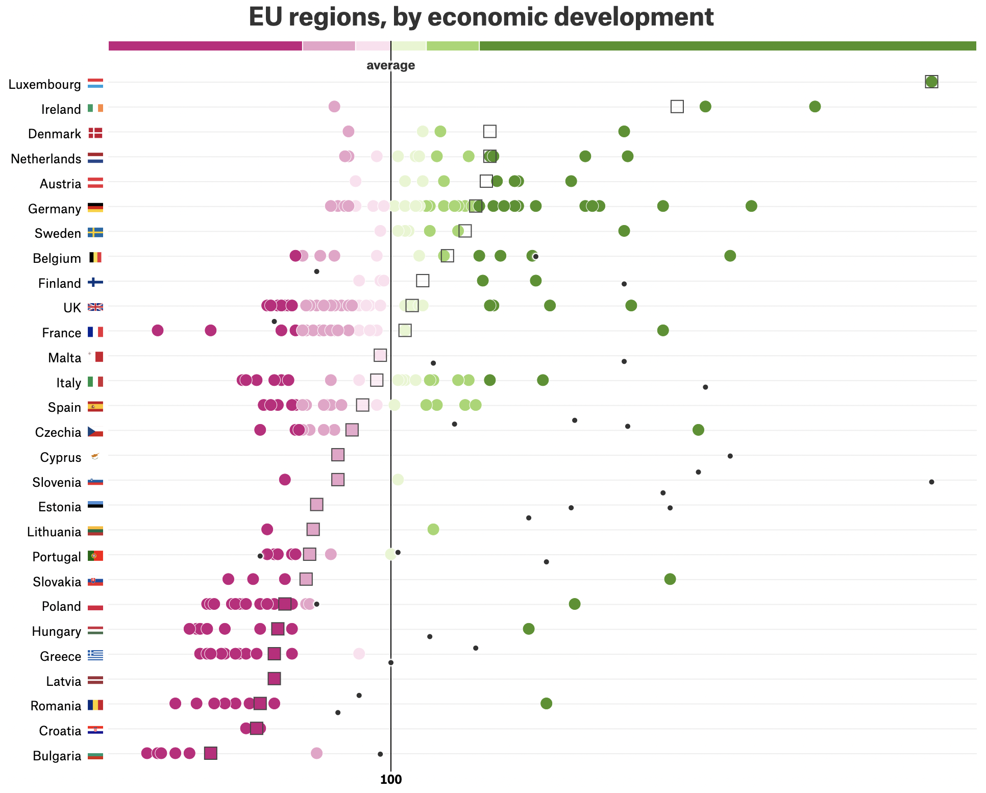
Source: Why Budapest, Warsaw, and Lithuania split themselves in two, pudding.cool/2019/04/eu-regions
Apart from averages, transformations can be used to aggregate data into counts, sums, medians, minima, maxima and more. Aggregations can be calculated for a whole data set, or for each group of records belonging to the same category. For example, in the plot above, the regions are grouped together by country first, and then the regional values are aggregated for each country.
Other transformations
Other common transformations which are sometimes needed for plotting the data include:
- sorting. Some tools require data for line charts to be sorted according to their value on the x axis, so a sort transformation might be needed.
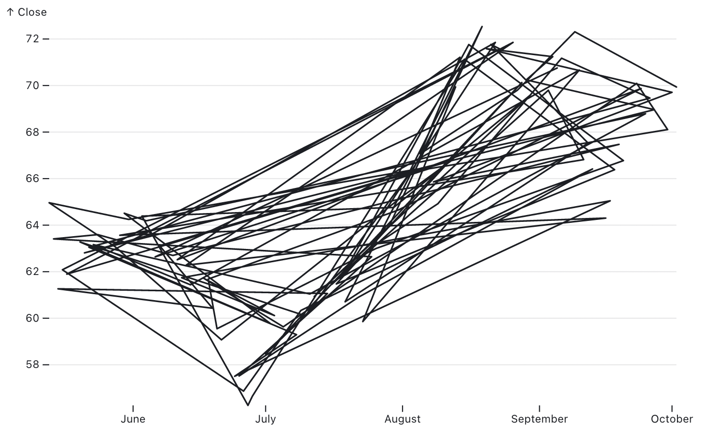
Unsorted data for line geometries can lead to unwanted results. Source: observablehq.com/@observablehq/plot-line
- another reason for sorting is to make sure that some geometries are drawn on top of others. For example, in a bubble chart, you want to draw the smaller bubble on top of the bigger ones. Otherwise the smaller ones will be hidden behind the bigger ones.
- some visualisations use the ranking of records. With a rank transformation, each record can be assigned a ranking number based on the values in numerical dimension of the data.
- a simple filter transformation can be used to remove records in the data from the plot.
- with a calculate transformation, the input data can be extended with additional variables derived from the original variables in the data. With transformations like this, relative numbers (percentages) can be derived from absolute ones, for example.