The next series of patterns for data driven storytelling are very similar to patterns used in traditional storytelling.
One such technique is question and answers: start with a question, and then answer by showing a visualisation or by adding new data to an existing visualisation up until a resolution is found.
The video below highlights the structure and the question and answers pattern in What’s Really Warming the World?, a scrollytelling article by Bloomberg published in 2015.
Note that the question and answers technique is similar to the small multiples pattern: it uses repetition to break down a multi-series visualisation into single series chunks.
To make it easier for people to understand how a chart works, and for building up tension and curiosity, you can choose to build up a visualisation instead of showing the the whole chart at once. In a scatterplot for example, you can explain the x axis first, then explain the y axis, then add a single dot and explain what it represents and finally add the rest of the dots to the visualisation.
This technique is especially handy for chart types many people are not very familiar with. Take for example the chart below. There is a lot going on on this chart, and without help people might have difficulties to understand how how the chart works.
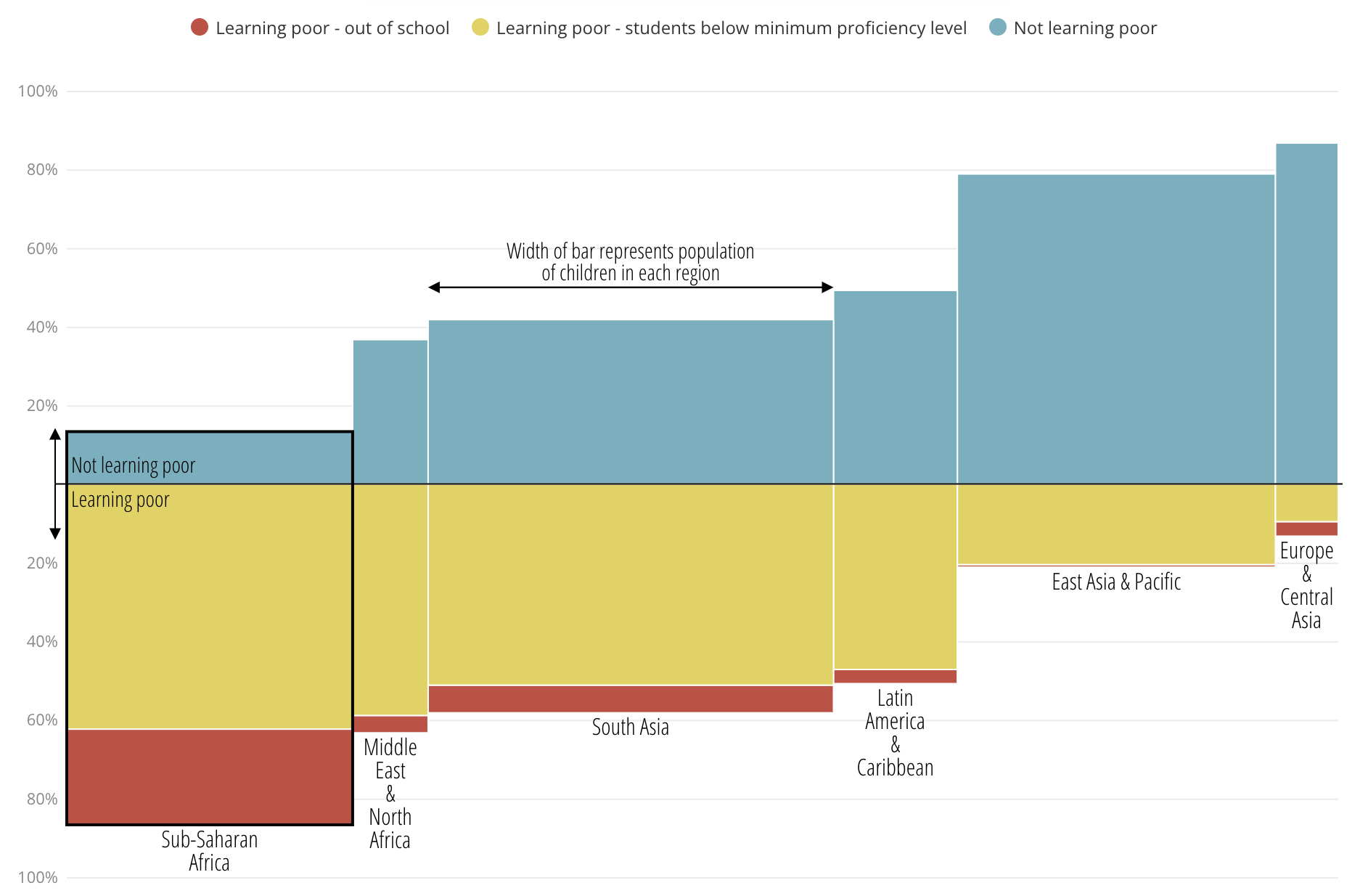
Source: Learning poverty: children’s education in crisis, Sustainable Development Goals Atlas 2020
This chart is part of a scrollytelling module, and before the chart takes the state above, it is preceded with the states below.
First the y axis is explicitly labelled and explained, showing the numbers for the whole world, and only 2 colors are used.
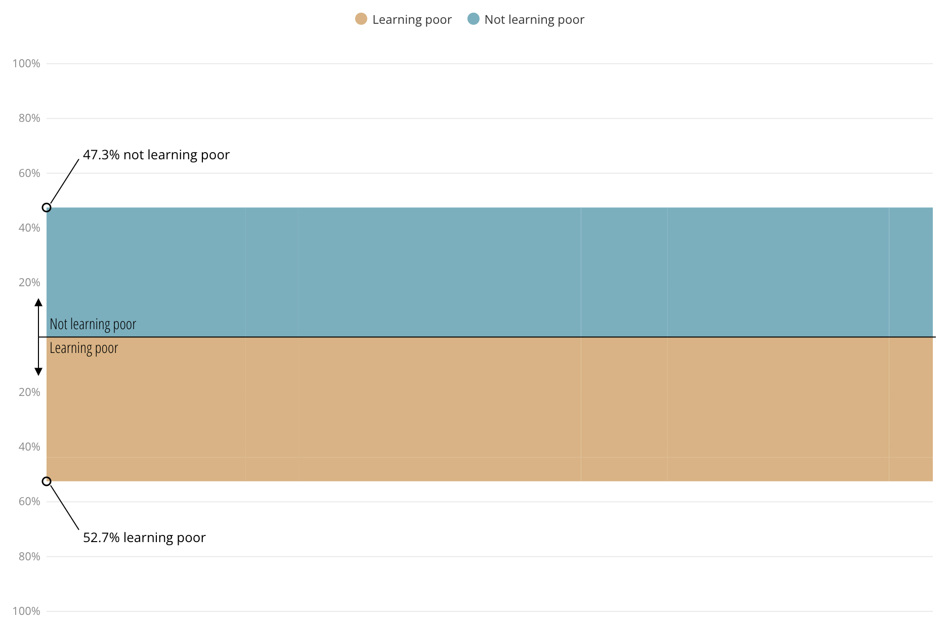
Source: Learning poverty: children’s education in crisis, Sustainable Development Goals Atlas 2020
Then a third category and colour is introduced:
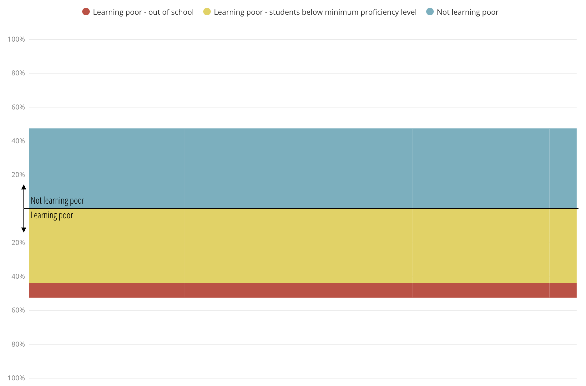
Source: Learning poverty: children’s education in crisis, Sustainable Development Goals Atlas 2020
And then the bars representing the whole world is split up to show the data by region.
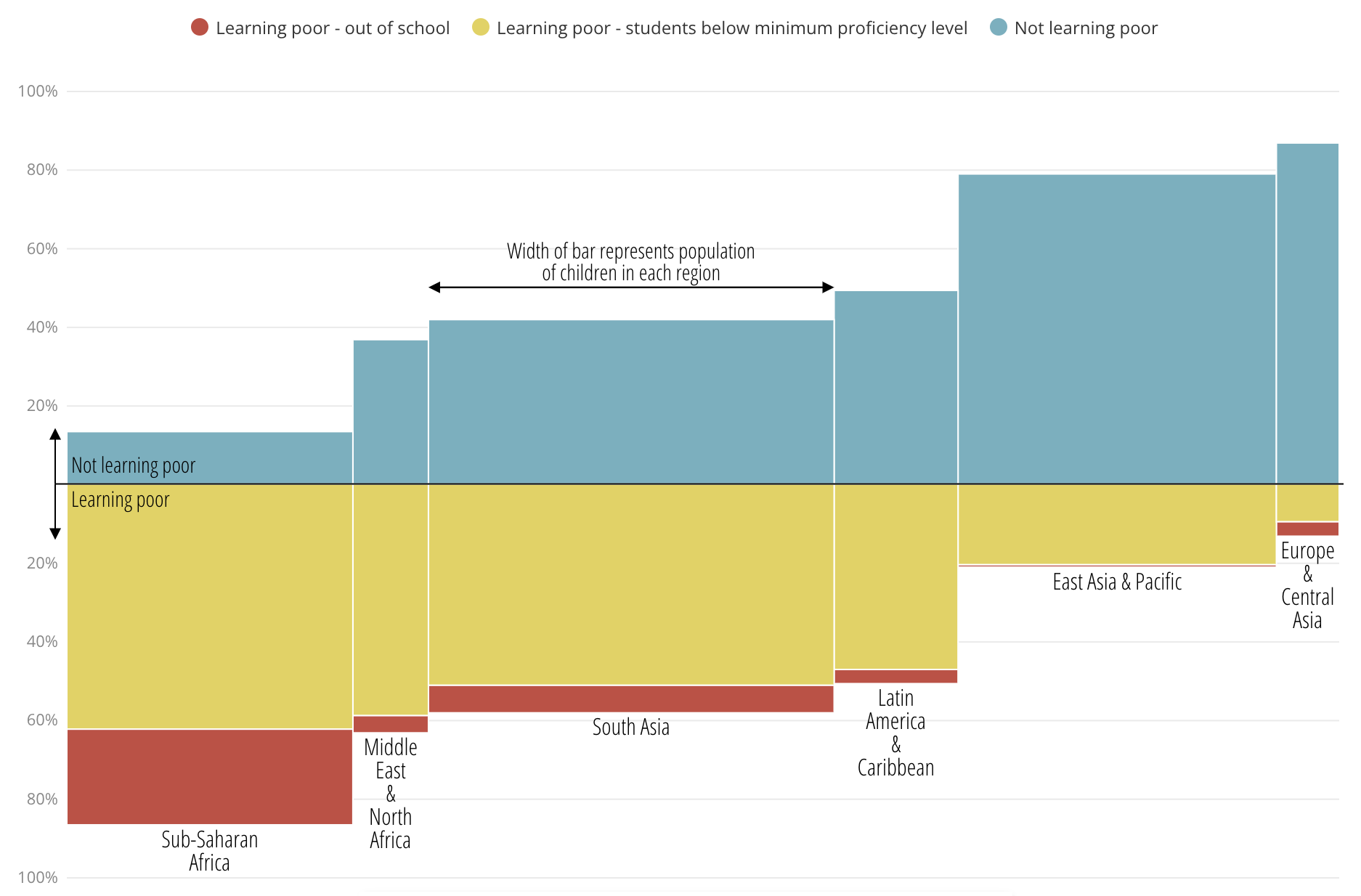
Source: Learning poverty: children’s education in crisis, Sustainable Development Goals Atlas 2020
Gradual visual reveal is a similar technique: instead of showing the whole dataset at once, the data is revealed in steps. On each step the newly added data can be explained.
Below are 4 steps from the scrollytelling article How Trump’s Trade War Went From 18 Products to 10,000, revealing new data on each step.
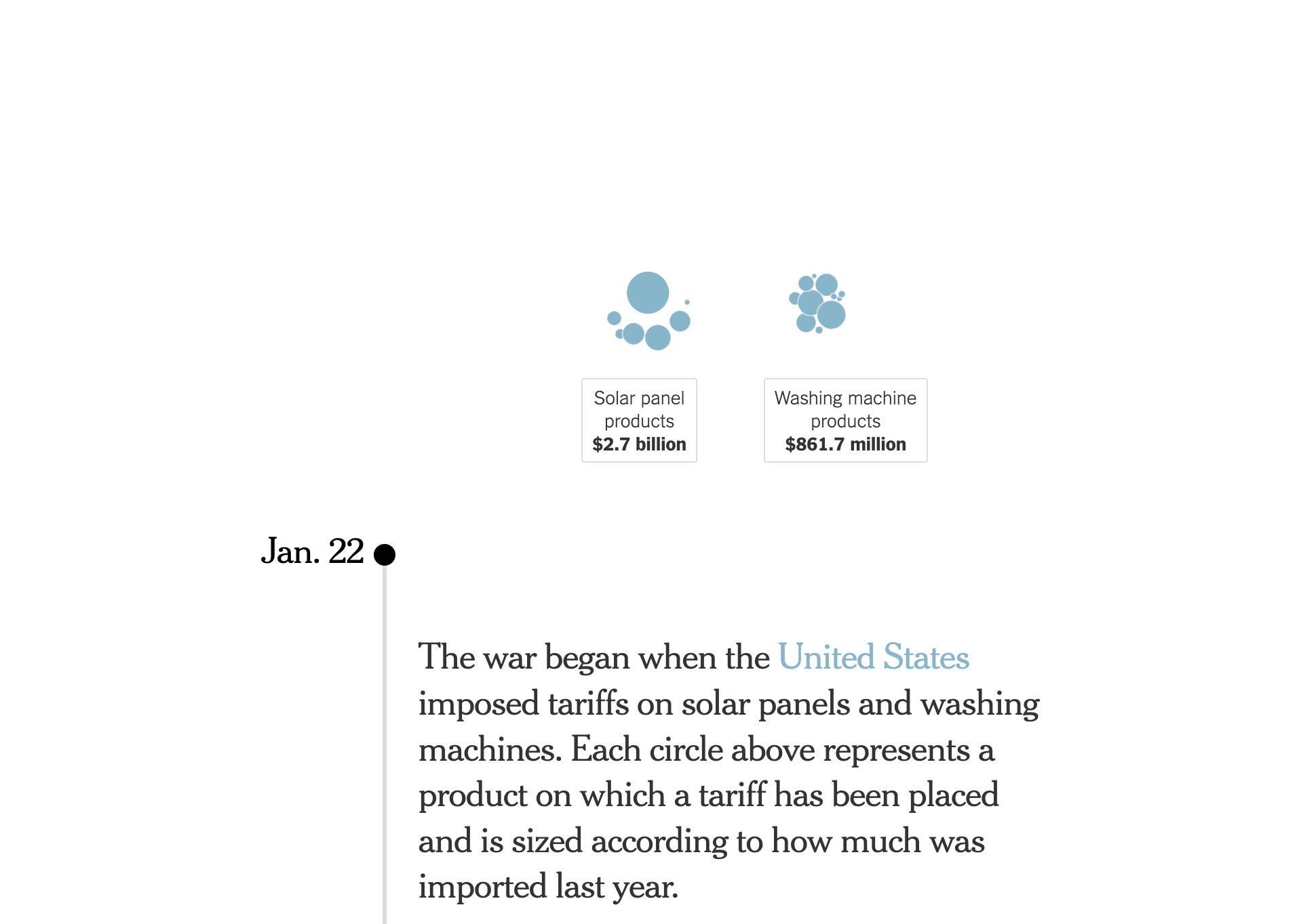
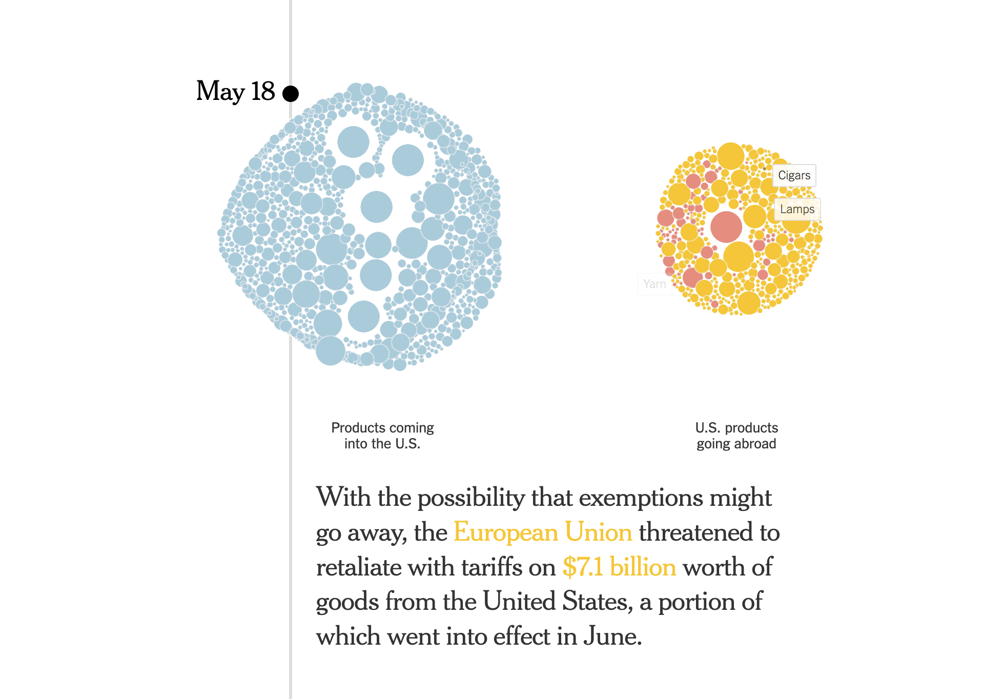
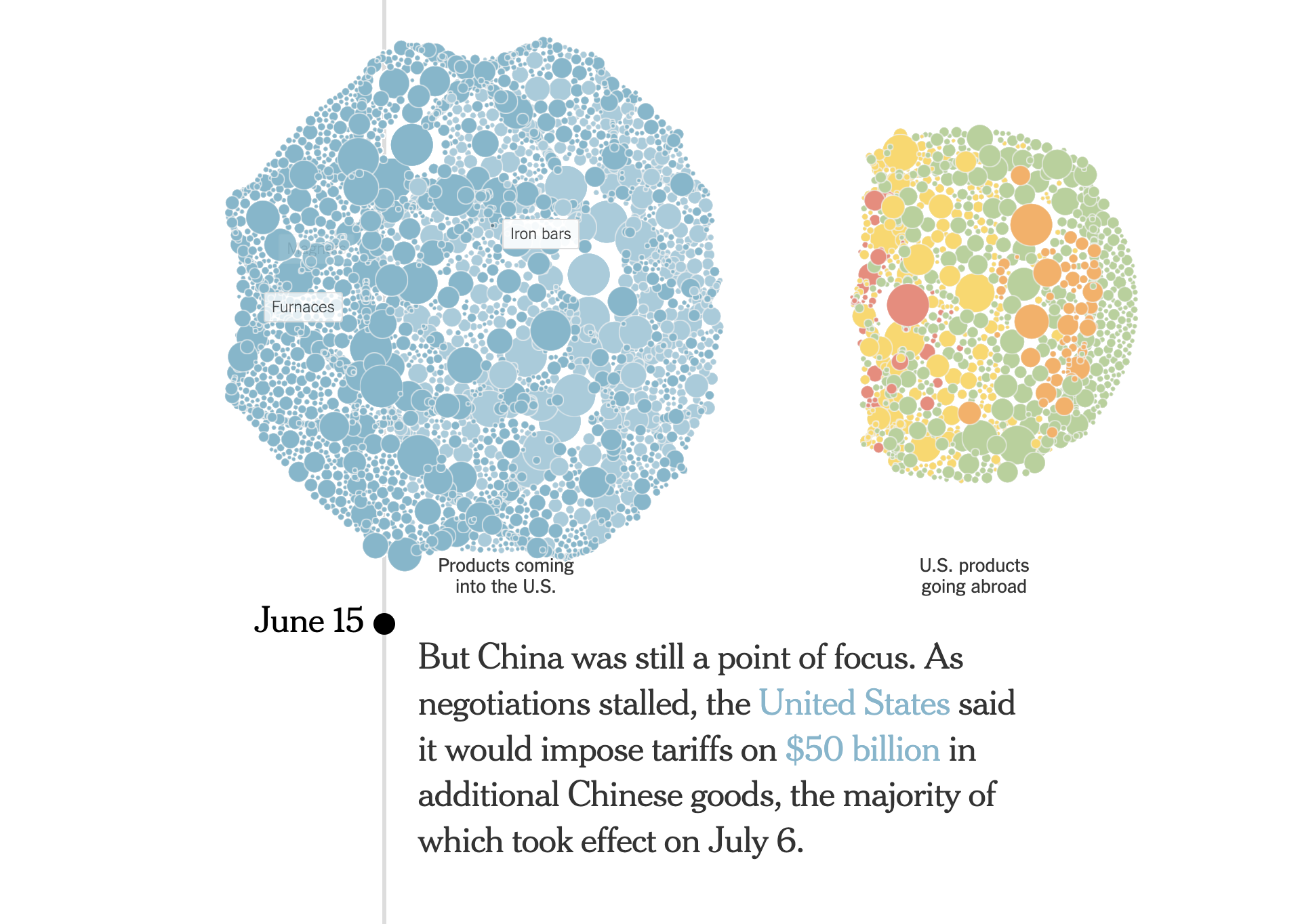
Source: How Trump’s Trade War Went From 18 Products to 10,000, nytimes.com
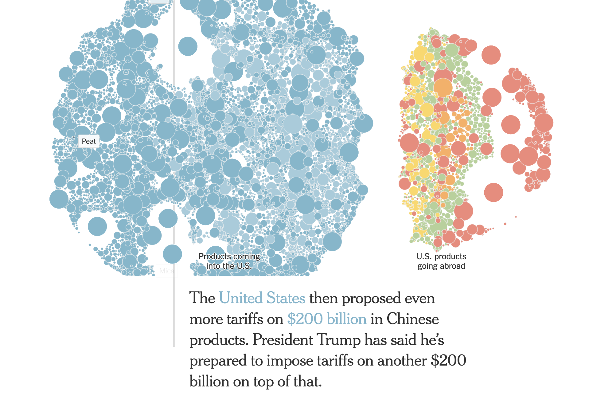
Source: How Trump’s Trade War Went From 18 Products to 10,000
The gradual visual reveal is also used in the racing bar chart about city populations (see Story patterns in data): the data is only shown up until the year the animation is currently at. This triggers curiosity: readers will want to know what the chart looks like in the years after that and at the end of the animation, showing the most recent available data.