Storytelling is all about making a connection with the reader. And there are some patterns that you can use to make that connection directly.
The first of these patterns is to translate big and abstract numbers and amounts to things that touch upon the daily lives of people. By concretising these big numbers, you make them more relatable to people.
The Reuters graphics team excels at this technique and has published some very nice examples. For example, in The messy business of sand mining explained they compare the amount of cement used over 10 years with the Great Pyramid of Giza:
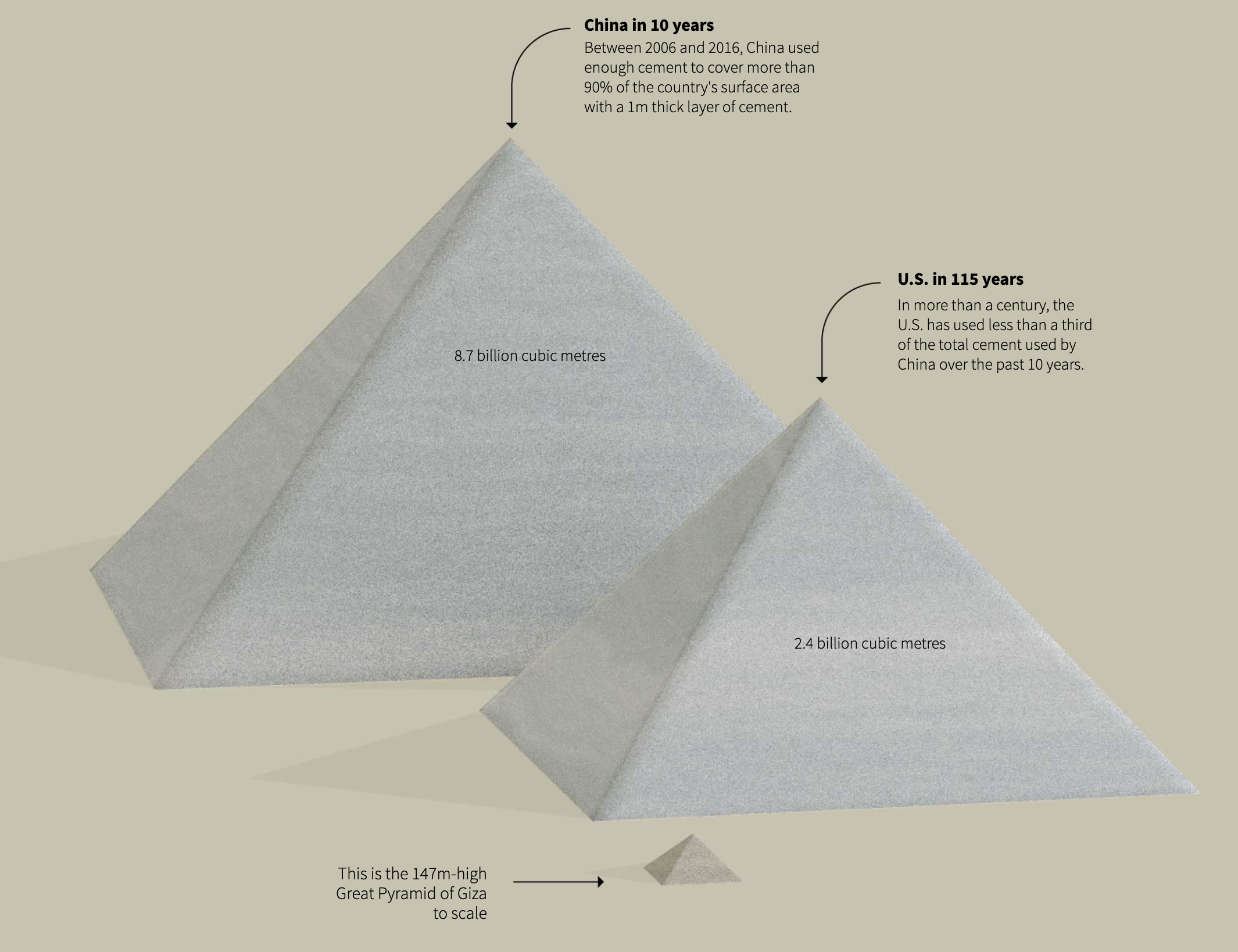
Source: The messy business of sand mining, graphics.reuters.com
Of course, this works less for readers who never saw the Great Pyramid in real life. But the article contains another example of concretising, and this time the comparison is made to something everyone is familiar with: the size of a human body.
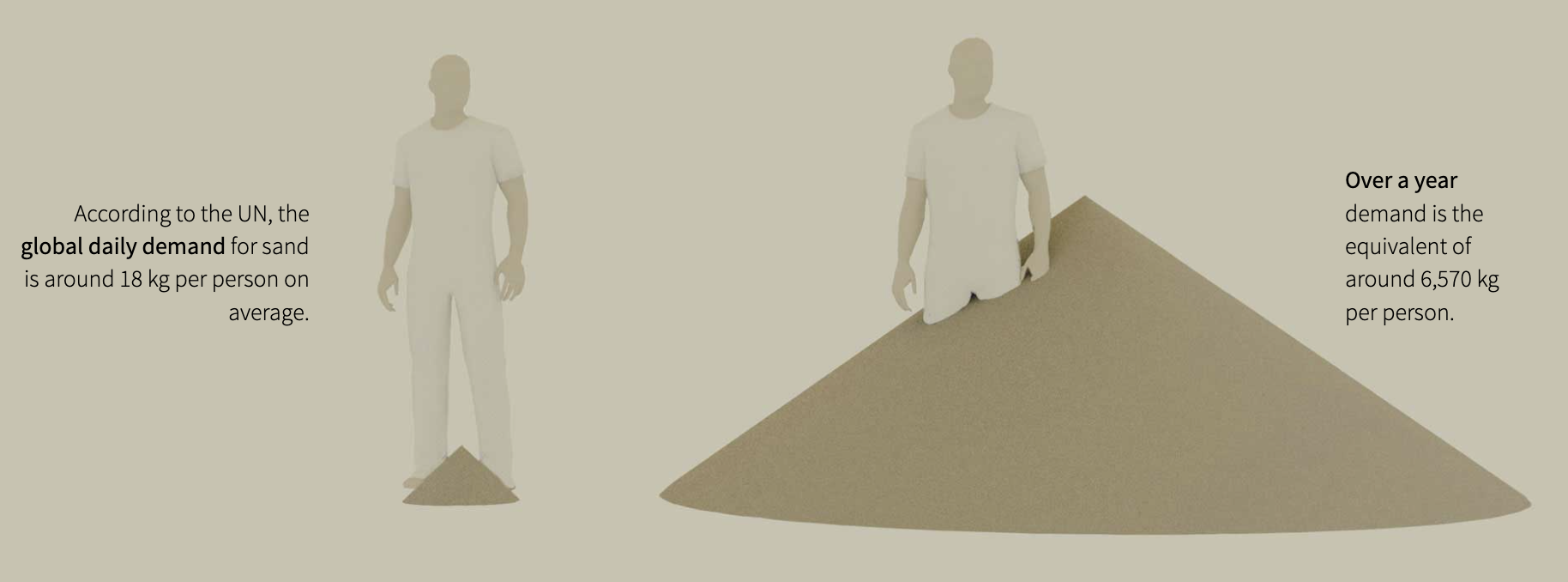
Source: The messy business of sand mining, graphics.reuters.com
In another piece they use a comparison with islands to make the size of giant iceberg A68a more relatable.
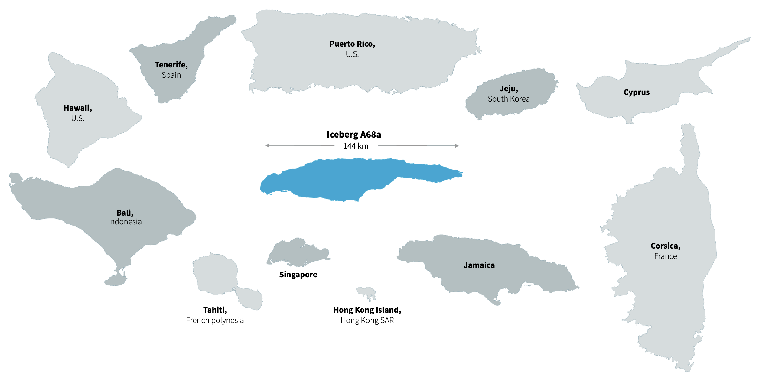
Source: World’s biggest iceberg heads for disaster, reuters.graphics.com
Concretising can also be applied to black boxes of models. Take for example this spreadsheet containing formulas to model Covid-19 aerosol transmission.
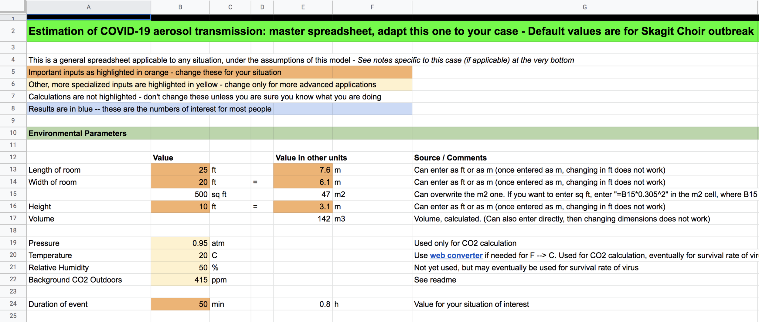
Source: COVID Airborne Transmission Estimator, Cooperative Institute for Research in Environmental Sciences, University of Colorado Boulder
The spreadsheet calculates the probability of people getting infected taking into account room characteristics (dimensions, amount of ventilation, …) and people behaviour (masking, crowding, movement). But for most people a spreadsheet like that is impossible to get any useful information out.
That is why Spanish newspaper El Pais turned the model into something concrete people can relate to: they drew the rooms and the people in it to show how covid-19 spreads under different circumstances.

Source: A room, a bar and a classroom: how the coronavirus is spread through the air, elpais.com
This approach paid off for the newspaper. The article, originally written in Spanish but later translated into English, went viral and became one of the most visited pages of the paper’s website.
Another engaging pattern is, instead of showing the data directly, to ask the reader what they think the data looks like first. The first article to use this pattern was You Draw It: How Family Income Predicts Children’s College Chances. The article asks you to draw what you think the relationship between parents’ income and the share of children attending college looks like.
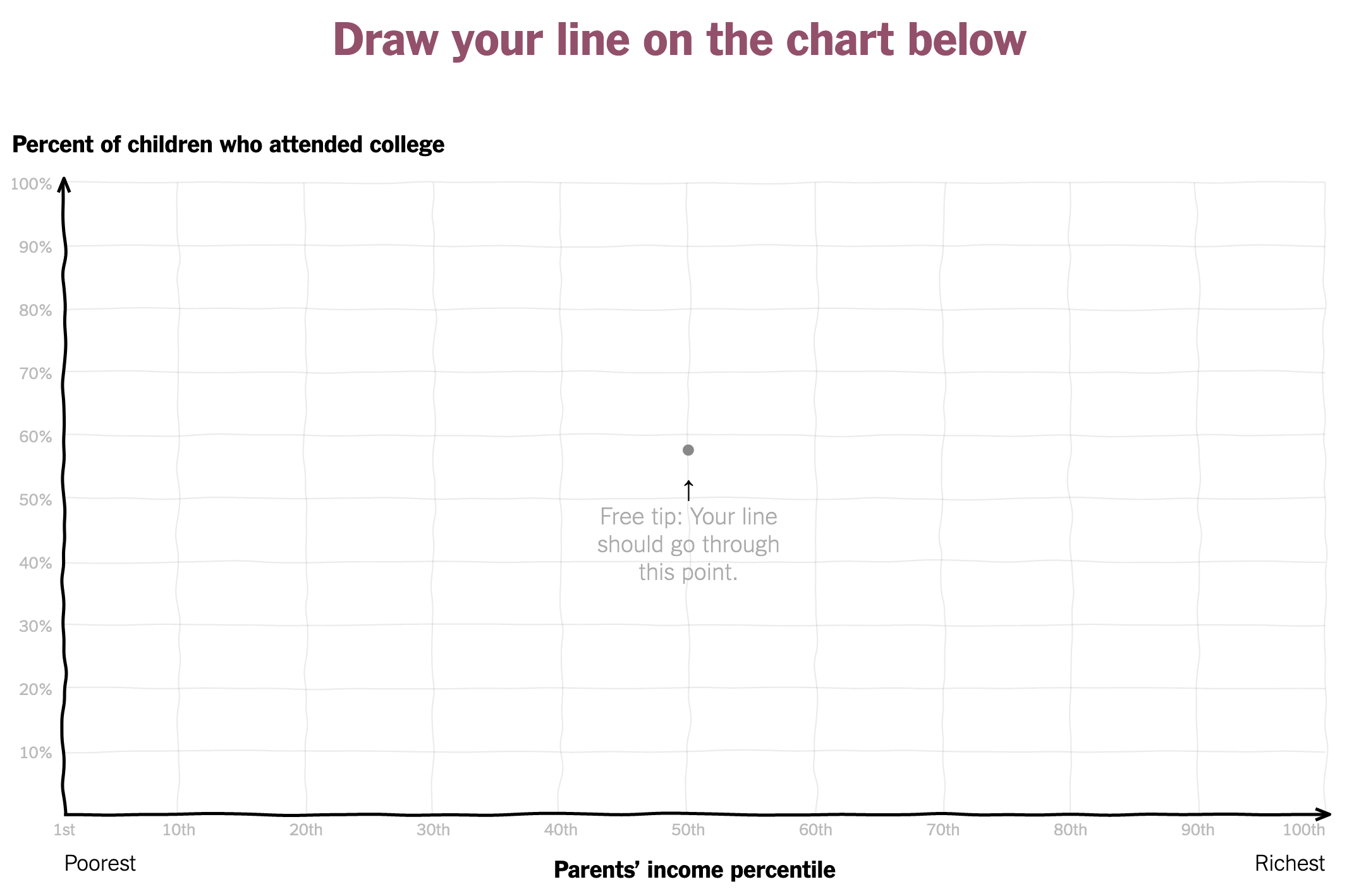
Source: You Draw It: How Family Income Predicts Children’s College Chances, nytimes.com
After drawing a curve and submitting it, you are presented with the real data and with a visualisation of how other people have drawn the curve.
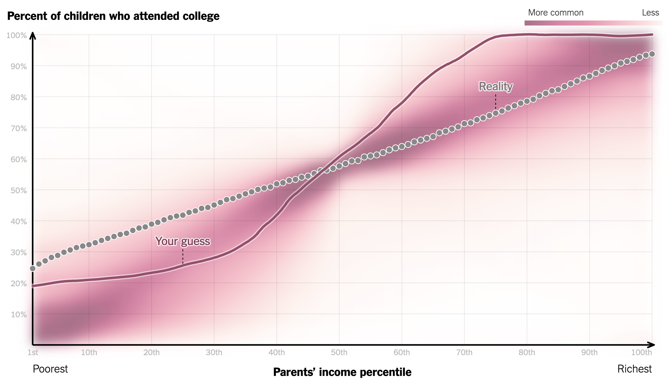
Source: You Draw It: How Family Income Predicts Children’s College Chances, nytimes.com
This “You draw it” pattern has become quite popular, and has been used by the Office for National Statistics from the United Kingdom too. In the chart below, you can draw a curve for how you think the average house price evolved over time in the UK.
Embedded from You draw the charts: 60 years of change, ons.gov.uk
Finally, a very powerful pattern is to show the humans behind the dots. In this pattern, visual marks representing humans reveal some kind of information about the person(s) they represent. It is much easier to empathise with a person than with a dot on a chart, and revealing some personal details reminds the reader of the fact that the visualised data represents real people like themselves.
This technique is closely related to the use of anthropographics.
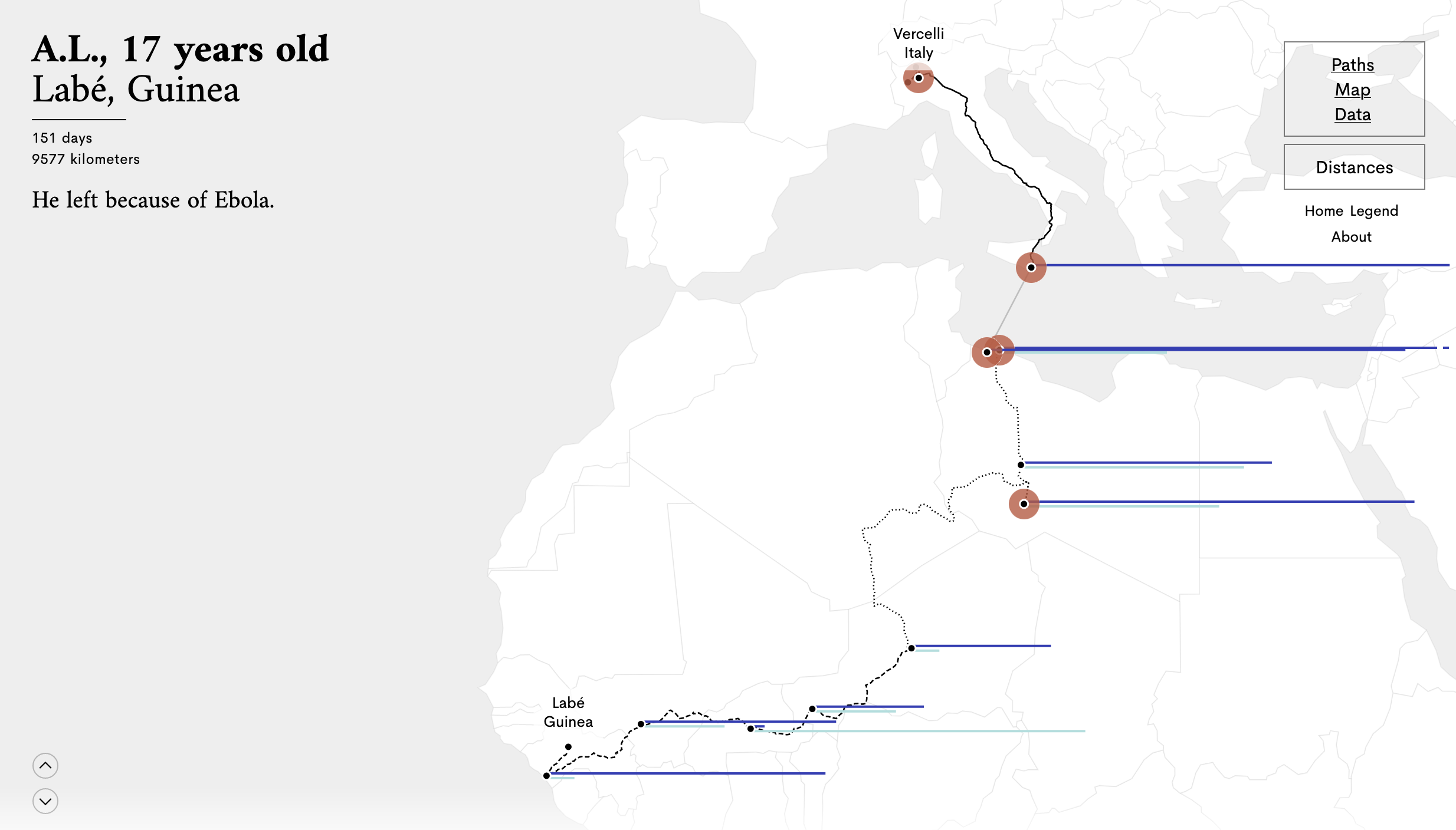
Stories Behind a Line tells the story of how seven migrants reached Europe after travelling long distances. The migrants are anonymous, but revealing their initials, their age and city and country of origin (see the top left), makes the stories a lot more personal. Source: storiesbehindaline.com
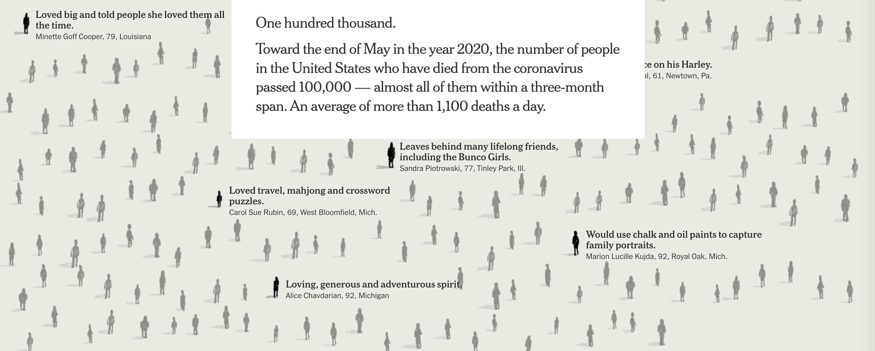
In May 2020, the Covid-19 death toll in the US reached 100.000 people. The graphics desk of the New York Times wanted to represent the number in a way that conveyed both the vastness of this number and the variety of the lives lost. They decided to use a text only approach, listing some of the deceased people, with their age, the place they lived and a little detail about their lives and what they meant for their community.

Source: The Project Behind a Front Page Full of Names, nytimes.com
Online, you can scroll through the names of the people, and the use of little silhouettes give you a sense of what was lost,
Source: An Incalculable Loss, nytimes.com
The scatterplot in What the Tax Bill Would Look Like for 25,000 Middle-Class Families reveals data about the household and financial situation of the families represented on it.
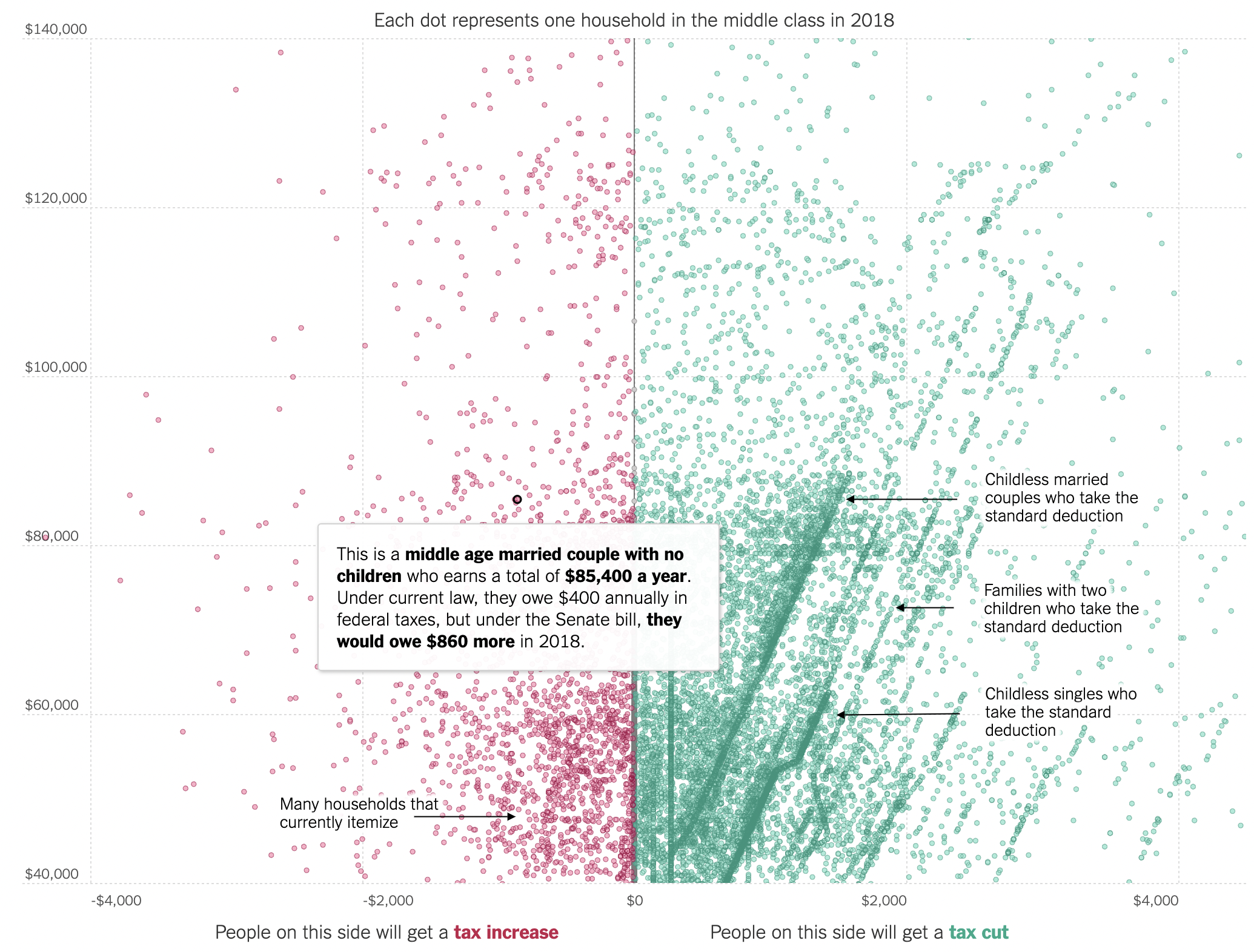
Source: What the Tax Bill Would Look Like for 25,000 Middle-Class Families, nytimes.com
A similar approach was used in the waffle charts in Beyond hunger: ensuring food security for all: hovering over one of the squares reveals details about the household composition, education level, level of income and risk of food insecurity of all households that participated in a survey:
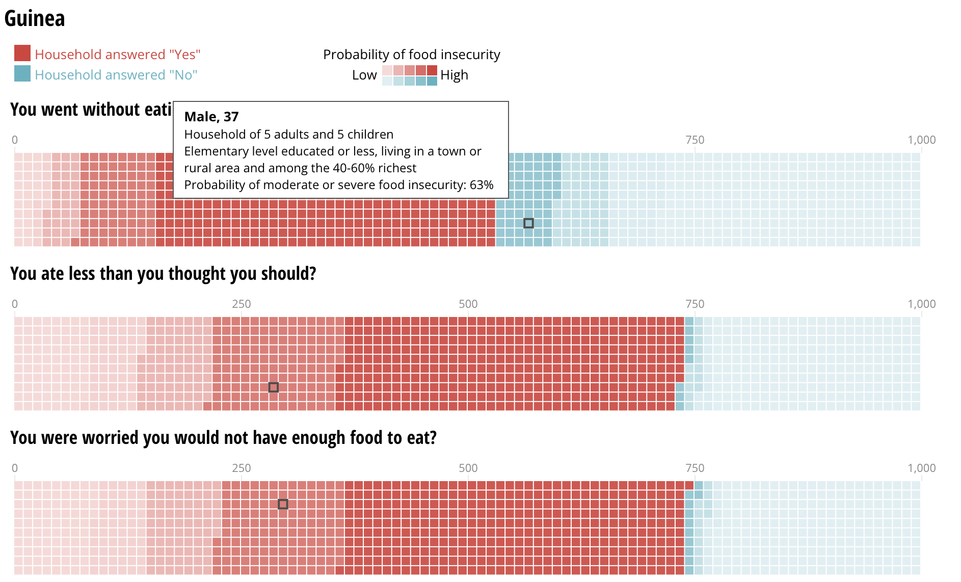
Source: Beyond hunger: ensuring food security for all, Sustainable Development Goals Atlas 2020, World Bank