Scales are at the heart of the Grammar of Graphics. Scales are the functions that turn the values of input variables into values for the aesthetics of geometric objects. Or, formulated a bit less abstract in the Vega-Lite documentation:
Scales are functions that transform a domain of data values (numbers, dates, strings, etc.) to a range of visual values (pixels, colors, sizes).
A simple scale
In order to understand scales, consider the following chart:
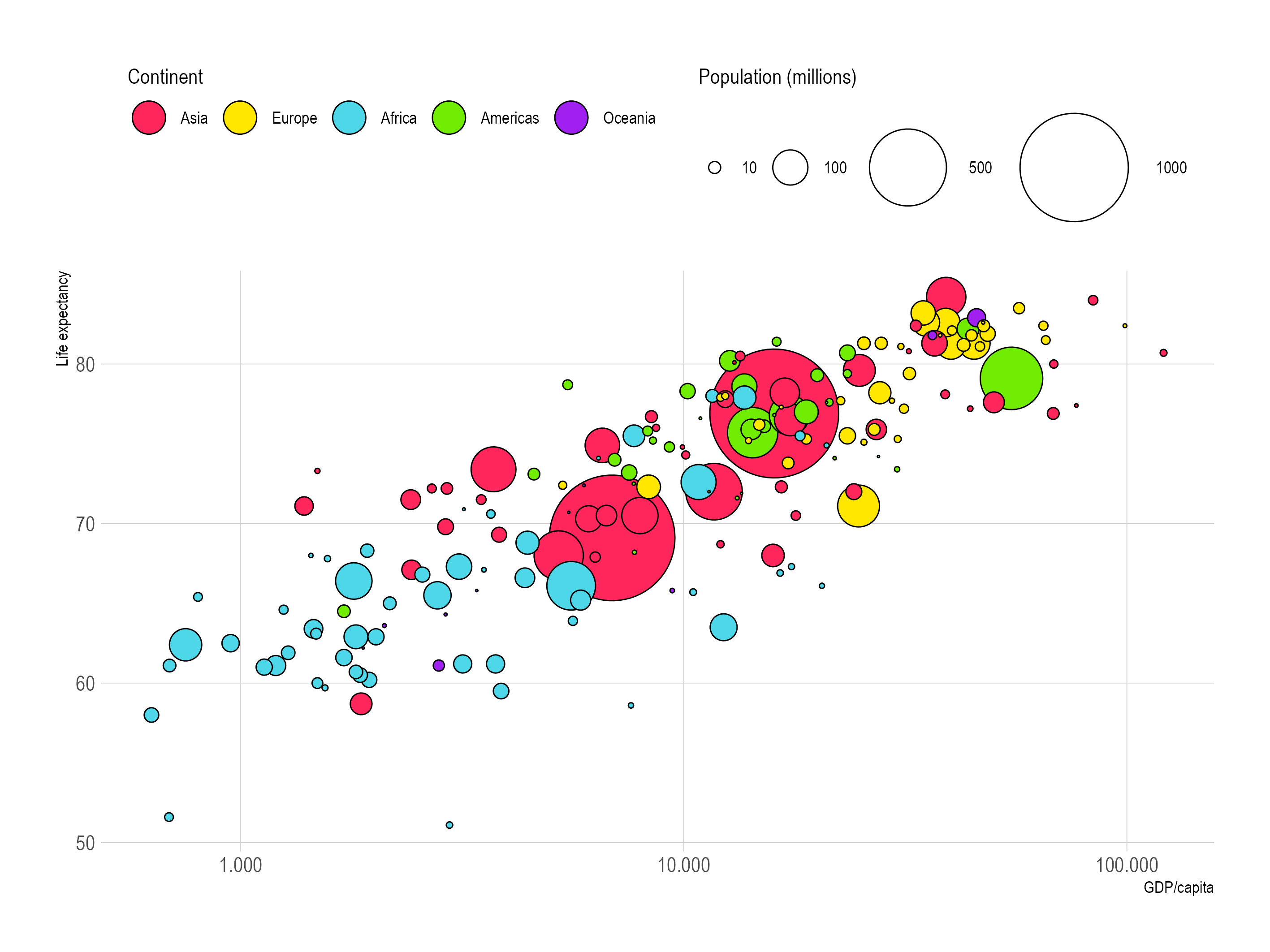
Source: Maarten Lambrechts, CC BY SA 4.0
This plot is based on a data set that looks like this:
| country | continent | population | life expectancy | income |
|---|---|---|---|---|
| China | Asia | 1.420.000.000 | 76,9 | 16.000 |
| India | Asia | 1.350.000.000 | 69,1 | 6.890 |
| United States | Americas | 327.000.000 | 79,1 | 54.900 |
| Indonesia | Asia | 267.000.000 | 72 | 11.700 |
| Brazil | Americas | 211.000.000 | 75.7 | 14.300 |
| … |
Let’s focus on the life expectancy variable first. It is mapped to the y aesthetic of the circle geometry. In this data set, the minimum life expectancy is 51,1 years (Lesotho), and the maximum life expectancy is 84,2 (Japan). The range of values a variable has in a data set is often called the domain of the variable. So in this case the domain for the y scale ranges from 51,1 years to 84,2 years.
Let’s suppose the height of the plot area is 400 pixels (the plot area is the space enclosed between the x and the y axis). The y scale is the function that will calculate the values for the life expectancy of the countries over the distance of 400 pixels, with 0 pixels at the bottom of the y axis to 400 pixels at the top. This interval, between the start and and of an axis, is often called the range of a scale.
In the simplest approach, the minimum value of the variable domain is mapped to the minimum value of the range, and the maximum value of the domain is mapped to the maximum value of the range.
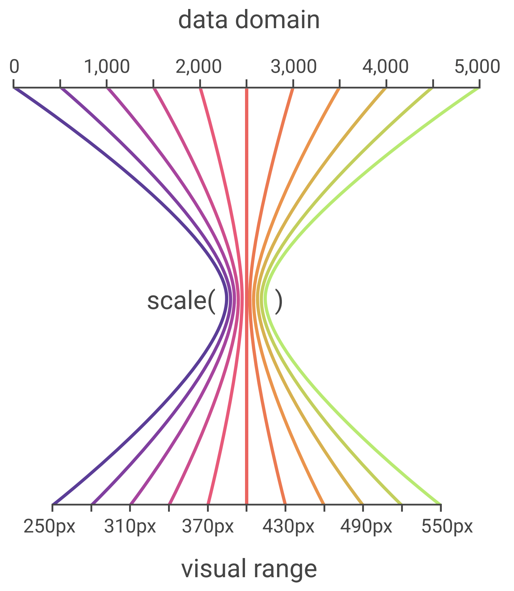
A visual representation of a scale that maps a domain of [0, 5000] to a range of [250 pixels, 550 pixels] Source: observablehq.com/@observablehq/plot-cheatsheets-layouts
This simple approach has some small issues, however:
- circles close to the top or the bottom of the range of the y scale might get cut off, or overlap with the ticks of the axis.
- because the lowest value in the domain (51,1) is close to the nice, round value of 50, we might want to include this value in the domain, so that we can display a tick label and grid line for this value.
To overcome both of these issues, Grammar of Graphics tools allow users to configure scales and set some options on them. For position scales (x and y scales) for example, these options that you can configure for the scale include:
- the minimum and maximum value of the scale
- the number of ticks, or the tick values to be displayed on the axis that is tied to the scale
- the formatting of the tick labels