Annotation highlights involve altering the appearance of some of the data marks in a visualisation to make them stand out. Data marks are the geometric elements that represent the items in a data set: the bars in a bar chart, the lines in a line chart, the dots in scatterplot, …
Highlighting can be done by differentiating the visual properties between the data marks to be highlighted and the other data marks. Highlighting can work in two directions: amplify a visual property of data marks to make them stand out more, or deamplify visual properties to dehighlight data marks and put them more in the background of the visualisation.
Colour is an obvious visual property to use in highlighting.
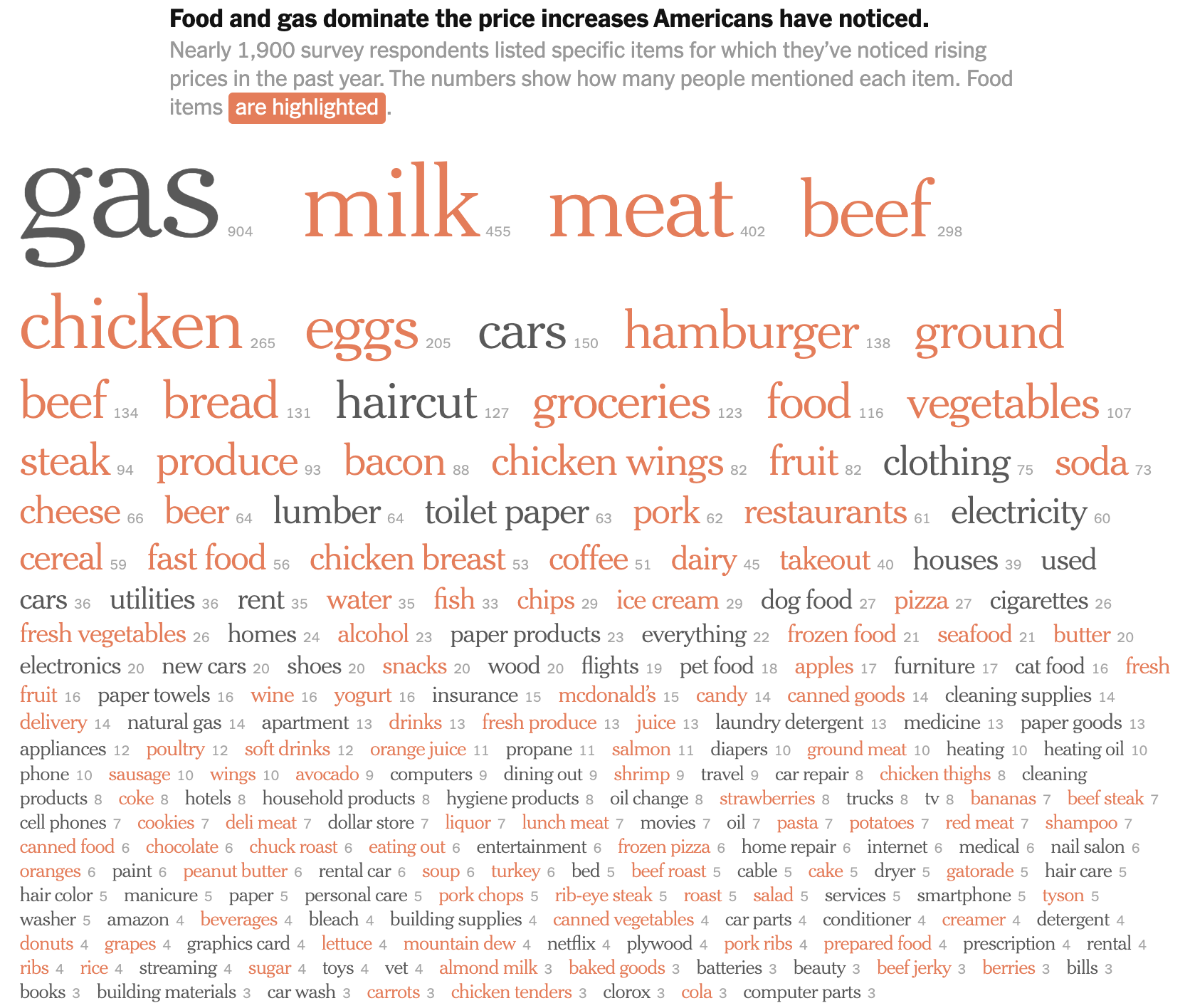
Source: Americans Say High Prices Are Hitting the Things They Need to Get By, nytimes.com
Other visual properties that can be used to highlight data marks are the stroke of visual elements (presence or absence of stroke, stroke colour, stroke widths).
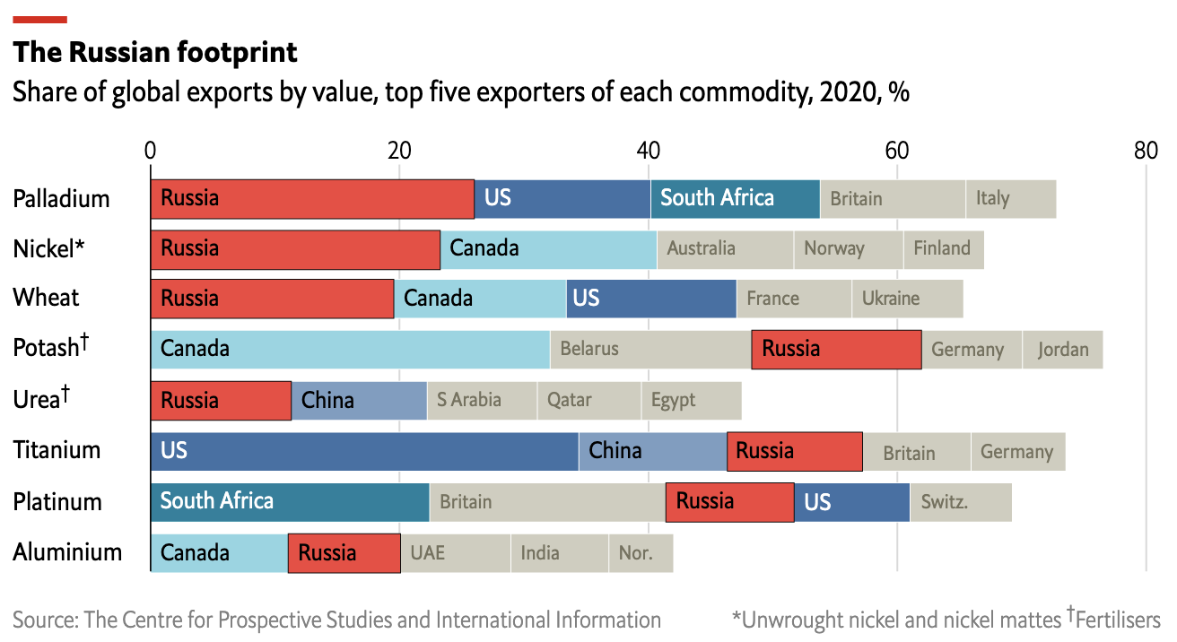
The above chart highlights the bars representing the share of Russia in global exports by adding a black stroke to these bars. The bars are also highlighted with colour: the red stands out from the blues and greys used for other countries. Source: How Russia’s war is reverberating through global goods markets, economist.com
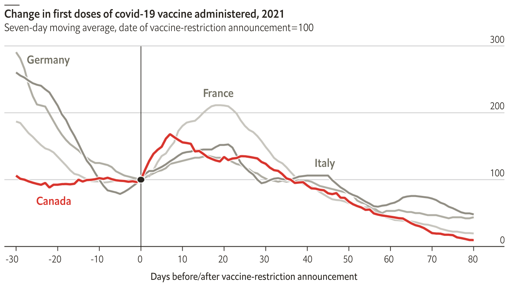
Colour and the stroke width work together to highlight the line for Canada in this chart. Source: Do vaccine mandates actually work?, The Economist
In some cases size can also be used as a property for highlighting. But when size is used for highlighting, there should be no confusion about data encoding: it should be clear that the differences in size serve highlighting purposes, and are not related to patterns in the underlying data.
When data marks are labelled (with data values, with names or with other text elements), the visual property used to highlight data marks can be copied into the styling of the labels: labels can copy the color and opacity of the data marks they belong to, for example. To make these labels highlighted, they can have bold styling or a bigger font size.
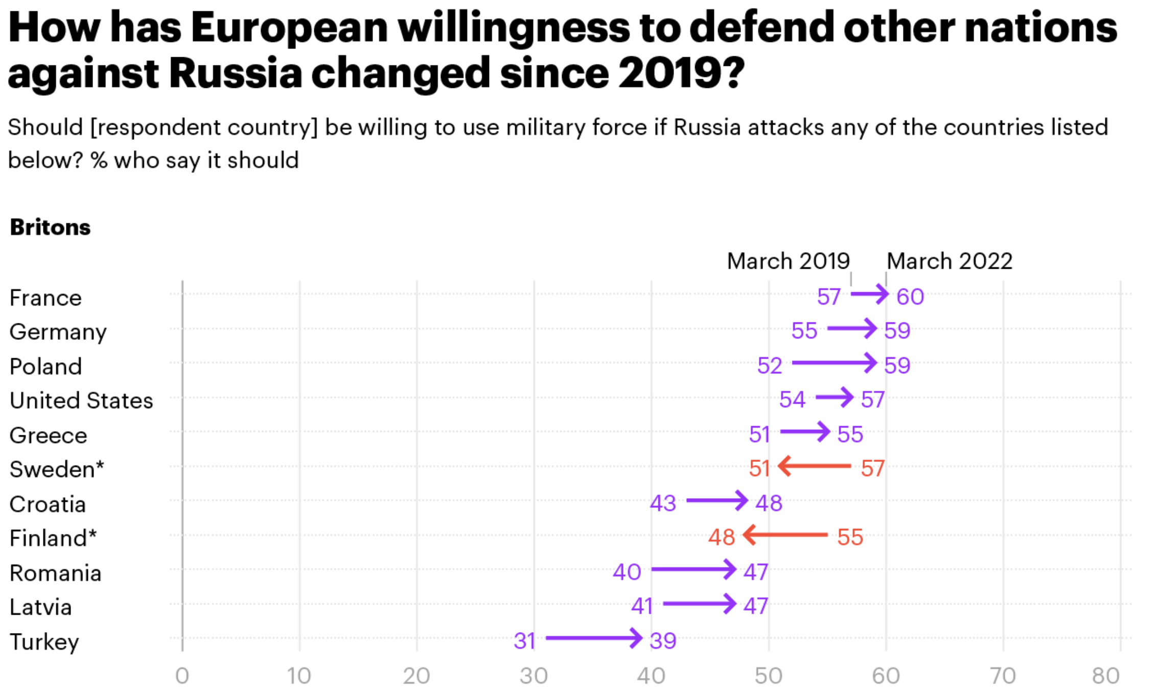
Source: What impact has the Russian invasion of Ukraine had on European attitudes to NATO?, yougov.co.uk
A common pattern in interactive visualisations is “highlighting on hover” or “highlighting on click”. With this technique, the hovered over or clicked data mark will receive visual properties to highlight it (intenser color, thicker stroke, …). Often a label or tooltip will appear showing text to identify the mark and show its value(s). Sometimes the other data marks in the visualisation will be dehighligted at the same time.
The chart embedded below is interactive and uses highlighting on hover. When you hover for a longer duration, the dots not belonging to the same category are removed from the chart. The bubbles have a white stroke, except the highlighted bubbles which have a black stroke. On hover, the hovered bubble gets a thick black stroke.
Source: datawrapper.de
The data marks to apply the highlighting to (the “highlighting targets”) depend on the message you want the visualisation to convey. These can be
- a single data point, around which the story is built. For example a country of interest among other countries
- a series of data points sharing an attribute in the underlying data. For example countries belonging to a region of interest among other countries
- data points sharing a common attribute not explicitly present in the data. For example countries with a numerical value below or above a certain threshold
- outliers: data points with extreme values
Instead of altering the appearance of some of the data marks on a chart, an additional layer with shape annotations can be added to a visualisation. Shapes can take the form of lines, arrows, curves, rectangles, circles, ellipses and other geometric elements.
Rectangles, ellipses, circles and irregular polygons or shapes can be used as an alternative for highlighting groups of data marks sharing common attributes. Enclosing data marks in a shape makes them stand out, signify their importance and cause the reader to compare the enclosed data marks to the ones outside of it.
Often these enclosing shapes are accompanied by explanatory text annotations.
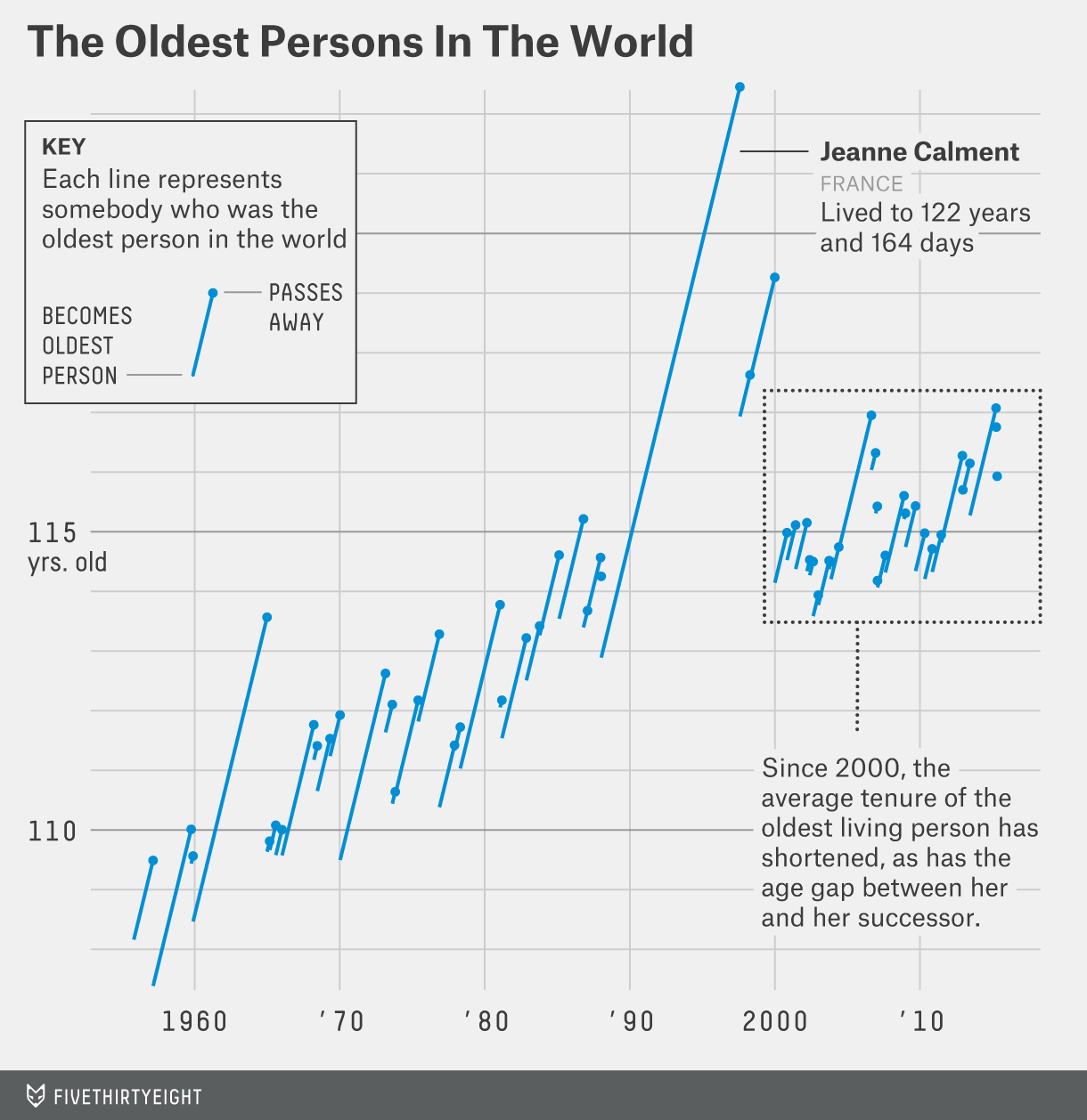
Source: Why the oldest person in the world keeps dying, fivethirtyeight.com
Triangle like shapes highlight part of the main line in the chart below. Also notice the use of 3 different strokewidths for the lines, the use of colour, and the white outline for the line of the year 2018.
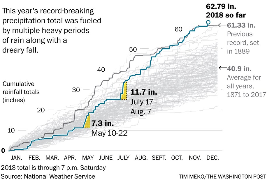
Source: Drenched city: 2018 is now Washington’s wettest year ever recorded, washingtonpost.com
Shape annotations can serve other purposes than highlighting data marks too. Lines and curves can illustrate trends in the underlying data. These shapes can be illustrative in nature, or their shape can be calculated from the data.
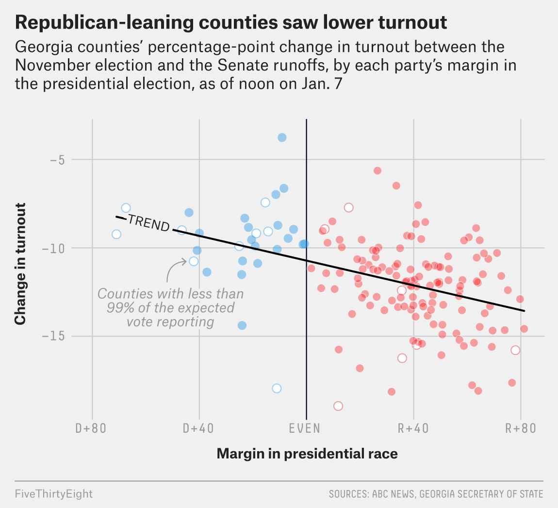
An example of a trend line derived from underlying data. Source: How Democrats Won The Georgia Runoffs, fivethirtyeight.com
![]()
Illustrative curves with arrow heads provide additional information to explain the trends in this line chart showing Covid-19 infection fatality ratio in England. Notice the added blue dotted lines and annotions to make a comparison between the fatality ratio of covid and influenza. Source: @jburnmurdoch
Instead of referring to the data itself, shape annotations can target the axes of a chart. For example, charts with a time axis (usually the x axis) can be visually annotated to indicate specific moments in time, or the start and end of time intervals relevant to the chart’s message
A vertical line highlights a specific moment in time on the x axis. Source: Jen Christiansen, COVID’s Uneven Toll Captured in Data, Scientific American
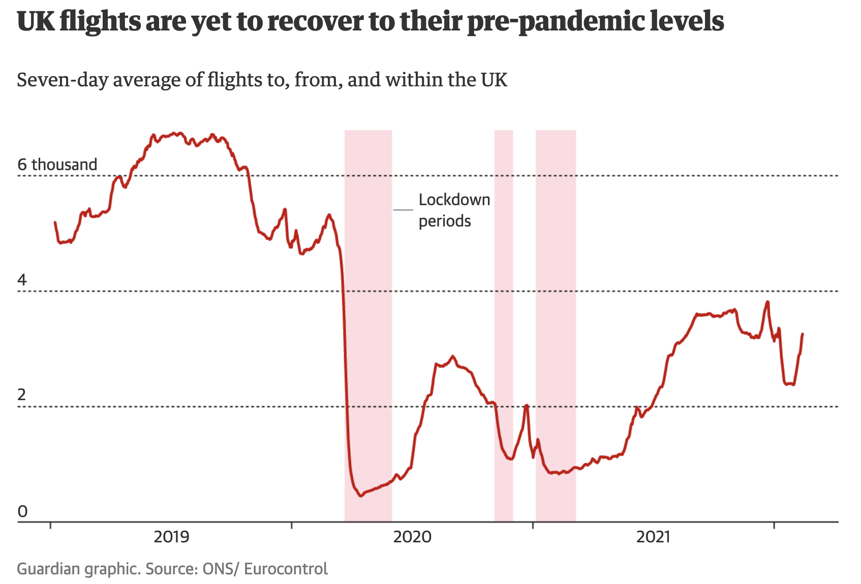
Rectangles highlighting time intervals on this line chart showing the number of flights in the UK. Source: Lockdown lifestyles: how has Covid changed lives in the UK?, theguardian.com
Highlighting regions can also be done on charts with other axes than time axes.
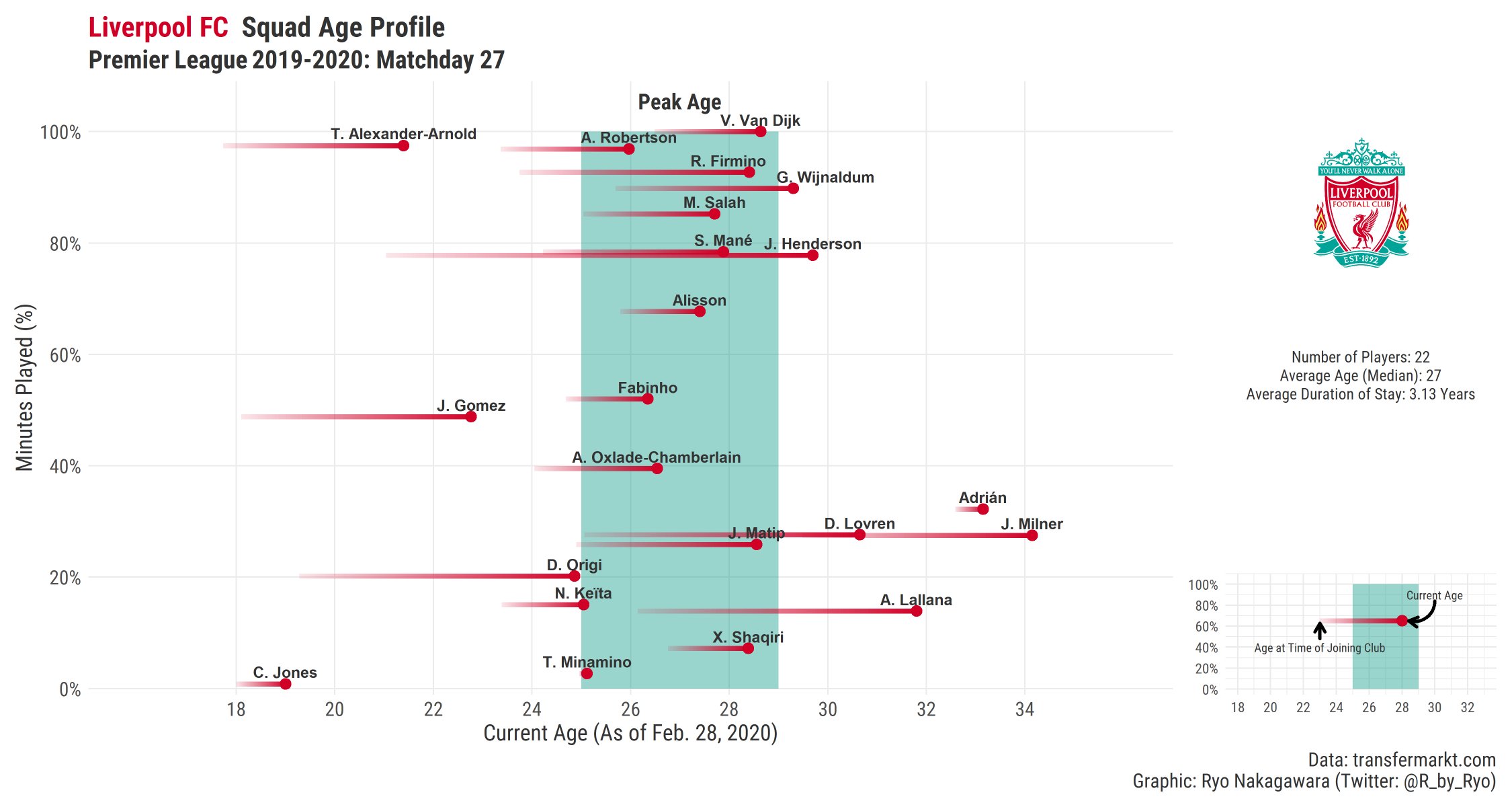
Source: Ryo Nakagawara
Stories around numerical values being under or over a certain threshold can benefit from making these thresholds visually explicit by adding lines showing the value of these thresholds on an axis. The same is true for targeted values: showing how far data values are still away from reaching a target, or how far values have already overshot a set target or often the crux of the story.
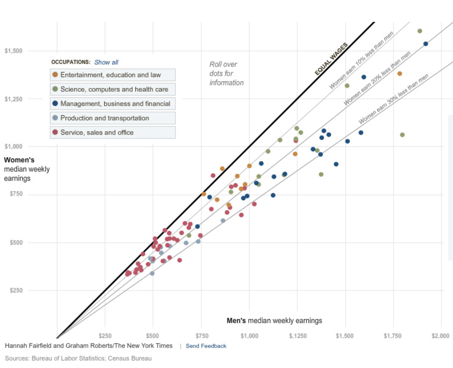
A classical example of lines showing thresholds. The diagonal lines show how much women in different sectors of the economy earn less then men. Source: Why Is Her Paycheck Smaller?, nytimes.com
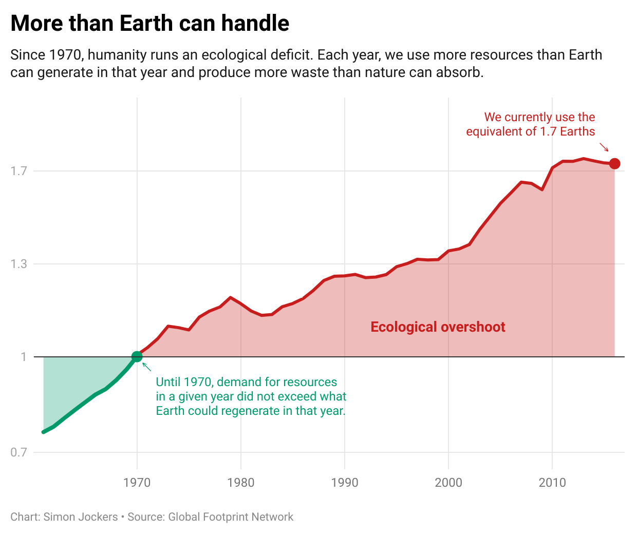
A horizontal line showing a threshold. The coloured areas showing the deviation of the values from the threshold reinforce the message of the chart. Source: There are no 1.7 Earths, datawrapper.de