Visual annotations can also be used to indicate values that provide information about the distribution of the data values visualised.
A line on a bar chart can indicate the median or mean of the values of all bars, for example. This can help the reader in assessing whether the value of a bar can be considered “low” or “high”.
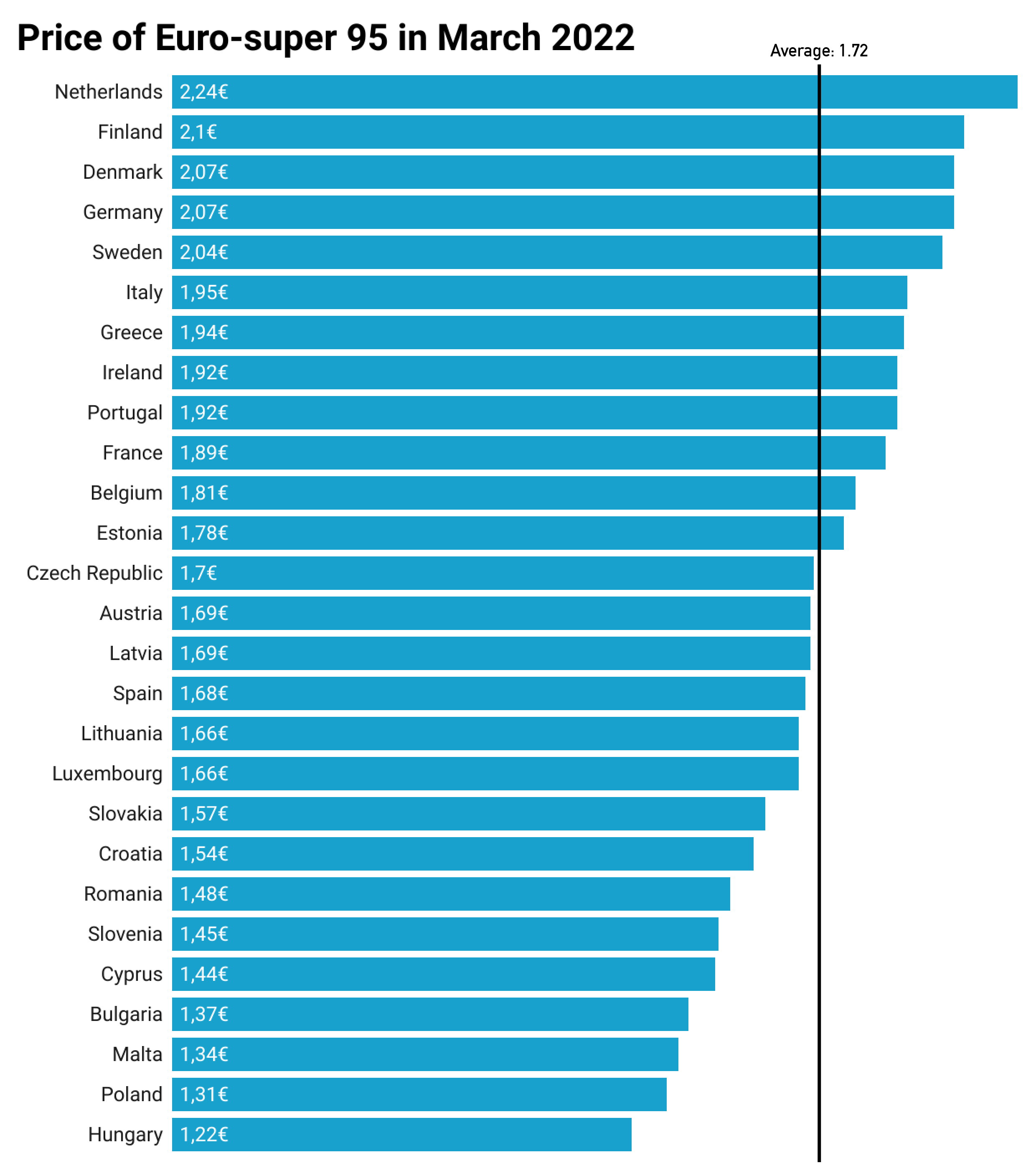
Source: Maarten Lambrechts, CC-BY 4.0
Adding lines for the medians in a scatterplot can serve as a powerful storytelling mechanism: the medians for the x and y values create 4 quadrants that can be used to classify the data marks into 4 categories for x and y values (”low-low”, “low-high”, “high-low” and “high-high”).
This interactive chart uses the “medians-quadrant” visual annotation technique. Notice how the chart makes use of multiple highlighting annotations: the bubbles in each quadrant have 4 different colours , with the ones on the left highlighted and the ones on the right dehighligted, the labelled bubbles have subtle outlines, and when hovered, bubbles get a strong outline. Source: The millennials who are making it, axios.com
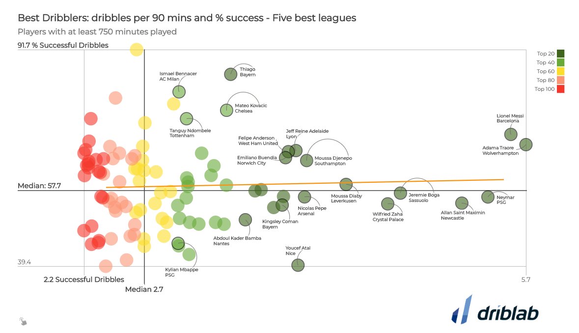
Source: @driblab
Visual annotations can also be used to highlight the range or spread in data values by highlighting the distance between minimum and maximum values.
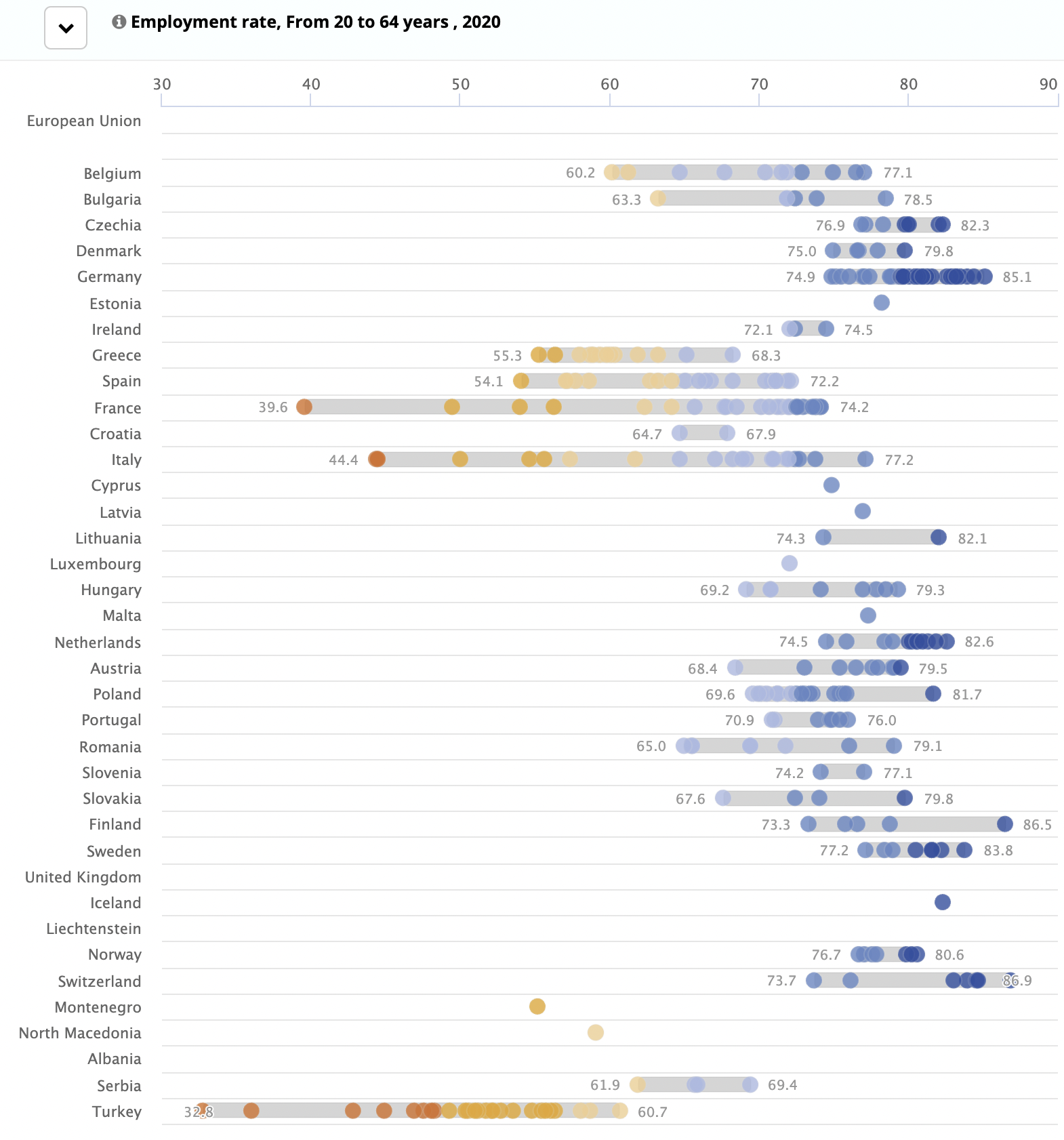
The range of values for the regions in each country are highlighted with a grey rectangle in the background. Notice how the minimum and maximum values are also highligted with added data labels. Source: Regions and Cities Illustrated, Eurostat
When differences between two time series are relevant for the message of a chart, it makes a lot of sense to highlight them by applying some colour to the area between. Scottisch data visualisation pioneer William Playfair, applied this technique in the first line charts ever made:
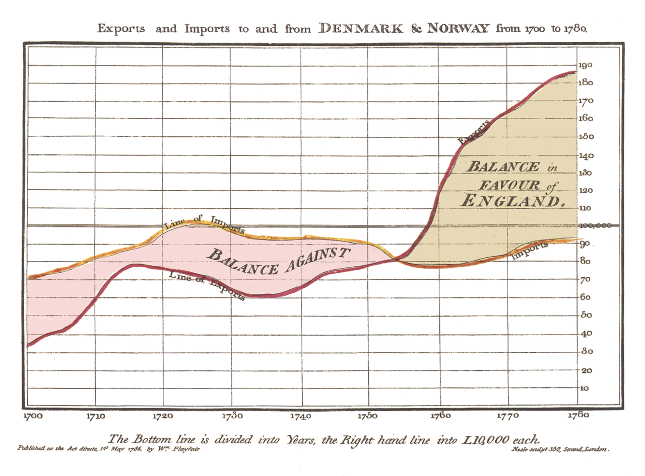
Highlighted time series differences in the first line chart ever produced. Source: The Commercial and Political Atlas, William Playfair, public domain
Colour legends can be used to give additional information on the distribution of values, like showing the highest and lowest values. They can even be turned into histograms to show the distribution of the values in the data set.
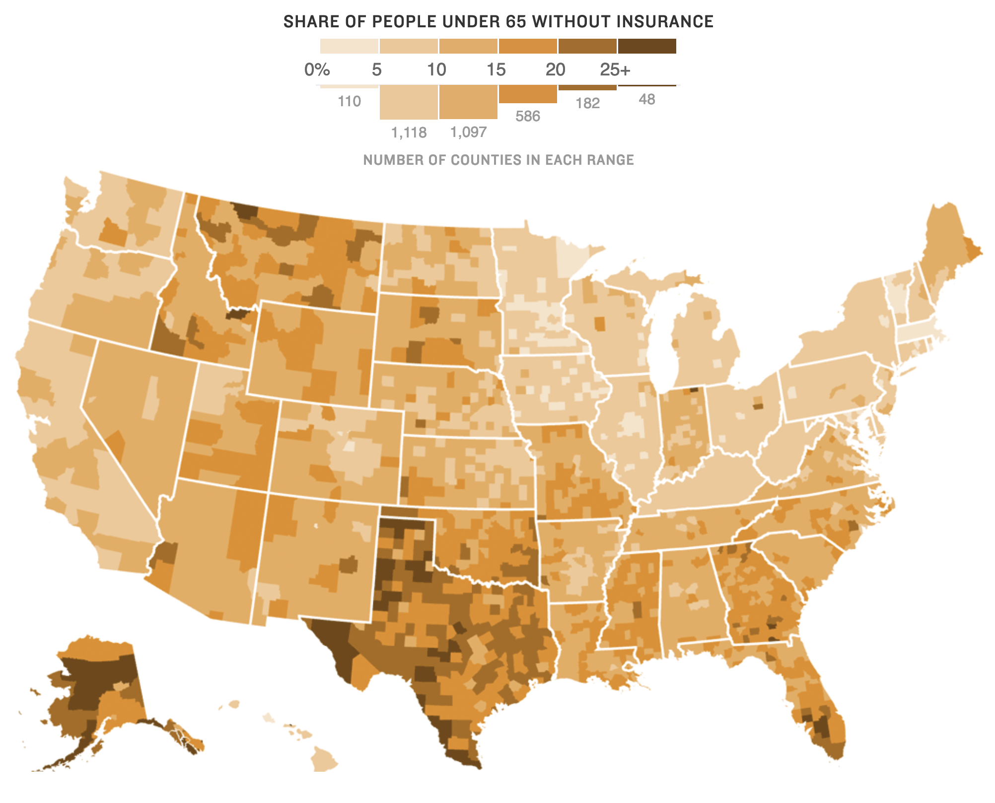
Source: Maps Show A Dramatic Rise In Health Insurance Coverage Under ACA, npr.org