The scatterplot shown below contains a regression line showing the trend in the data. To help the understanding, this trend line should be explicitly annotated. The line could be annotated with a generic annotation, like “Trend line”, but better would be to annotate it with text reinforcing the take away message of the chart, like “Higher sugar consumption is associated with higher numbers of decayed teeth”.
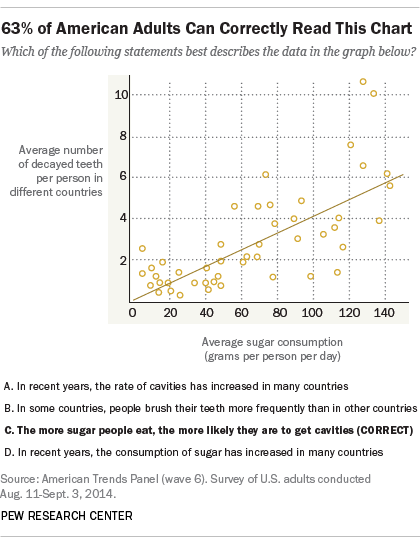
Source: The art and science of the scatterplot, pewresearch.net
The trend line in the Pew scatterplot divides the scatter plot into two regions: the region above the line contains the countries with people having relatively high numbers of decayed teeth, and in the countries below the line people have low numbers of decayed teeth. If the countries below the line would have some shared characteristic relevant to the story (like high per capita numbers of dentists, good government policies on dental care, …) the area below the and above the trend line can also be explicitly labelled.
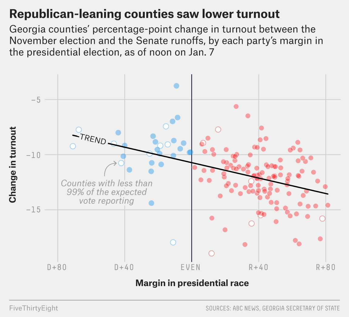
An explicitly labelled trendline. Source: fivethirtyeight.com
When the observed correlation in the data is not a linear one, you could use other regressions techniques. See Smoothing lines for some examples.