Many graphs are not hierarchies: the edges between the nodes go beyond strict parent-child relationships. For example, the edges can be (bi)directional: on Twitter you can follow someone, that person could follow you, or you could be mutual followers. The edges can be any arbitrary kind of relationship between nodes, and edges can have their own properties.
In those cases the graph is not a hierarchy, and the chart types discussed above are not valid anymore. So other techniques must be used.
The most basic representation of a graph is the matrix (also called adjacency matrix). In the matrix, all nodes in the graph are listed in both the columns and the rows, and the edges between each pair of nodes are represented at each crossing of a row and column, with a 1 for an edge and a 0 for no edge.
Consider this simple graph, with 6 nodes:
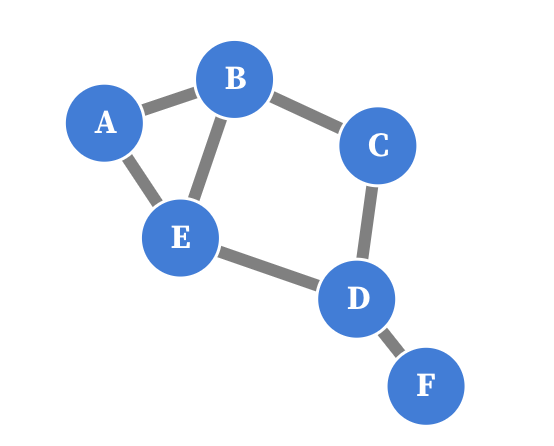
Source: Maarten Lambrechts, CC BY SA 4.0
The adjacency matrix of this graph looks like this:
| Node | A | B | C | D | E | F |
|---|---|---|---|---|---|---|
| A | 0 | 1 | 0 | 0 | 1 | 0 |
| B | 1 | 0 | 1 | 0 | 1 | 0 |
| C | 0 | 1 | 0 | 1 | 0 | 0 |
| D | 0 | 0 | 1 | 0 | 1 | 1 |
| E | 1 | 1 | 0 | 1 | 0 | 0 |
| F | 0 | 0 | 0 | 1 | 0 | 0 |
Because this graph is undirected (the edges have no direction), the matrix is symmetrical, and because there are no loops (nodes with an edge to themselves), the diagonal contains only zeroes.
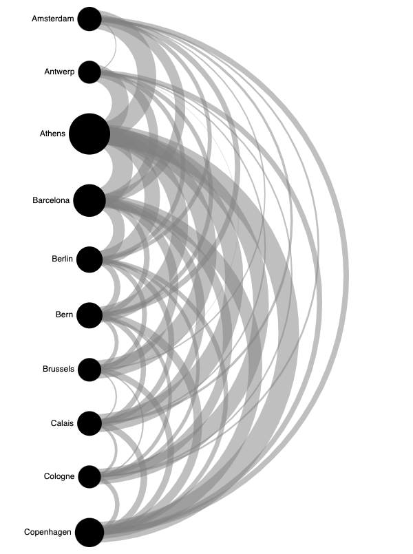
When the edges have a numerical property, like the distance between nodes, the matrix becomes a distance matrix. Below is a distance matrix of driving distances between some European cities.
| Distance (km) | Amsterdam | Antwerp | Athens | Barcelona | Berlin | Bern | Brussels | Calais | Cologne |
|---|---|---|---|---|---|---|---|---|---|
| Amsterdam | 0 | 160 | 3082 | 1639 | 649 | 875 | 209 | 385 | 280 |
| Antwerp | 160 | 0 | 2766 | 1465 | 723 | 704 | 46 | 211 | 237 |
| Athens | 3082 | 2766 | 0 | 3312 | 2552 | 2627 | 3021 | 2976 | 2562 |
| Barcelona | 1639 | 1465 | 3312 | 0 | 1899 | 913 | 1419 | 1399 | 1539 |
| Berlin | 649 | 723 | 2552 | 1899 | 0 | 986 | 782 | 936 | 575 |
| Bern | 875 | 704 | 2627 | 913 | 986 | 0 | 655 | 854 | 583 |
| Brussels | 209 | 46 | 3021 | 1419 | 782 | 655 | 0 | 212 | 219 |
| Calais | 385 | 211 | 2976 | 1399 | 936 | 854 | 212 | 0 | 431 |
| Cologne | 280 | 237 | 2562 | 1539 | 575 | 583 | 219 | 431 | 0 |
The numbers in a distance matrix can be used to size and/or colour shapes, which is sometimes called a matrix plot.

Source: made with RAWgraphs, Maarten Lambrechts CC BY SA 4.0
In the matrix plot above, the cities are sorted alphabetically. The way a matrix plot looks depends heavily on the sorting of the rows and columns. You can see that when comparing the matrix above with the one below, which is sorted according to the sums of the driving distances for every city.

Source: made with RAWgraphs, Maarten Lambrechts CC BY SA 4.0
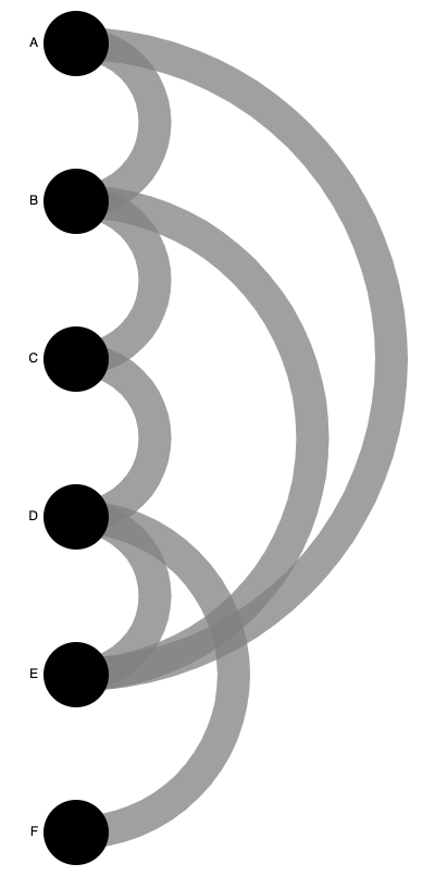
Another way of presenting a distance matrix (which can contain other numerical properties than physical distances between nodes), is an arc diagram. In an arc diagram the nodes are laid out next to each other, and the edges are represented as arcs of which the width is scaled according to the value of their numerical properties.
Source: Maarten Lambrechts, CC BY SA 4.0
As you can see from the example above, arc diagrams do not scale very well for larger distance matrices: because there is a lot of overlap in the arcs, the diagrams become busy with only a limited amount of nodes.
Arc diagrams work better for graphs in which the number of nodes are limited. If we go back to the simple graph from the beginning of this section, we can turn it into an arc diagram too.
Source: Maarten Lambrechts, CC BY SA 4.0
Source: Maarten Lambrechts, CC BY SA 4.0
When the nodes are not arranged next to or above each other, another method to arrange the nodes in the graph must be used. A popular way to do this is to use a simulation of forces attracting and repulsing the nodes in the graph. In the simulation, all nodes are pushed away from each other, but the edges between nodes hold the connected nodes together.
The initial position of the nodes in the simulation does not matter much, and the simulation runs until an equilibrium between the attracting and repulsing forces is reached. Embedded below is an example of a force directed graph. To see the simulation in action, click and drag one of the nodes in the graph. You will notice that the graph reaches a new equilibrium quickly.
Below is a more complex force directed graph. It shows how 300 popular recipe ingredients are used together in a collection of 178.000 recipes. You can pan and zoom the graph, and hover each ingredient to get more details.