When a graph is directed (the edges have a direction, from a source node to a target node) and the edges are weighted (they have a numerical property attached to them), the flows through the graph can be visualised as a Sankey diagram.
Below is a Sankey diagram that shows how energy in the US is converted or transmitted before being consumed or lost.
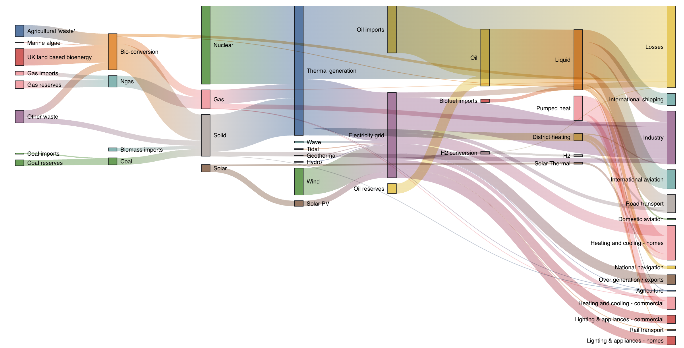
Source: Mike Bostock, observablehq.com
The Sankey diagram is named after Matthew Henry Sankey, who created the first Sankey diagram to show the flow of energy in a steam engine.
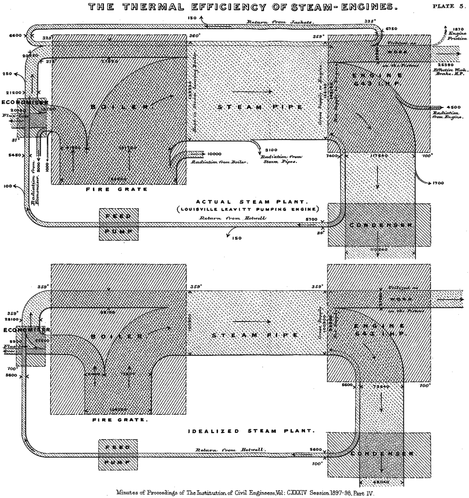
Source: M. H. Sankey, public domain
The original Sankey diagram has loops: part of the condensed water in the steam engine is pumped back into the boiler. In many Sankey diagrams made today, the flow goes in only one direction: from source nodes to target nodes. If there is a flow from a downstream target back to an upstream source (or from a target to itself), this creates a loop in the Sankey diagram.
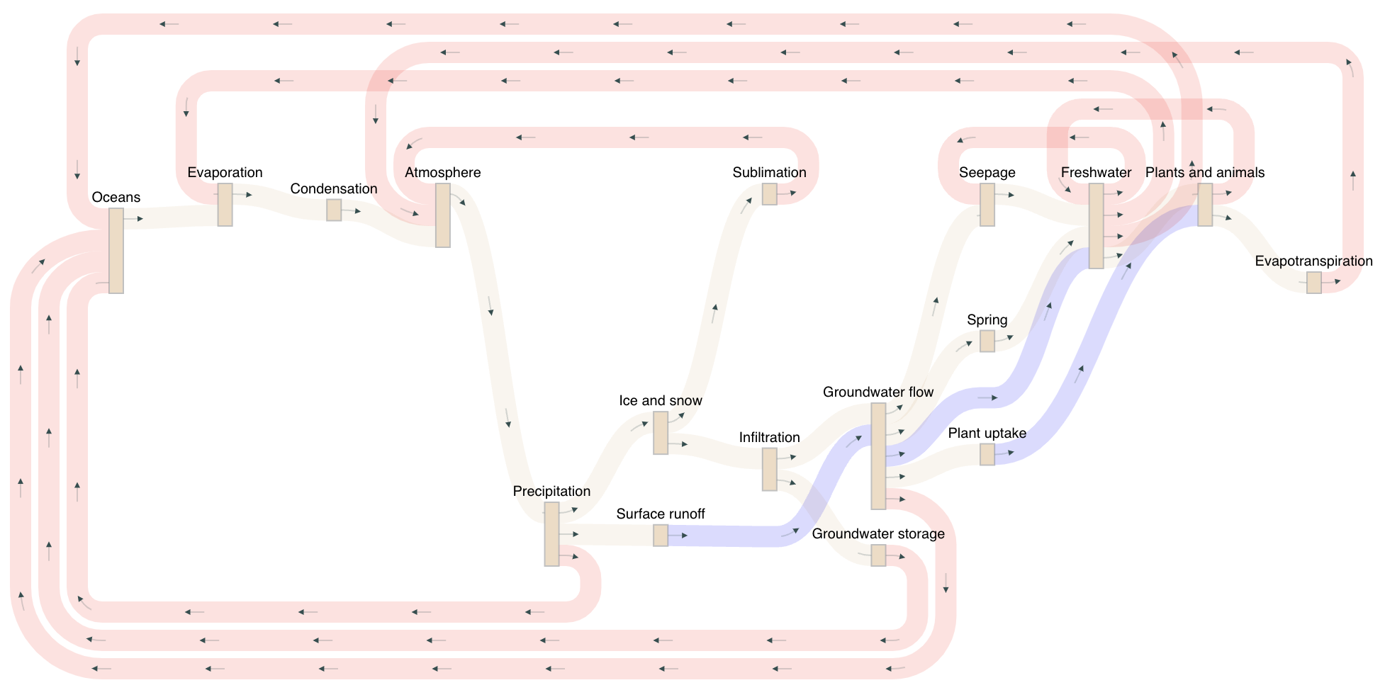
Source: Tom Shanley, observablehq.com
Alluvial diagrams may look similar to Sankey diagrams (and the distinction between both is a bit blurry), but they are mainly used to show how data is distributed over multiple categories. Below you can find an alluvial diagram showing the breakdown of some characteristics of hate crimes registered in New York City.

Source: made with RAWgraphs, Maarten Lambrechts CC BY SA 4.0
Alluvial diagrams can also be used to show changes between categories on 2 moments in time, like differences in vote shares between elections.
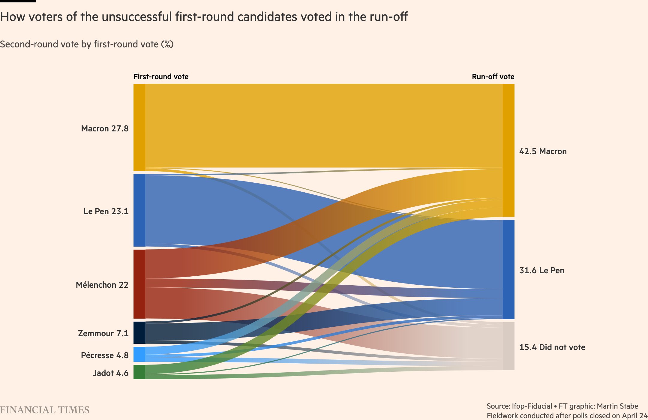
Source: Martin Stabe, Financial Times
The circular nephew of the alluvial diagram, is the chord diagram. Chord diagrams also show the flows between categories, but with a radial layout.
The chord diagram below shows the proportion of survey respondents owning a particular brand of phone with the lengths of the outer arcs, while the inner chords show the brand of these individuals’ previous phone. So, this chart shows how the consumers shift between brands. Hover over the chords to see the percentages of survey respondents shifting brands.
Source: observablehq.com