In order to perceive colour, the human eye uses 3 different types of photosensitive receptors (these are called “cones”). Each type of cone is sensitive to light with different wave lengths, so the cones allow us to see red, green and blue light and the full palettes that emerge from mixing these pure colours.
When one of these type of cones is not functioning properly, the ability to perceive a colour diminishes, leading to colour weakness. The most common colour weaknesses are protanomaly (red colour weakness) and green colour weakness (deuteranomaly). 1 in 12 European men suffer to some degree from red/green colour weakness, women are much less affected. Tritanomaly, blue colour weakness, is much less common.

Source: Maarten Lambrechts, CC BY 4.0
The colours of the colour palette above as seen through eyes with protanomaly
Only when the cones of a certain type are not functioning at all, we speak of colour blindness. The medical terms for the 3 types of colour blindness are similar to the ones for colour weakness, but substituting -anomaly with -anopia: protanopia (red colour blindness), deuteranopia (green colour blindness) and tritanopia (blue colour blindness).
Source: Maarten Lambrechts, CC BY 4.0
The colours of the palette above as seen through eyes with protanopia
The complete lack of the ability to perceive any colour at all is called achromatopsia, but this is very rare.
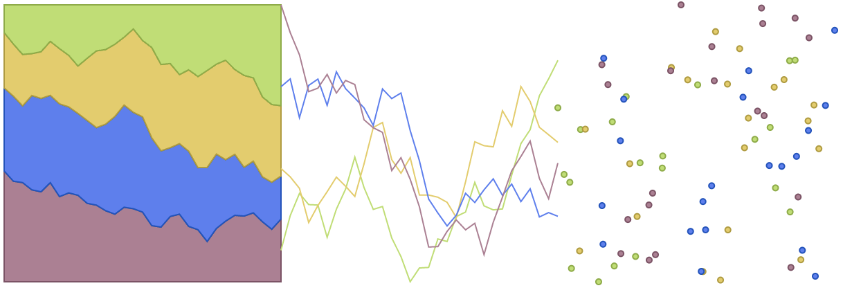
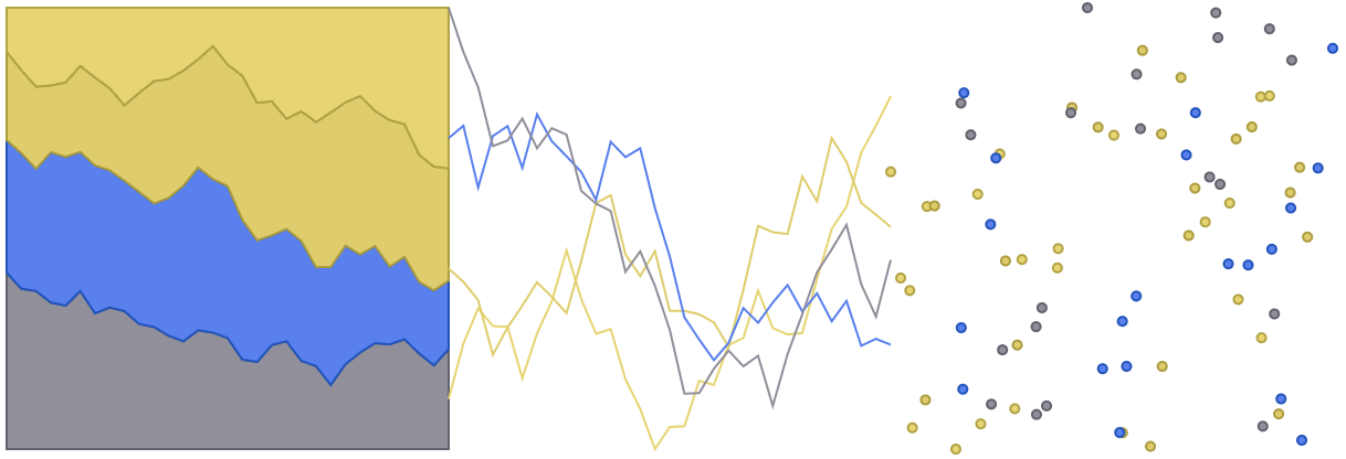
Because red and green colour weakness/blindness are the most common, combining and mixing red and green colours is not a good idea. Palettes with red, orange, brown and green colours are inaccessible to a significant part of your audience. As an example, compare how people with protanopia perceive the green and orange-brown colour in the illustrations above. They are perceived as almost identical.
Other colour combinations that are problematic for red and green colour weak/blind people are pink-turquoise-grey and purple-blue.
Picking colours
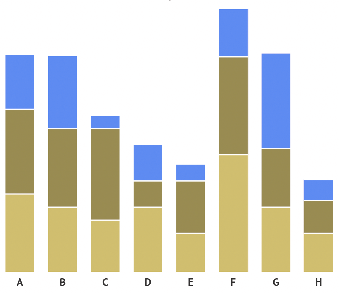
If you want the colours in your visualisation to be perceived the same by most people, your safest bet are blue colours. If you need multiple colours, you should go for blue with orange or red:
- for red blind users, these will look like blue and olive
- for green blind users like blue and orange
- for blue blind users as teal and pink
A palette based on reds and blue. Source: Maarten Lambrechts, CC BY SA 4.0
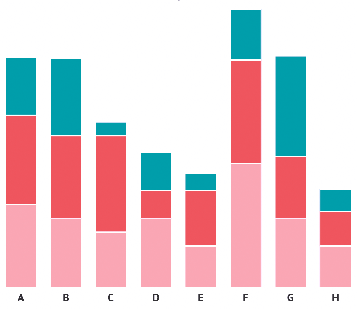
Perceived with deuteranopia. Source: Maarten Lambrechts, CC BY SA 4.0
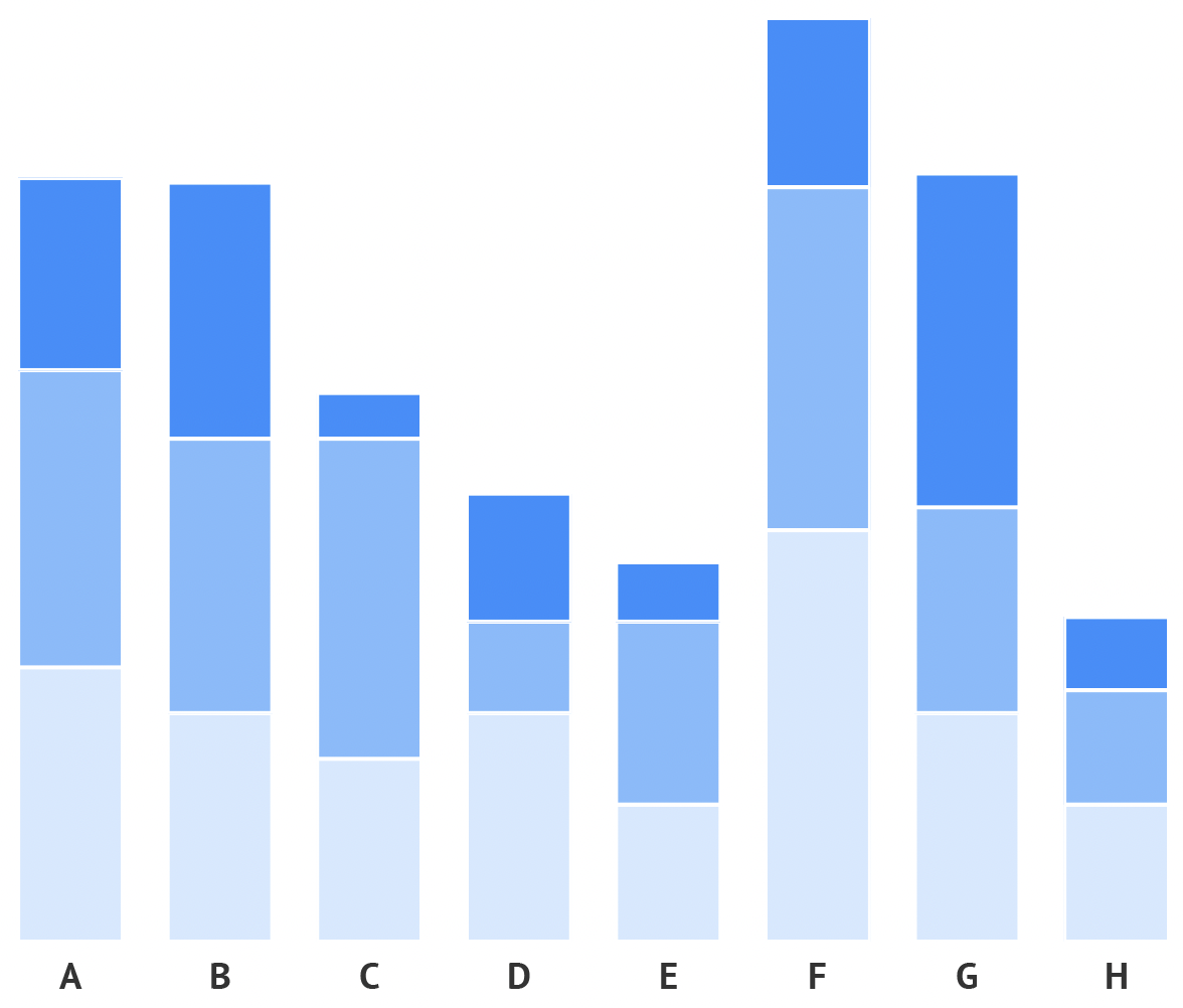
Perceived with protanopia. Source: Maarten Lambrechts, CC BY SA 4.0
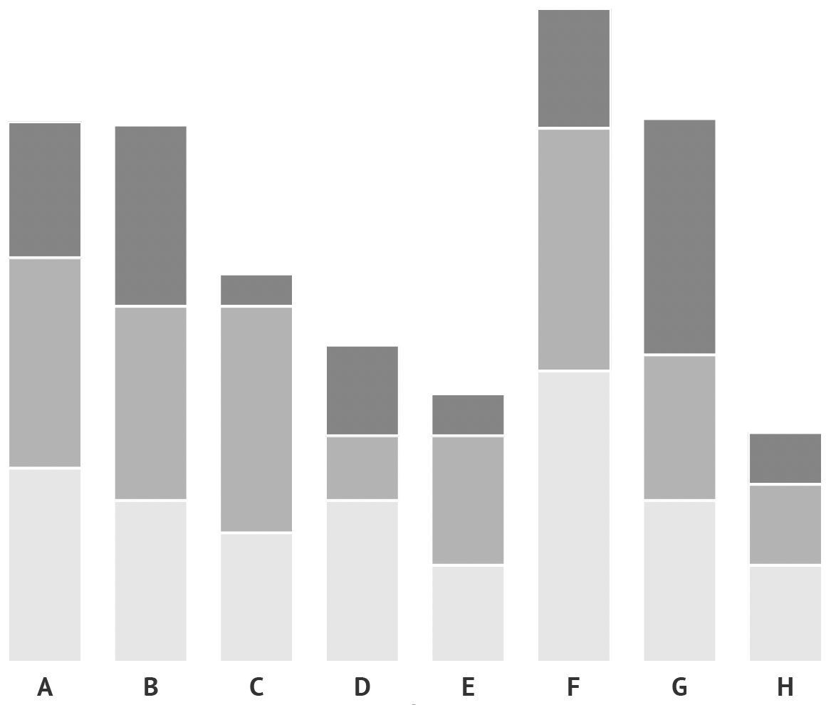
Perceived with tritanopia. Source: Maarten Lambrechts, CC BY SA 4.0
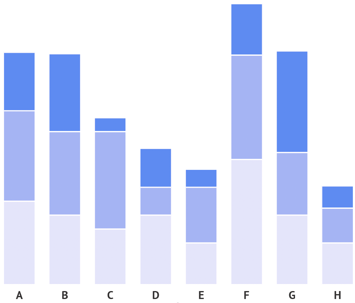
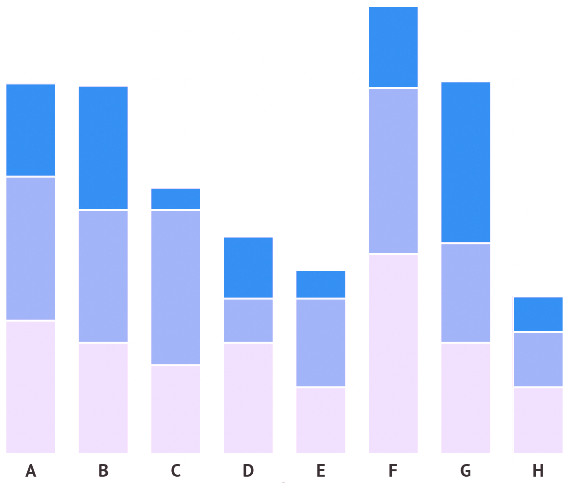
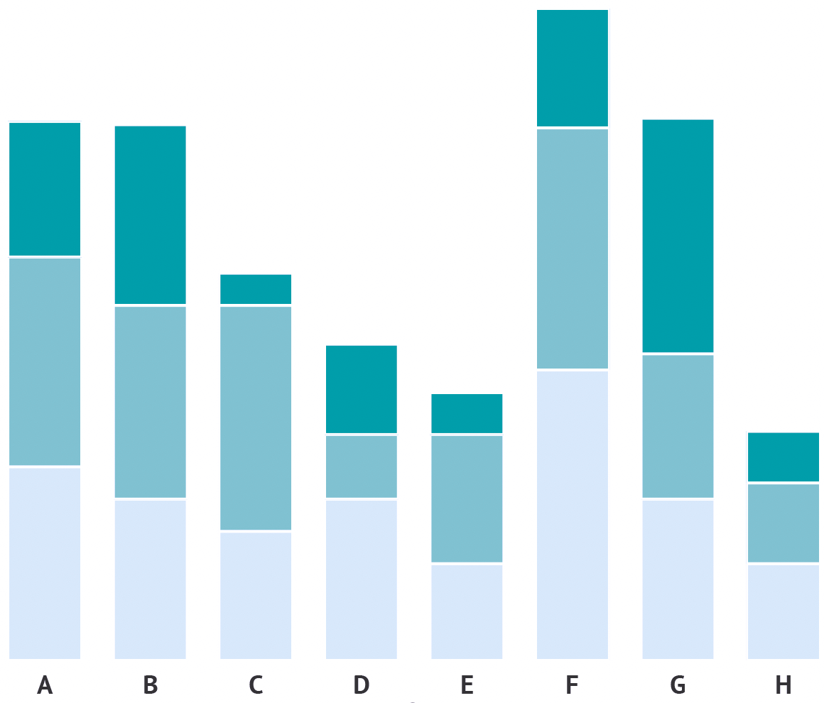
If you want to use other colour combinations, you should make sure that they vary in lightness. Colour combinations with varying lightness will still work when printed in black and white, and will be distinguishable by people suffering from any kind of colour weakness or colour blindness. With differences in lightness, you can even use the problematic red-green combination.
A palette with blues with different lightness. Source: Maarten Lambrechts, CC BY SA 4.0
As perceived by fully colour blind people. Source: Maarten Lambrechts, CC BY SA 4.0
As perceived by people with protanopia. Source: Maarten Lambrechts, CC BY SA 4.0
As perceived by people with deuteranopia. Source: Maarten Lambrechts, CC BY SA 4.0
As perceived by people with tritanopia. Source: Maarten Lambrechts, CC BY SA 4.0
Researchers have studied colour palettes and colour blindness, and developed and published colour blind safe palettes. The most known tool in this area is ColorBrewer.
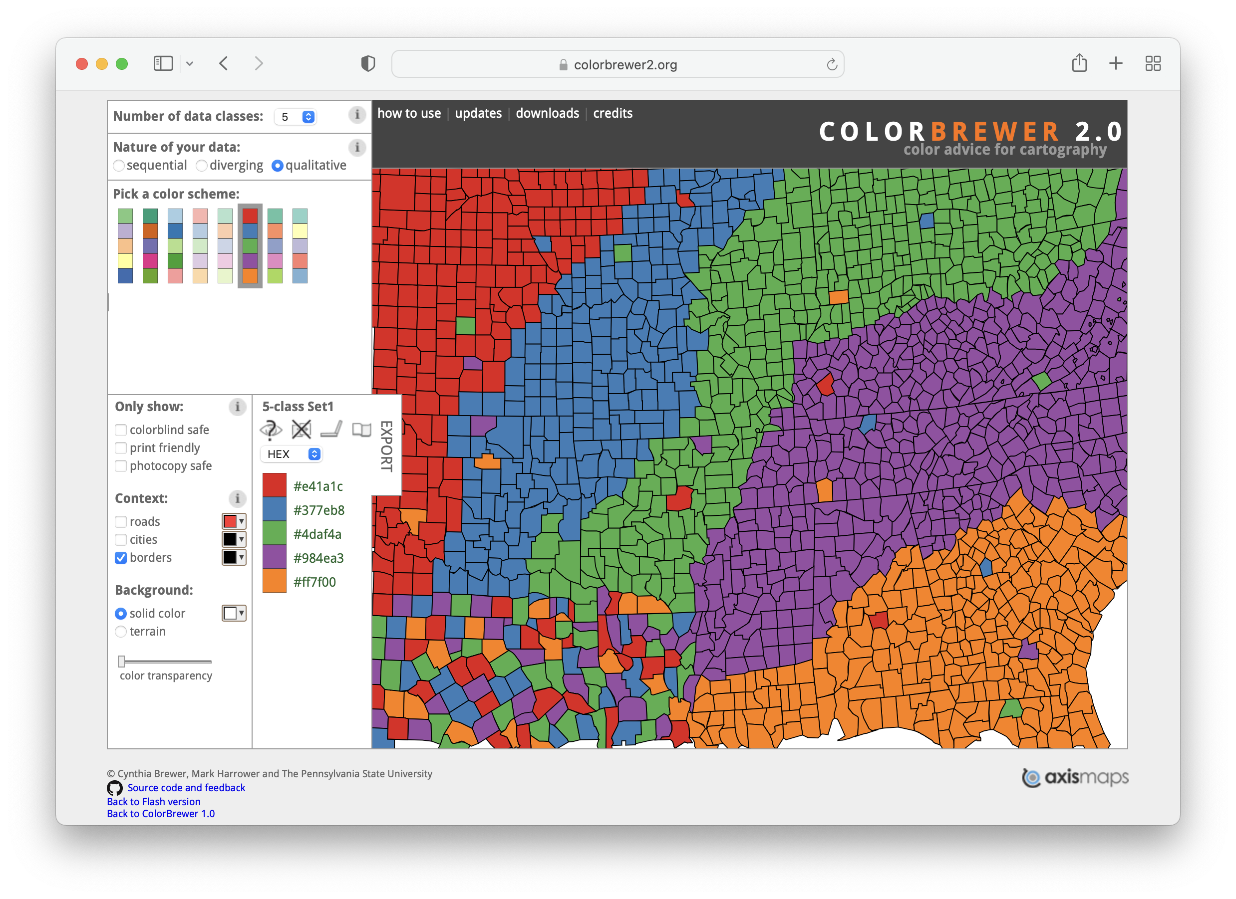
Source: ColorBrewer
ColorBrewer was designed to assist when picking colours in cartography, but it just works as well for charts. When the “qualitative” option is selected under “Nature of your data”, ColorBrewer presents categorical palettes to choose from. Under “Only show”, you can select to show only colour blind safe palettes. But notice that only a single categorical palette with a maximum of 4 different colours is available when this option is selected. This suggests that colour blind safe categorical colour palettes are rare and hard to design.
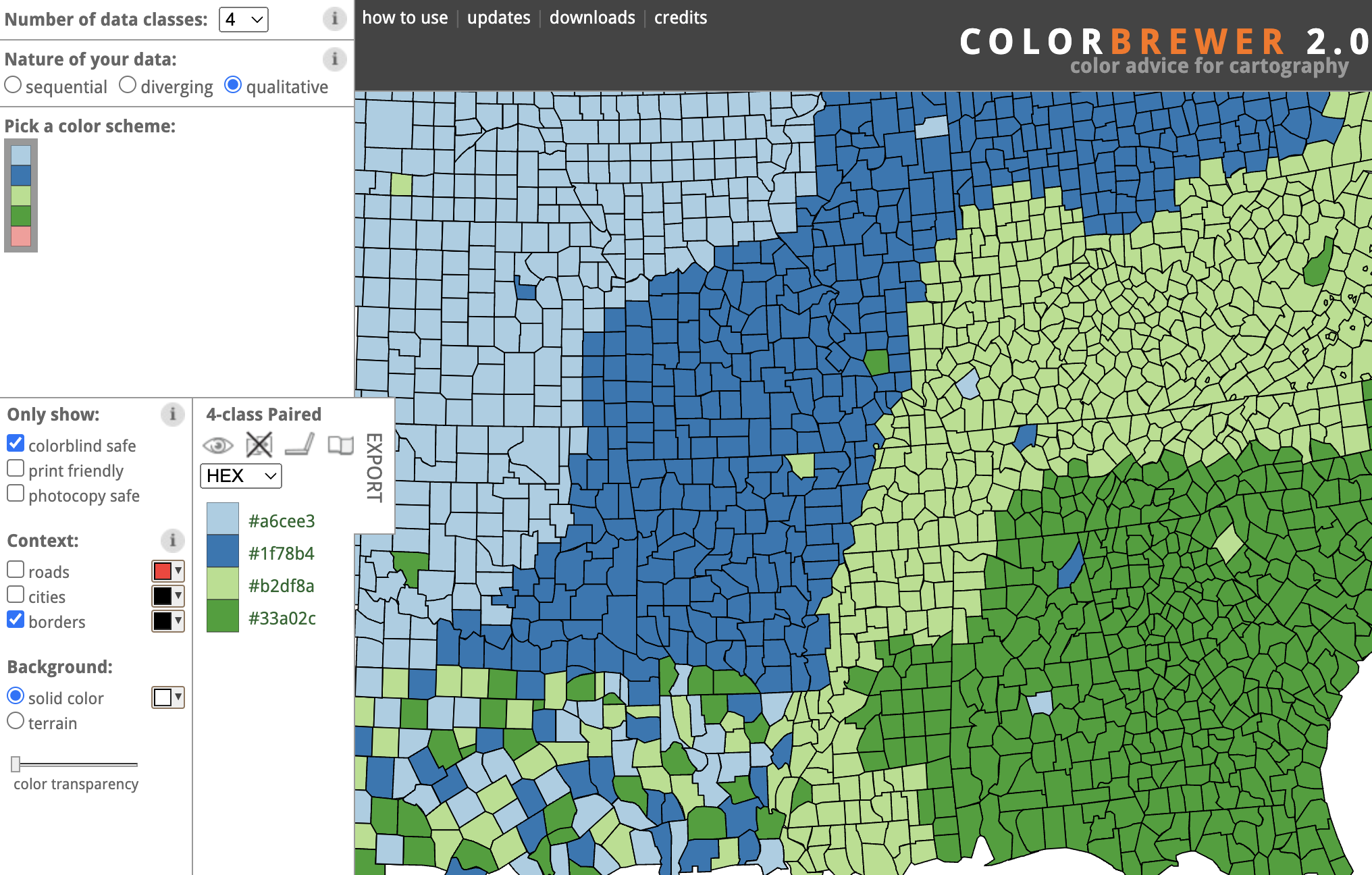
Source: ColorBrewer
A good tool to evaluate the colour blind safety of a colour palette for data visualisation is Viz Palette. For every combination of colours, this tool will generate a small colour report indicating which colours are too similar.
Below you can see that the palette we used at the beginning of this page is a good palette for people without any kind of colour blindness. But the report confirms that we have an issue for people with protanopia.
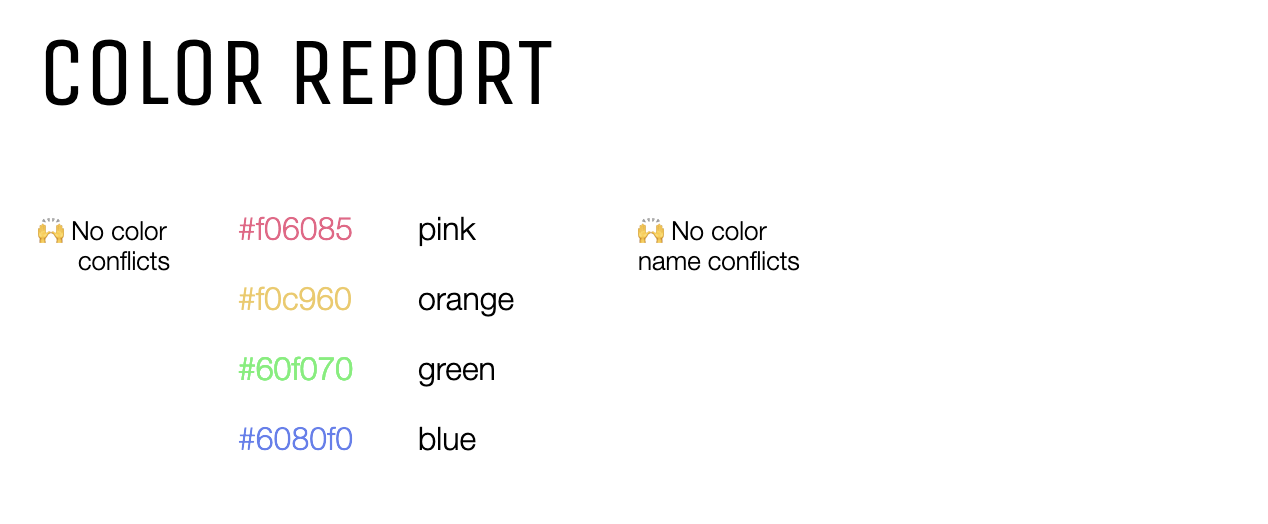
No issues detected for people with normal vision. Source: Viz Palette
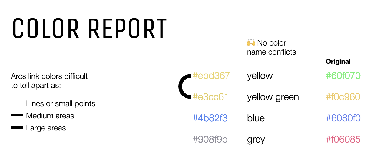
The arc connecting the light orange and the orange indicates that these colours are too similar for people suffering from deuteranopia. Source: Viz Palette
Other colour blindness simulators are Sim Daltonism and Color Oracle.
Sim Daltonism is a Mac app that overlays a window over your screen to simulate different kinds of colour blindness.
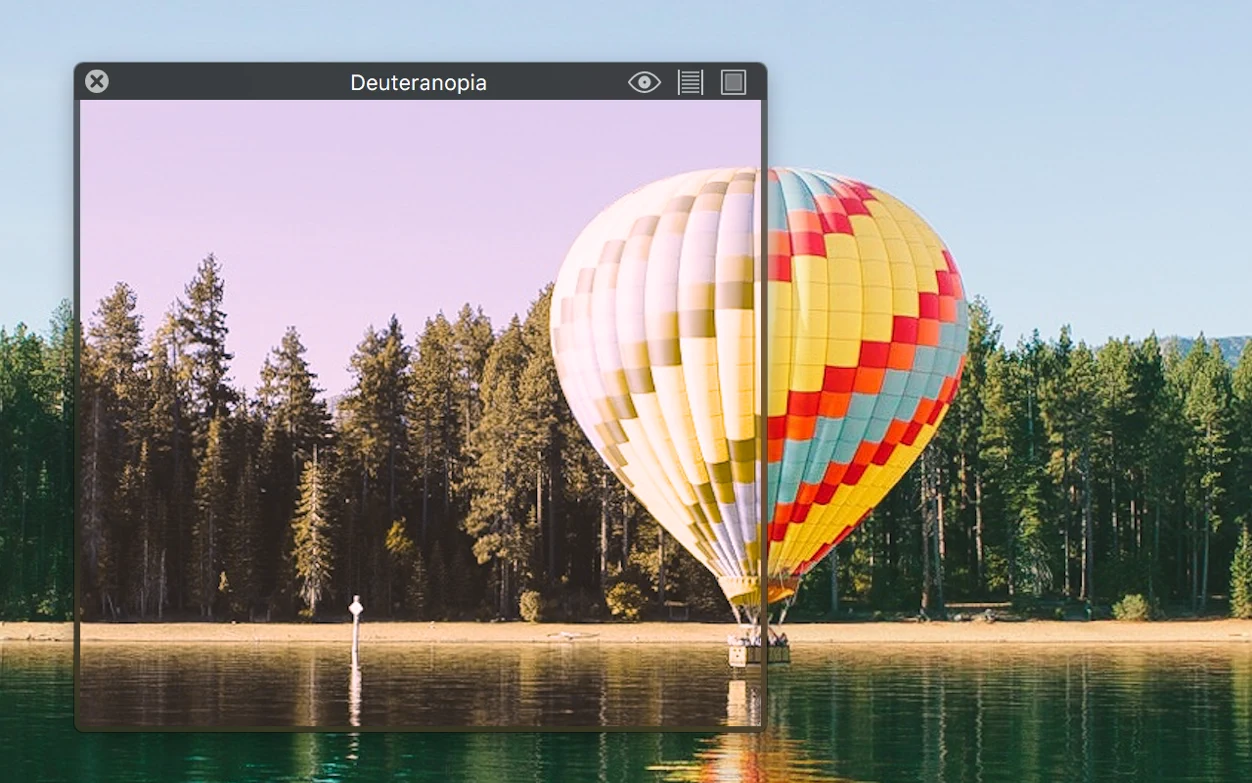
Source: Sim Daltonism in the Mac App Store
Color Oracle is a colour blindness simulator for Windows, Mac and Linux.
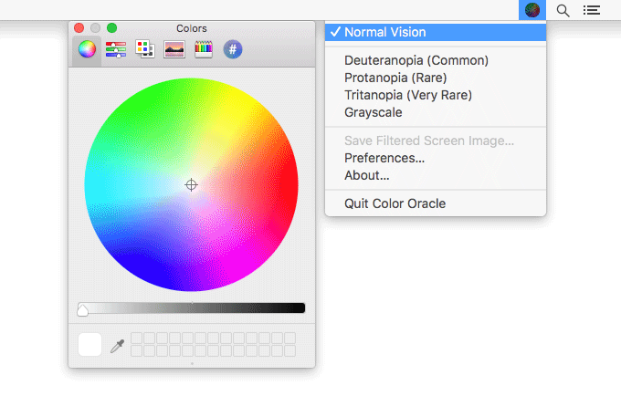
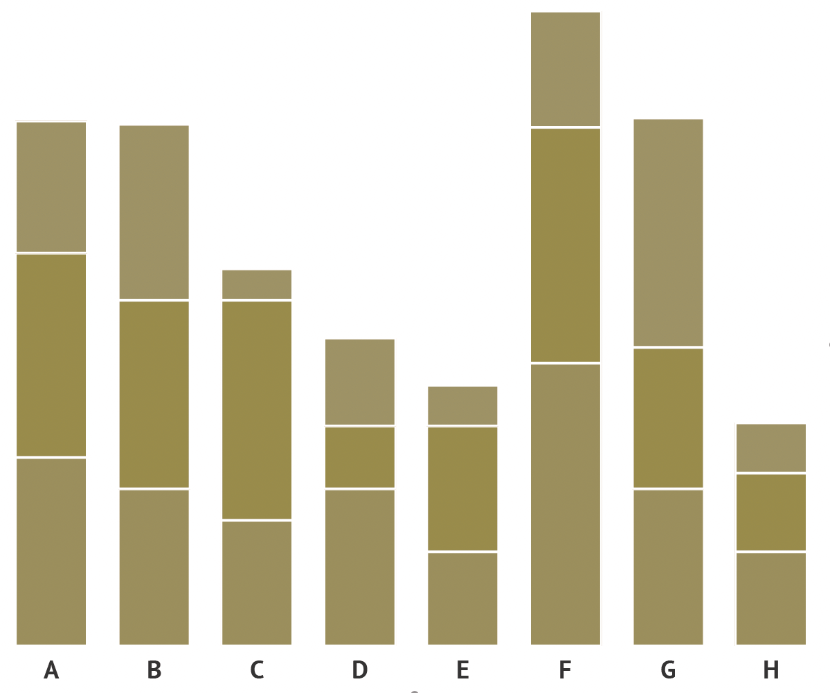
Source: Maarten Lambrechts, CC-BY-SA 4.0
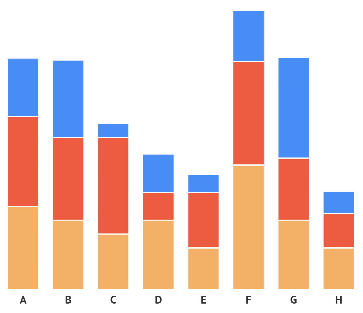
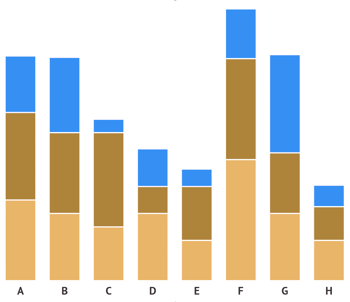
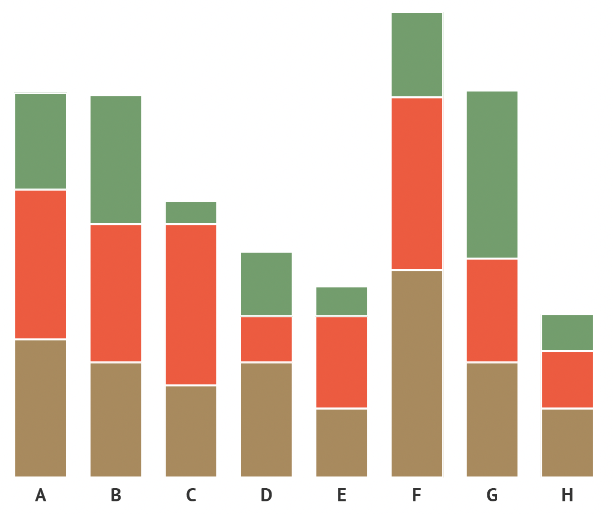
Adding some spacing between neighbouring elements in a visualisation is a fallback strategy for when you don’t have control over the used colours and you can’t pick a colour blind safe palette.
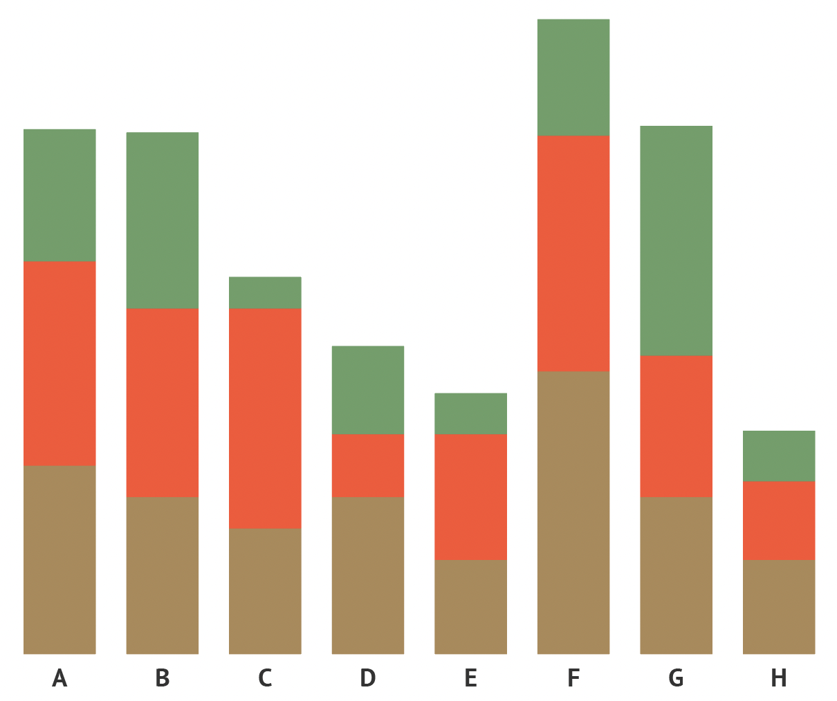
Source: Maarten Lambrechts, CC BY SA 4.0
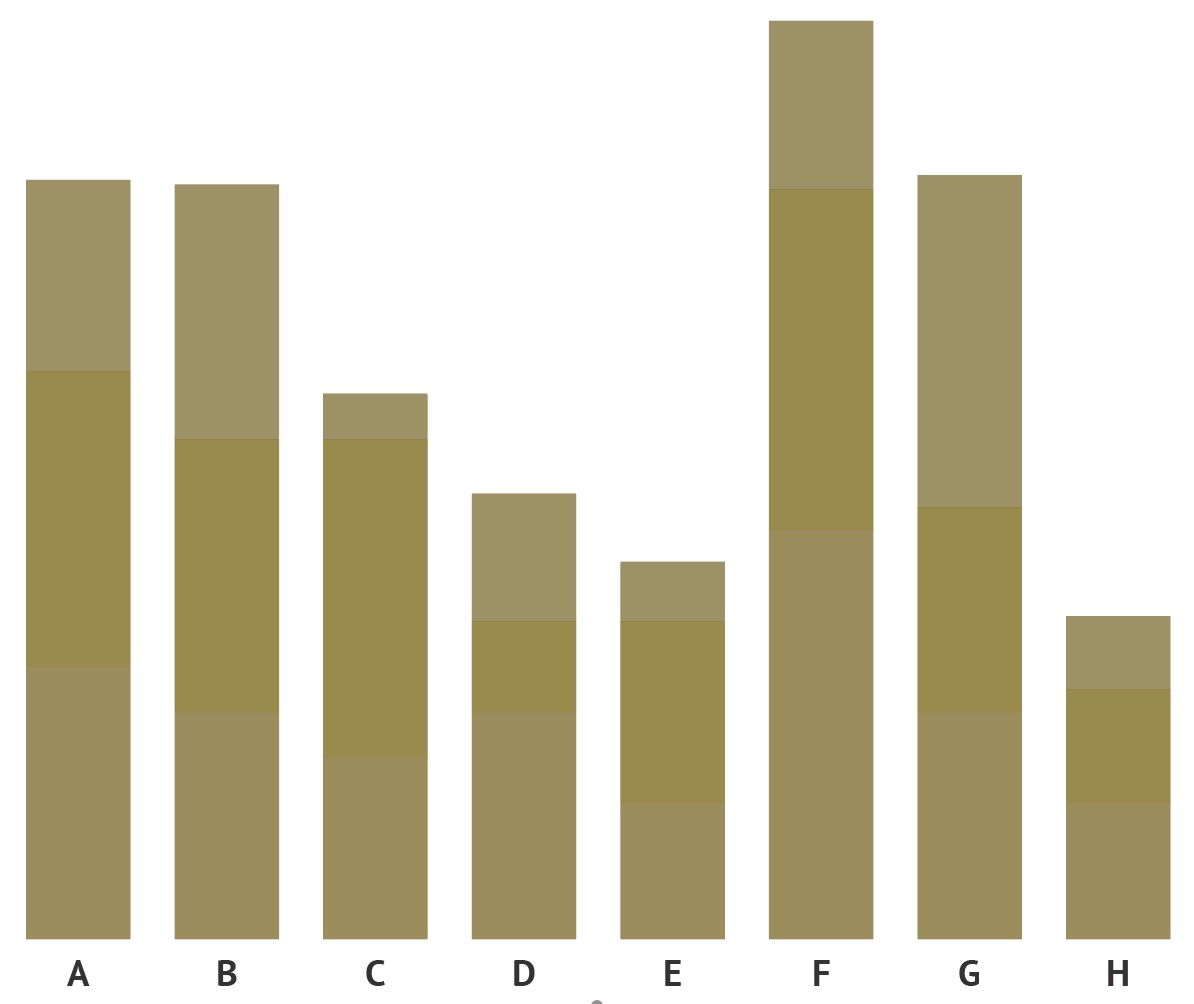
This is the same stacked bar chart as above, as perceived by people suffering from protanopia (red colour blindness). Source: Maarten Lambrechts, CC BY SA 4.0
Source: Maarten Lambrechts, CC BY SA 4.0
Source: Maarten Lambrechts, CC BY SA 4.0