Consider the data table below. It contains numbers on the yearly imports and exports between England on the one hand, and Denmark and Norway on the other hand. Now look at the table and try to answer the following questions:
- What was the year with the highest imports?
- In which year did the trade balance flip from being against England to in favour of it (this is the year the exports became bigger than the imports)?
| Year | Import | Export |
|---|---|---|
| 1700 | 71,1 | 32,8 |
| 1705 | 74,5 | 40,9 |
| 1710 | 82,6 | 59 |
| 1715 | 87,2 | 77,9 |
| 1720 | 96,8 | 75,2 |
| 1725 | 102,6 | 71,3 |
| 1730 | 96,4 | 64,7 |
| 1735 | 93,7 | 60,5 |
| 1740 | 92,9 | 65,1 |
| 1745 | 92,5 | 74,3 |
| 1750 | 90,1 | 77,4 |
| 1755 | 79,9 | 82,8 |
| 1760 | 76,6 | 117,5 |
| 1765 | 79,6 | 151,8 |
| 1770 | 83,8 | 163,8 |
| 1775 | 90,4 | 175,7 |
| 1780 | 92,7 | 185,4 |
With some mental effort, you are probably able to answer the questions posed above by scanning the table and comparing the numbers horizontally and vertically. But finding the answers is not straightforward, and does require some mental brain work.
When the same data is represented in a visual way, answering these questions suddenly becomes much easier. Check the chart below: finding the year with the highest imports is as easy as finding the location where the yellow line is at its peak (around 1725), and finding the moment the trade balance shifts is just a matter of finding the location were the yellow and red line cross each other (around 1755).
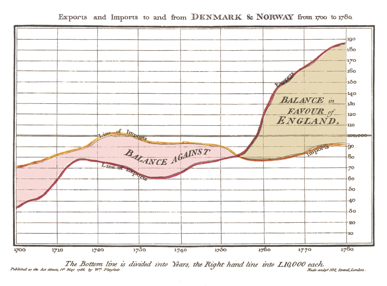
Source: William Playfair, public domain
The chart above was published in 1786 by William Playfair in his book Commercial and Political Atlas. Playfair was a Scottish engineer and he was the first to represent time series as a line chart (in the same book, he also invented the bar chart). In the introduction of the book he writes the following:
As knowledge increases amongst mankind, and transactions multiply, it becomes more and more desirable to abbreviate and facilitate the modes of conveying information from one person to another, and from one individual to the many.
So Playfair understood that publishing numbers in tables is not the optimal way for people to find and understand trends and proportions in numbers: turning the numbers into visual lines and shapes makes it much easier for people to makes sense of numerical (and other) data.
So, in a way, data visualisation is a form of assistive technology: by mapping numbers and data to the colour, size and position of visual elements, the trends and proportions in the numbers are made more accessible. Without it, making sense of the numbers would take a lot more time and effort, and may not even be possible at all for some people.