When a visualisation is published as an image in a web page, the image should have an alt attribute set to it (”alt” stands for alternative text). More on alt text can be found in Accessible images, for now it suffices to mention that alt text is read out by screen readers when they encounter an image in a web page. Many web pages and social media, like Twitter, also display the alt text if the user chooses to read it.
So the alt text provides an opportunity to describe the content of a visualisation to people who can’t, or don’t want to, see images in a web page. Many guidelines exist to write alt text for images, but data visualisation are images with a very specific content and purpose. So alt text for visualisations deserve some special attention.
Data visualisation designer Amy Cesal came up with a formula for writing good alt text for data visualiations:
alt = ”Chart type of type of data where reason for including chart”
In this equation, the chart type is the type of chart the visualisation is using, like a bar chart, a line chart or a scatter plot. The type of data describes the data that the chart is showing. You could use the titles of the axes of the visualisation: these should explain what data is used, and what the units of the data are. The reason for including the chart is the main point of the chart and the message that you, as the author of the chart, want people to take away from it. The visualisation should make a point, and you should tell people what to look for.
According to Cesal’s formula, the chart below could be summarised in an alt text as:
alt = ”Line chart of cumulative burnt area in Europe where the 2022 area is more than double the 2006-2021 average, and well above the range for the same period”
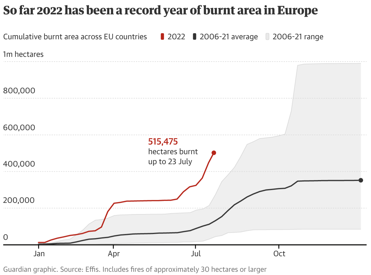
Source: theguardian.com
In recent research, a four-level model for describing visualisations was developed. This model can also be used to write alt text in a structured way.
At the first level the chart type and the encodings are described. This means that the axes are explained (including their ranges), together with the meaning of colours, for example. The chart title is also mentioned at this level.
A template for this first level looks like this:
“This is a [chart-type] entitled [chart-title]. [y-encoding] is plotted on the vertical y-axis from [y-min] to [y-max]. [x-encoding] is plotted on the horizontal x-axis from [x-min] to [x-max].”
At the second level, chart descriptions include statistics, relationships and comparisons in the data. The description could include the average value for one of the plotted dimensions for example, or include the values of some outliers in the data.
At the third level, chart descriptions describe patterns in the data that can be visually deducted from the visualisation, but which are much harder to catch by only using descriptive statistics like averages.
Finally, at the fourth level, descriptions can contain contextual and domain specific knowledge that can explain the patterns visible in the data.
Consider the following chart and the descriptions at the 4 different levels below:
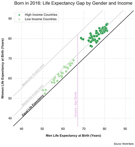
Source: World Bank
Level 1 (chart type and encodings): This is a scatter plot entitled “Born in 2016: Life Expectancy Gap by Gender and Income” that plots Women Life Expectancy at Birth (Years) by Men Life Expectancy at Birth (Years). The Women Life Expectancy at Birth is plotted on the vertical y-axis from 40 to 90 years. The Men Life Expectancy at Birth is plotted on the horizontal x-axis from 40 to 90 years. High Income Countries are plotted in dark green. Low Income Countries are plotted in light green. A 45 degree line from the origin represents Equal Life Expectancy.
Level 2 (statistics and comparisons): For low income countries, the average life expectancy is 60 years for men and 65 years for women. For high income countries, the average life expectancy is 77 years for men and 82 years for women.
Level 3 (patterns): Overall, women have a slightly higher life expectancy than men. Women live around 5 to 10 years longer than men. The low income countries are more scattered than the high income countries. There is a visible gap between high and low income countries, indicated by the Income-Age Divide line.
Level 4 (context): People living in low-income countries tend to have a lower life expectancy than the people living in high-income countries, likely due to many societal factors, including access to healthcare, food, other resources, and overall quality of life. People who live in lower income countries are more likely to experience deprivation and poverty, which can cause related health problems.
The researchers that developed this 4 level chart description model found that non-sighted people appreciated the level 1 to 3 descriptions, but preferred to stick to the information included in the visualisation itself, and skip the level 4 descriptions (which are probably more appropriately included in the text surrounding the visualisation anyway).