As a general rule for any content aimed at a broader public, text should be clear and free from jargon and acronyms. This also applies to any text used in data visualisation, for the chart titles and any other text contained in a visualisation.
The units the data is expressed in should be provided and should be unambiguous. Without units, it is impossible to understand a chart and get some insights from it. Axes should be clearly labelled, and a legend should be present to explain any encoding that might require it (like a colour legend when direct labelling is not possible, or a legend explaining how visual elements are sized, for example).
For less common chart types, a clear explanation should be provided to explain how the chart should be read. Annotations and arrows can be used to explain what the positioning of elements means and how values can be read from the chart. Explaining the positioning, size, colour, … of a single data point (like a single country in a visualisation in which multiple countries are represented) can help the reader in interpreting the other data points in the chart.
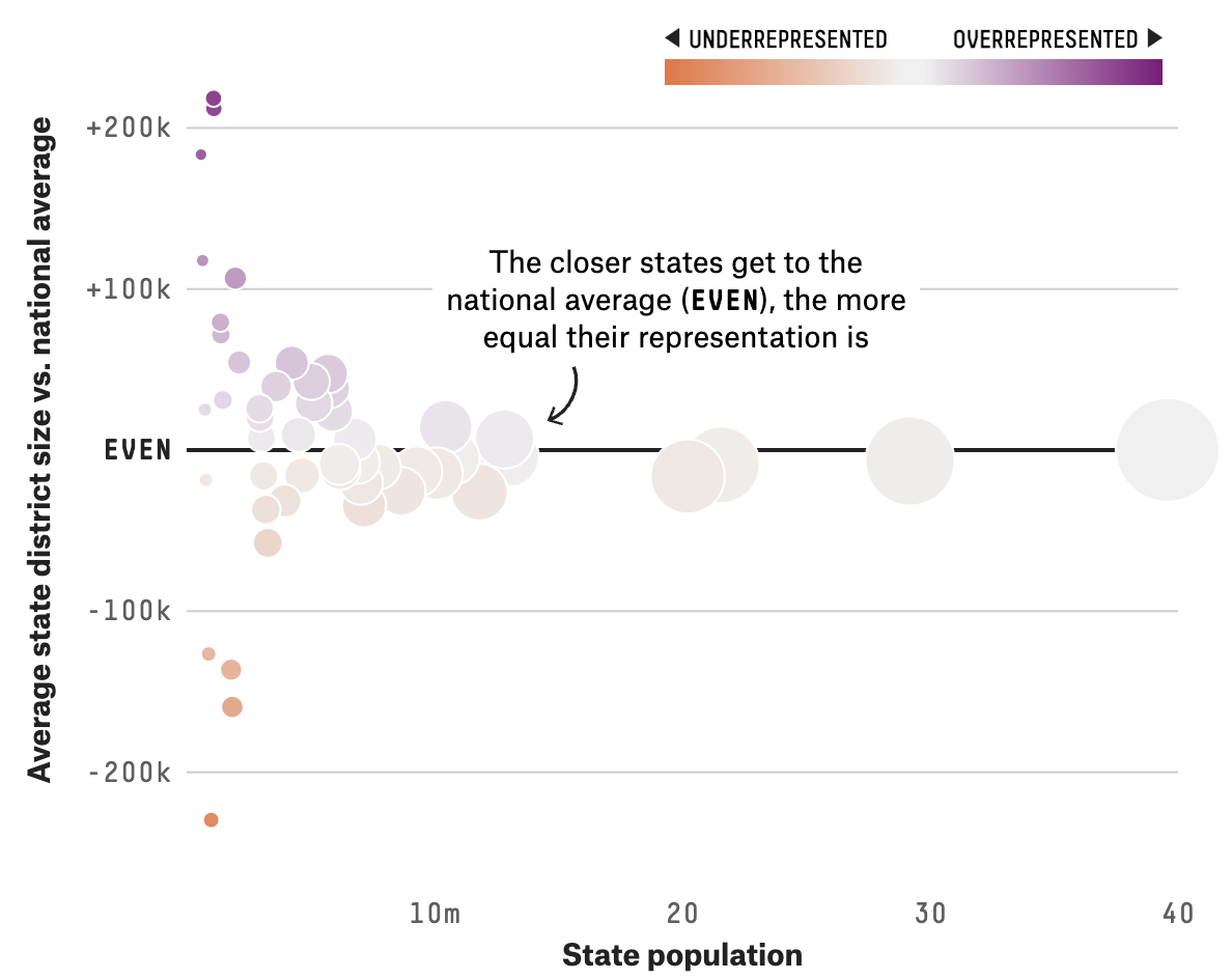
An example of a scatter plot with clearly labelled axes, a colour legend and an annotation explaining how the chart should be read. Source: projects.fivethirtyeight.com/435-representatives
When a chart contains interactive features, they should be obvious and explained explicitly. When an interactive feature causes a visualisation to update, the changes should be easy to follow. When a change in the data or a change in the encoding is meaningful, changes should be animated.
For more guidelines, seeAccessible interactivity .