In order not to overwhelm or confuse the reader, a chart’s design should not be overloaded. The number of data points and the number of different categories shouldn’t be too high as to not overcrowd the visualisation with marks and colours. Providing enough white space is important for easy digestion of the information contained in a chart.
Reducing the number of data points can be done through filtering (only showing the most important data points) or through aggregating (showing weekly values instead of daily values, or showing country averages instead of regional values). The data points or data series can also be split up and shown over multiple charts.
A chart shouldn’t intent to communicating multiple messages at the same time. A good basic rule is “One chart, one message”. If you would like to communicate multiple messages with the same data and the same chart, you can repeat the chart and highlight different elements on each copy of the chart to explain the different messages.
More complex and less common chart types, with unusual encodings or with more than 2 dimensions encoded, need to be explained well. The complexity of the visualisation can be built up in steps, explaining the encoding step by step. The sequence of images below, for example, illustrate how values should be read from a ternary plot.

In the first step, the 3 axes of the plot are introduced and labelled. The 3 axes represent the share of the 3 fuel sources for electricity generation. Source: Maarten Lambrechts, CC BY SA 4.0
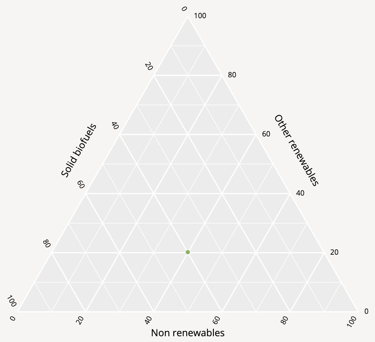
In the second step a single data point is shown. This point represents a single country and its location shows the energy source mix for electricity generation of that country. Source: Maarten Lambrechts, CC BY SA 4.0
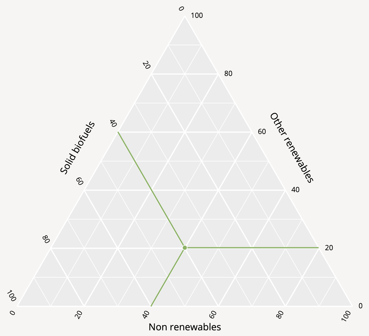
Then the way to read values from the 3 axes for the country is illustrated. In this case, the country generates 40% of its electricity from non-renewable sources, 40% from solid biofuels and 20% from other renewable sources. Source: Maarten Lambrechts, CC BY SA 4.0
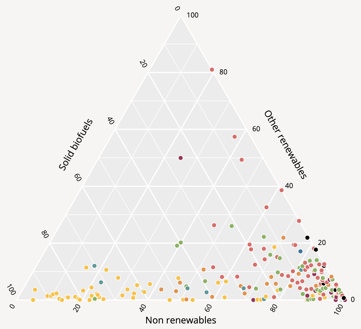
And finally the other data points are shown. Source: Maarten Lambrechts, CC BY SA 4.0
Finally, when there is uncertainty in the data, this should be clearly presented visually and explained in text.
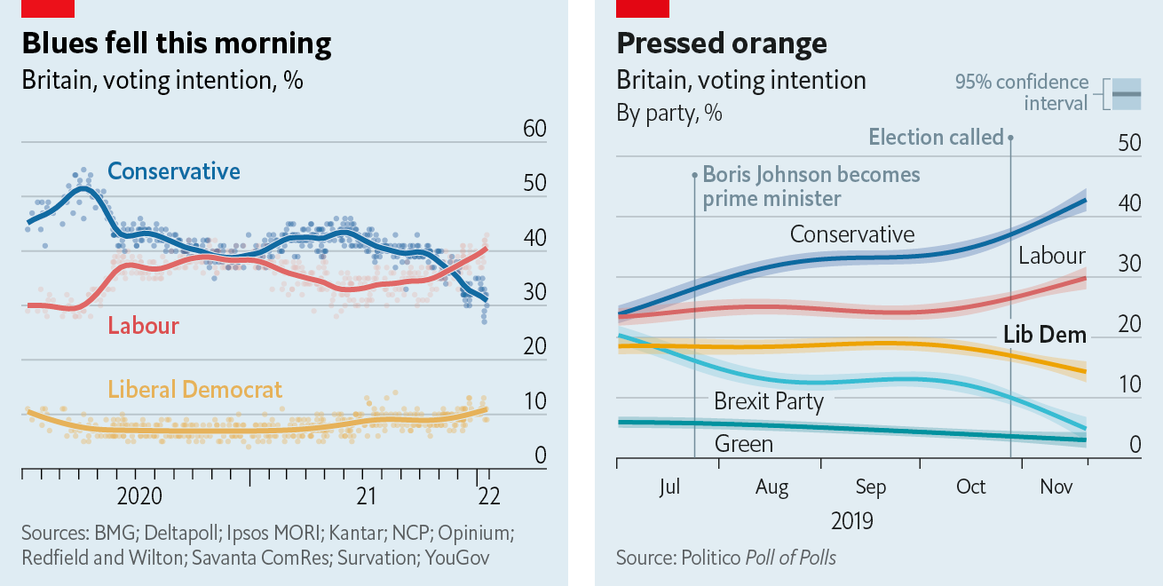
Two techniques to show uncertainty: showing a trend line with all the data points (left) and trend lines with confidence intervals (right). Source: Off the Charts newsletter, edition 2022-03-22, economist.com
See the Visualising uncertainty pages for more explanation and techniques to communicate uncertainty in data.