With filtering, selecting and aggregating, data can be transformed to make it fit certain chart types. Some examples:
- time series data can be filtered to only contain the most recent data. This means that the same data can be used to produce a line chart and a bar chart.
- continuous numerical data can be binned into a discrete numbers of classes (see the maps above).
- the geographical component of geographical data can be removed or ignored to produce non-map visualisations (see the bar chart showing the gasoline prices in EU member states above)
- daily data can be aggregated into monthly averages or monthly totals that better reveal trends
These examples illustrate that the same data can be visualised using many different chart types. A data set can also contain many dimensions with different data types, from wich you need to choose the dimensions to include in your visualisation.
So, it is clear that data visualisation designers have to make a lot of decisions when it comes to choosing the data to include in a visualisation and which chart form to pick to visualise it. In those circumstances it helps to pause for a moment, and think about the purpose of the visualisation you are working on. What is the message you are trying to communicate to your audience?
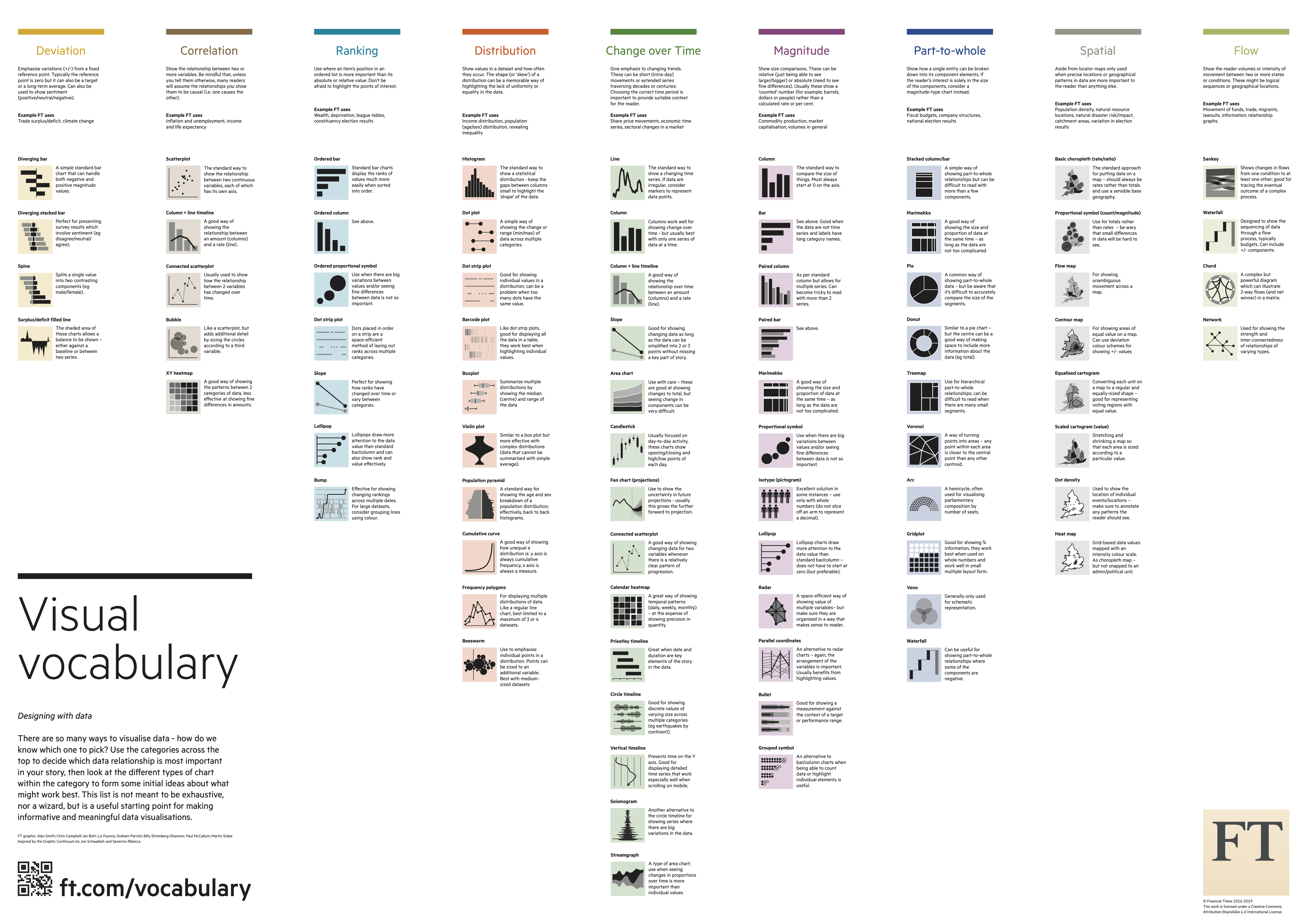
The visual journalists of the graphics desk of the Financial Times news paper were having a lot of discussions with their non-graphic colleagues about what kind of chart would fit a story the best. In order to structure those discussions and to establish a common vocabulary to talk about chart types, they designed the Visual Vocabulary.
Source: Financial Times
The Visual Vocabulary is a collection of chart types organised by the pattern in the data they can highlight.
Source: Financial Times
Each chart type is visualised with a thumbnail icon and also has a line of description.
](Choosing%20the%20right%20chart%20type%20for%20your%20story%20534c70625e194b62ad932d52825d1579/visual-vocabulary-descriptions.png)
Source: Financial Times
So whenever you need to pick a visualisation type, you can use the Visual Vocabulary to think about what pattern or relationship in your data is the most important one for the story you want to tell. The Vocabulary contains the following patterns:
Deviation, for emphasising positive and negative variations from a fixed reference point (0, a certain target value, an average value, …).
Correlation, to show the relationship between two or more variables.
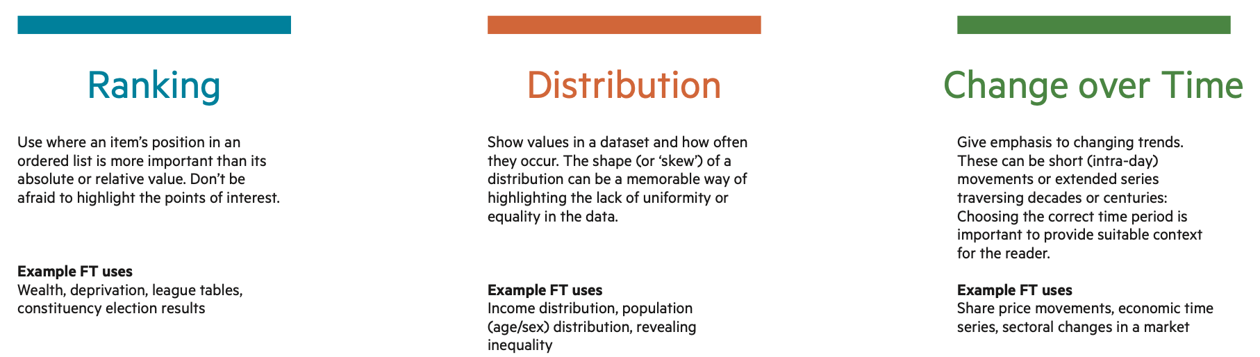
Ranking, to use when an item’s position in an ordered list is more important than its absolute or relative value.
Distribution, to show values in a dataset, and how often they occur.
Change over time, to give emphasis to changing trends.
Magnitude, to show size comparisons.
Part-to-whole, to show how single entity can be broken down into its component elements.
Once you have identified the pattern best fitting the message of your story, the Vocabulary gives you some suggestions for possible chart types to use. Of course, theses are just suggestions, and as the sections below show, other factors also play their role in the choice of chart type.