The size of your data, expressed in the number of rows of the corresponding data table, also determines what the optimal chart type should be.
If, instead of plotting the life expectancy of the 27 EU member states, you would like to visualise the life expectancy for all countries in the world, then a bar chart will not work very well, for example. Instead of a bar chart, you could consider using a dot plot or a barcode plot. They pack more data in less pixels, so they have a higher data density than bar charts.
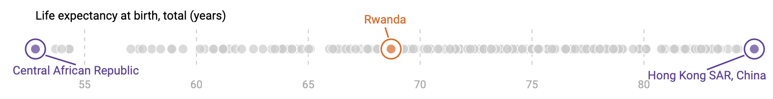
An example of a dot plot, showing the life expectancy of all countries worldwide. Source: Maarten Lambrechts, CC-BY 4.0
A downside of these kind of charts is that they require interactivity to identify each country, because there is too little space available to put all country names in the visualisation.
Scatterplots are a data dense visualisation type too: plotting the data for 200 countries usually is not a problem. But what if you need to plot thousands instead of hundreds of points? Then overlapping dots can become a problem.
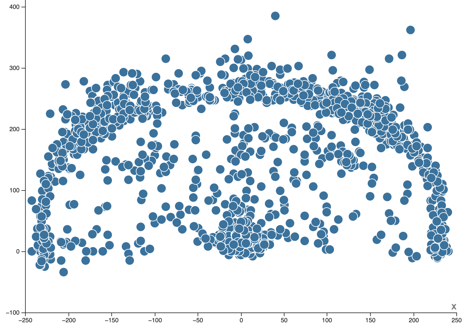
Source: Maarten Lambrechts, CC-BY 4.0
This can be tackled partially by reducing the size of the dots, or by giving them some transparency.
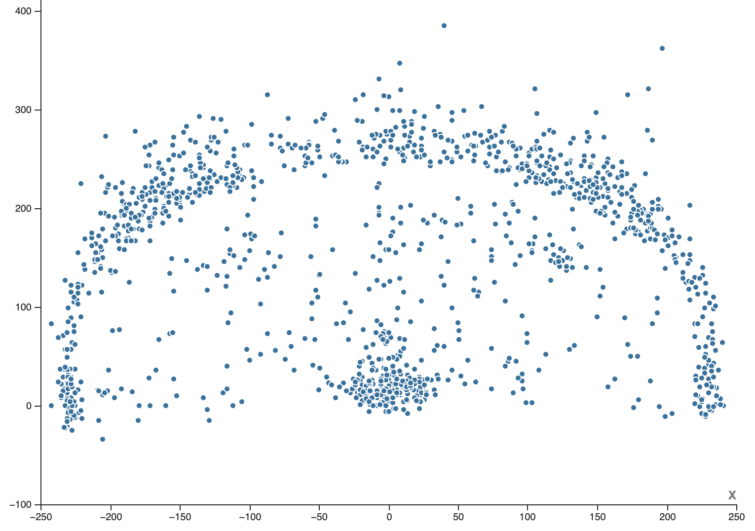
Source: Maarten Lambrechts, CC-BY 4.0
But this technique also has its limits. When the number of dots is still too high and there is still too much overplotting in the dots, the data can be visually aggregated with a hexagonal binned scatterplot…
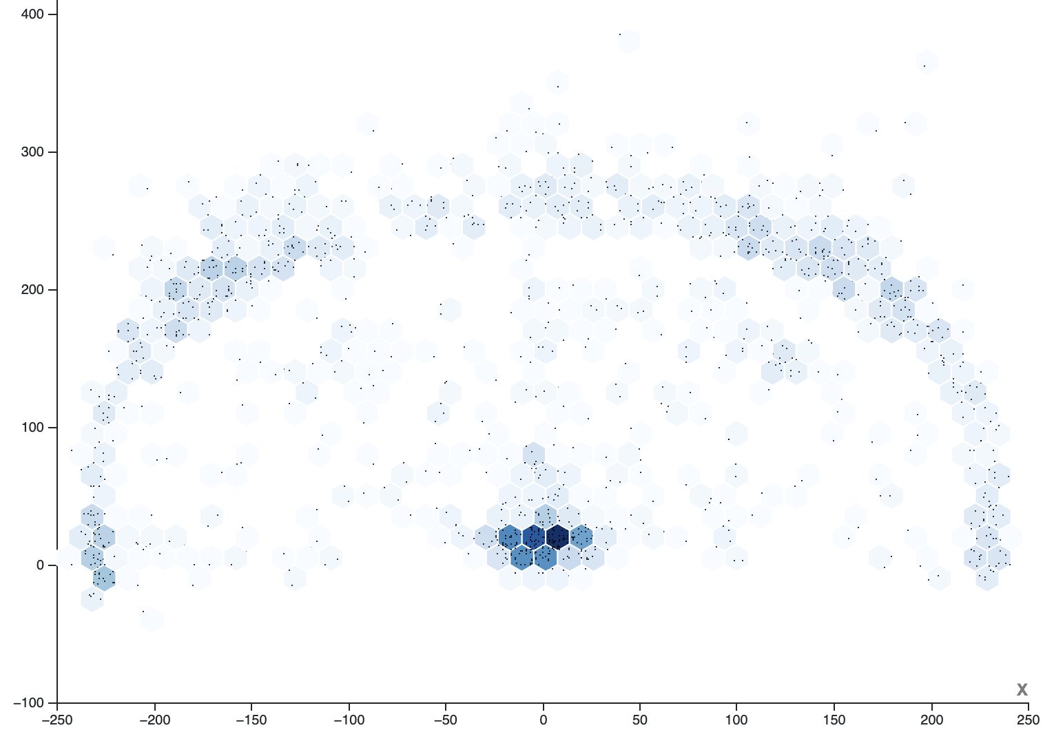
Source: Maarten Lambrechts, CC-BY 4.0. Visualisation made with RAWGraphs
…or a contour plot.
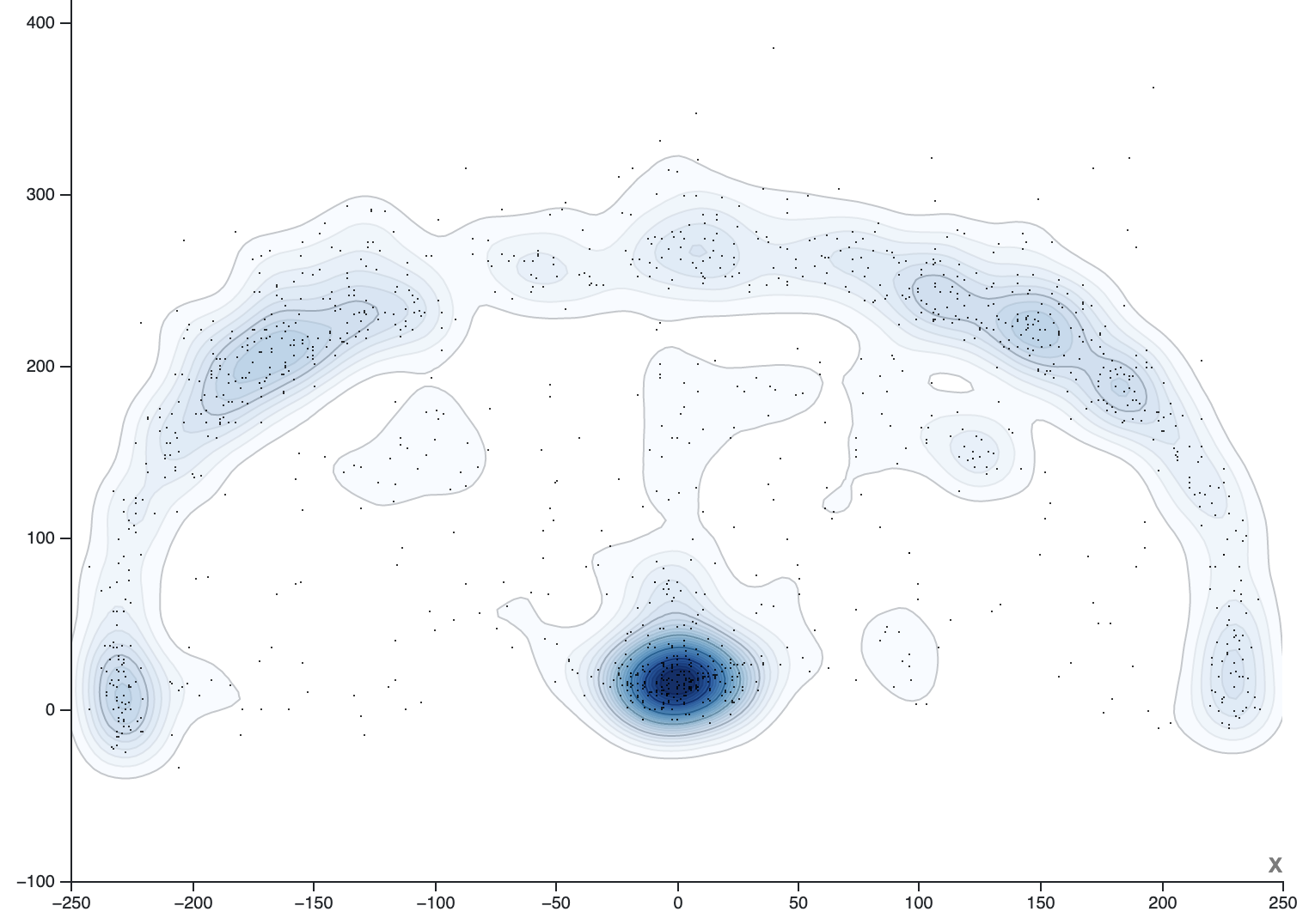
Source: Maarten Lambrechts, CC-BY 4.0. Visualisation made with RAWGraphs
Another example of a data dense chart type are horizon charts. They can be used as an alternative to line charts when the number of series to display is high. The horizon chart below shows more than 70 time series in a single chart, which would be very difficult to do with a traditional line chart.
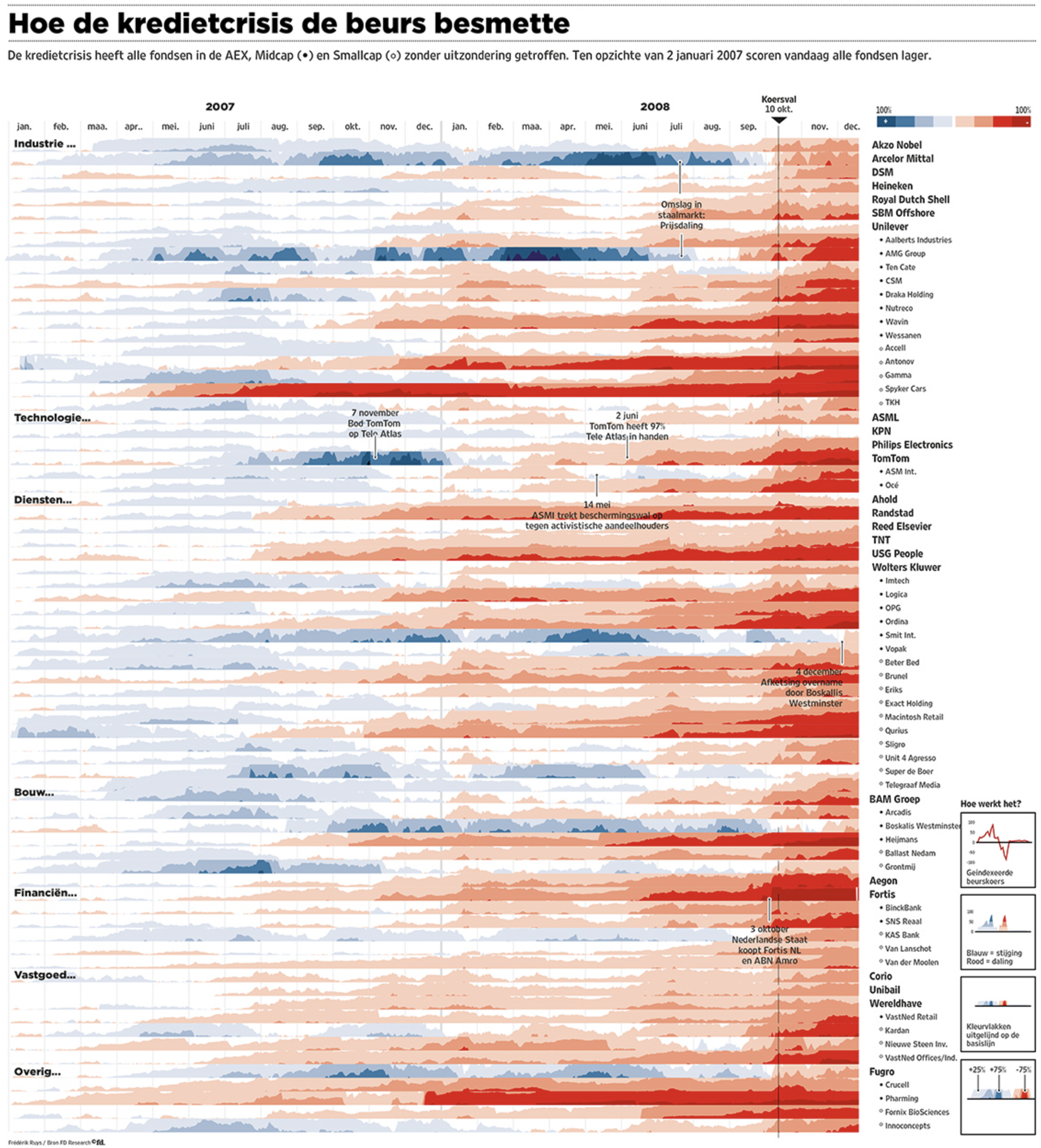
Source: Frédérik Ruys for Financieele Dagblad
More on horizon charts can be found on How to introduce less common chart types and Data dense time series. They can be produced with the RAWGraphs visualisation tool.