Data comes in the form of many types, and the types in your data will limit the options when it comes to chart types.
Categorical data is usually text based data that groups records in a dataset together, or that identifies each feature in a dataset. For example, the country names in a bar chart showing the cost of gasoline in the EU member states are categorical data.
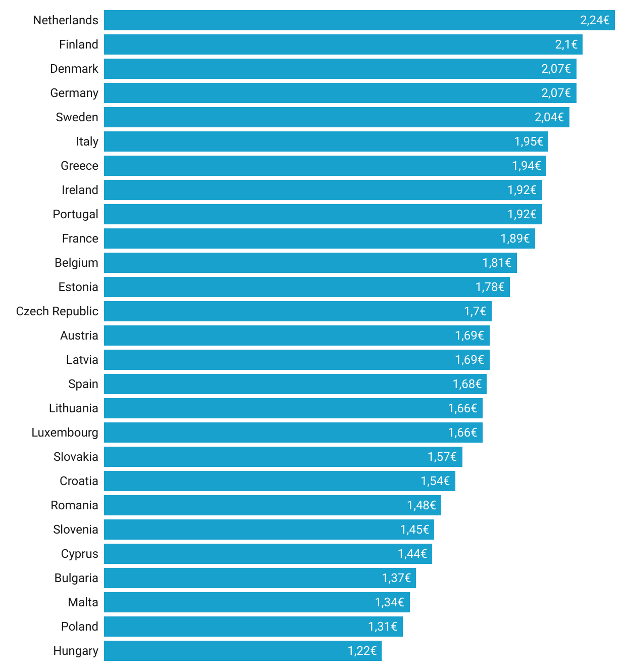
Source: Maarten Lambrechts, CC-BY 4.0
Categorical data is also used to colour visual elements in a chart belonging to the same group. For example in the bubble chart below, the bubbles representing countries from the same region share their colour.
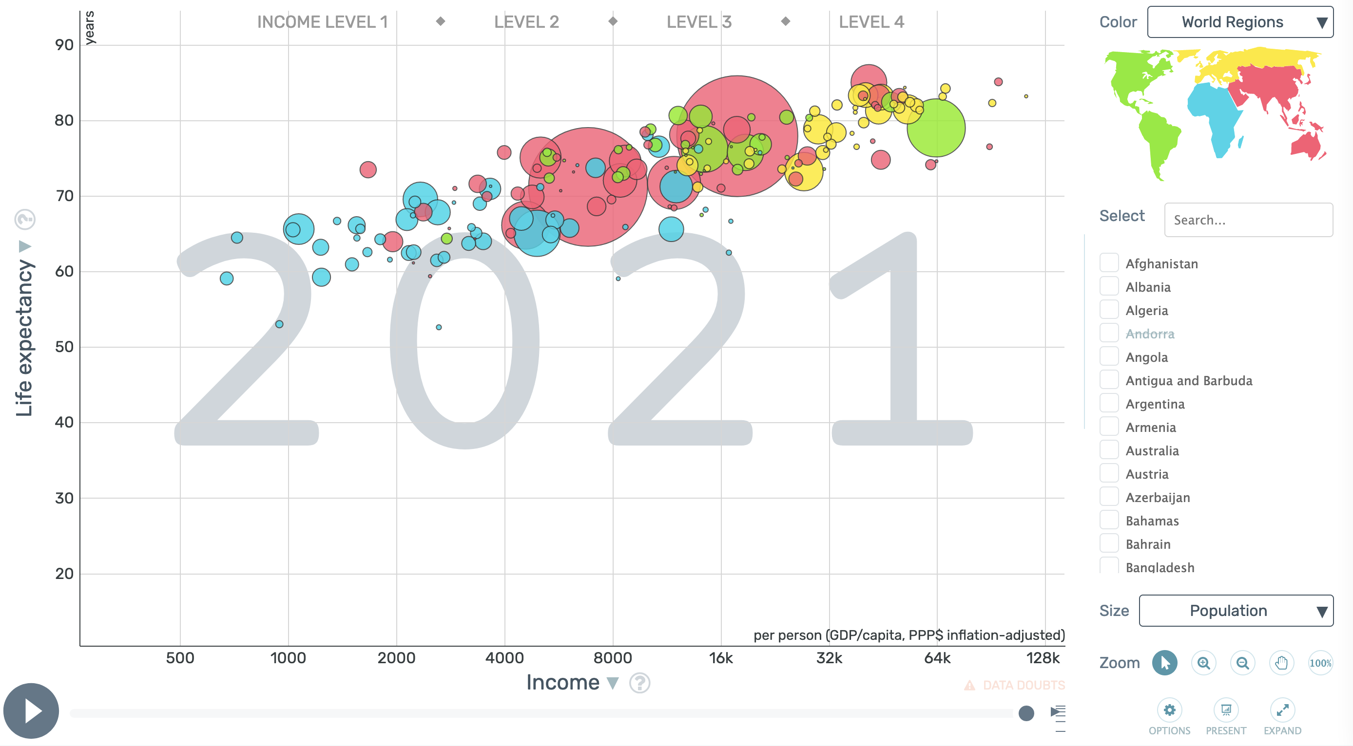
Source: gapminder.org/tools
Numerical data is the most common data type in data visualisation. Numbers can be used to position, size and colour geometrical objects in a visualisation. In the bubble chart above, numerical data is used to position and size the bubbles.
Numerical data can be continuous or discrete. In continuous data, a data point can take any value, while in discrete numerical data the number of possible values is limited. Continuous data can be converted into discrete, binned values, as the following 2 maps illustrate. Binned numerical values behave very much like categorical data.
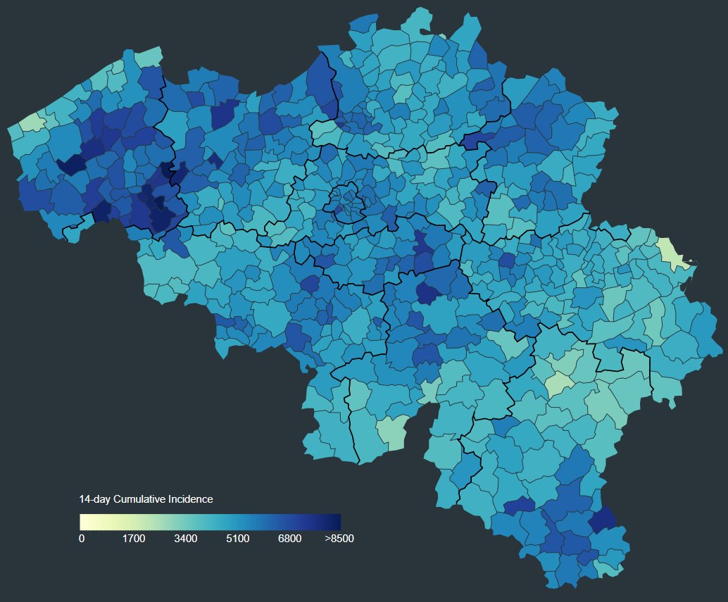
A choropleth map with a continuous colour scale. Source: Mathias Leroy
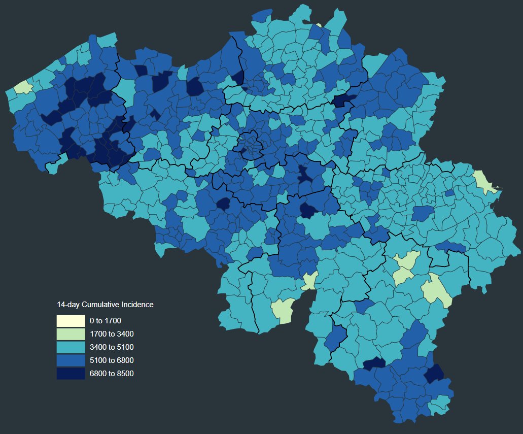
The same map, but this time with a binned colour scale. Source: Mathias Leroy
A very common type of data is temporal data, data containing information about a variable at different moments in time. Changes over time are usually visualised as line charts, with the x axis being the time axis, and time running from left to right.
Geographical data is any kind of data (categorical, numerical or temporal data, or a combination of these) that additionally contains information about geographical locations or entities. Geographical data can be used to make maps.