An alternative to choropleth maps are scaled symbol maps. These maps use the size of symbols to encode numerical variables. The symbols can be placed on exact locations, or they can be placed somewhere in the polygons for which they represent data.
Circles are the most used symbols for scaled symbol maps. The surface area of the circles on a scaled symbol map should be proportional to the values they represent.
In the map below, the colour of the circles is used to encode a secondary numerical variable.
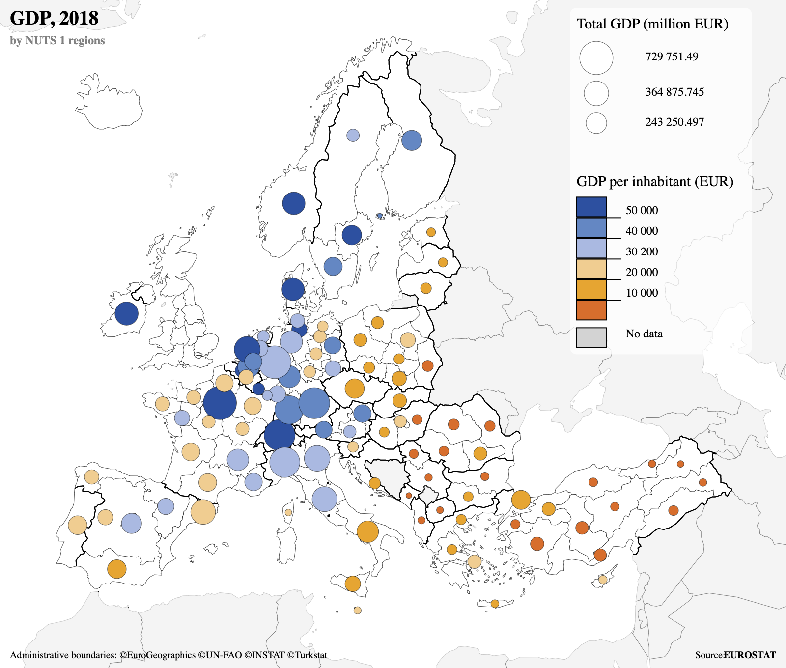
Source: Eurostat-map.js on observablehq.com
Other symbols, like squares, are also an option.
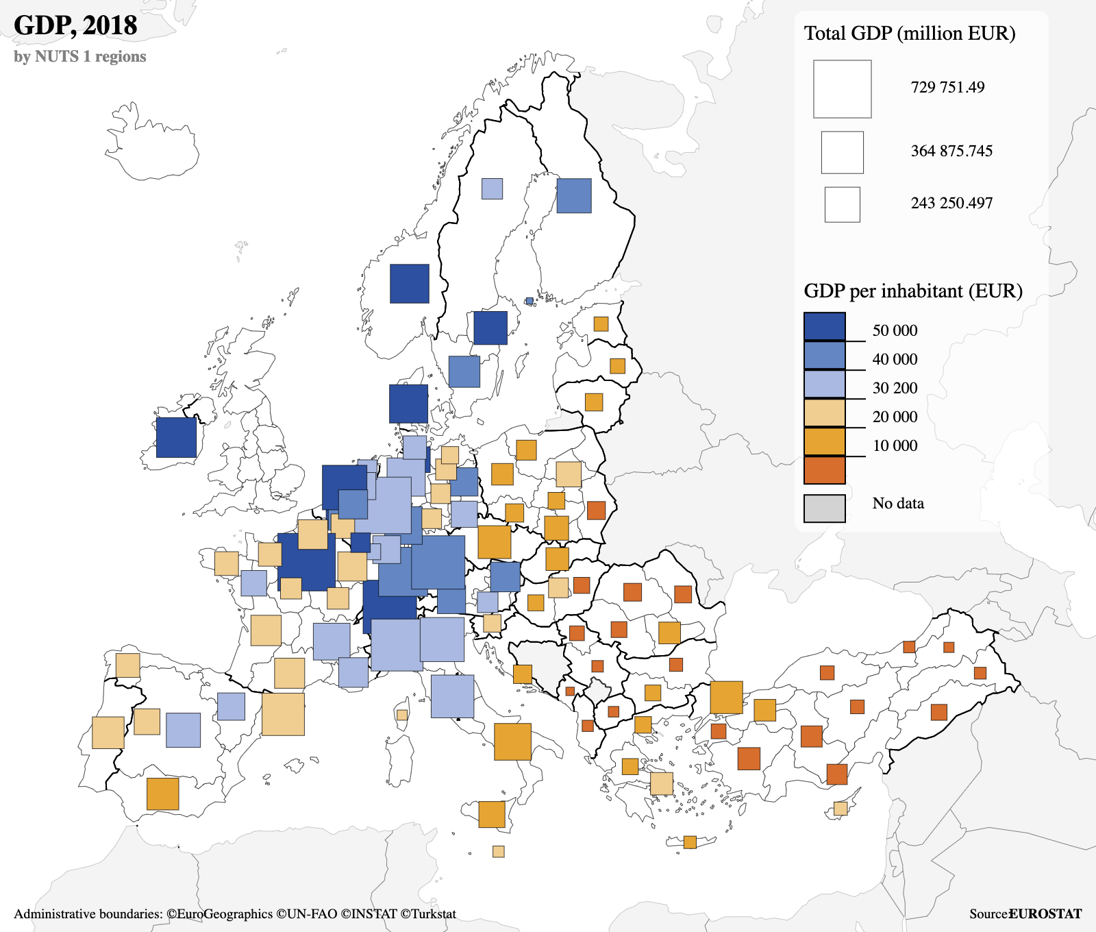
Source: Eurostat-map.js on observablehq.com
Spike maps are a special kind of scaled symbol maps. They use triangles that are scaled only in one direction. Spike maps have some advantages over scaled symbol maps that use circles or squares:
- the spikes overlap less, because they only grow in one direction
- because they are narrower, the spikes are better tied to a geographical location
- values can be compared better because it is easier to compare lengths than it is to compare areas
The spike map below encodes two additional numerical values with the colour and the width of the spikes.
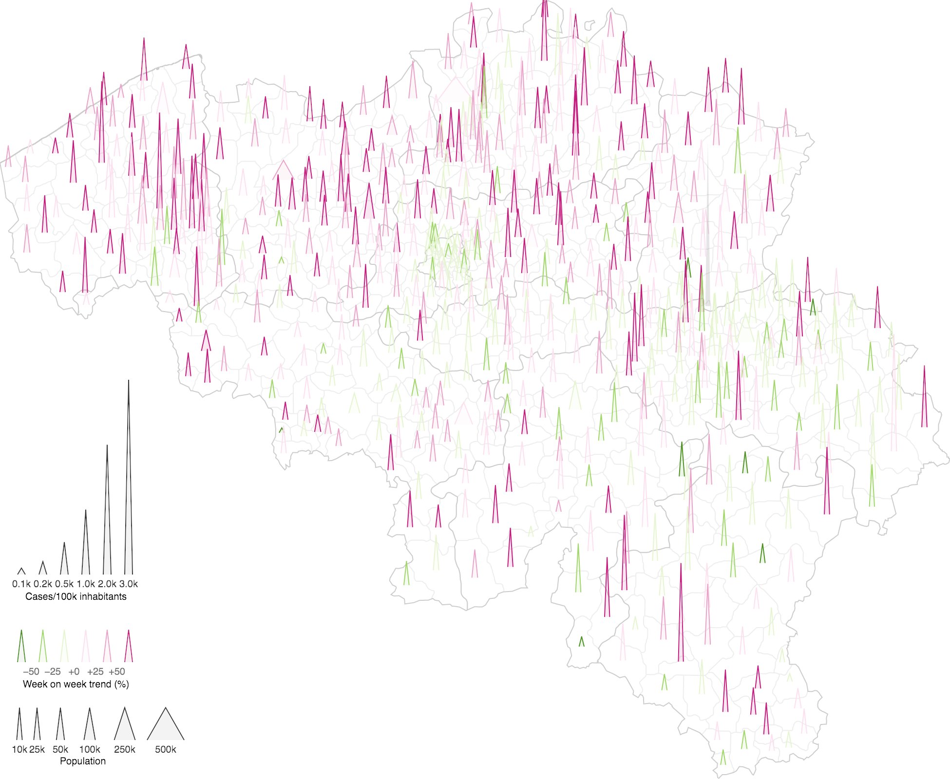
Source: Maarten Lambrechts, CC BY SA 4.0