Choropleth maps are a popular map type to show numerical values associated with administrative units (countries, provinces, municipalities, …) or other predefined geographical entities.
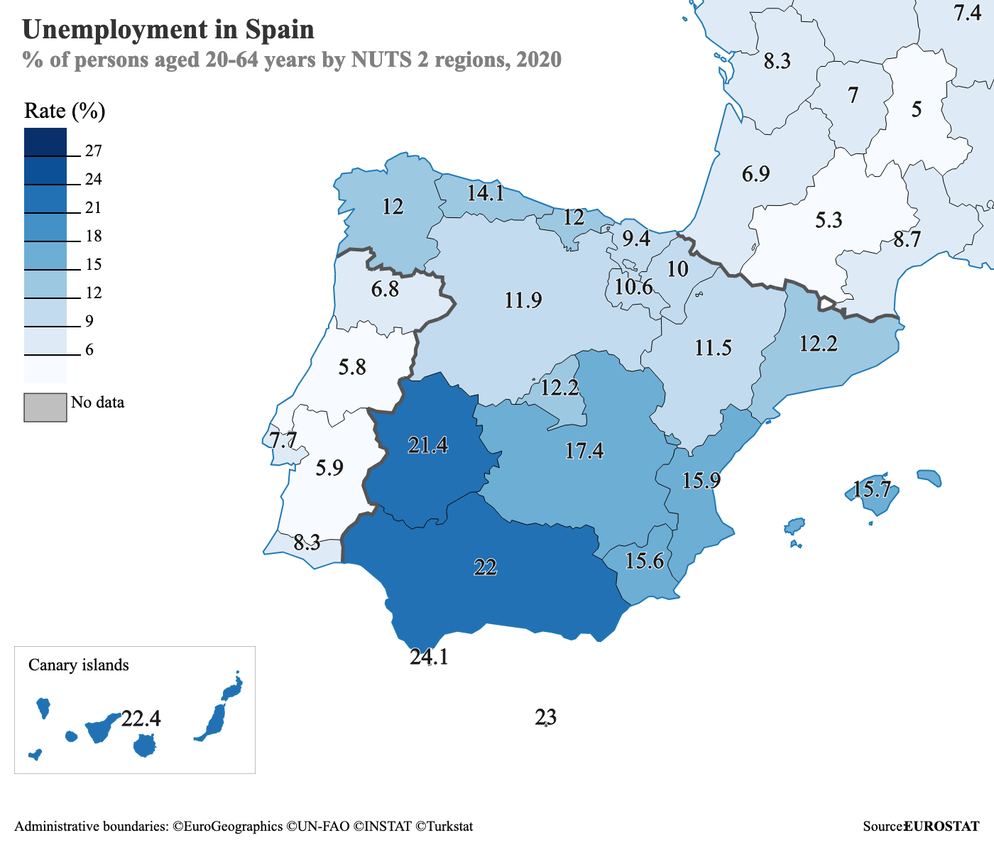
A choropleth map showing unemployment in Spanish regions. Source: Eurostat-map.js on observablehq.com
Crucial for choropleth maps is that the numbers shown are scaled for population (or in other words: the data should be normalised). Below is a choropleth map of the number of soldiers by country. Can you see how the most populous countries (China, India, United States) have the most soldiers, and why the map is more of a population map than a map about army sizes?
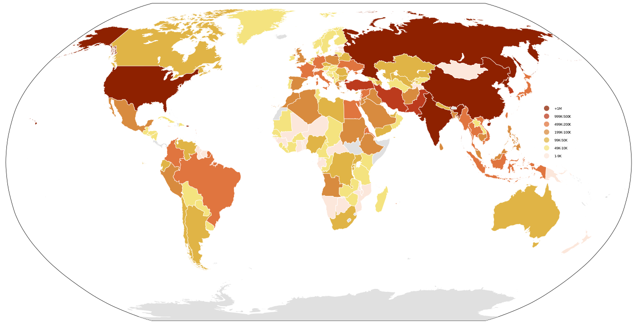
Source: Danalm000, CC-BY-SA 3.0
The colour palette of a choropleth map can be sequential, with light colours for small values and dark colours for high numbers like in the maps above, but when the values shown are deviations from a central value (like zero), the colour palette can also be diverging. In a diverging colour palette, two sequential colour palettes are combined to show the values on either side of the central value.
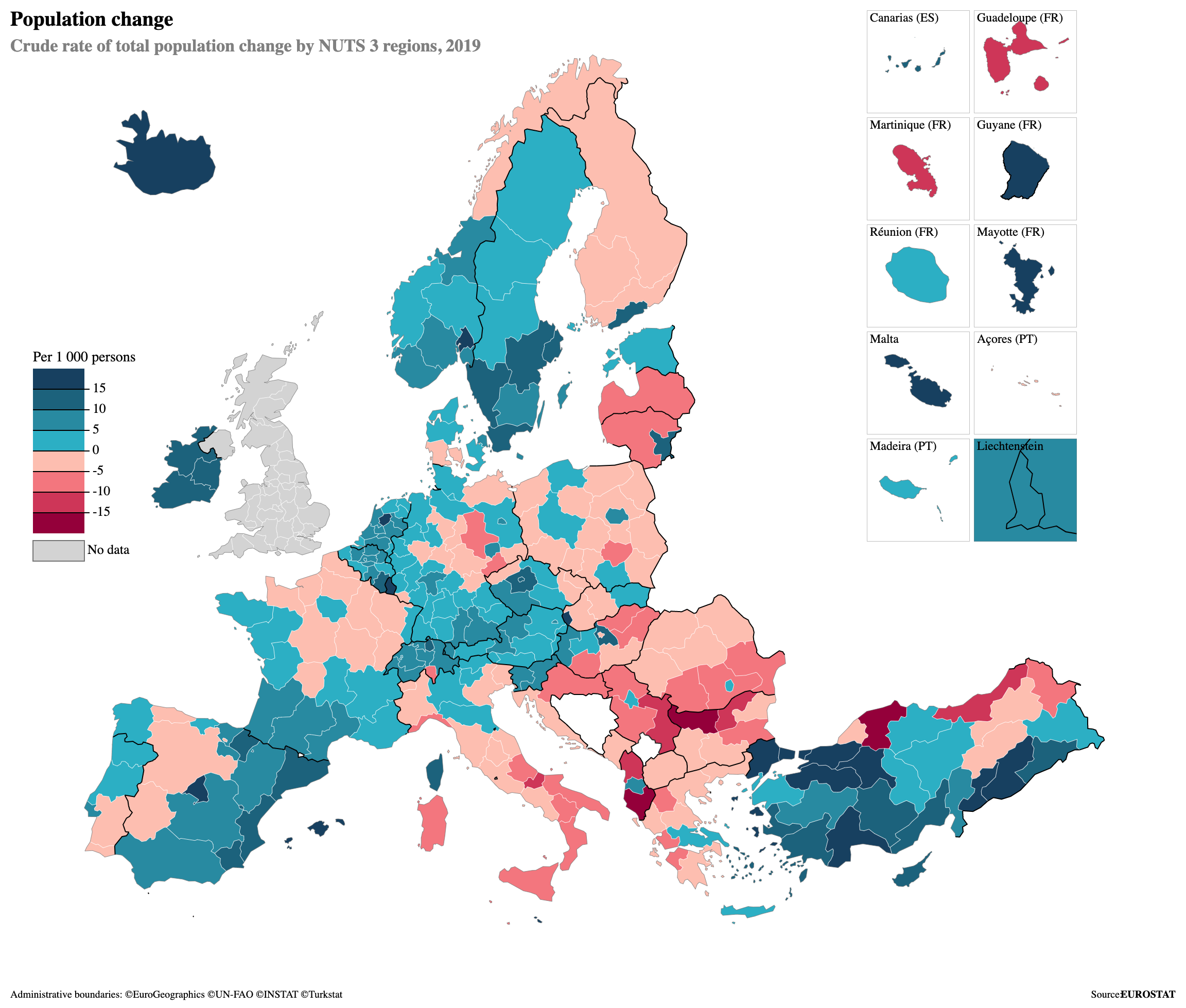
A choropleth map showing population change in European regions using a diverging colour palette. Source: Eurostat-map.js on observablehq.com
ColorBrewer is a good tool to pick good colour palettes for choropleth maps.
Choropleth maps, and especially world choropleth maps, should use a map projection in which the surface areas of countries are proportional (these projections are called equal area projections). So choropleth maps using the Mercator projection should be avoided.
Choropleth maps can also be used to show categorical data instead of numerical.
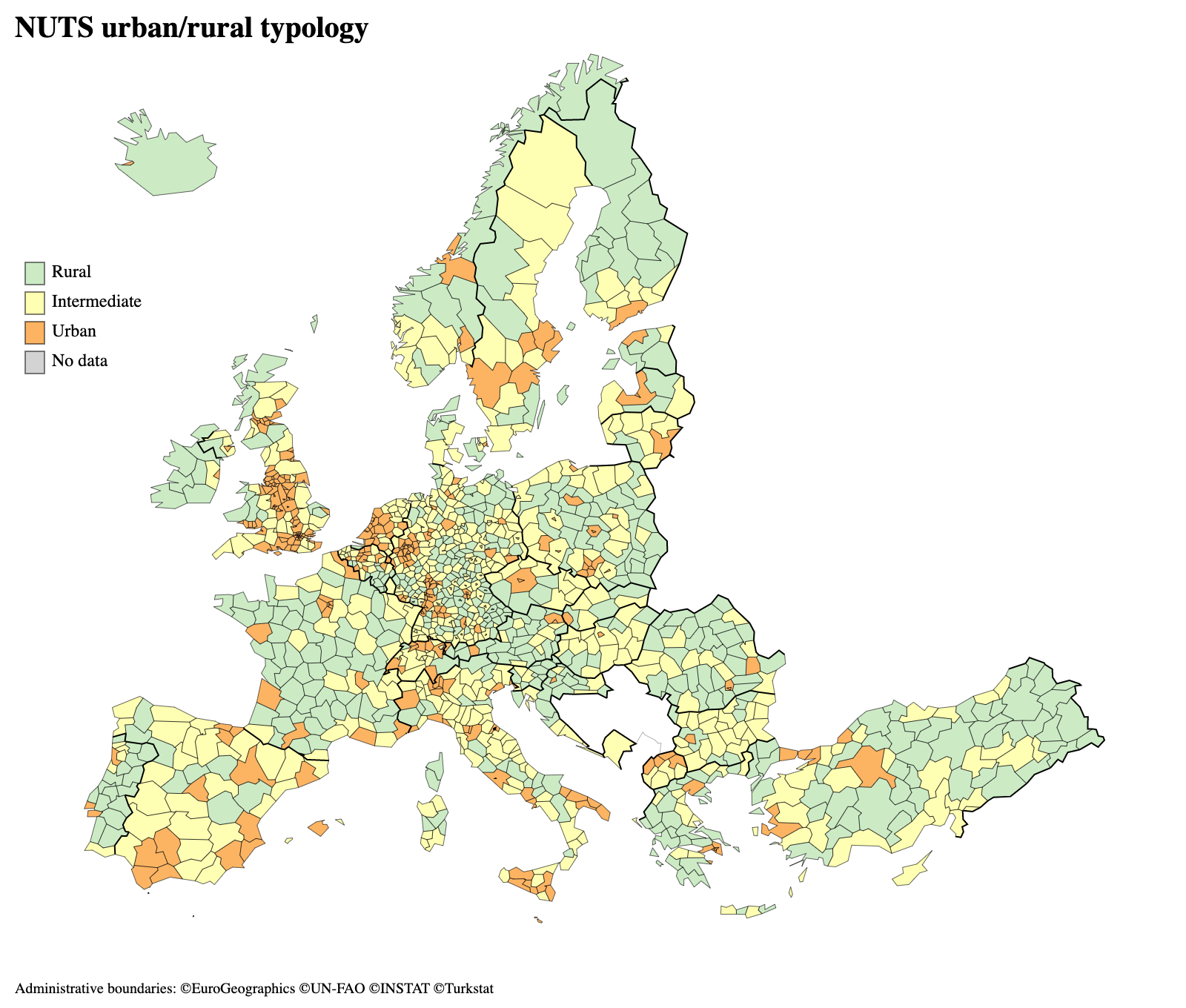
Source: Eurostat-map.js on observablehq.com
A special type of choropleth maps are bivariate choropleth maps. Instead of showing just one numerical value, bivariate choropleths show two. They do this by using a colour palette that goes in two directions.
As the example below shows, bivariate choropleth can reveal interesting patterns, but they are not so easy to read and interpret. Plotting a choropleth map for each of the two variables separately next to each other might be a better option.
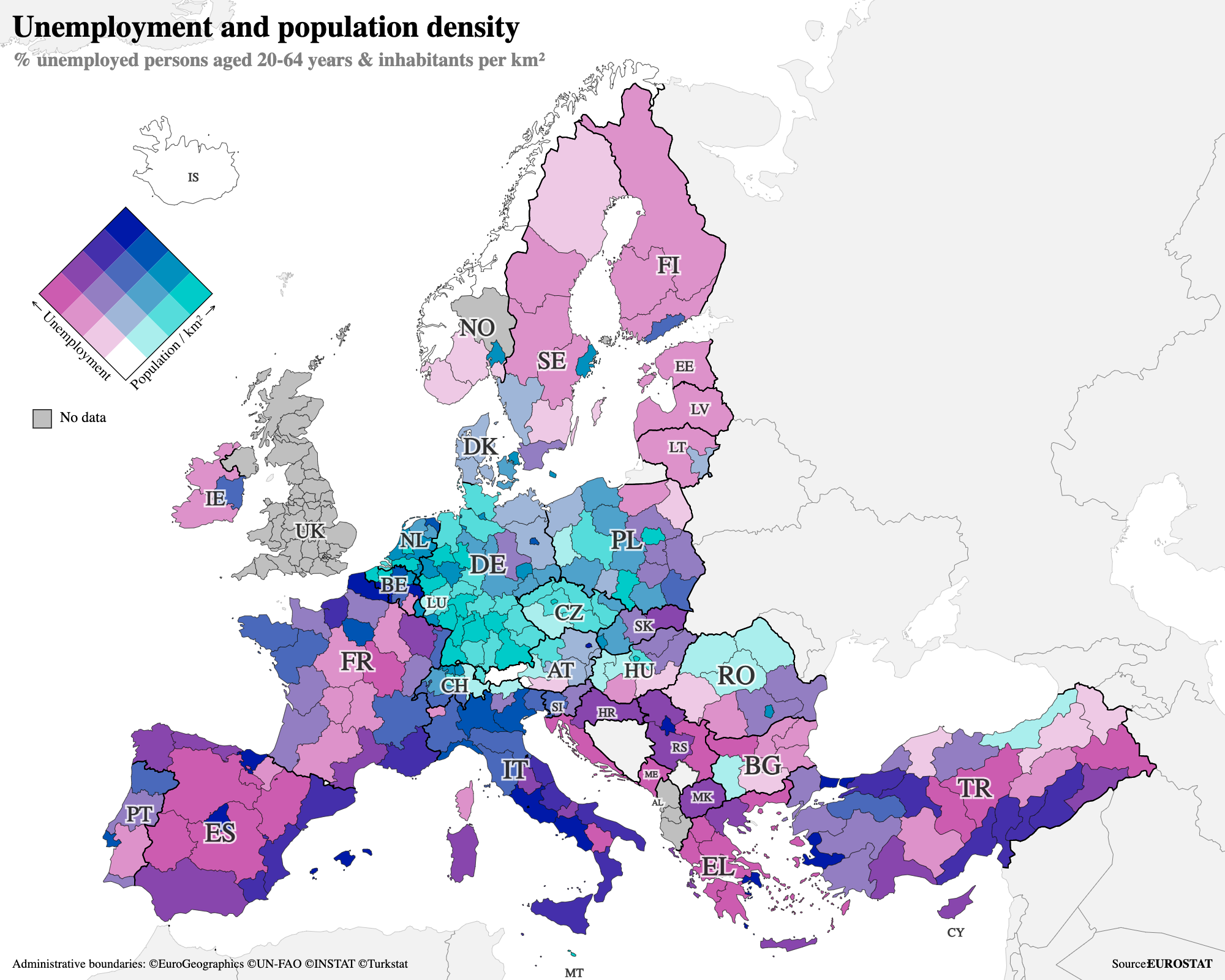
Source: Eurostat-map.js on observablehq.com