The normalising data describes that when numbers relate to geographic entities and they correlate with population, you should normalise them to per capita numbers to make meaningful comparisons. This is relevant for maps too.
Weighing by population is very important in choropleth maps (maps that show numerical values associated with administrative areas, using different shades of colours). Below is a choropleth map of the number of soldiers by country. Can you see how the most populous countries (China, India, United States) have the most soldiers, and why the map is more of a population map than a map about army sizes?
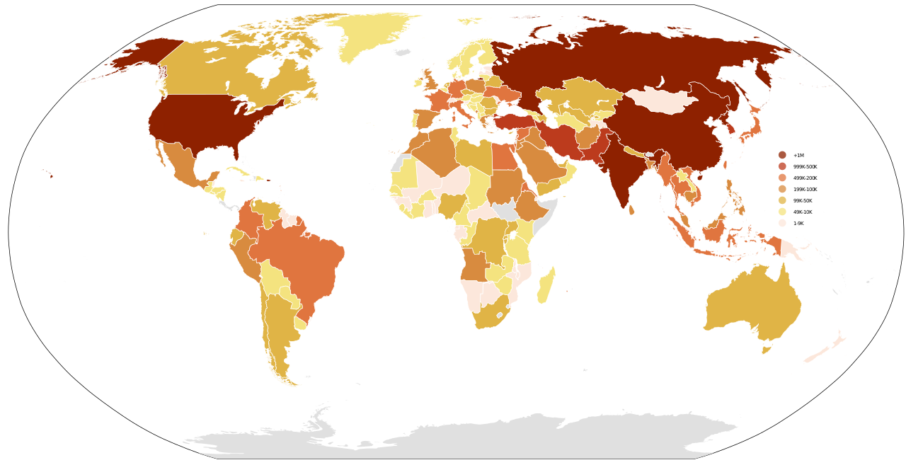
Source: Danalm000, CC-BY-SA 3.0
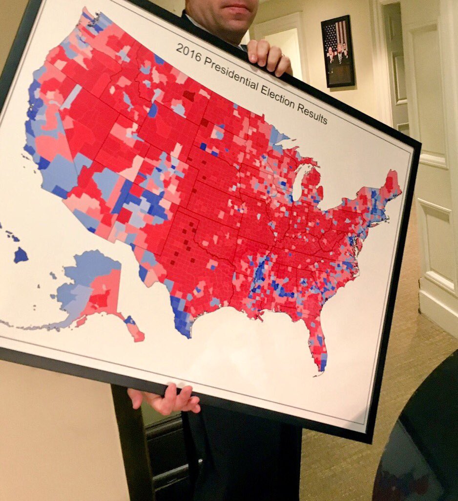
The map below shows the 2016 election results at the county level.
Source: @TreyYingst
The map is on its way to be hung on a wall in the White House, because president Trump really liked the map: it shows a lot of red representing his Republican party. So the map seems to support Trump’s claim of a landslide victory over Hillary Clinton.
But the map is not factoring in population density. Many red counties in the centre of the map have a big surface area, but small populations, while the (mostly Democrat) big cities on the east and west coast have large populations, but only small visual weights on the map because of their limited geographical extent.
Many techniques exist to factor in population on maps like this. One such technique is to visualise the counties using circles scaled by population.
Source: Karim Douieb
The animation in the video above shows an alternative mapping technique for choropleth maps. It uses circles to represent counties, with the size of the circle proportional to the population in each county.
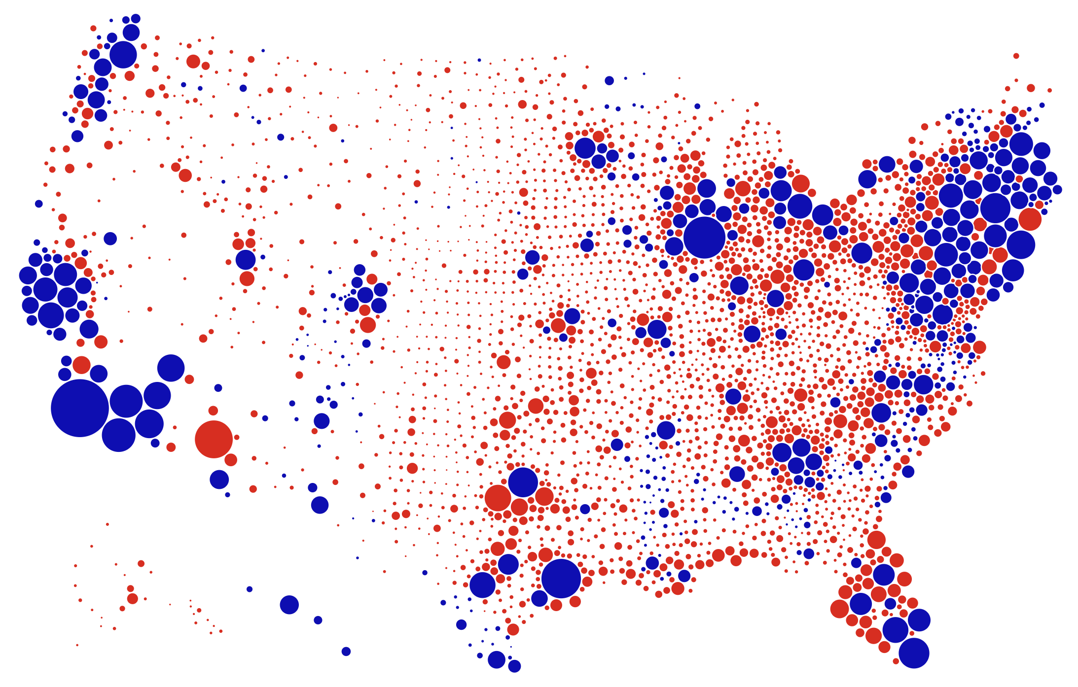
Source: Karim Douieb
These maps are called proportional symbol maps, and can make use of other shapes than circles. It is important to not fall into the scaling circles pitfall discussed on the respecting proportions page. In order to have the surface area of the symbols accurately represent the proportions in the data, the square root of the numbers should be mapped to the radius of the circles (or to the length of the sides of a square, for example).