Earth is a three-dimensional sphere, while maps are represented on flat two-dimensional sheets of paper or screens. It is impossible to turn the 3D surface of the earth into a flat surface without cutting and stretching the 3D surface.
Source: Vox
Different formulas for cutting and stretching the 3D surface of the globe exist, each with their own characteristics, drawbacks and advantages. These formulas are called projections, because they “project“ a 3D surface onto a 2D surface.
The most common projection today is without a doubt the Mercator projection. It was invented in the 16th century by Flemish cartographer Gerardus Mercator, and it was used heavily in shipping navigation. The main advantage of the Mercator projection is that you can follow straight lines on the map by following a constant direction on a compass.
With the birth of online maps, the Mercator projection made a very strong comeback. Its properties proved to fit the way interactive maps work really well, and so it was adopted by Google Maps and similar services, and became ubiquitous online.
But the Mercator projection has some serious drawbacks. The biggest one is that it introduces big deformations in the northern and southern parts of the map.
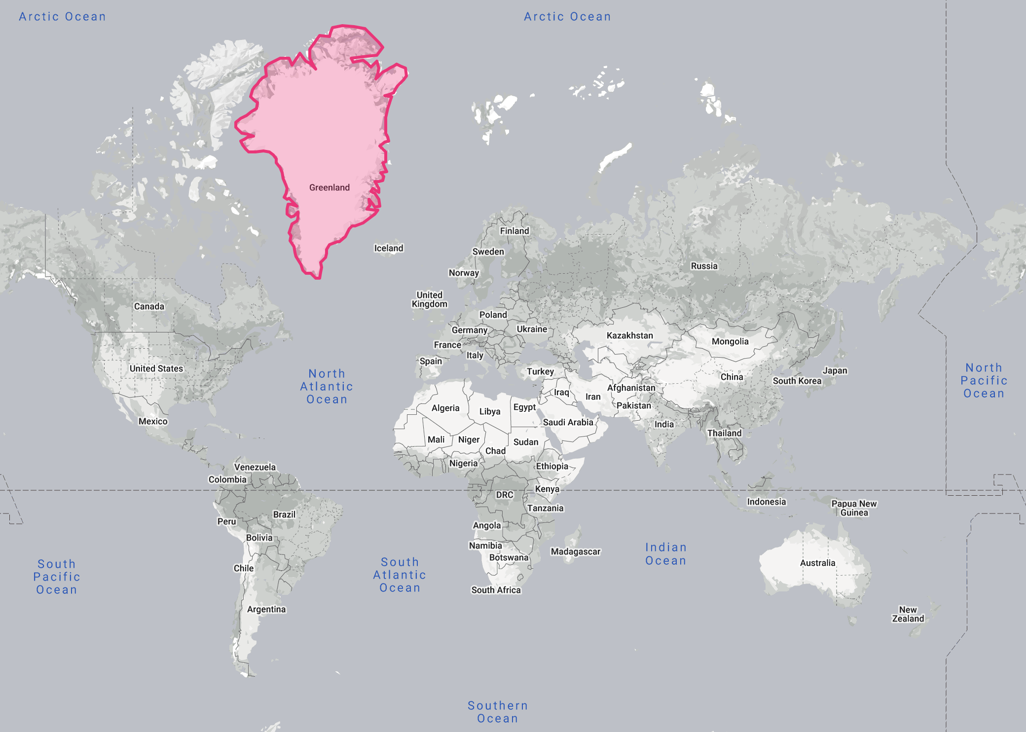
Here is an example to illustrate this. This is a world map using the Mercator projection, with Greenland highlighted.
Source: thetruesize.com
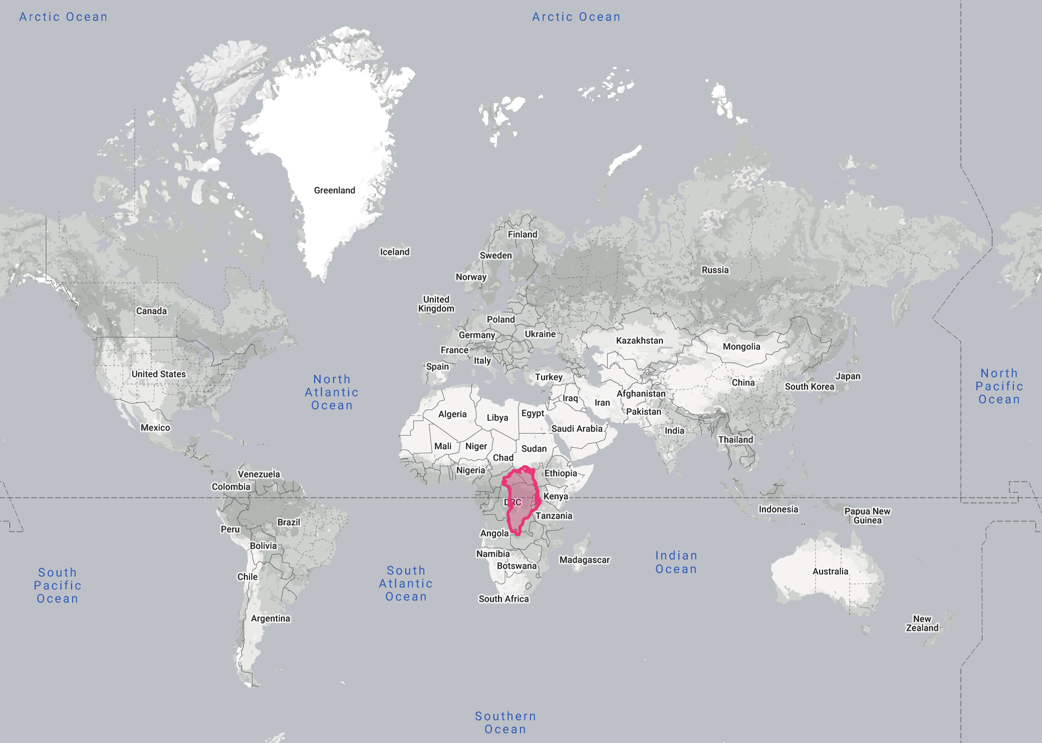
From this map, you might conclude that Greenland is roughly the size of the African continent. But that is very far from the truth. Look what happens when we bring Greenland to the equator on this map:
Source: thetruesize.com
Greenland has shrunken to the size of the Democratic Republic of the Congo. In reality, Africa can hold Greenland 14 times: Greenland has a surface area of 2,17 million square kilometres, while Africa is 30,4 million square kilometres big (DRC is 2,35 million square kilometres). Go to thetruesize.com to compare and drag other countries on the map.
So the Mercator projection overestimates the area of regions more to the north and south of the map. But this “stretching” of the map going north and south has other consequences too, as some journalists experienced when they published the map below in the edition of the The Economist of 3 May 2003.
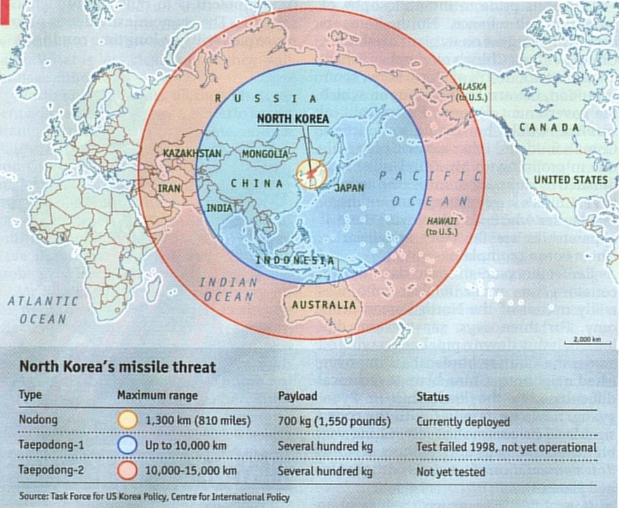
Source: The Economist
The map shows the range of 3 types of North Korean missiles on top of a Mercator world map. According to this map, the most powerful North Korean missile is able to strike as far north as the most northern tip of mainland Russia and as far south as the most southern point of Australia.
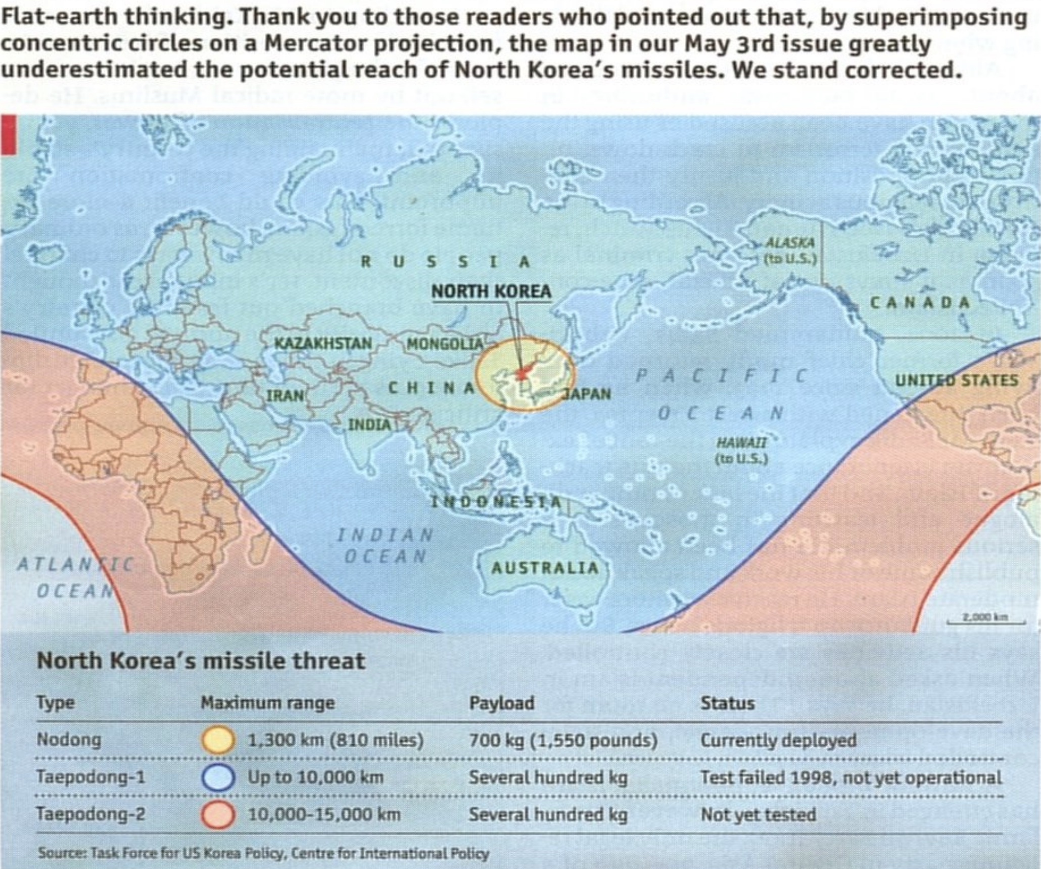
But as we’ve seen already, the areas are distorted heavily in northern and southern areas on Mercator maps. And as a result, what on a 3D sphere are concentric circles will not be concentric circles on the Mercator map. Cartography knowledgable Economist readers knew this and filed complaints about the map. Two weeks later, The Economist published a corrected version of the map.
Source: The Economist
The concentric circles have been replaced by an ellipse and sinusoidal bands on the map. The most powerful North Korean missile is able to strike all land except for Latin America.
Instead of using the Mercator projection, a more elegant solution would be to use a projection that looks down on Earth from directly above North Korea. With a projection like that, the concentric circles on the globe remain concentric circles on the map.
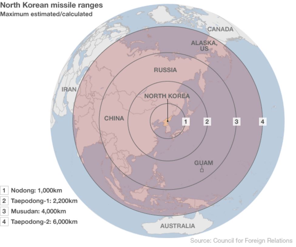
Source: North Korea test-fires mid-range missiles, bbc.com
Of course, this projection can only show half of the world at once. To show how far the biggest missiles can strike, you need to use yet another projection, and look at the globe from space at another angle.
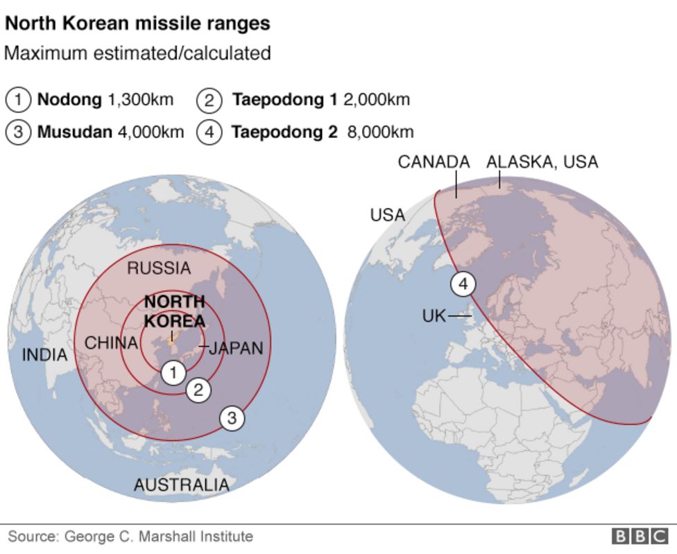
Source: North Korea ‘fires short-range missiles’ into sea, bbc.com
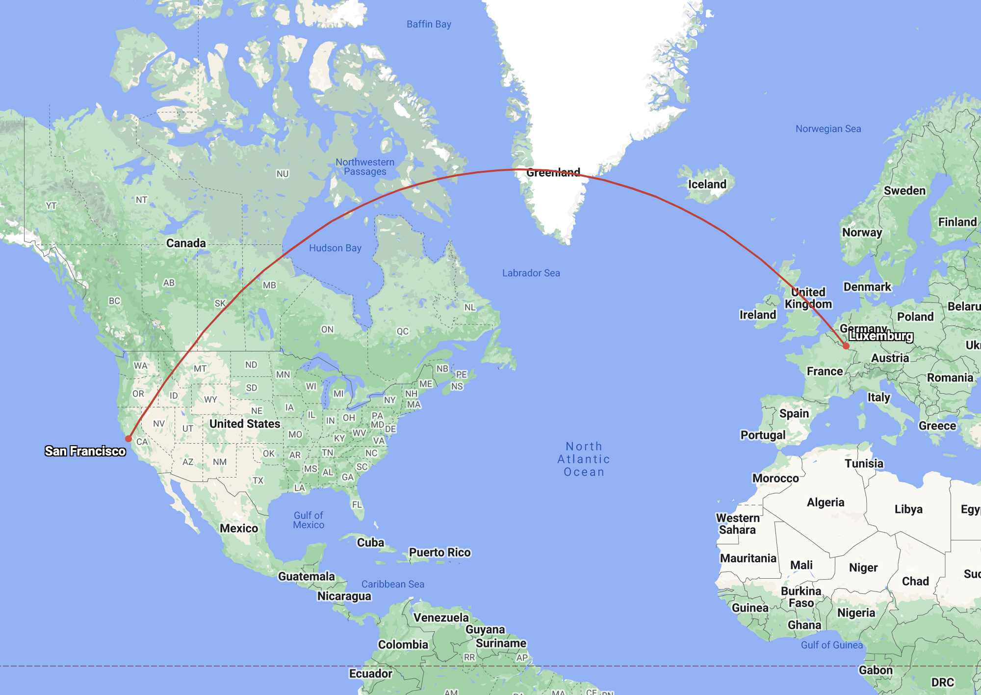
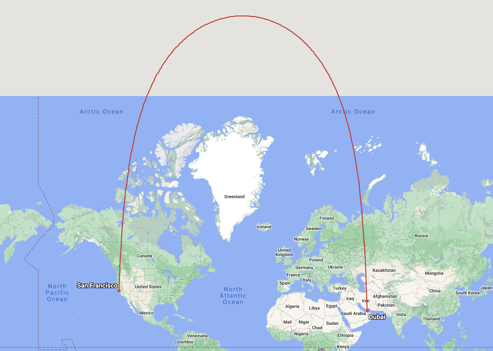
In the same way that circles on the globe are not circles on a Mercator map, straight lines on the globe are not straight lines on the map.
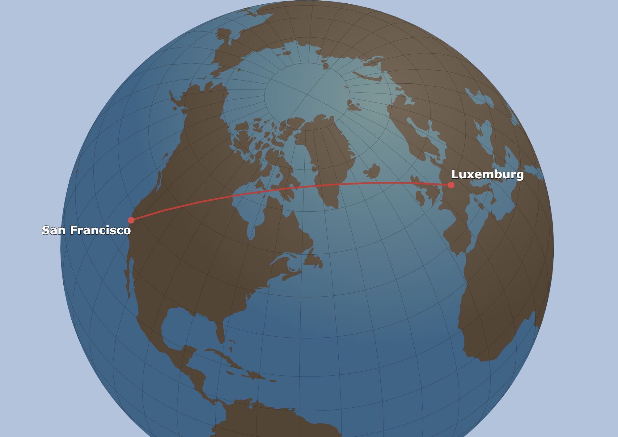
Source: greatcirclemap.com
Source: greatcirclemap.com
And this is what happens when you map the route of flight passing close the North pole:
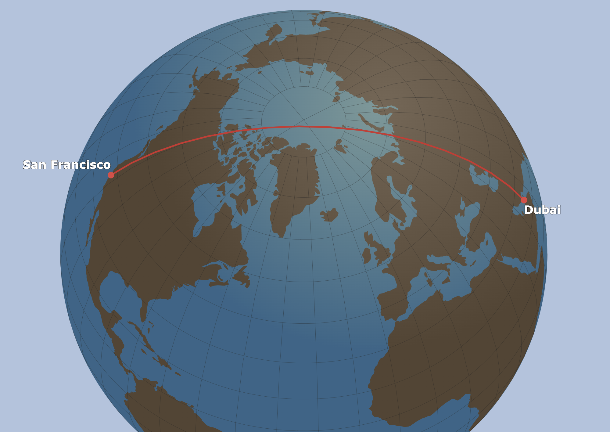
Source: greatcirclemap.com
Source: greatcirclemap.com