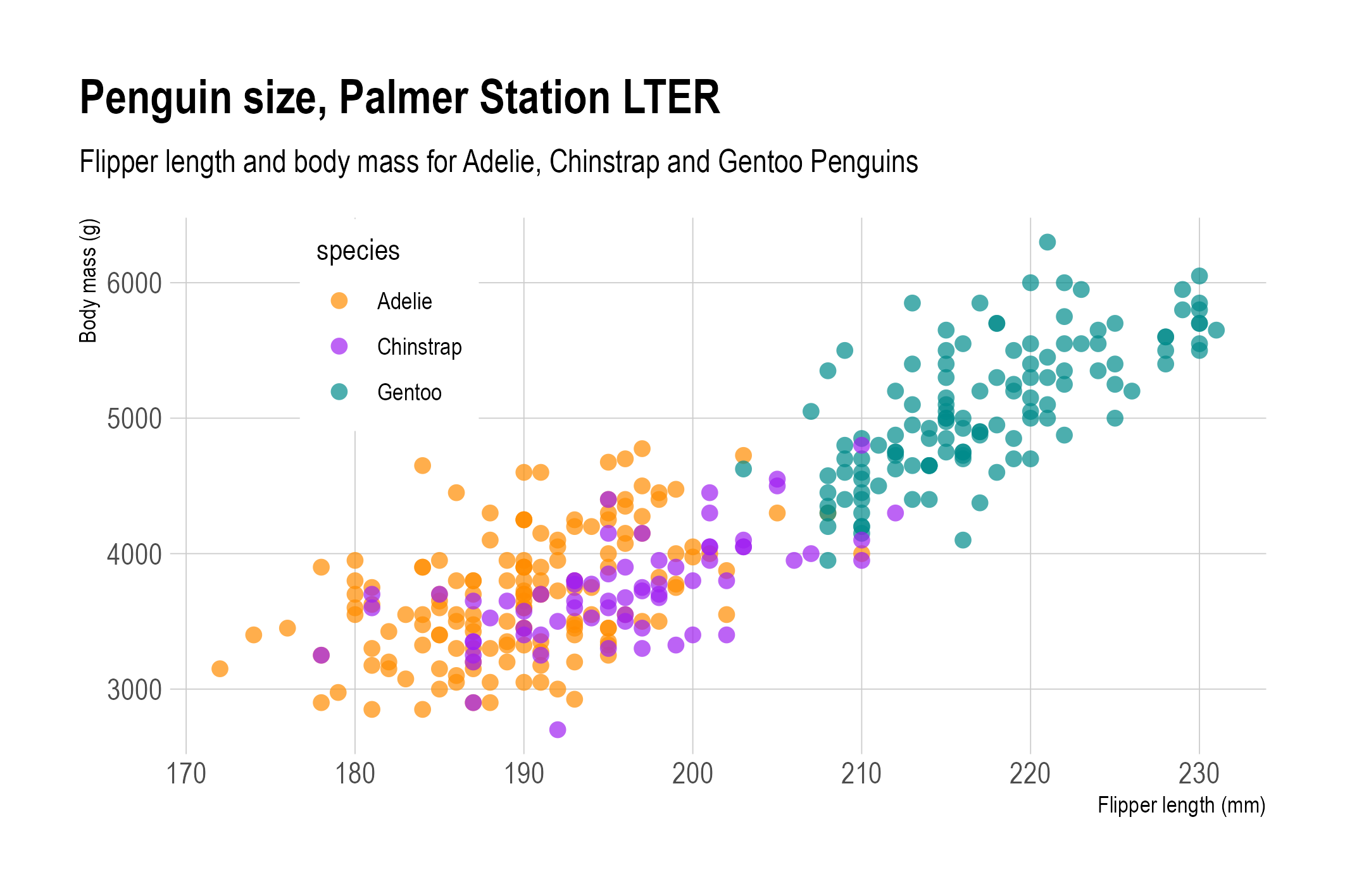
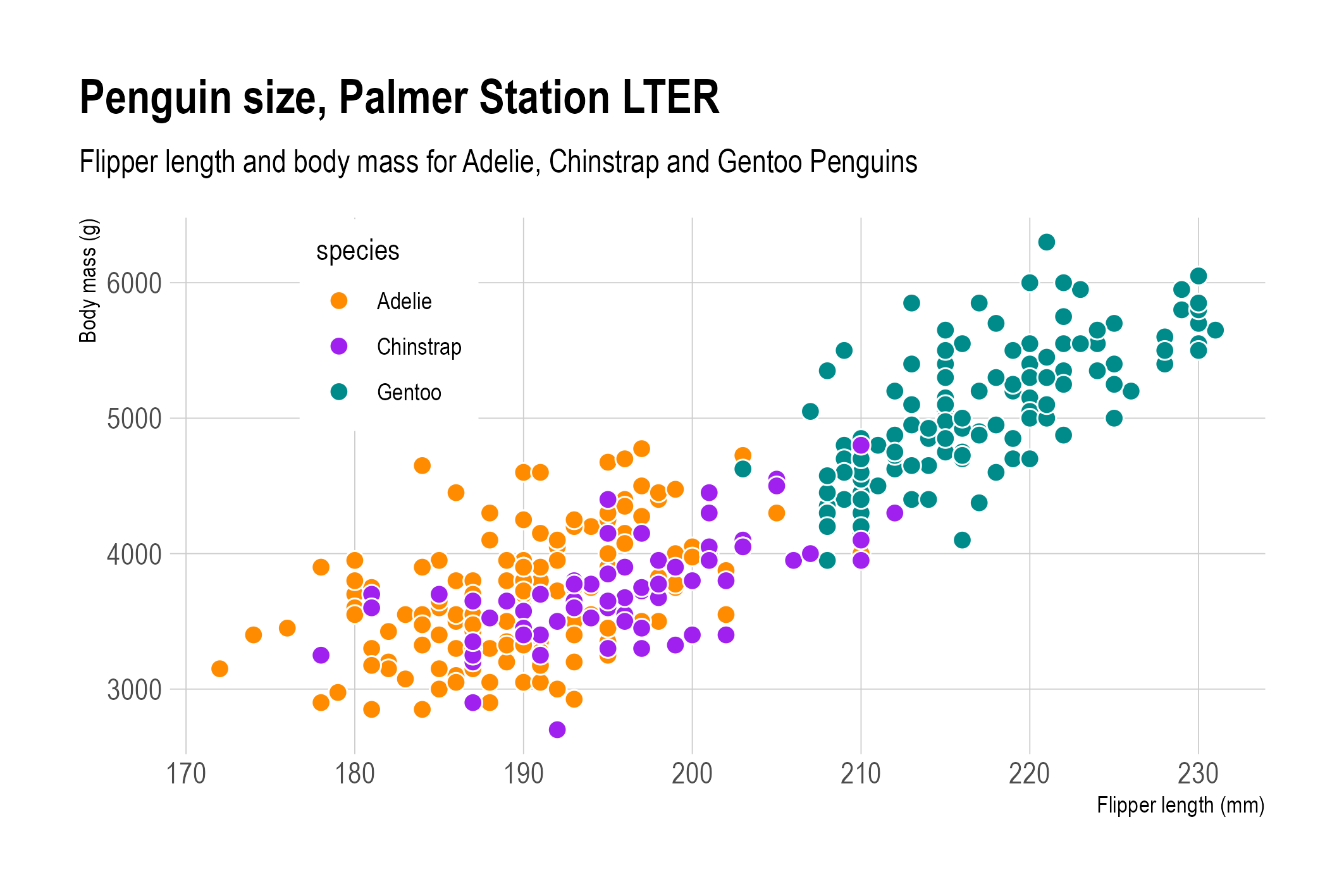
In the scatter plots shown above, many of the circles representing the data points are overlapping each other. Both charts use the opacity of the circles to show the overlap: because the circles have some transparency, the areas on the chart where there is a lot of overlap have a darker colour than the circles that are not overlapping other circles.
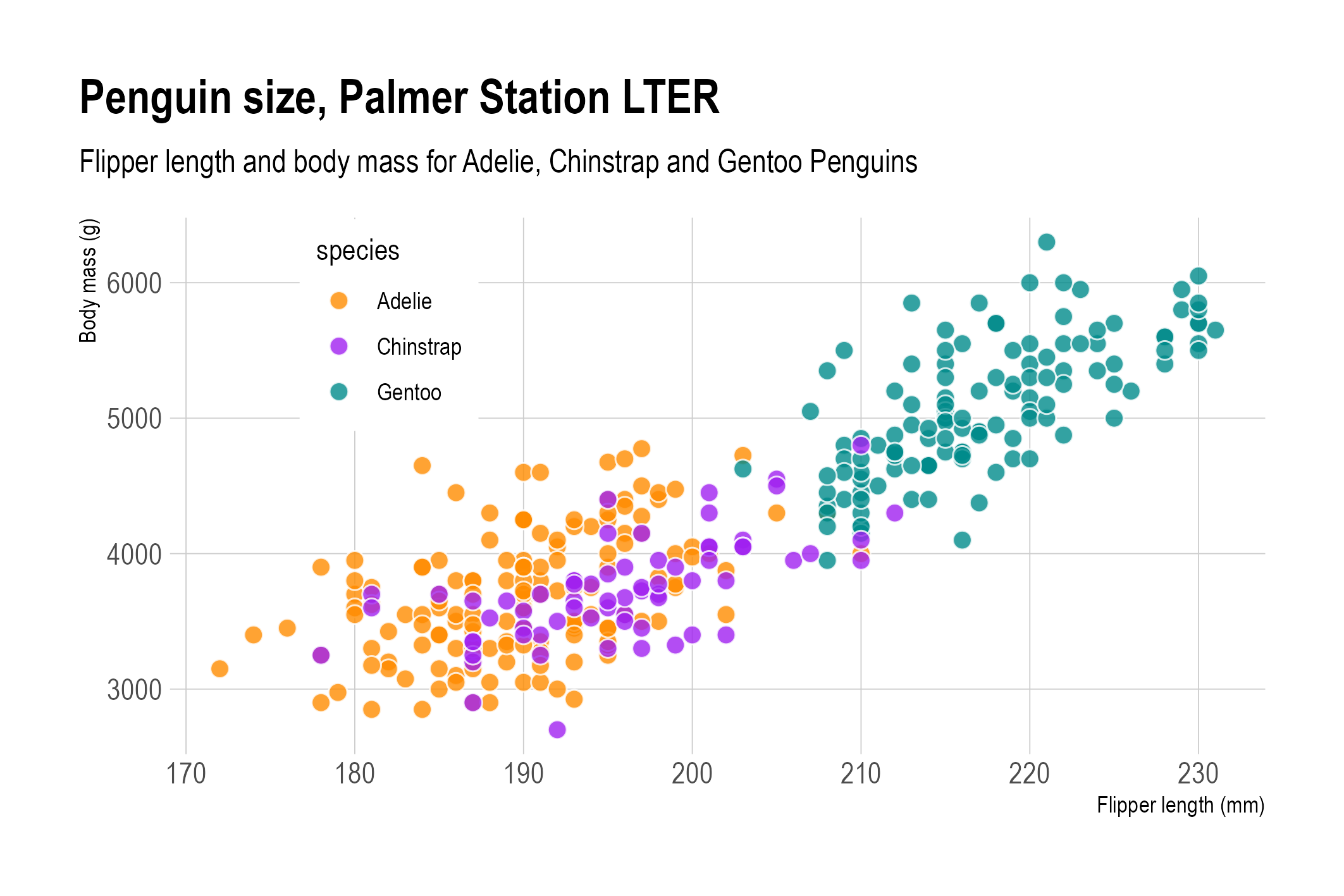
This technique of using transparent circles can be replaced or complemented with giving the circles a white or other light coloured outline.
](A%20deep%20dive%20into%20scatter%20plots%20447afd31ef0d4b0a887b000d2b360f95/penguins-scatter-overplotted.png)
Overlapping dots without outline nor opacity. Source: adapted from Allison Horst
Overlapping dots with opacity. Source: adapted from Allison Horst
Overlapping dots with a white outline. Source: adapted from Allison Horst
Overlapping dots with both opacity and a white outline. Source: adapted from Allison Horst
When the number of data points to show is so high that when using the techniques mentioned above, the scatter plot is still too crowded, the size of the dots can be reduced. When even this does not solve the issue, you could look into binning your scatter plot to create high data density scatter plots.