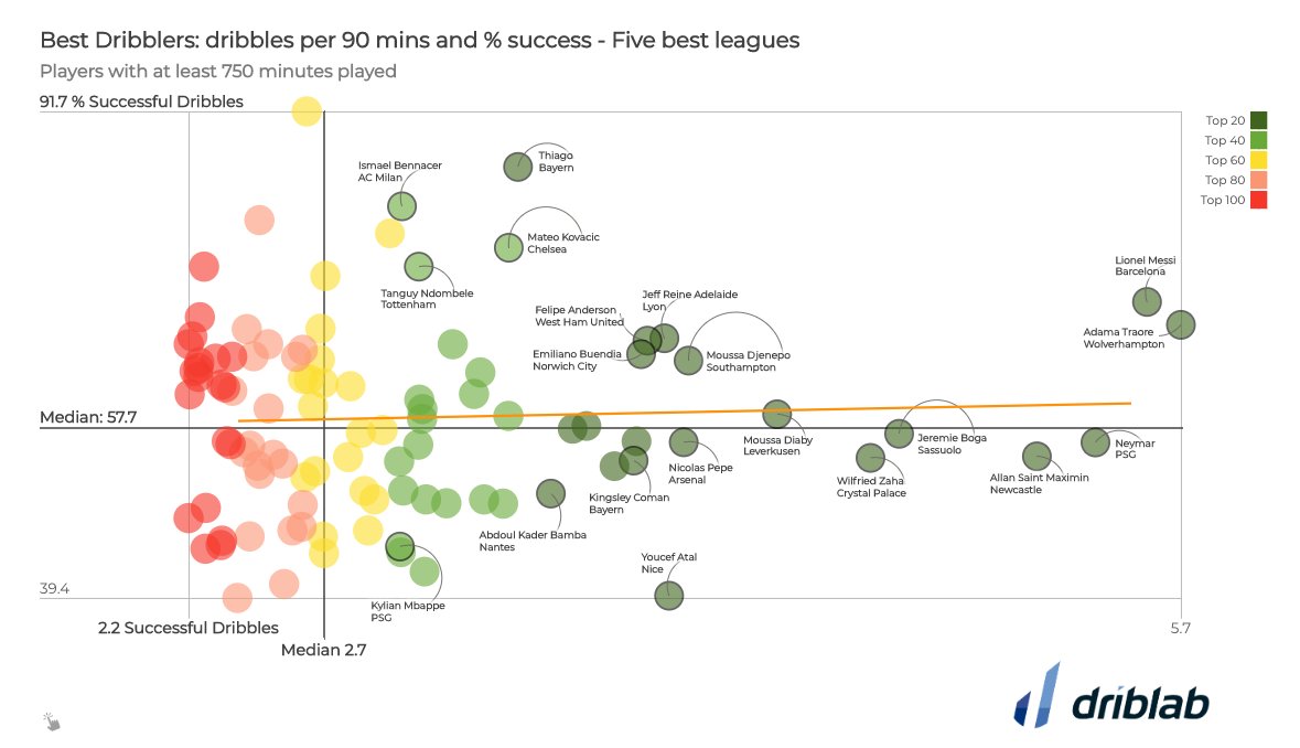
Adding lines for the medians in a scatterplot can serve as a powerful storytelling mechanism: the medians for the x and y values create 4 quadrants that can be used to classify the data marks into 4 categories for x and y values (”low-low”, “low-high”, “high-low” and “high-high”).
Using the medians for x and y assures that each quadrant contains the same amount of data points: half of the points are above and below the horizontal median line for y, and half of the points are to the left and right of the vertical median line for y.
The interactive chart above uses the “medians-quadrant” visual annotation technique. Source: The millennials who are making it, axios.com
Source: @driblab