Communication of uncertainty in data is a big challenge, because most audiences are not familiar with abstract concepts that are used to describe uncertainty, like sampling, variability and estimation. Because of this, uncertainty is often ignored and left out of the visual representation of data altogether. This is, of course, the worst solution.
Better, but still not optimal, is to use error bars to show a standard-deviation ranges or confidence intervals. This communicates at least that there is some kind of variability in the data, and that the estimates come with a degree of uncertainty.
But error bars can also be misinterpreted by people not familiar with standard deviations and confidence intervals. In one study that looked at how people interpreted a bar chart showing forecasted minimum night time temperatures with a 95% confidence interval, participants incorrectly believed that the limits of the confidence interval represented minimum and maximum forecasted temperatures.
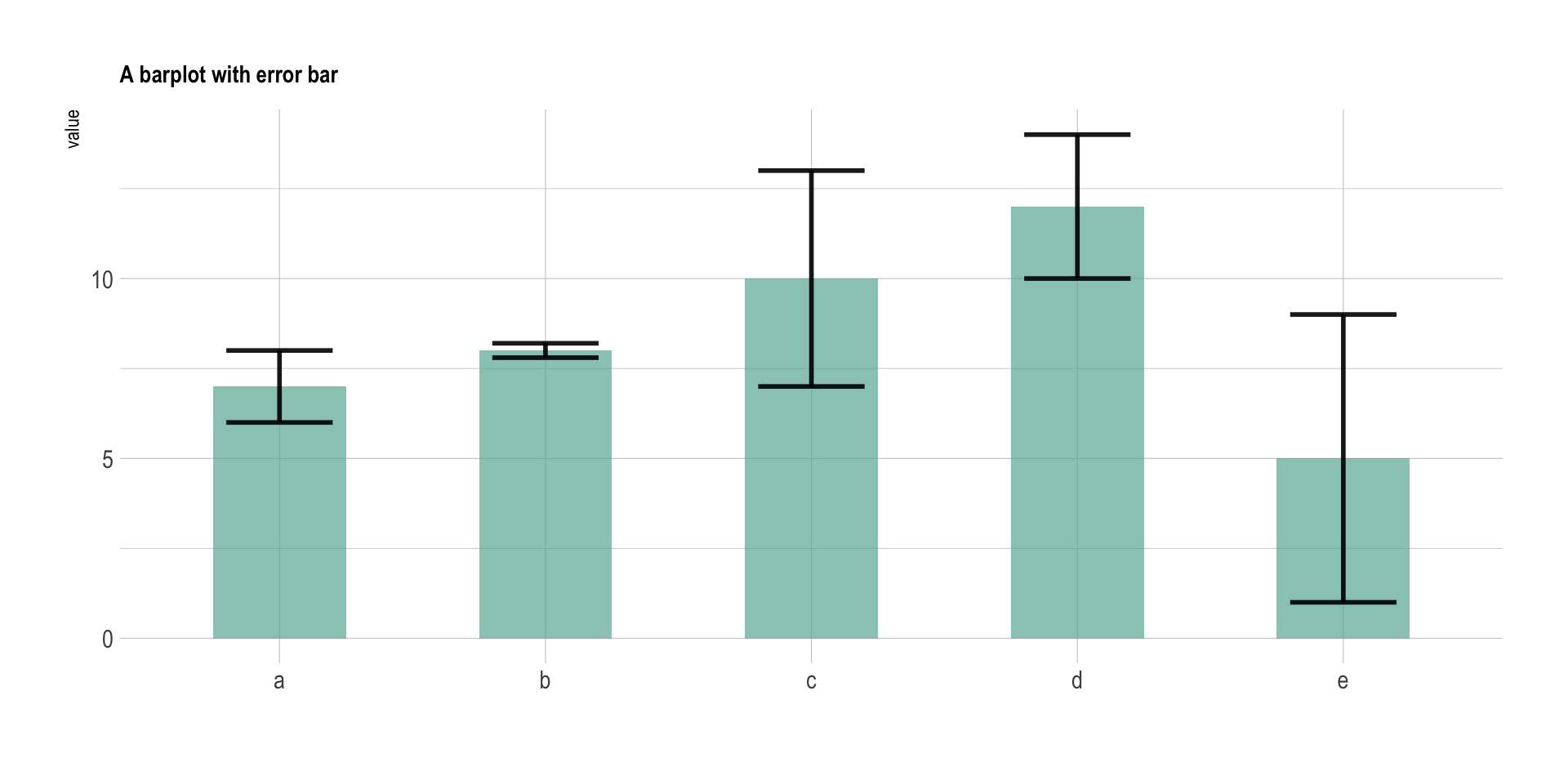
Source: The issue with error bars, data-to-viz.com
Using bar charts to summarise a distribution itself is a bad idea, even when error bars are present to show the uncertainty in the estimate. Research has shown that viewers appear to implicitly believe that a bar contains the full distribution of data values because of its metaphorical status as a container. Even when reminded that the top of a bar chart represents the mean of a distribution of values, viewers still rate points that fall slightly below the tip as more likely to belong to that distribution than points placed slightly above it.
And there is another problem associated with summarising a data set with a bar + error bars. Consider these 2 bar charts with error bars, and the 2 datasets they summarise:
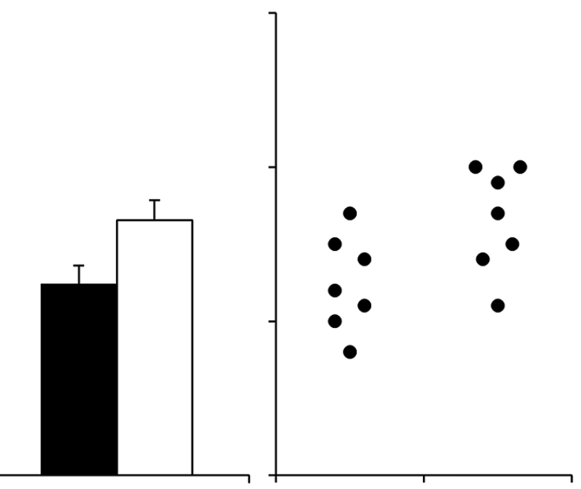
Source: Beyond Bar and Line Graphs: Time for a New Data Presentation Paradigm
This illustrates the issues that visualising distributions with bar charts suffer from:
- the bars have a “zone of invisibility”: an interval on the y axis where data values occur but which is not covered by the bars
- the bars also have a “zone of irrelevance”: part of the bars cover an area where no data values occur
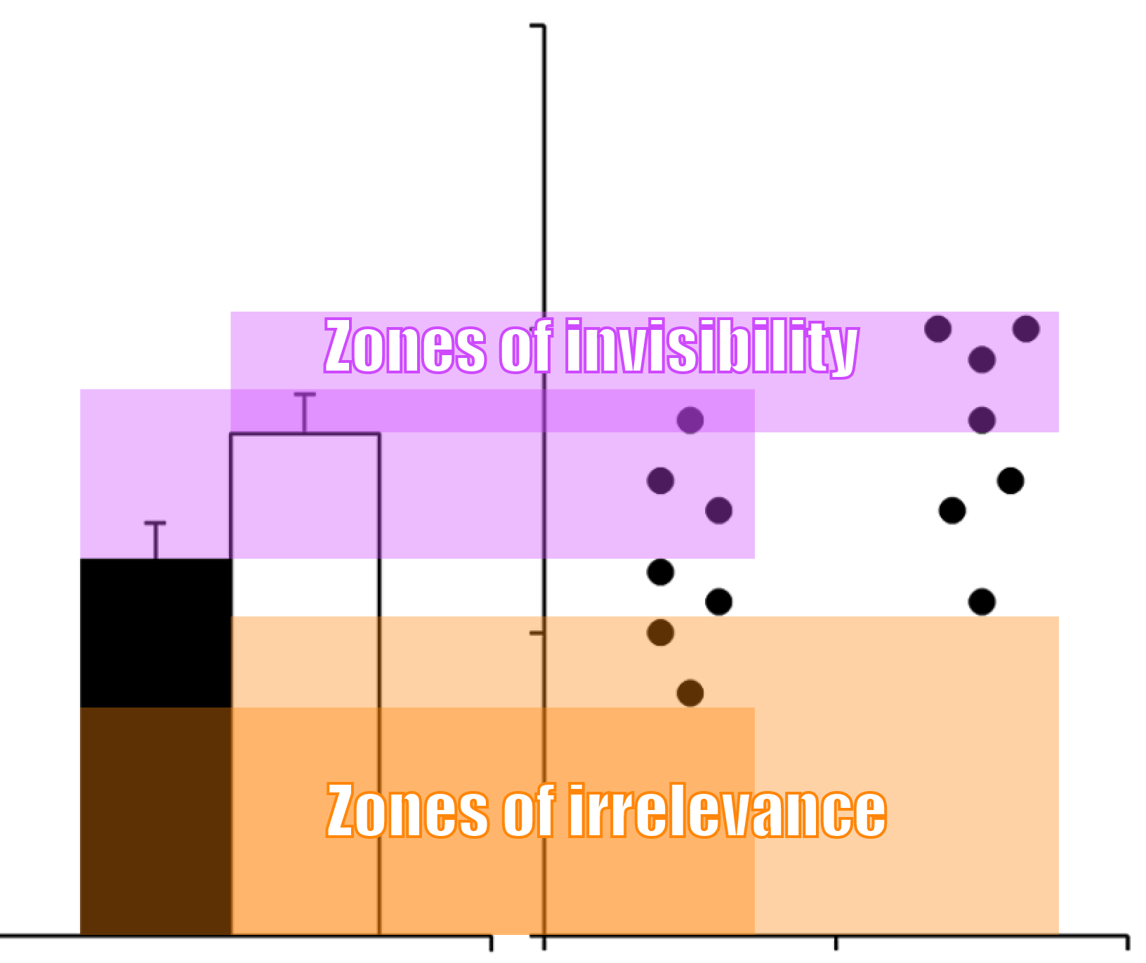
Source: Beyond Bar and Line Graphs: Time for a New Data Presentation Paradigm
Another example of a visual representation of a confidence interval that is often misunderstood, is the “cone of uncertainty” that is used by many weather services in the US to show the predicted paths of hurricanes on maps.
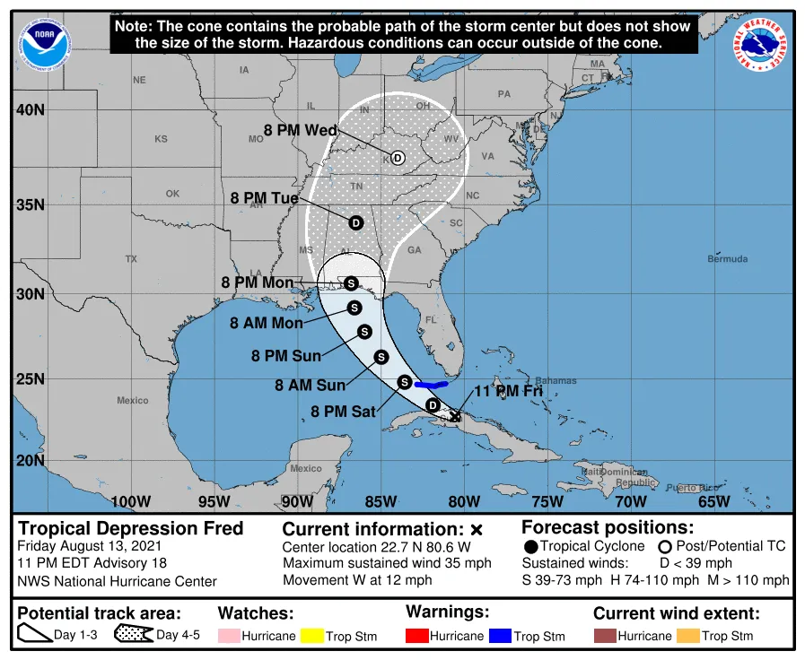
A map showing a cone of uncertainty for the predicted path of a hurricane. Source: NOAA - NWS
The cone represents the 66% confidence interval across thousands of simulations of the future paths of a hurricane. But many viewers interpret the cone as the area where dangerous weather is expected, and the area outside of it as safe. Viewers also conclude from the shape of the cone that the storm will become bigger over time. None of these are true: many simulated storm paths actually fall out of the cone, so in no way the areas outside of the cone could be considered totally safe. And the bigger width of the cone at the end of it is due to the higher uncertainty of the path of the storm further into the future.