Dot maps (also called dot density maps or dot distribution maps) uses dots to visualise the density of big numbers of individual objects. Each dot can represent a single object or single individual, are a fixed number of them. For example each dot on a map could represent 100 people.
The dot map below shows a dot for every individual living in an area in the Netherlands. The colour of each dot represents the origin of the people they represent: Dutch (pink), western (green) and non-western (blue).
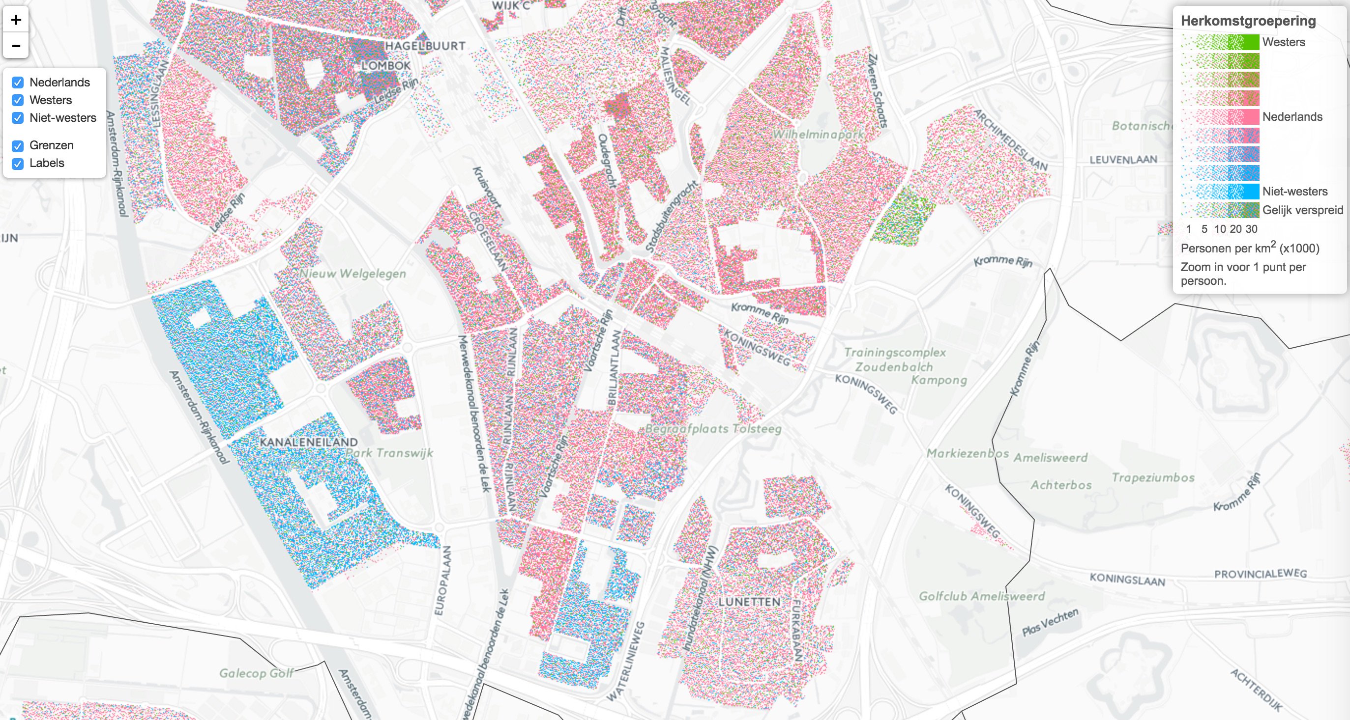
Source: CBS
Note that the map above only draws dots in areas that are classified as residential, so the dots are only drawn in areas where people are living. This technique of excluding areas from a choropleth or dot map where the variable plotted is known to be not relevant is called dasymetric mapping.