Just like overplotted scatter plots can be summarised with binned scatter plots, a map with a lot of points can be summarised by creating a grid and counting how many points fall into each grid.
The used grid could consist of squares, but usually hexagons are used because they cover the plane in a nicer way. The hexbin map below shows the density of farmer markets in the US.
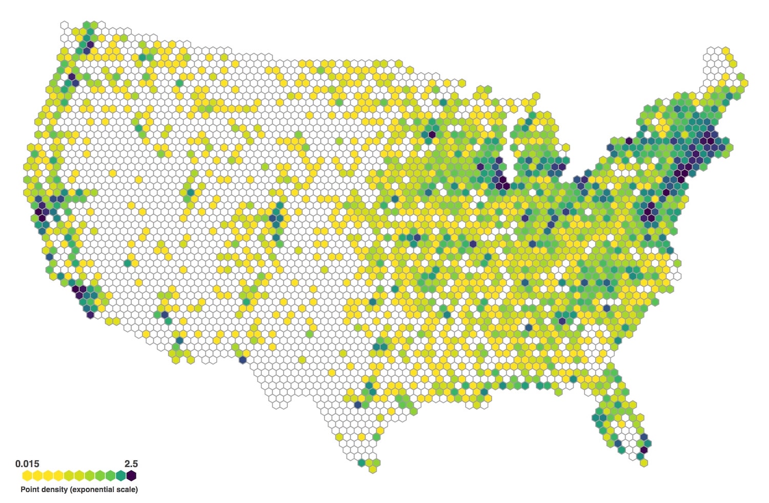
Source: d3-hexgrid
When the number of points in each hexagon is used to scale the hexagons in size, their colour can be used to encode a secondary variable. In the hexbin map below the hexagons are scaled according to how many Walmart stores they contain, and the colour of each hexagon represent the median opening year of the stores it contains.
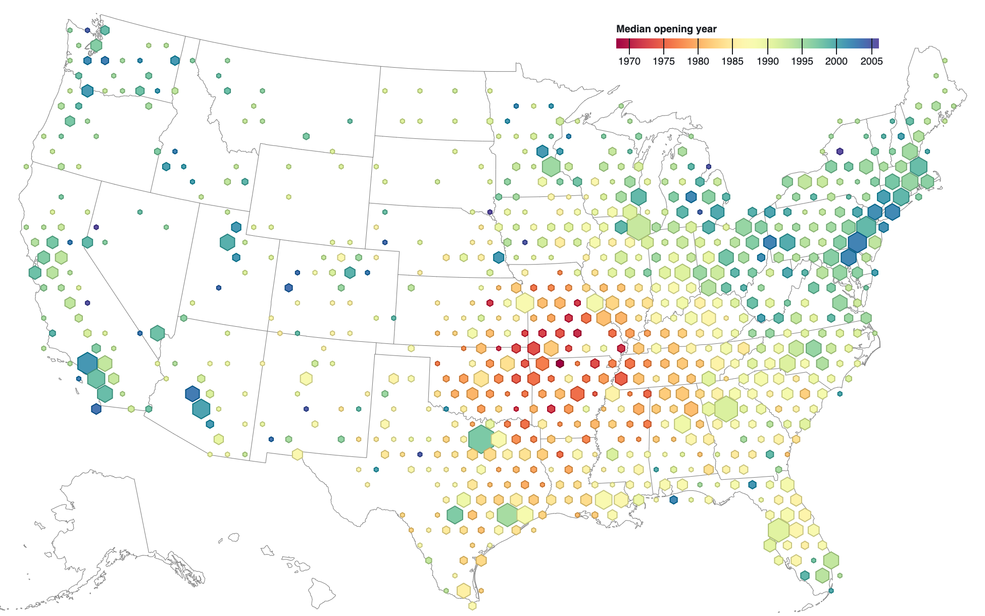
Source: observablehq.com/@d3