When showing data about people, like in the example above showing arrested people in Hong Kong, visualization designers and data journalists often use design strategies that presumably help the audience relate to those people. The term anthropographics has been recently coined to refer to this practice and the resulting visualizations.
The goal of using more relatable depictions of human beings in data visualisation is to promote social feelings or prosocial behaviour. It is a way to evoke empathy with the subjects of your data visualisation.
The design space of antropographics is very large: humans can be represented in a wide variety of ways.
People icons used in a graphic on covid-19 clusters. Source: The Korean clusters, graphics.reuters.com
Anthropographics don’t have to be visual necesarily: revealing some details about a person can already be enough to make an abstract visualisation more relatable.
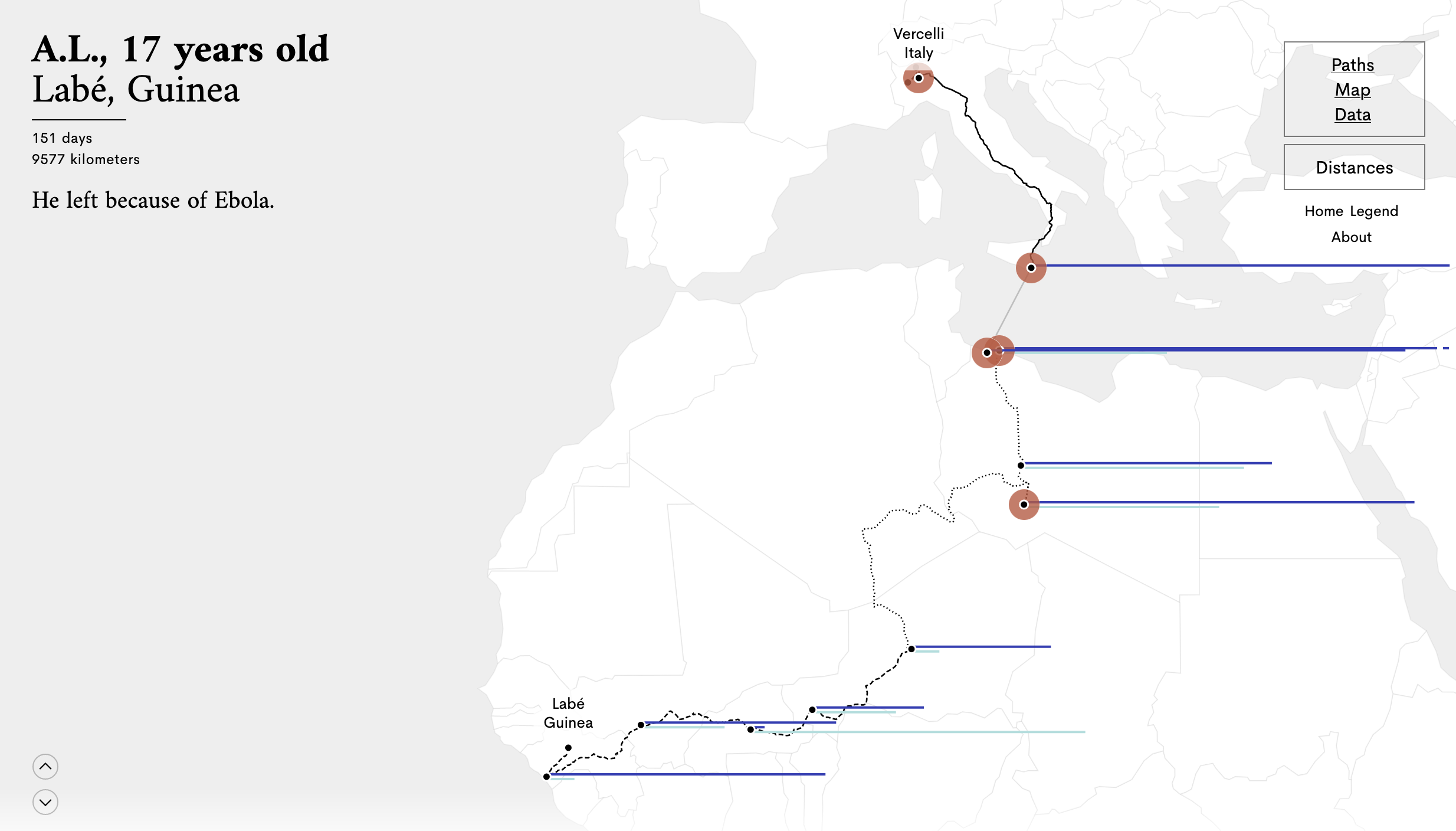
Stories Behind a Line tells the story of how seven migrants reached Europe after travelling long distances. The migrants are anonymous, but revealing their initials, their age and city and country of origin (see the top left), makes the stories a lot more personal. Source: storiesbehindaline.com
Below, different properties of anthropographics are discussed and illustrated.
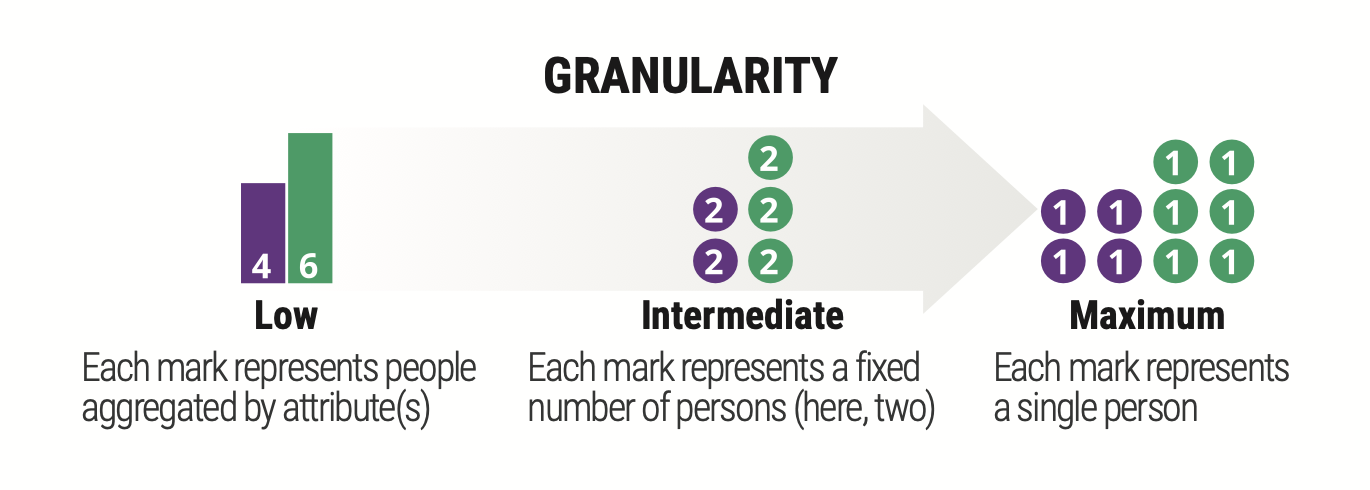
Granularity
Granularity refers to the extent to which the persons in the visualized dataset are mapped to separate data items – and equivalently, to separate marks on the visualization.
Source: Luiz Morais, Yvonne Jansen, Nazareno Andrade, Pierre Dragicevic. Showing Data about People: A Design Space of Anthropographics. IEEE Transactions on Visualization and Computer Graphics, Institute of Electrical and Electronics Engineers, In press. hal-02931257v2
In a visualization with low granularity, each mark corresponds to a group of persons who have one or more attribute values in common.
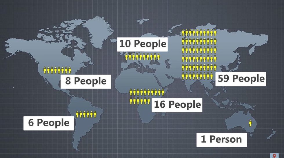
Low granularity anthropographics from the video What If Only 100 People Existed on Earth? by RealLifeLore
In a visualization with maximum granularity, each data item corresponds to a single person.
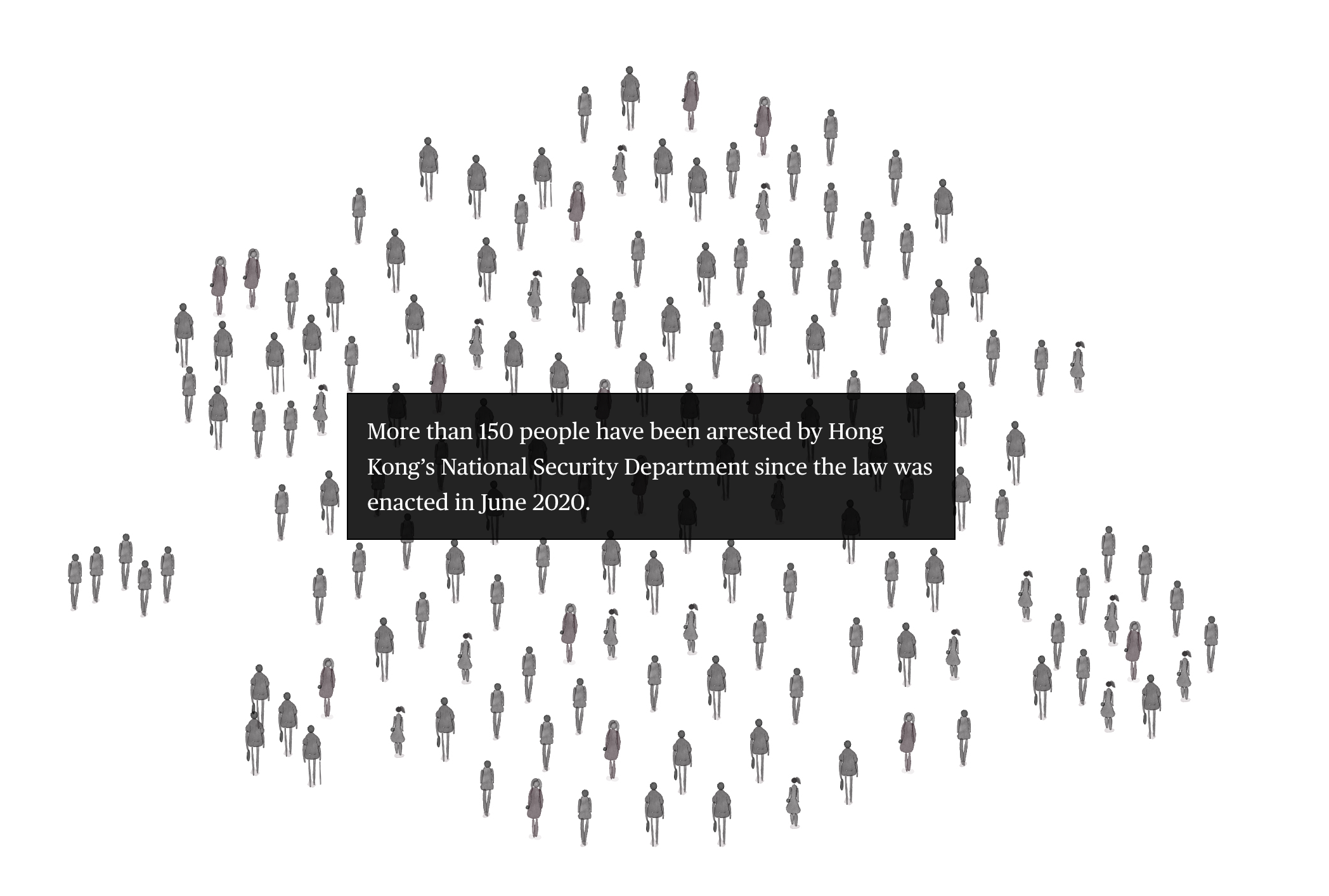
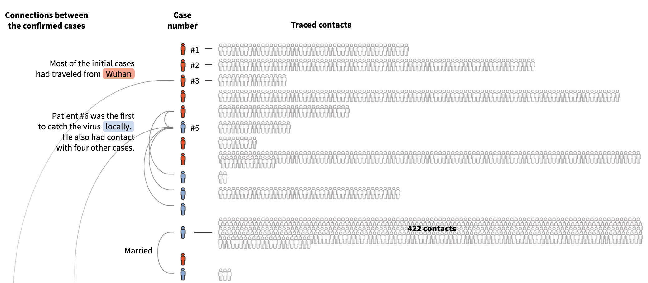
Source: How Hong Kong’s National Security Law Is Changing Everything, bloomberg.com
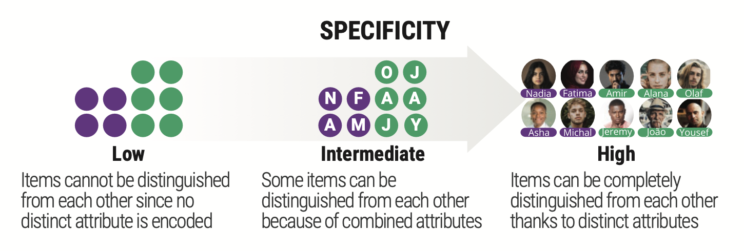
Specificity
The specificity of a visualization corresponds to how distinctive the entire set of attributes of people in the visualized dataset is. The more the attributes allow to distinguish between data items (either individuals or groups of people) the higher the visualization’s specificity.
Source: Luiz Morais, Yvonne Jansen, Nazareno Andrade, Pierre Dragicevic. Showing Data about People: A Design Space of Anthropographics. IEEE Transactions on Visualization and Computer Graphics, Institute of Electrical and Electronics Engineers, In press. hal-02931257v2
In a visualization with low specificity, items tend to be visually very similar to each other and most of them cannot be distinguished.
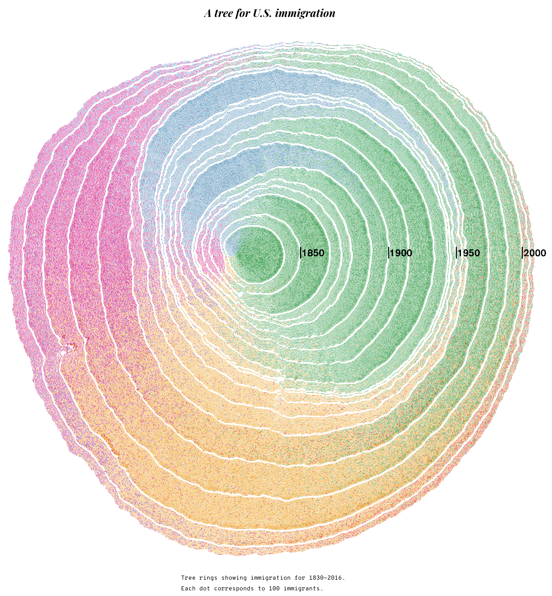
A visualisation showing where immigrants in the US originated from. Each dot represents 100 people, and the colours and angle from the center represent the region of the world people came from. The visualisation has a low specifity: apart from where people came from, no other attibutes are used to distinguish between them. Source: Simulated Dendrochronology of U.S. Immigration 1790-2016
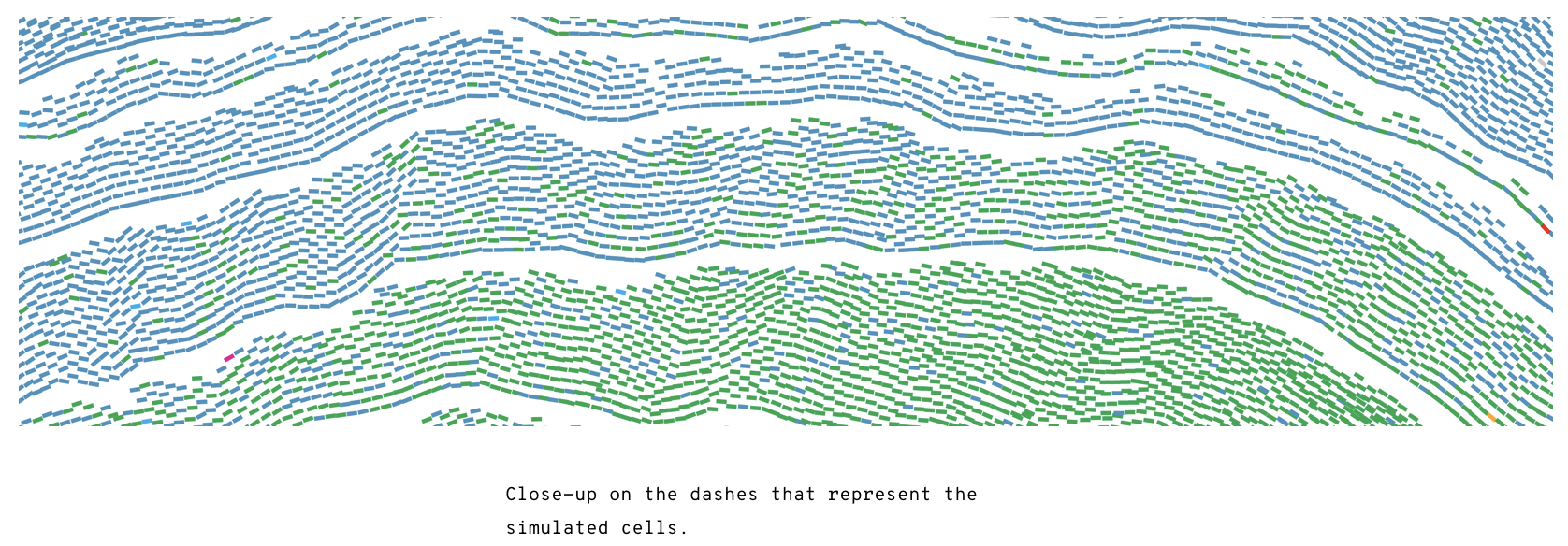
Source: Simulated Dendrochronology of U.S. Immigration 1790-2016
In a visualization with high specificity, the attributes in the visualized dataset allow the reader to perfectly distinguish all data items.
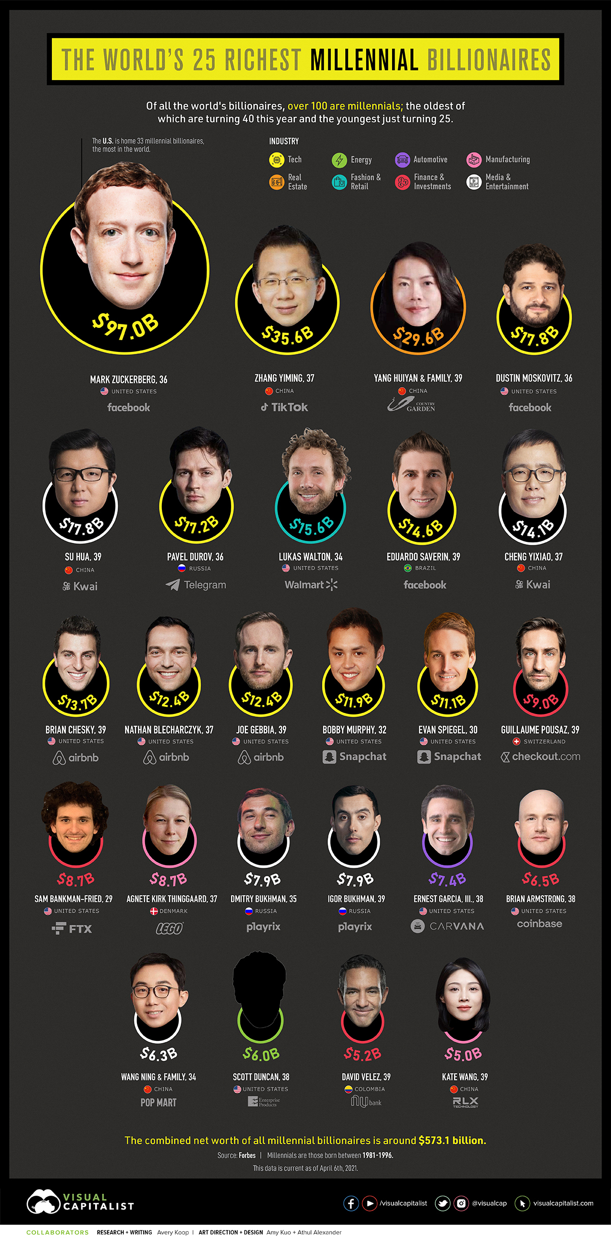
Source: visualcapitalist.com
Realism
Realism refers to the degree of resemblance of the visualization’s marks to actual persons.
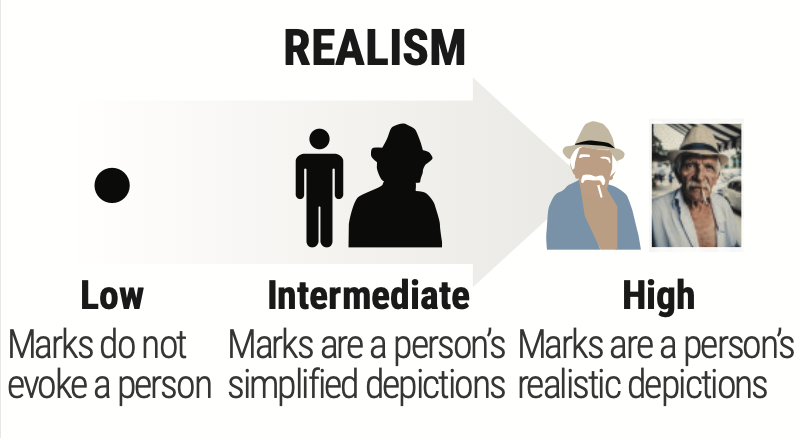
Source: Luiz Morais, Yvonne Jansen, Nazareno Andrade, Pierre Dragicevic. Showing Data about People: A Design Space of Anthropographics. IEEE Transactions on Visualization and Computer Graphics, Institute of Electrical and Electronics Engineers, In press. hal-02931257v2
A visualization with low realism represents people or groups of people using symbolic marks that are non-anthropomorphic, that is, they bear no resemblance with a human. Such marks include dots, bars, abstract glyphs, or shapes that evoke inanimate objects. A visualization with high realism is made of realistic anthropomorphic marks, which closely resemble an actual person.
Wee People is a font that renders silhouettes of people, so it has an intermediate level of realism.
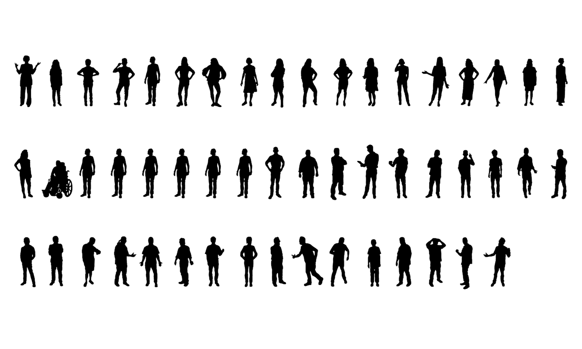
Source: Our Font Is Made of People
You can see the Wee People in action in What Happened to All the Jobs Trump Promised?
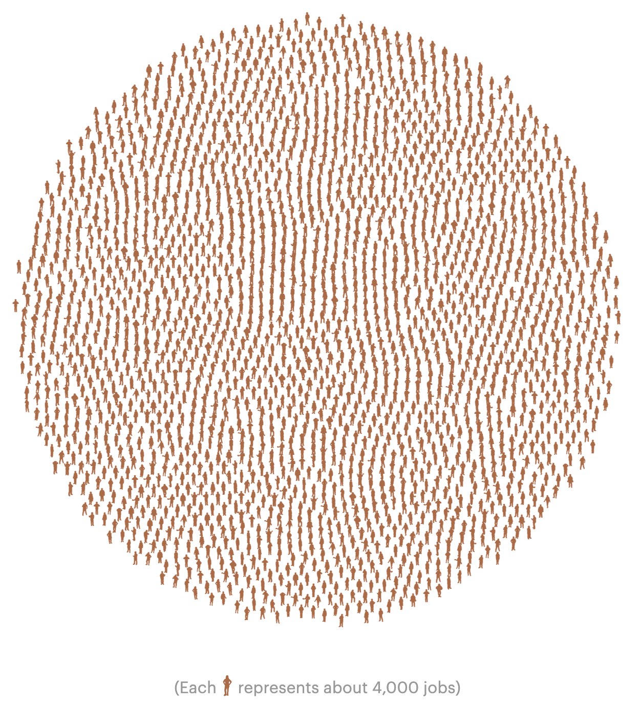
Source: What Happened to All the Jobs Trump Promised, propublica.org