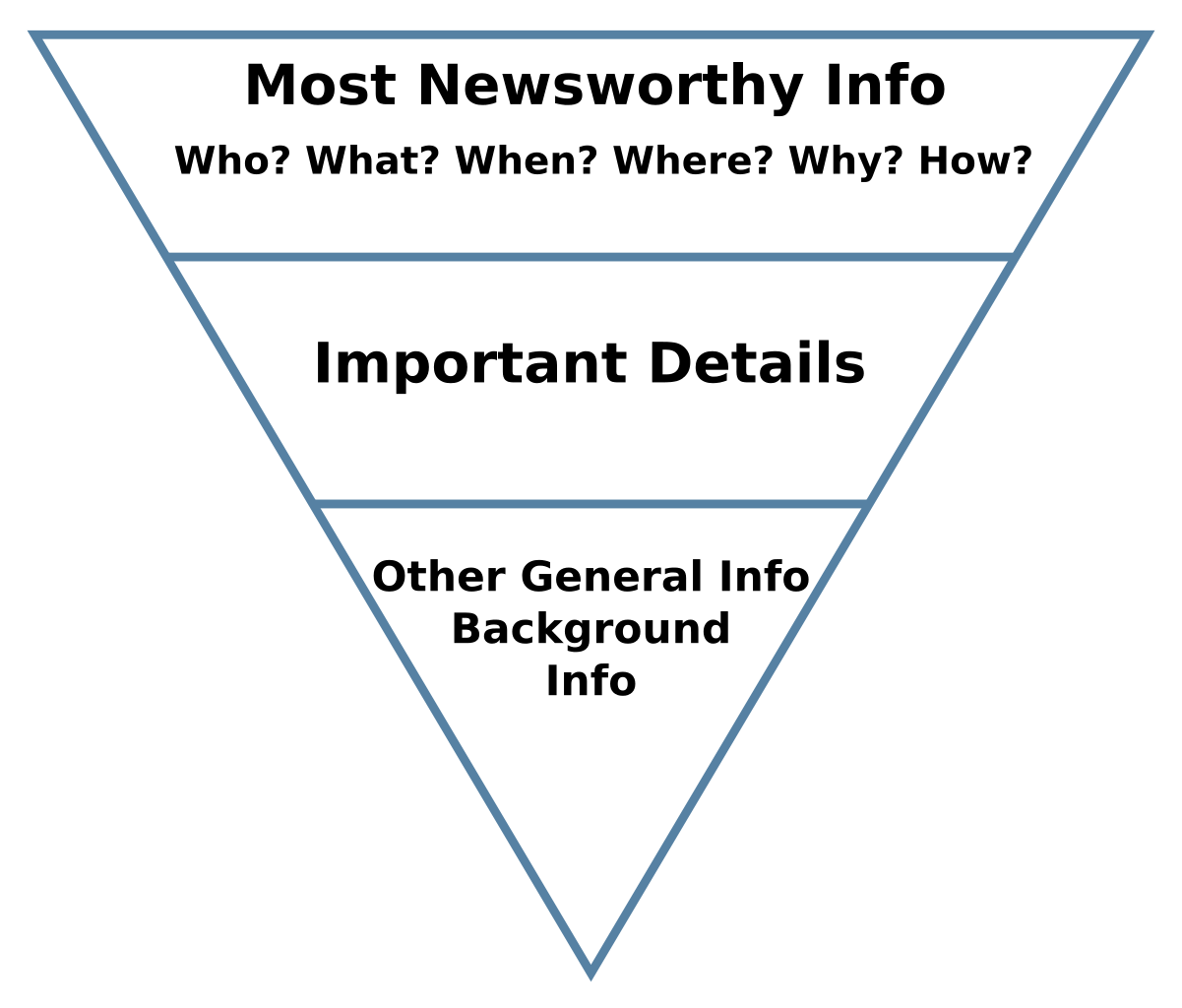
In journalism, the “inverted pyramid” refers to a metaphor used to structure the content of news articles. According to the inverted pyramid, the most important and interesting information in an article should already be contained in the first few sentences. Details can follow later in the text, and additional background information should be mentioned last.
Source: Makeemlighter, public domain
Using the inverted pyramid to structure a text leads to articles with some interesting properties:
- in a world where attention and time of the audience are scarce goods, readers get the take away message upfront. Without reading the whole article, readers get the essence, and can decide to read the rest of the article if they are interested in the topic, or are triggered by a “hook”, which is sometimes also part of the lede of an article (a lede are the first few sentences of an article).
- when an article with the inverted pyramid structure needs to be shortened, it can be “cut from the bottom”. Because the least important information is placed at the end of the article, it can be removed without major consequences: the most important information is still there, and the article can still be read and understood without any problem.
So, the lede should contain the main message of the charts. A helpful technique to determine what this message should contain is another journalistic technique, the 5 W’s. The 5 W’s explain the who, what, when, where and why of the story, and the theory states that any good news story should answer all 5 W’s (the how of a story is sometimes also added).
So how is the inverted pyramid relevant in data visualisation and in data storytelling?
The first take away is to add a descriptive title (see the Chart titles pages) and a good chart description or subtitle to communicate the main message of a chart. Even readers spending limited attention on reading the chart, will still be able to understand the key message.
According to the inverted pyramid, the less important information should come at the end. So things like methodological notes and less important metadata should be added below the chart (if they need to be added at all).