Research has shown that people understand probabilities better when they are expressed as frequencies instead of percentages. For example, when the occurrence of the side effects of medication was framed as a percentage (”10% of patients developed a bad rash from the medication”) especially people with low numeracy underestimated the probability in comparison to when the side effects were framed as a frequency (”10 out of 100 patients developed a bad rash from the medication). For people with high numeracy, there was no difference, probably due to those people understanding both formats equally well.
From this follows that the most effective way to communicate probabilities is through visualisations that show frequencies. There are two main chart types that do this. The first one are icon arrays.
Icon arrays show the denominator of a probability as the total number of icons or symbols arranged on a grid. The numerator of the probability is the number of icons in the total set of icons with visually different properties to make them stand out.
![]()
An icon array showing the difference in the probability of having a stroke or heart attack resulting from taking aspirine among people with symptoms of arterial disease. Source: American Psychological Association
Important for effective icon arrays is that they should visualise the denominator (the total number of icons or symbols) and the numerator (the highlighted icons or symbols) proportionally accurate. Arranging the icons or symbols in a grid makes them easy to count.
The second frequency based chart type that is very effective for communicating probabilities, are quantile dot plots. In a sense, they are the icon array version of density plots: the curve of the density plot is replaced by stacked icons in such a way that the stacks follow the curve of the density plot as much as possible.
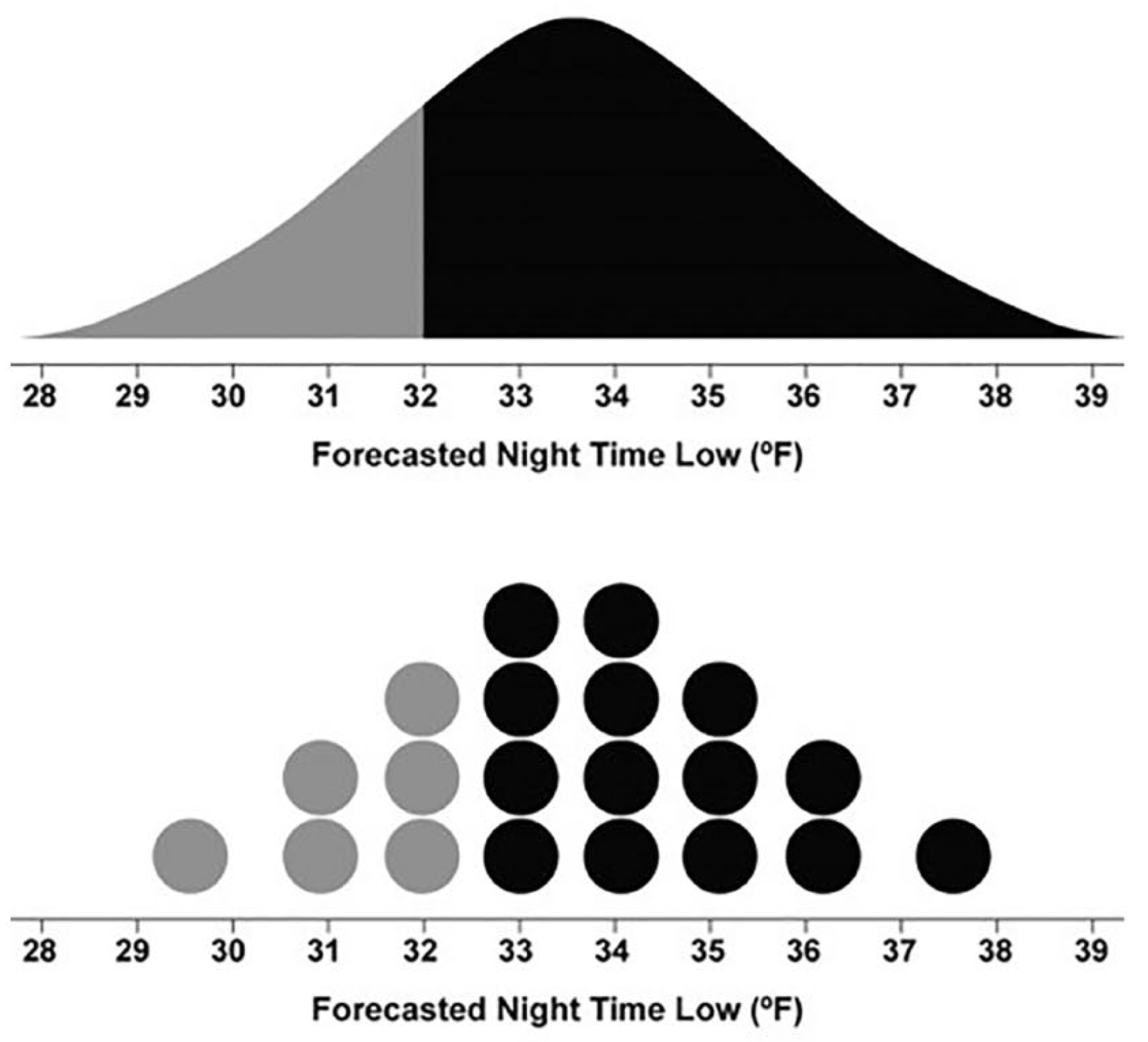
On top: a density plot. At the bottom: a quantile dot plot. Source: The Science of Visual Data Communication: What Works
The top plot above is a density plot of the forecasted night time low temperature. If you want to know what the probability is that the night time minimum temperature is going to be lower than 32°F (that is 0°C), you need to compare the grey area under the curve to the total area under the curve. That is not an easy task to perform.
The bottom plot is a quantile dot plot. The density curve is replaced by stacked circles in such a way that the stack heights approximate the density curve as much as possible. The task of estimating the chance of freezing temperatures now becomes much easier: you can just calculate the proportion of the grey circles (6) in the total number of circles (20), so the chance of a night with freezing temperatures is 30 percent.
The focus on frequencies can also help in a better understanding of the “cone of uncertainty” used to show hurricane predictions. Instead of showing a confidence interval for predicted hurricane paths, a subset of the actual model outcomes that resulted in the summarising confidence interval could be shown.
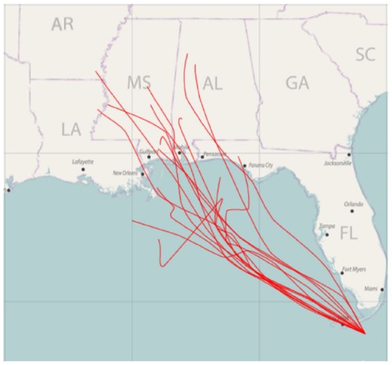
Source: L. Liu et al., 2018
Because randomly sampled modelled hurricane paths can look quite messy, alternative techniques have been developed that show model outputs in a cleaner way.
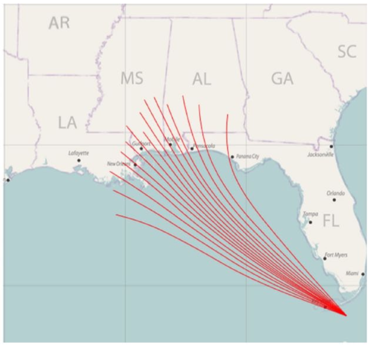
Source: L. Liu et al., 2018
Showing all model outcomes, and then highlighting some of the more interesting ones, is what The Economist did for a range of scenarios for future carbon dioxide emissions. This gives a good overview of the range of possible futures and a sense of the uncertainty.
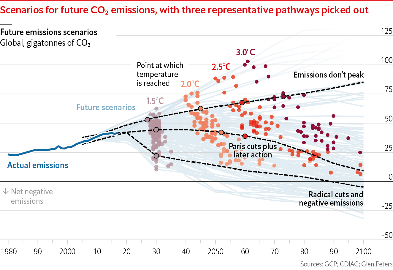
Source: Off the charts newsletter, edition 2022-03-22, economist.com
Similarly, instead of just showing a trend line, or a trend line with confidence intervals, showing the actual data points from which the trend line is calculated from, can help showing the variability, and help viewers to see the uncertainty.
The Economist uses both techniques:
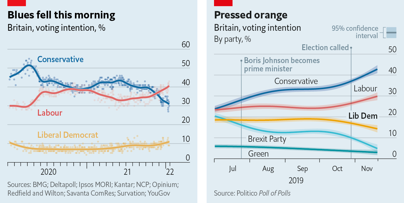
On the left: a trend line with added data points, on the right: trend lines with confidence intervals. As mentioned, confidence intervals can be difficult to understand for readers, so the added data points approach might be more effective in communicating uncertainty. Source: Off the Charts newsletter, edition 2022-03-22, economist.com