To move away from the abstract and hard to understand error bars, confidence intervals and cones of uncertainty, and towards more intuitive and easier to understand depictions of uncertainty, research suggest to show underlying probability distributions.
Density plots and violin plots show how probable a value is: where the plot is the widest, probabilities are the highest. This allows viewers to asses the variability in the data, the mean and wether the distribution is normal, skewed, bimodal or has any other shape.
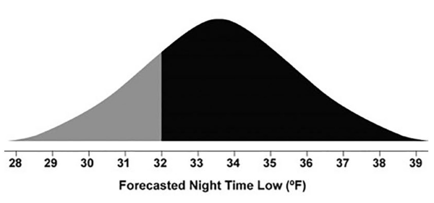
An example of a density plot of forecasted night time low temperatures. Source: The Science of Visual Data Communication: What Works
When values are uncertain, some visual properties of visual elements depicting data points are better than others in communicating this uncertainty. The “fuzziness” of a data point, where the boundaries of the data point are not clearly visible, is such a property, just as “sketchiness” (with unorderly line arrangements) and colour brightness. A higher fuzziness, lighter colours and a more chaotic arrangement of lines are all associated with higher uncertainty.
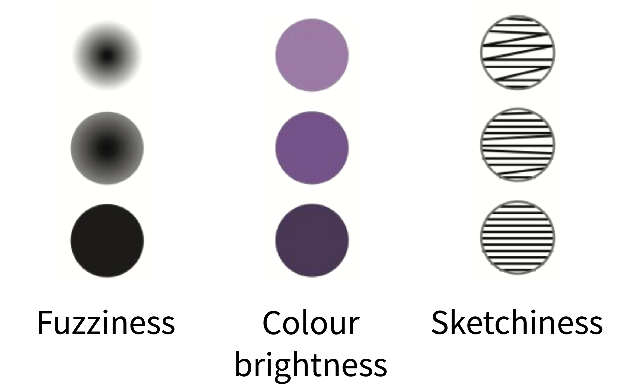
Source: The Science of Visual Data Communication: What Works
Fuzziness can be used to literally show the uncertainty, and make reading exact values impossible. A point on a map with an uncertain location can be rendered blurry, so that its exact location cannot be read from the map, for example.
A technique called “value suppressing uncertainty palettes” uses colour brightness and grouping of colours to make reading values harder when uncertainty is higher.
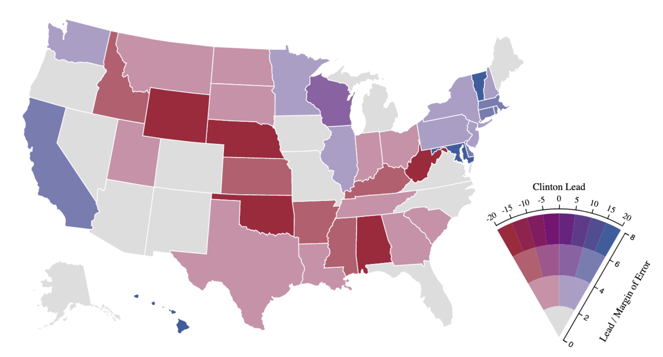
A map showing polling data prior to the 2016 US presidential elections using a value suppressing uncertainty palette. When uncertainty is high, colours are less bright and reading values is more difficult. Source: Value-Suppressing Uncertainty Palettes, research.tableau.com