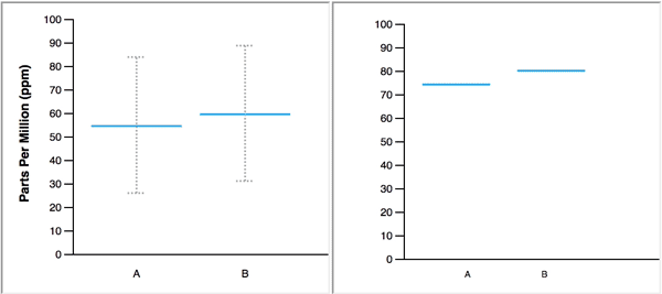
Understanding the results from a sample drawn from a population distribution is not very intuitive. Hypothetical outcome plots (HOPs) try to make this easier to grasp.
Instead of showing some summary statistics, like the sample mean and a confidence interval, HOPs simulate multiple samples from the same distribution, and show them in an animated way.
Source: Hypothetical Outcome Plots: Experiencing the Uncertain
The animation of a HOP can give viewers an intuitive sense of the uncertainty surrounding the true trends.
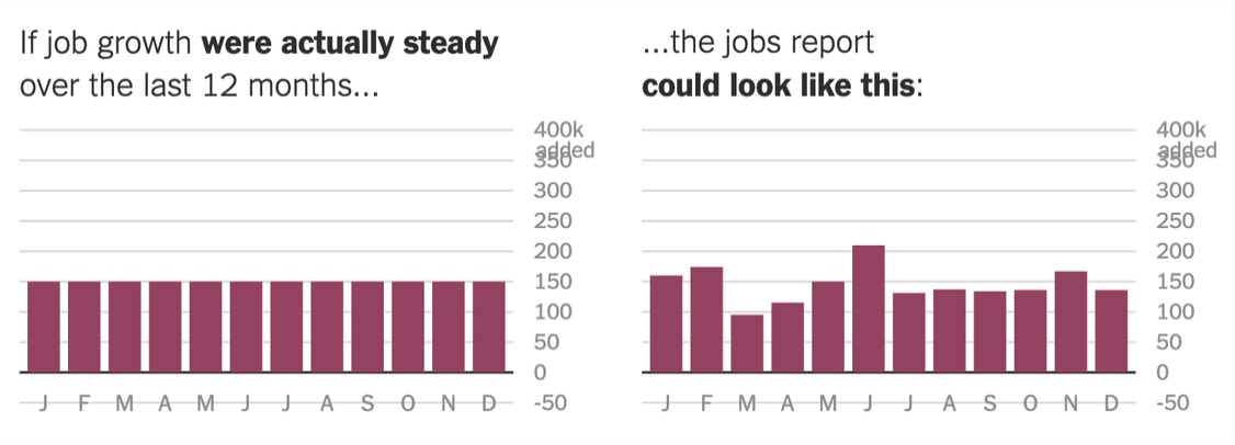
The New York Times used some HOPs to simulate how the US Labor Department’s monthly jobs report numbers would look like when resampled with the same sampling error the jobs report has. The results are quite striking.
Source: How Not to Be Misled by the Jobs Report, nytimes.com
When animated HOPs leave a trace, they can be used to build up a static image that shows the cumulative results of each frame of the HOP. An example of this technique is the animation in the Extensive Data Shows Punishing Reach of Racism for Black Boys article by the New York Times. It shows how black boys who grew up rich have a higher chance to end up poor than their white peers.
Source: Extensive Data Shows Punishing Reach of Racism for Black Boys, nytimes.com