Research has shown that the role of anthropographics in provoking empathy might be limited. But a technique that has proven its effectiveness is to tell a data driven story by complementing it with the traditional journalistic technique of personalising events through the eyes of those experiencing it.
An excellent example of putting in real people is Dollar Street. Dollar Street visited 264 families in 50 countries and collected 30.000 photographs to show these families and how their income relates to their living conditions. The project manages to humanise dry statistics by putting a face to the families, it makes the experience of consuming the numbers much more visceral.
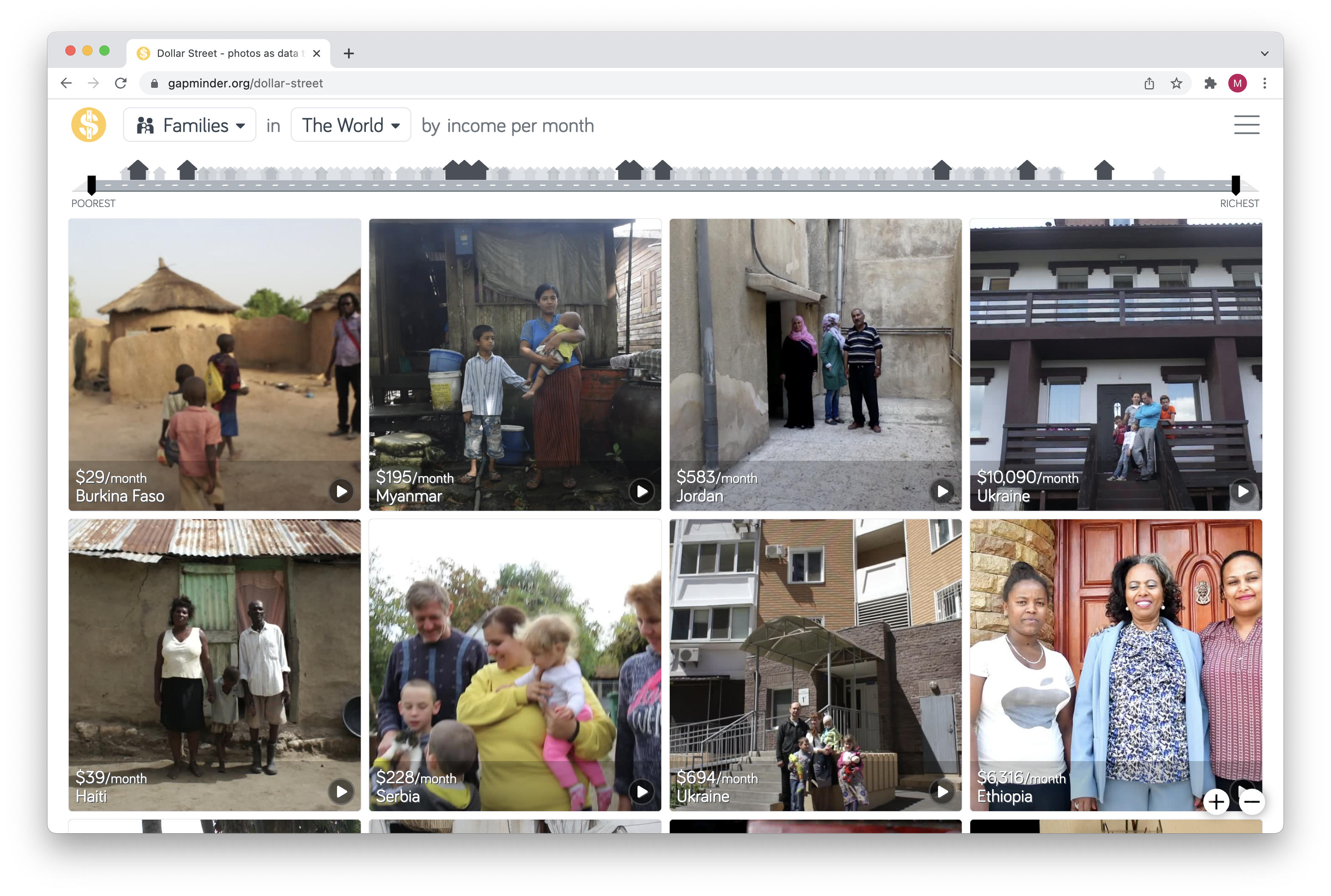
Source: gapminder.org/dollar-street
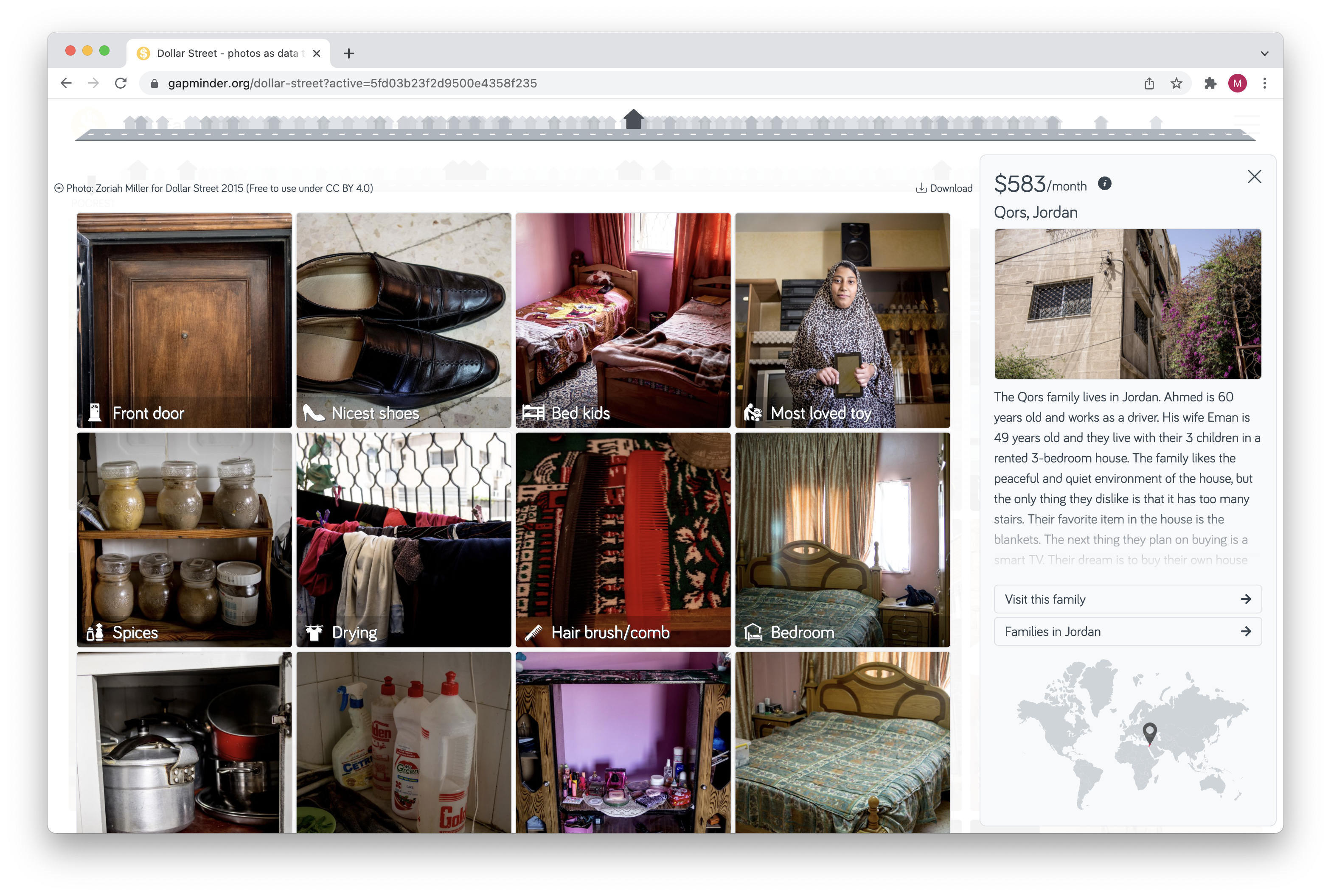
Source: gapminder.org/dollar-street
In The Last Person You’d Expect to Die in Childbirth, the issue of maternal deaths in the United States is introduced by telling the story of neonatal intensive car nurse Laura Bloomstein. Laura died soon after giving birth to a baby girl in 2011.

Source: The Last Person You’d Expect to Die in Childbirth, propublica.org
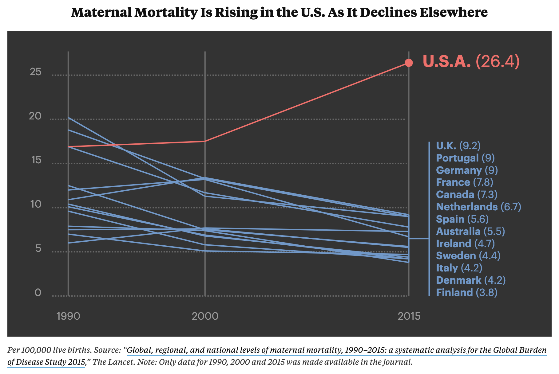
Laura’s story is a gripping story, and it is impossible not to go through many emotions when reading it. It is an illustration of a wider problem in the American health care system, that suffers from high maternal death rates, even though spending in the sector is high.
Only after Laura’s story, the statistics showing this problem are presented through data visualisation.
Source: The Last Person You’d Expect to Die in Childbirth, propublica.org
People empathise with people, not with numbers. So when dealing with statistics related to people, like life and death, health, income and other topics, picking real people and telling their story can be an entry point into the broader issue made visible with data visualisation.