Coming full circle is another storytelling technique that you can use in data driven stories. For example, Why Budapest, Warsaw, and Lithuania split themselves in two shows a map of the regions of Hungary in the beginning of the article, which are shown again at the end.
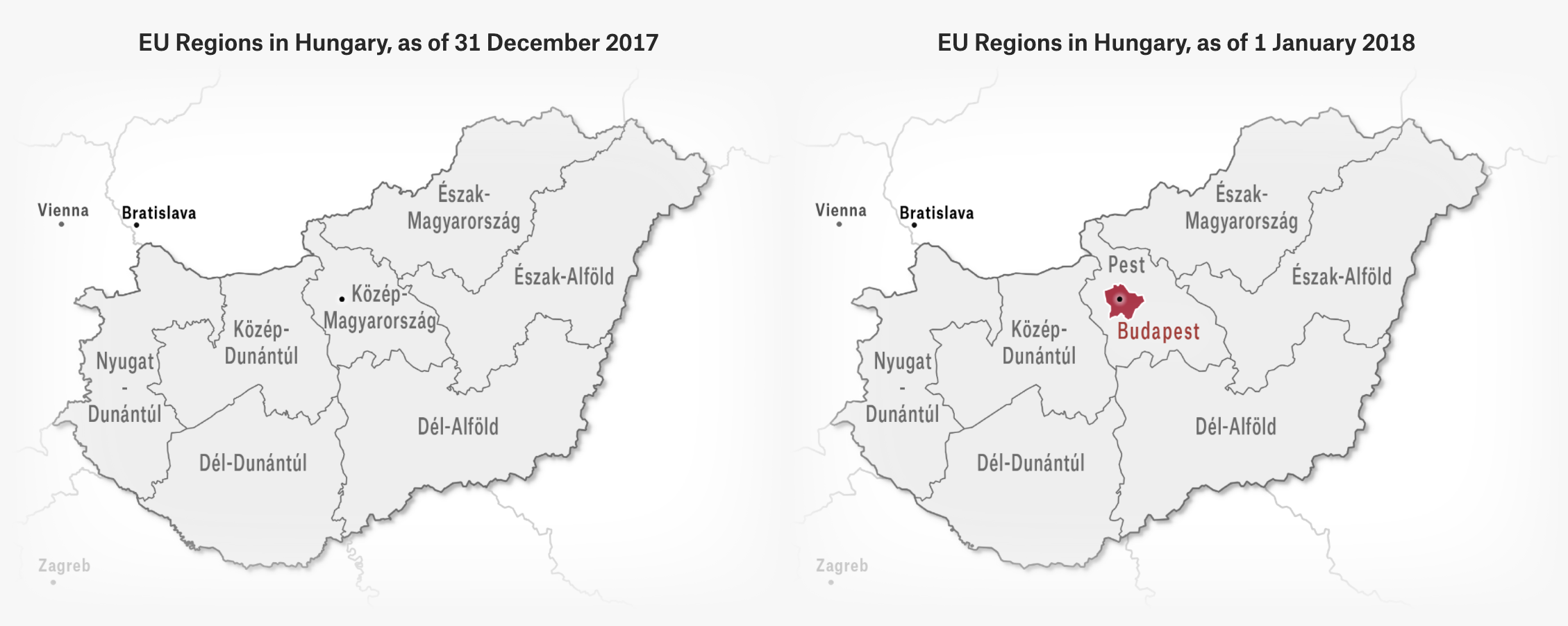
Source: Why Budapest, Warsaw, and Lithuania split themselves in two, pudding.cool
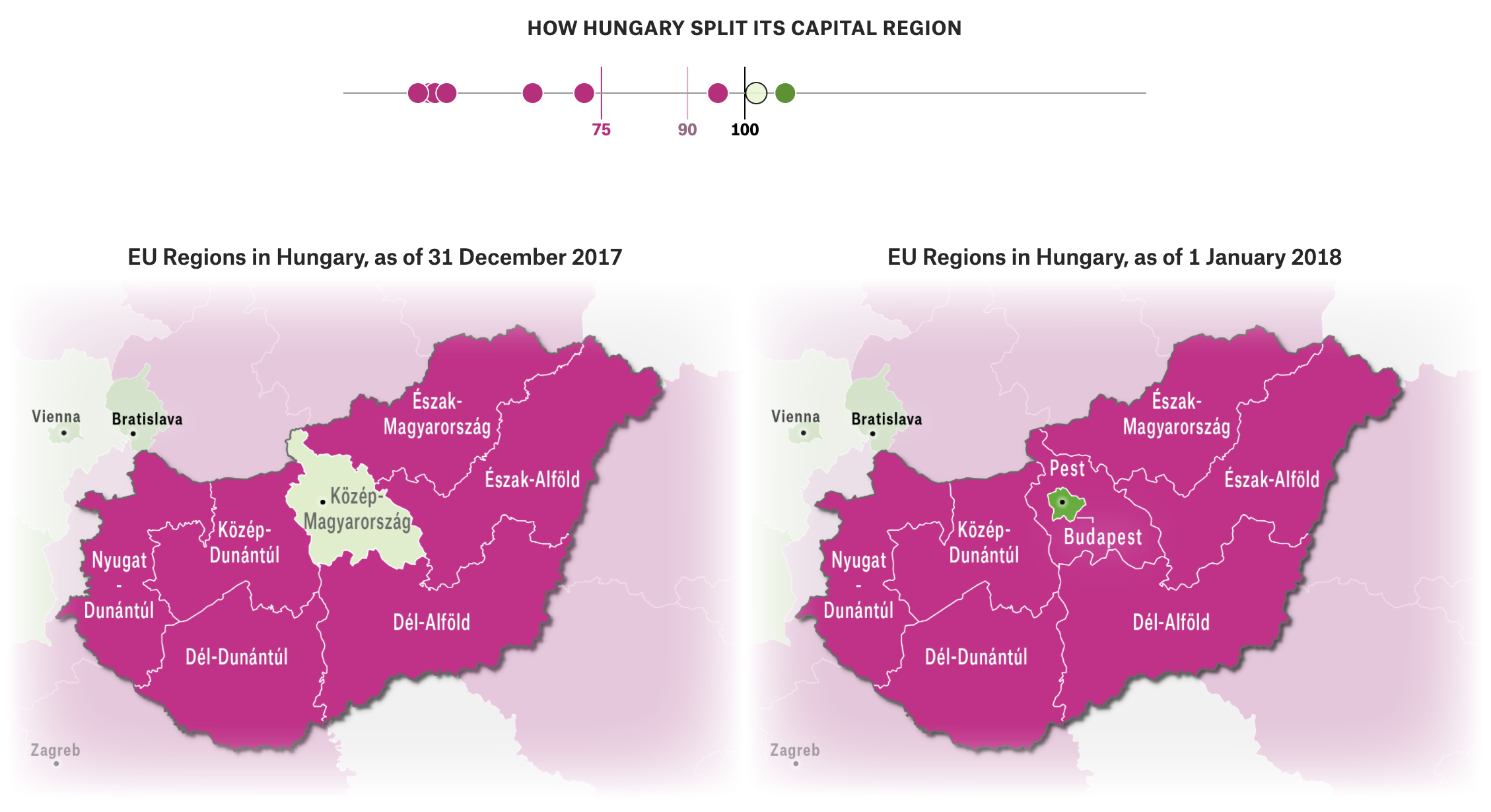
Source: Why Budapest, Warsaw, and Lithuania split themselves in two, pudding.cool
The text and visualisations in between the maps explain the why of what is shown on them. But I am not revealing what that is here, because I want to create a cliffhanger to trigger your curiosity and make you click through to the original article 😉