The most useful application of the inverted pyramid to data visualisation, however, is in multi-panel and interactive visualisation: it provides a good framework for deciding how graphics should be arranged and how interactivity should be structured.
Looked at it this way, the inverted pyramid is similar to the “visual information-seeking” mantra, coined by Ben Shneiderman in 1996.
“Interestingly, the journalism triangle more or less corresponds to the mantra of interactive graphics: overview first, zoom and filter, and details on demand” - Barbara Tversky in Data-Driven Storytelling
The mantra was developed with interactive and exploratory data visualisation in mind, but it also applies to explanatory data visualisation.
According to the mantra, overview should be provided first. In a story driven by data, a visualisation of the longer term trend, or the overall distribution or relations in a data visualisation can be shown to sketch the context and introduce the topic and the data. All data points are shown. The overview can also consist of a single key metric, like a global average or total sum.
Then come zoom and filter. The view on the data is changed so that items of interest in the data come into focus and uninteresting items are filtered out. Outliers are highlighted, correlations are shown, smaller interesting patterns are annotated, the total sum is broken down into its components, …

The opening of a series of graphics in a scrollytelling module in How Hong Kong’s National Security Law Is Changing Everything, by Bloomberg, is a clear example of an overview: it introduces the topic and the data set of 150 people, which is fully displayed.
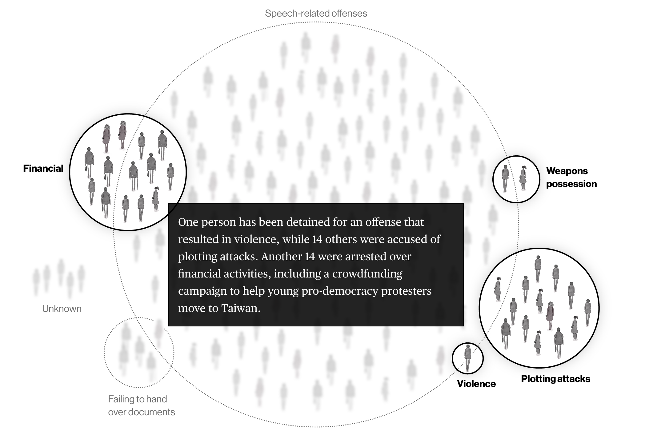
After the overview, the story uses zoom: specific groups of people are highlighted. Source: How Hong Kong’s National Security Law Is Changing Everything, bloomberg.com

In the next step, individual persons are highlighted. Source: How Hong Kong’s National Security Law Is Changing Everything, bloomberg.com
Nathan Yau, author of flowingdata.com, also uses “Overview first, then zoom” in How Much Americans Make. He first shows the overall distribution of income, after which he zooms in on age classes:
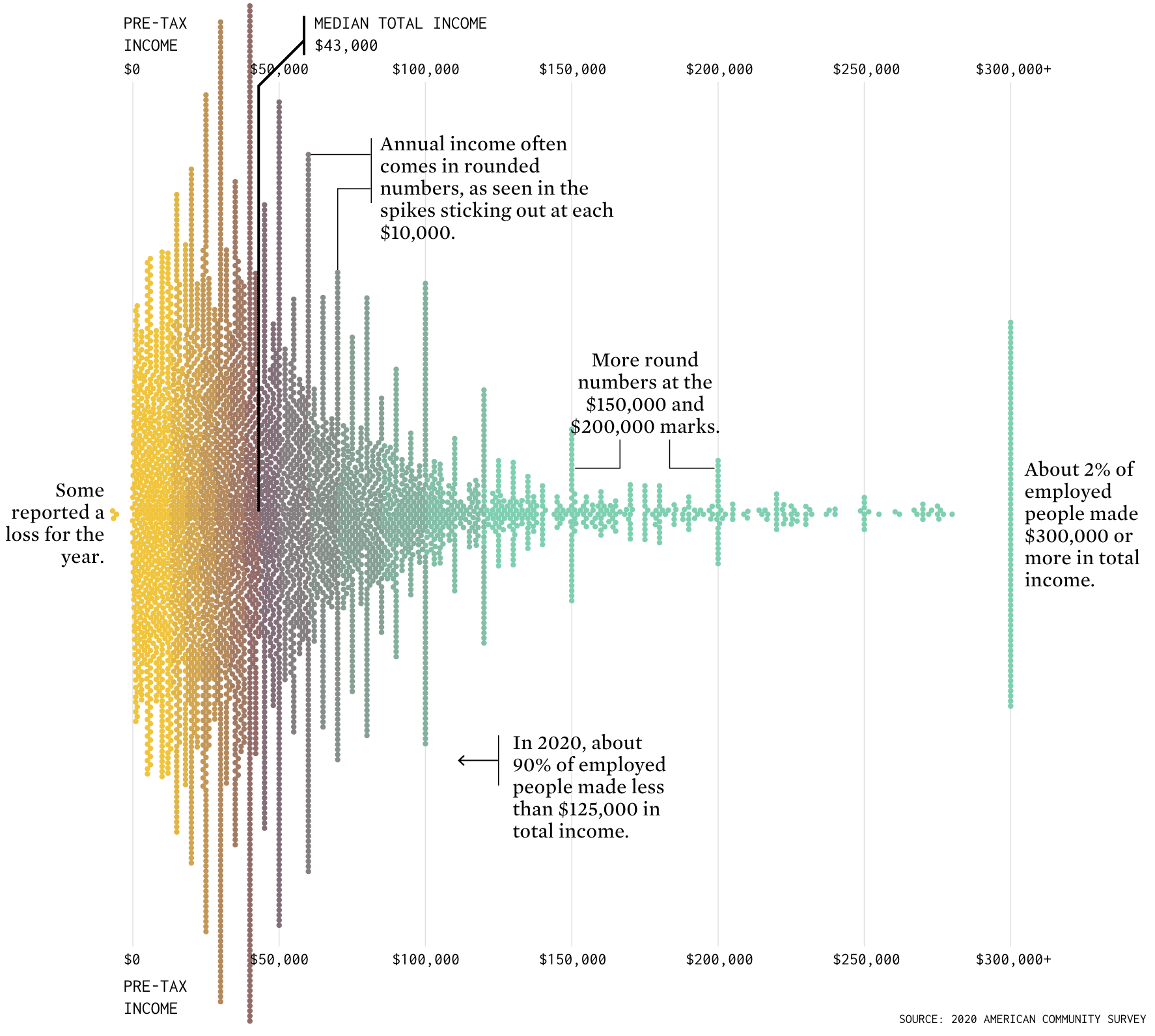
Source: How Much Americans Make, flowingdata.com
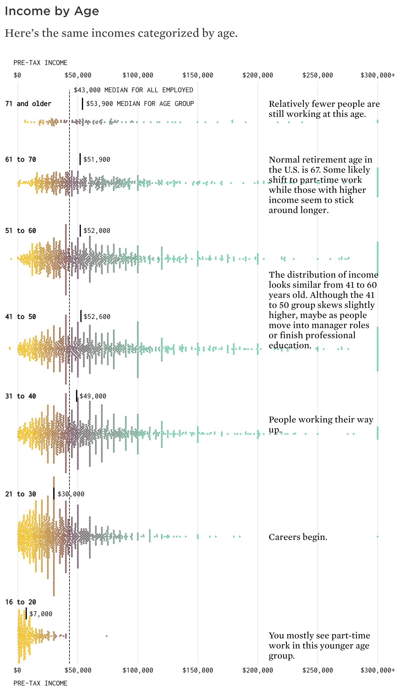
Source: How Much Americans Make, flowingdata.com
The last step (only reserved to interactive media) is to offer the user details on demand by giving her access to all the data about items of interest. The user is invited to interact with the visualisation by hovering over elements to get detailed data, or to enter queries in a search box or in order to look up and find items of interest and their associated details.
The example chart above showing the distribution of income between age classes could show where you would fit in in the shown chart, given your age and yearly income, for example. Or, if available, the sector each person is working in could be revealed on hovering the dots on the chart.